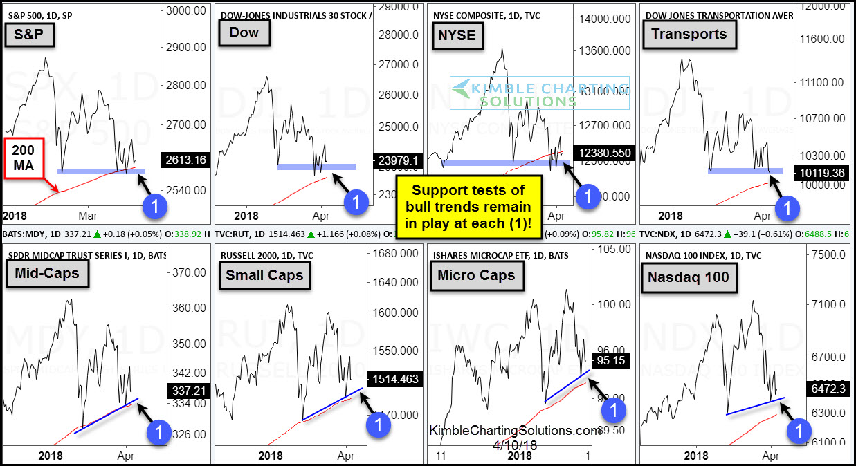
I saw a headline recently touting the “confirmed upside breakout” for Gold. As I tend to follow the markets, ahem, somewhat closely, I was a bit surprised that I somehow missed this. So imagine my confusion when I pulled up a bar chart to see the “confirmed upside breakout” that I somehow missed and saw what appears in Figure 1.
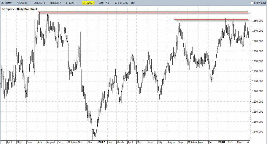 Figure 1 – Daily Spot Gold (Courtesy ProfitSource by HUBB)
Um, not to be trendy but, “dude, where’s my breakout?” All I see in this chart is serious resistance in the $1,370-$1,380. So was this pundit off his rocker? Turns out, no not necessarily. For if we switch to a monthly chart we can see exactly what he was referring to.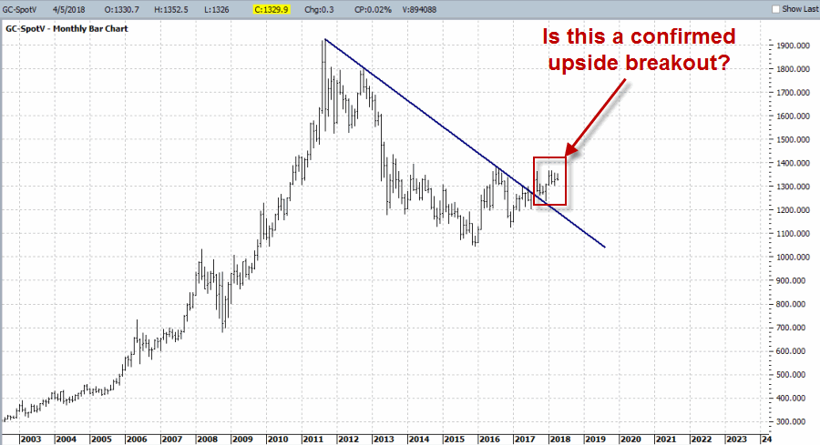 Figure 2 – Monthly Spot Gold (Courtesy ProfitSource by HUBB)
So, yes it is possible to make the case that gold has “broken out” to the upside. Still, if you put the two together you get Figure 3.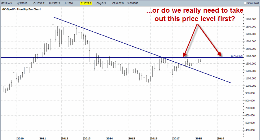 Figure 3 – Monthly Spot Gold (Courtesy ProfitSource by HUBB)
So as with most things in the financial markets – it’s all in the eye of the beholder. You can look at Figures 1 through 3 and reasonably say:
*Gold has broken out to the upside on a long-term basis so I am bullish
*A long-term trend line was broken but there is significant resistance near $1,370-$1,380 so I am going to remain neutral for now
*The resistance level looks pretty solid; I am going to be bearish until that level is taken out.
Take your pick.
In other words, the gold market right now is whatever you want it to be. So what to do? Well, let’s say you are the impatient type (“Hi, my name is Jay”) and you want to be positioned for a big move to the upside, but you have serious concerns about if and/or when that move might occur. Sound intriguing?
Sorry folks, you’ve just been sucked into another lesson on options trading.
The Ratio Backspread
In Figure 4 we see a bar chart for ticker GLD – an ETF that tracks the price of gold bullion with implied option volatility overlaid in black. 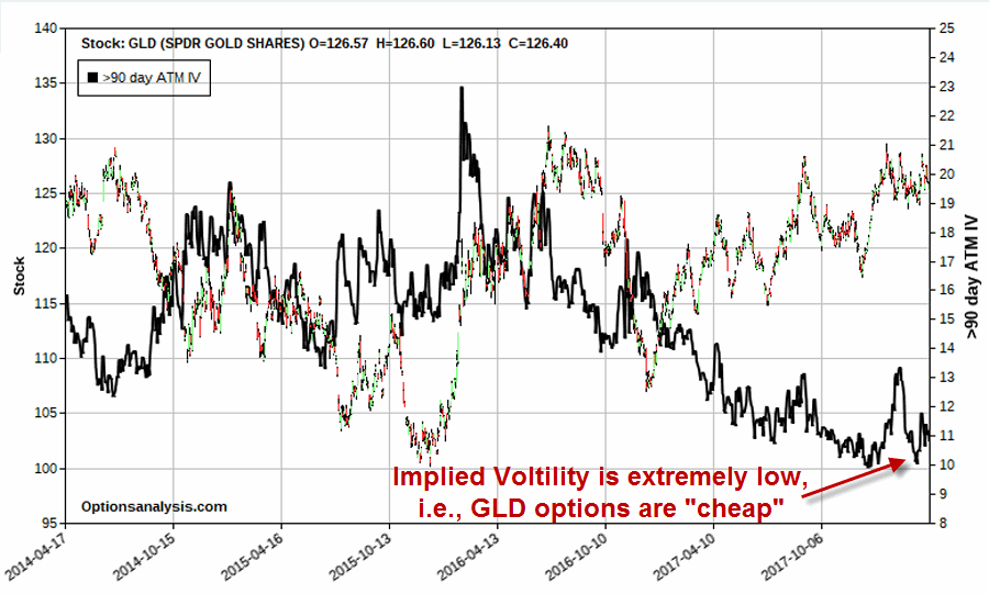 Figure 4 – Ticker GLD with implied volatility (Courtesy www.OptionsAnalysis.com)
You do not have to be an options expert to recognize that IV is presently at the very low end of the historical range. This has several implications. The primary things to know are:
*Low IV means there is relatively less time premium built into GLD option prices, i.e., GLD options are presently “cheap”.
*A subsequent rise in IV should it occur, would serve to inflate the price of GLD options
*Longer-term options are much more sensitive to changes in IV that shorter-term options. Therefore, if IV does rise, longer-term options will increase more in value than shorter-term options.
So let’s consider a possibility. IMPORTANT: As always I need to point out that what follows is simply an example of “one way to play” and I am in no way “recommending” this trade nor implying that it will generate a profit. It is presented solely as a means to teach people the relative advantages and disadvantages of various option trading strategies in a given circumstance. Are we clear?
The trade displayed in Figures 5 and 6 involves:
*Selling 1 Dec31 GLD 119 calls @ $10.60
*Buying 2 Dec31 GLD 126 calls @ $5.23
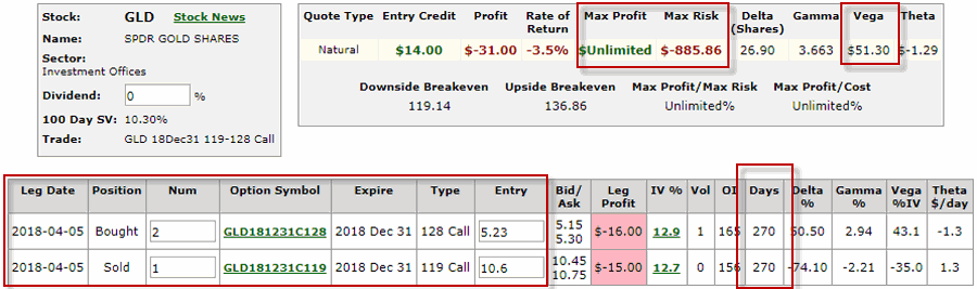 Figure 5 – GLD ratio backspread (Courtesy www.OptionsAnalysis.com)
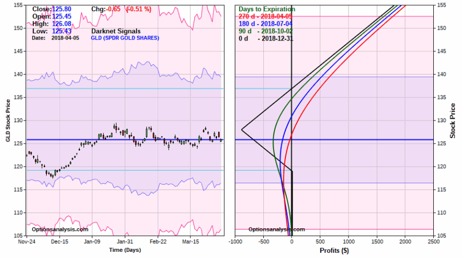 Figure 6 – GLD ratio backspread risk curves (Courtesy www.OptionsAnalysis.com)
This trade has 270 days left until expiration and the maximum risk is -$886 if GLD closes at exactly $130 a share on 12/31/2018 (and wouldn’t that be just my luck?). As you can see in Figure 6:
*If GLD rallies this trade can make a lot of money
*If GLD remains unchanged eventually this trade will lose money
*If GLD tanks this trade will breakeven or experience at most a small loss
Also, if IV rises in the meantime, that would push the risk curves further into positive territory. For example, if IV rose from 12% to 16% (i.e., 33%), the risk curves would look like those in Figure 7.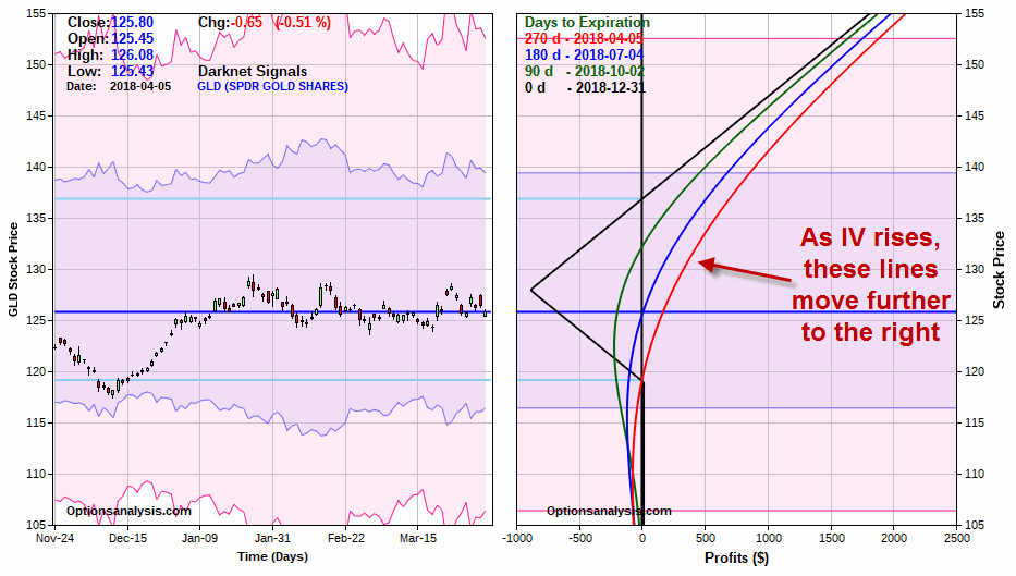 Figure 7 – GLD ratio backspread risk curves if implied volatility increases 33% from current levels (Courtesy www.OptionsAnalysis.com)
Summary
Which way will gold goal from here? It beats me.
Will GLD implied options volatility increase from here? It beats me.
Will the example trade above generate a profit? It beats me.
OK, not exactly the “rip roaring, go to the mattresses, take no prisoners, Katie bar the door” summary you might have been hoping for. So let me sum it up in a series of questions you can answer at home:
Question 1: Do you think there is a chance gold will rally between now and the end of the year?
Question 2: Do you think there is a chance that GLD implied option volatility will pick up sometime between now and the end of the year?
Question 3: Do you have $886 bucks?
Jay Kaeppel
Disclaimer: The data presented herein were obtained from various third-party sources. While I believe the data to be reliable, no representation is made as to, and no responsibility, warranty or liability is accepted for the accuracy or completeness of such information. The information, opinions and ideas expressed herein are for informational and educational purposes only and do not constitute and should not be construed as investment advice, an advertisement or offering of investment advisory services, or an offer to sell or a solicitation to buy any security.
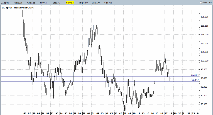
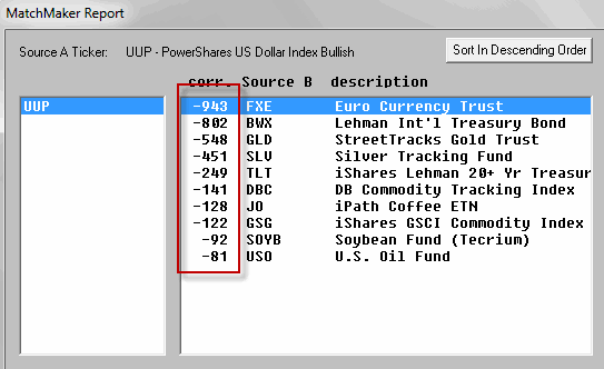
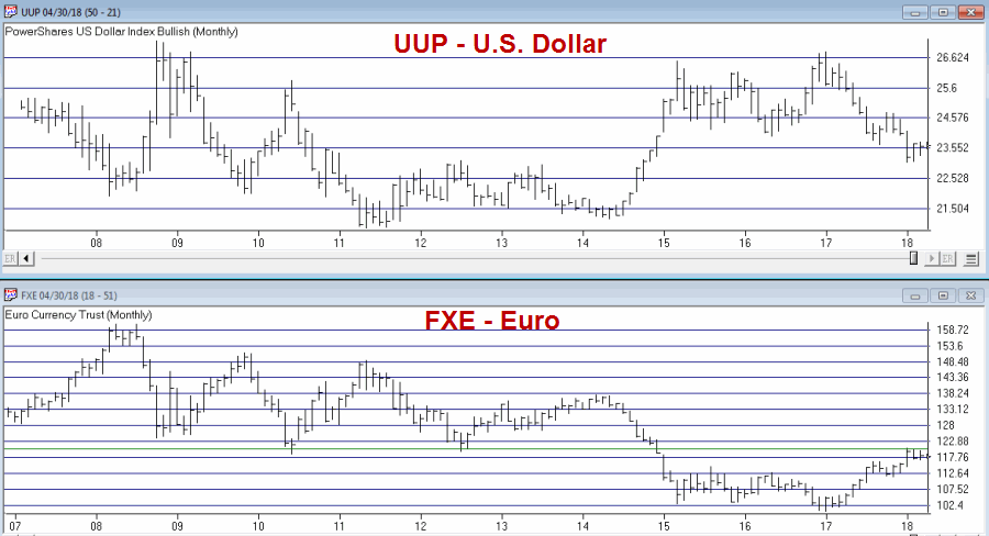
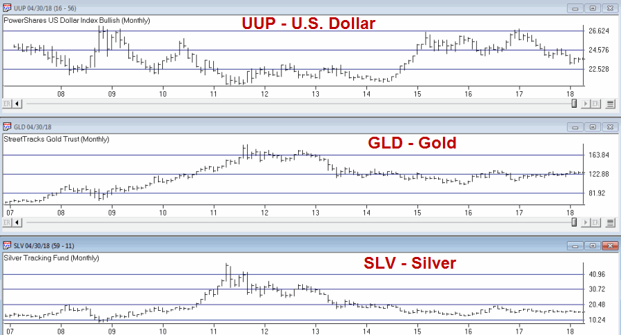
 Figure 1 – U.S. Dollar
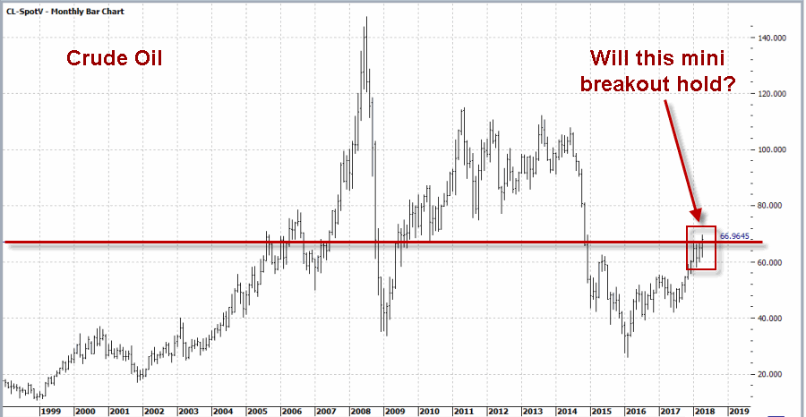 Figure 2 – Crude Oil
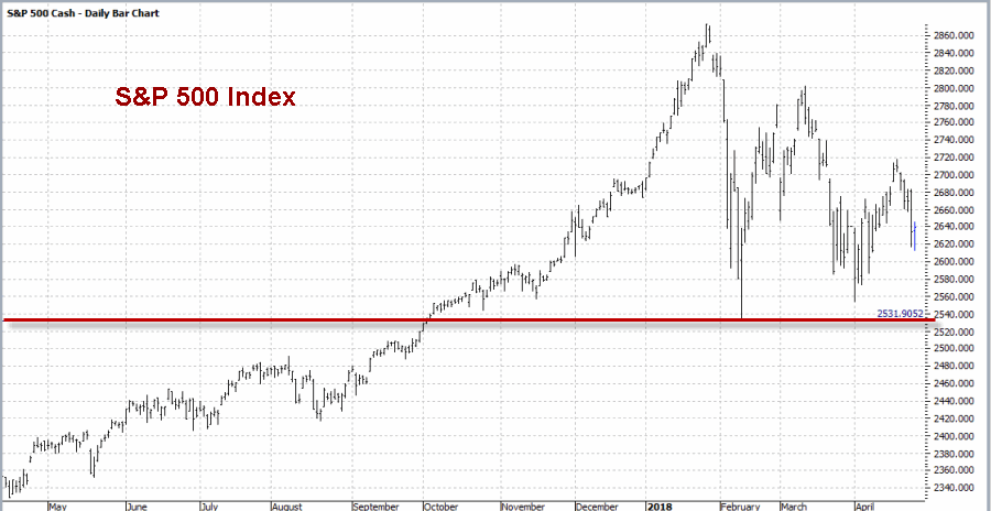 Figure 3 – S&P 500
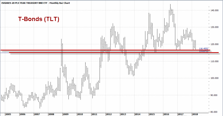 Figure 4 – T-Bonds (TLT)
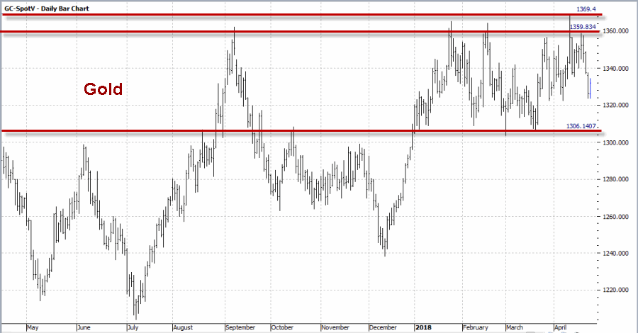 Figure 5 – Gold
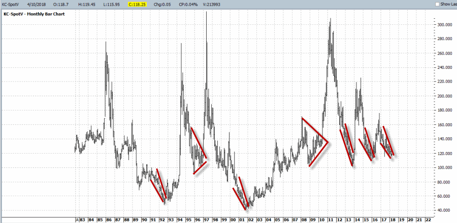
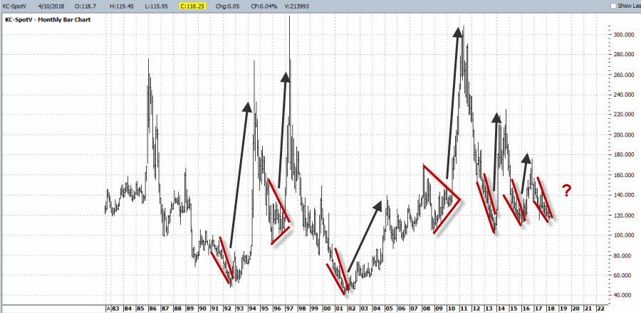
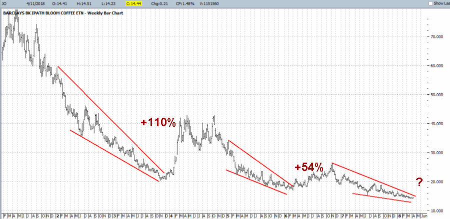
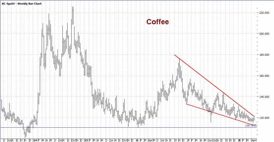 Figure 6 – Coffee
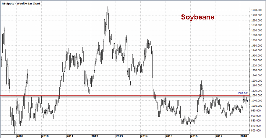 Figure 7 – Soybeans


