In two articles (here and here) I tried to point out that there might be a way to know in advance if you are about to have a “bad day” – at least in the stock market. Here I want to summarize everything in chart and one table.
First a recap.
The Bad Days
For our purposes we will count the first trading day of the month as TDM 1, the second as TDM 2 and so on.
We will also count backwards from the last trading day of the month as follows: The last trading day of the month is TDM -1, the next to last day is TDM -2 and so on.
Here are the “Bad Days” of the month:
*TDM 13 through TDM 16
*TDM -10 through TDM -5
For this piece I used daily price data for the Dow Jones Industrials Average starting on 12/31/1933 and for each calendar month I calculated the cumulative price gain or loss for the Dow:
a) On the “Bad Days” listed above
b) All other trading days of the month
The Results
In a nutshell, for every single month except August and December:
*The “Bad Days” lost money
*”All other days” made money
*For the month of August both periods lost money.
*For the month of December both periods made money.
Figure 1 summarizes everything starting on January 1st 1934
*The Column labeled “Bad Days” displays the cumulative price gain or loss or the Dow Jones Industrials Average by month ONLY during the “Bad Days” listed above.
*The Column labeled “All Other Days” displays the cumulative price gain or loss or the Dow Jones Industrials Average by month ONLY during all trading days of the month that DO NOT fit into the “Bad Days” listed above.
| Month | All Other Days
Cumulative % +(-) |
Bad Days
Cumulative % +(-) |
| Jan | +136.0% | (-23.8%) |
| Feb | +25.1% | (-12.8%) |
| Mar | +60.7% | (-3.7%) |
| Apr | +235.1% | (-1.1%) |
| May | +50.7% | (-38.8%) |
| Jun | +68.3% | (-27.5%) |
| Jul | +250.0% | (-14.3%) |
| Aug | (-6.1%) | (-17.0%) |
| Sep | +5.5% | (-41.7%) |
| Oct | +170.3% | (-36.8%) |
| Nov | +147.7% | (-12.8%) |
| Dec | +158.3% | +50.7% |
Figure 1 – Cumulative Monthly % +(-) for Dow on “Bad Days” versus all other days; 12/31/1933-10/31/2017
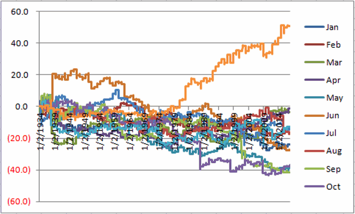
Figure 2 displays graphically the gain/loss per month during the “Bad Days”. Note that December is the ONLY month to show a cumulative gain during these days. Figure 2 – Dow %+/- by month ONLY during “Bad Days”
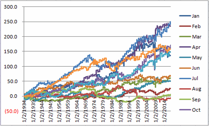
Figure 3 displays graphically the gain/loss per month during “All Other Days”. Note that August is the ONLY month to show a cumulative loss during these days. Figure 3 – Dow %+/- by month ONLY during “Bad Days”
Summary
So is it worthwhile to trade out of the market on the “Bad Days” and to be back in the market on “All Other Days”? That’s not for me to say. But 83+ years of market history makes a compelling case.
Have a Good Day (or not, you know, depending…)
Jay Kaeppel
Disclaimer: The data presented herein were obtained from various third-party sources. While I believe the data to be reliable, no representation is made as to, and no responsibility, warranty or liability is accepted for the accuracy or completeness of such information. The information, opinions and ideas expressed herein are for informational and educational purposes only and do not constitute and should not be construed as investment advice, an advertisement or offering of investment advisory services, or an offer to sell or a solicitation to buy any security.


Hello Jay,
Thank you for posting great ideas. I have your blog as a daily favourite!
This is an off topic question but felt that you might have though about it before.
On the Nordic stock markets (I’m from Sweden) the impression I get is that the index movements are mostly very small but the normal distribution in terms of individual stock price movements is increasing. However, I haven’t done a serious analysis yet but with the strategy that I’m using I have in average around 50 different shares in my portfolio at any given time. The universe I’m using (mostly chosen on the basis of liquidity – the strategy requires exits within a trading day) consists of around 500 shares.
When I look at the daily normal distribution in my portfolio and the universe I believe I can see that its widening at the same time as the big indices are more or less flat or show little volatility.
It this a sign of something happening “behind the scenes” in the stock market? Any chance you’ve done a backtest? Is this worth looking at as a potential predicting indicator? (I’m a huge fan of market internals/breadth)
Thank you in advance, Stefan
Stefan, Thanks for the comments. It sounds like your looking at market internals and breadth, etc. There are ways to use this type of information (i.e., a rising advance/decline that is above its longer-term average is a more favorable sign than a declining A/D line that is below its longer-term moving average; also many shorter-term overbought/oversold indicators use advance/decline and/or up volume/down volume as inputs). That being said, from a strict “systematic” point-of-view I don’t know of any purely systematic approaches to using this info to trade (other than with some subjective decision making involved). The problem (in a nutshell) is that what is “oversold” this time around may only be the beginning of a much greater oversold situation that may develop the next time around. Sorry, I don’y have a more useful answer for you. Jay
The current graph images only have legends from Jan thru Oct. Can Nov and Dec be added?