The truth is that I am not so good at making predictions (for the record, I do take some comfort in the fact that, neither is anyone else, but I digress). But I am pretty good at “looking back”, and I am also slightly above average at spotting trends that typically alternate from “one thing” to “another.” I have found that this can be helpful.
So first….
A Quick Look Back
Figure 1 displays the Shiller P/E Ratio going back into the 1800’s. The negative numbers on Figure 1 represent the magnitude of the bear markets that followed peaks in the Shiller P/E Ratio above 21 (the -83% value marked with an asterisk represents the bear market decline of the Nasdaq 100 Index from 2000-2002; all others represent the bear market decline of the Dow Jones Industrial Average).
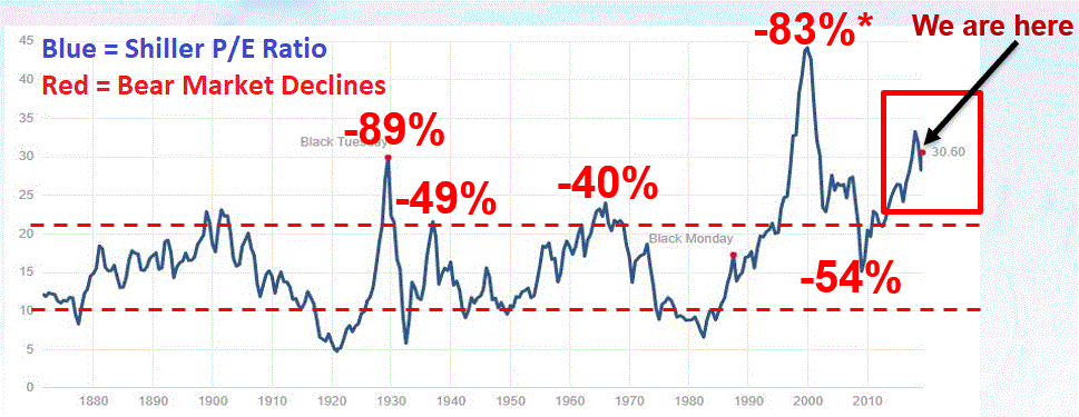
Figure 1 – Shiller P/E Ratio with bear market magnitudes following peaks above 21 (Source: http://www.multpl.com/shiller-pe)
It is important to point out that valuation measures are NOT good “timing” indicators. However, they are useful “perspective” indicators. What the negative numbers – plus the current high reading for the P/E Ratio – tell us is that the next bear market – whenever it may come – is likely to be “one of the painful kind.” This does NOT constitute a sell signal. As long as the trend remains “up”, the party can and will go on indefinitely. The current high level of valuation does, however, serve to remind us that now may be a good time to at least “locate the nearest exit” for when the time comes to use it.
Figure 2 highlights another important piece of info. Figure 2 reminds us that the Dow Industrials (as well as ever other major average) can go sideways for painfully long periods of time.
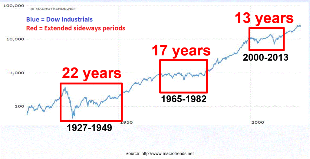
Figure 2 – Dow Jones Industrial Average – the stock market can go sideways for long periods of time
(Source: http://www.macrotrends.net)
Here is a question for you:
“If the stock market goes sideways for the next 13 to 22 years, how will you make money?”
Hint: Based on what we see in Figure 2 the correct answer is NOT, “Well, that probably won’t happen.”
The Last 10 Years
The last 10 years have been exceptional for stock investors. And while one may occasional sense that the bull is getting “long in the tooth”, we should also remember that the market rallied almost 20 years from the mid-1940’s to the mid 1960’s and for 18 years from 1982 to 2000 (of course those rallies were launched when stocks were dirt cheap according to the Shiller P/E Ratio, but never mind about that right now). My main point, is that if the market breaks out to a new high, we could easily see another significant up leg.
But with history as a guide, the chances seem good that the next 10 years will not look exactly the same as the last 10 years. Let’s look at a the first of few “potential reversions to the mean.”
International Stocks
Figure 3 displays the cumulative total return for the S&P 500 Index (U.S. stocks) and the MSCI EAFE Index (broad, international index) since 1970. Clearly in the last 10 years, U.S. stocks have vastly outperformed international stocks. Will this last forever?
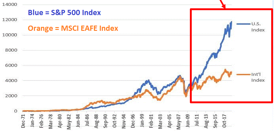
Figure 3 – S&P 500 Index versus MSCI EAFE Index PEP; 1970-2019; SPX has vastly outperformed in last 10 years (Source: PEP Database from Callan Associates)
Let’s divide the S&P 500 by the EAFE Index to get the ratio that we see in Figure 4.
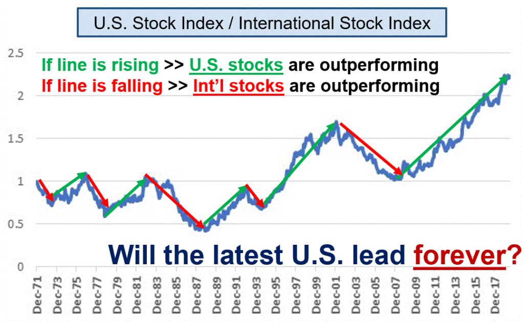
Figure 4 – SPX divided by EAFE Index; there is a long history of “back and forth” (Source: PEP Database from Callan Associates)
As you can see in Figure 4, sometimes U.S. stocks lead, other times international stocks lead. Looking at the regular “back and forth” apparent in Figure 4 it is not hard to envision international stocks outperforming U.S. at some point in the not too distant future. It should also be noted that Vanguard Investors 10-Year projections for 4 major asset classes (U.S. and International stocks and bonds) presently favors international stocks over the ext 10 years.
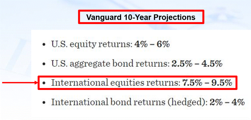
Figure 5 – Vanguard Investors 10-Year Projections for 4 major asset classes (Source: https://institutional.vanguard.com/)
2 ETFs that track international indexes that exclude U.S. stocks appear in Figure 6.

Figure 6 – International index ETFs
Is any of this meant to imply that investors should sell their U.S. holdings and pile into international stocks and/or stock indexes right this very minute?
Not at all.
As long as the line in Figure 4 keeps rising (i.e., as long as U.S. stocks continue to outperform) the current trend remains intact. The only point being made here is to remember that nothing lasts forever in the stock market. And the day will come – and history suggests possibly in the not too distant future – when international stocks will once again outperform U.S. stocks.
Parts II and II to follow…
Jay Kaeppel
Disclaimer: The information, opinions and ideas expressed herein are for informational and educational purposes only and are based on research conducted and presented solely by the author. The information presented does not represent the views of the author only and does not constitute a complete description of any investment service. In addition, nothing presented herein should be construed as investment advice, as an advertisement or offering of investment advisory services, or as an offer to sell or a solicitation to buy any security. The data presented herein were obtained from various third-party sources. While the data is believed to be reliable, no representation is made as to, and no responsibility, warranty or liability is accepted for the accuracy or completeness of such information. International investments are subject to additional risks such as currency fluctuations, political instability and the potential for illiquid markets. Past performance is no guarantee of future results. There is risk of loss in all trading. Back tested performance does not represent actual performance and should not be interpreted as an indication of such performance. Also, back tested performance results have certain inherent limitations and differs from actual performance because it is achieved with the benefit of hindsight.
