Monthly Archives: March 2017

All Bets are Off in Beans and Sugar

In this article I highlighted a variety of “potential opportunities” that may or may not have been setting up.  Two of those involved soybeans and sugar.  But the potential setups forming for these two markets appear to have dissipated – at least for the moment.

Soybeans

Soybeans have a seasonal tendency to rally between late winter and mid-to-late spring (see here and here regarding the same setup in 2016).  However, May futures contract broke decisively through the price the 991 level that I was looking at as a potential support level.1Figure 1 – May Soybeans break support (www.Barcharts.com)
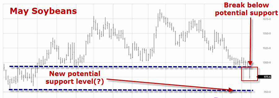
Do not be surprised if beans find support somewhere above the 954 support level and do not be surprised if they end up rallying between now and early June.  But for now the setup that appeared to be forming is kaput.

Sugar

As I wrote about here, sugar has a tendency to show weakness between early March and mid-April.  As I wrote about in the original post, sugar futures appeared to be breaking down below the 17.66 support level.  I also mentioned however, that if sugar reversed back above that support level, then all bets are off. As you can see in Figure 2, July sugar futures are back above that level.2Figure 2 – Sugar breakdown fails to follow through (www.Barcharts.com)
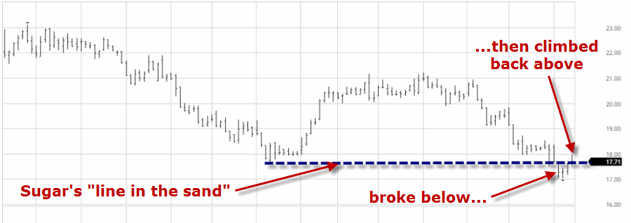
Sugar may still break down.  But for now – as with beans – the initial idea did not follow through.  So a trader looking to trade the short side of sugar should keep a close eye to see if another breakdown unfolds.

Jay Kaeppel

Disclaimer:  The data presented herein were obtained from various third-party sources.  While I believe the data to be reliable, no representation is made as to, and no responsibility, warranty or liability is accepted for the accuracy or completeness of such information.  The information, opinions and ideas expressed herein are for informational and educational purposes only and do not constitute and should not be construed as investment advice, an advertisement or offering of investment advisory services, or an offer to sell or a solicitation to buy any security.
The MACD ‘Tell’ Strikes Goldman Sachs

There are many ways to use the MACD indicator developed long ago by Gerald Apel.  This is one of them.  Maybe.  Nothing more, nothing less.

First the caveat: what follows is NOT a “trading system” or even something that you should consider on a standalone basis.

(See also Speculative Ideas from A to Z)

MACD

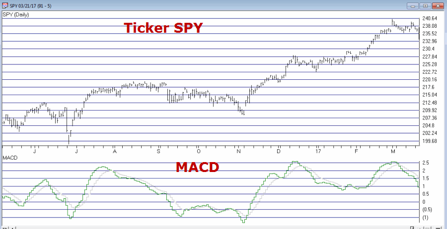
The MACD indicator uses exponential moving averages to identify the underlying trend for a given security and is also used by many traders to identify divergences which may signal an impending change of trend.

Figure 1 displays the daily MACD for ticker SPY.1Figure 1 – Ticker SPY with MACD Indicator (Courtesy AIQ TradingExpert)

The MACD ‘Tell’

While this is NOT intended to be a mechanical signal, I am going to put specific rules on it just to give it some structure.  The rules:

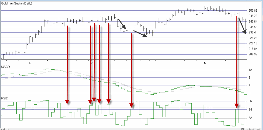
1) If the daily MACD (12,26,9) has declined for at least 7 consecutive trading days AND

2) The 2-day RSI is at 64 or above

Then an “alert” signal is flashed.  The key thing to note is that if the MACD ticks higher on the day that the 2-day RSI rises above 64, the signal is negated.

Before proceeding please note that the 12,26,9 parameter selection is simply the “standard” for MACD.  Also, there is nothing magic about 7 consecutive days – so one might experiment with different values there.  Finally, using the 2-day RSI and a “trigger” value of 64 are also both arbitrary.  There may be better values and/or different overbought/oversold indicators to use.

Ticker GS

A “classic” example of the MACD Tell appears in Figure 2 using ticker GS.2Figure 2 – Ticker GS with the MACD Tell (Courtesy AIQ TradingExpert)

The MACD Tell is typically best used as a short-term indicator.  In this case a short-term trader might have considered playing the short side of GS – or even better – using option strategies such as buying puts or selling bear call spreads.

Summary

No one should rush out and start trading put options based on this indicator (or any other indicator for that matter) without spending some time doing some homework and testing out the viability for producing profits.

In reality, this is the type of indicator that should typically be combined with “something else” and/or used as a confirmation rather than as a standalone approach.

Jay Kaeppel


Disclaimer:  The data presented herein were obtained from various third-party sources.  While I believe the data to be reliable, no representation is made as to, and no responsibility, warranty or liability is accepted for the accuracy or completeness of such information.  The information, opinions and ideas expressed herein are for informational and educational purposes only and do not constitute and should not be construed as investment advice, an advertisement or offering of investment advisory services, or an offer to sell or a solicitation to buy any security.
Speculative Ideas from A to Z

OK, technically it is not A to Z but B to S, but I’ve learned that it’s never a good idea to pair “B” and “S” together in the title.  So allow me to be candid: If you think of yourself as a thoughtful, savvy longer-term investor then this article is probably not for you.  This article is more for the “speculator”, i.e., a person who is not averse to taking a reasonable risk in hopes of generating an above average return – with any luck, in a relatively short period of time.

(See also The ‘Range Bound Consolidation Pattern’)

Caveat

Two things to note:

*Nothing that follows should be considered a “recommendation”. I am simply attempting to present some potential opportunities that I see setting up in a variety of markets.

*All of the examples and charts come from the futures markets. Where applicable though, I also list the ticker symbol for the ETF that tracks the market in question. These ETFs allow a trader to buy or sell short a given commodity just as they would buy or sell short shares of any stock – without having to trade futures contracts.

British Pound

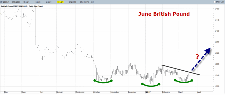
I wrote about this here, but as you can see in Figure 1, the Pound appears to be setting up for a move to the upside.  The stop-loss point would be below the lowest low drawn in Figure 1.1Figure 1 – June British Pound futures (Courtesy ProfitSource by HUBB)

The British Pound ETF is ticker FXB.

Euro

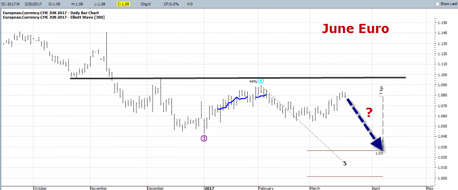
As you can see in Figure 2, the Elliott Wave count from ProfitSource by HUBB is projecting a move to lower levels for the Euro. The Euro is slightly overbought and there is an identifiable “Uncle” point at the black horizontal line.2Figure 2 – June Euro (Courtesy ProfitSource by HUBB)

The ticker for the Euro ETF is FXE.

Gold

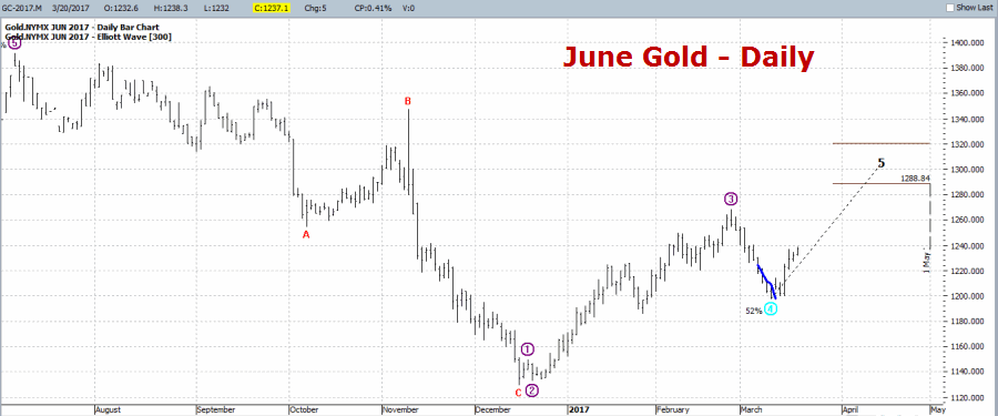
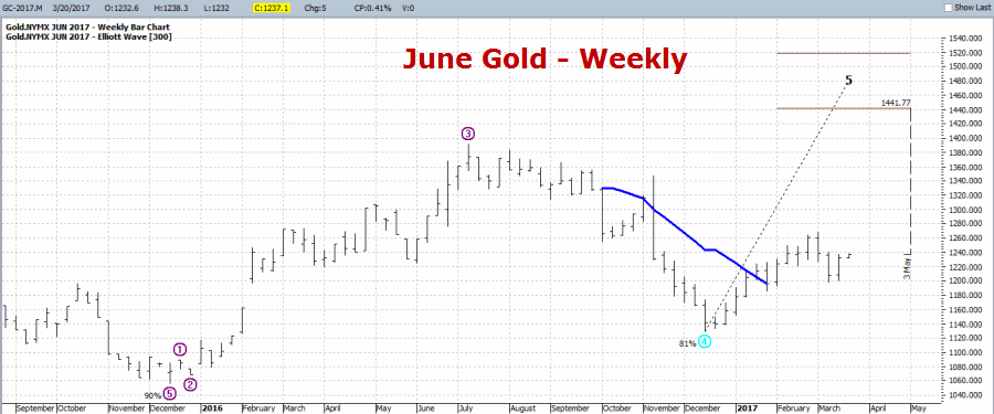
Gold has been wildly unpredictable of late, so any position here – long or short – is definitely “speculative” in nature.  That being said, as you can see in Figures 3 and 4 the daily and weekly Elliott Wave counts for June Gold futures are both projecting higher. Does this mean that gold is sure to rise?  Not at all.  It does tell me to look to play the long side for now.  A reasonable stop-loss would be below the March low on the daily chart.

4Figure 3 – June Gold daily (Courtesy ProfitSource by HUBB)

5Figure 4 – June Gold weekly (Courtesy ProfitSource by HUBB)

The ticker for the gold ETF is GLD (or ticker IAU).

Soybeans

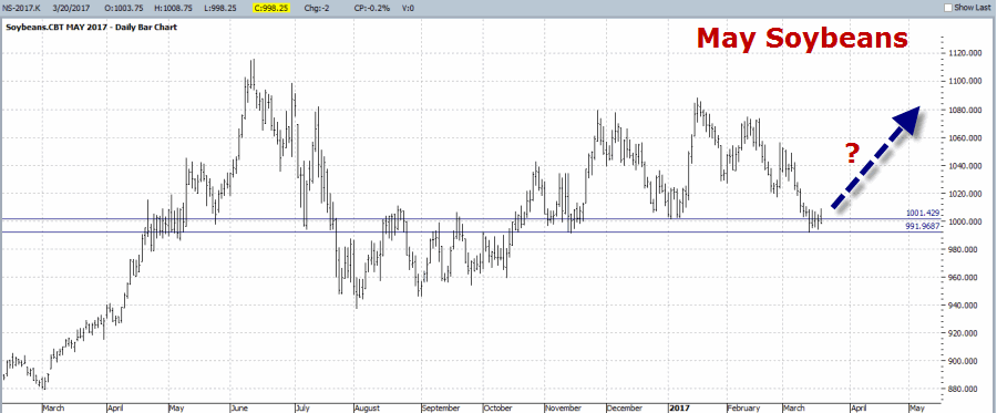
Soybeans DO NOT always rally in late winter to early spring.  But if beans are going to make a move higher, this is the time we should be looking for it.  A potential stop-loss level would be somewhere below the support area drawn in Figure 6.3Figure 5 – May Soybeans (Courtesy ProfitSource by HUBB)

The soybean ETF is ticker SOYB

Sugar

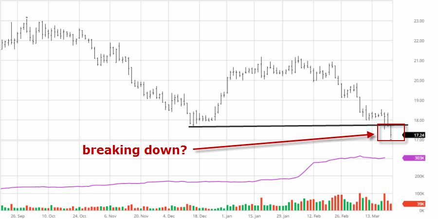
As I wrote about here, Sugar has a tendency to display weakness during the March/April period.  In Figure 6 we see that May Sugar may be breaking to the downside (although, if Sugar bounces back quickly above the black line in Figure 6 then all bets are off.

6Figure 6 – May Sugar (Courtesy ProfitSource by HUBB)

The Sugar ETF is ticker SGG

(See also Blood in the Energy Streets)

Summary

Are any of these good ideas that will actually pan out?  As always, only time will tell.  What they do represent though are “potential” opportunities.

Whether or not to act on any of  these “opportunities”, and how to  go about it (long or short futures contracts, long or short ETF shares, options on futures, options on ETFs, etc) are all decisions that each trader must make on their own.

Jay Kaeppel

Disclaimer:  The data presented herein were obtained from various third-party sources.  While I believe the data to be reliable, no representation is made as to, and no responsibility, warranty or liability is accepted for the accuracy or completeness of such information.  The information, opinions and ideas expressed herein are for informational and educational purposes only and do not constitute and should not be construed as investment advice, an advertisement or offering of investment advisory services, or an offer to sell or a solicitation to buy any security.
The Only Months That Matter in 2017

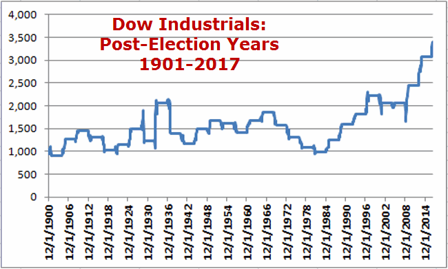
2017 is a post-election year.  During the 1960’s to the 1980’s the “post-election year” gathered a reputation as being a “bad year” for the stock market.  But the truth is that starting in 1985 the post-election year has been a pretty good one for the stock market.

(See also This is Why We Trade)

Figure 1 displays the growth of $1,000 invested in the Dow Jones Industrials Average ONLY during each post presidential election year since 1901 (using month-end price data).1Figure 1 – Growth of $1,000 invested in Dow Jones Industrials Average during “Post-Election” years since 1901 (using month-end price data)

 The “Big Two” Months

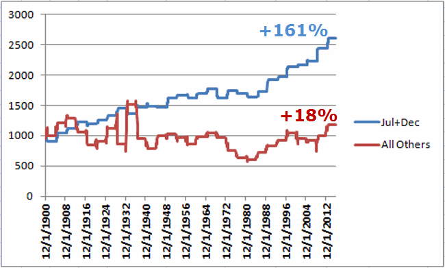
Figure 2 displays the growth of $1,000 during post-election years since from 1901 through 2016 broken down into two categories:

*The months of July and December only

*All other post-election year months

2Figure 2 – Growth of $1,000 invested in Dow ONLY during July and December of post-election years (blue line) versus the “Other” 10 months of the year (red line); 1901-2016

(See also Jay’s Trading Maxim’s (Part 1))

As you can see the months of July and December combined:

*Cumulative gain = +161%

*# times showing a net gain = 21 (72%)

*#times showing a net loss = 8 (28%)

The “Other” 10 months combined:

*Cumulative gain = +18%

*# times showing a net gain = 16 (55%)

*#times showing a net loss = 13 (45%)

Summary

So does this mean that we should have our money in a mattress until July? Not necessarily (obviously, with the Dow already up +5.4% for the year).  This tidbit of information regarding July and December of post-election years is not intended to constitute a “trading system” per se.

It is interesting to note though the relatively consistent performance for the stock market during these two months and the relatively inconsistent performance of the stock market during the other 10 months of the post-election year.

Jay Kaeppel

Disclaimer:  The data presented herein were obtained from various third-party sources.  While I believe the data to be reliable, no representation is made as to, and no responsibility, warranty or liability is accepted for the accuracy or completeness of such information.  The information, opinions and ideas expressed herein are for informational and educational purposes only and do not constitute and should not be construed as investment advice, an advertisement or offering of investment advisory services, or an offer to sell or a solicitation to buy any security.
The ‘Range Bound Consolidation Pattern’

A lot of people who claim to be technical analysts trade using chart patterns.  I typically do not.  Nothing wrong with using chart patterns to trade.  The thing is though, you have to have confidence in your ability to interpret and act upon what you see (or think you see) on a given chart.  Once again, I typically do not.

(See also Beans, Bonds and BPounds, Oh My)

Chart pattern analysis by its very nature is fraught with subjectivity.  While teaching a class on trading I once handed out a copy of a particular bar chart and asked the students to draw any and all relevant trend lines and/or chart patterns that they found.  Unsurprisingly, no two charts came back marked the same way.

Also, some people get a little carried away.  This prompted me many years ago to create:

Jay’s Trading Maxim #27: If you draw enough lines on a bar chart price will eventually touch one of them.

Tongue-in-cheek and smart-alecky all-in-one, still the point is that the market doesn’t actually care what lines you draw on a piece of paper or a computer screen.  It’s going to do what it’s going to do.

Here is what you really need to remember about trendlines/etc: The lines that you draw should be more for the purpose of guiding you in how you want to play a given security, and NOT for the purpose of you telling the market what it “should” do.

One of My Favorite Patterns – “Range Bound Consolidation”

But there is one “pattern” that gets my attention from time to time.  I refer to it as “range bound consolidation.”  Drawing up sloping and/or down sloping trend lines is subjective in my mind.  But drawing horizontal lines based on previous high and low points is based on something “market based.”  So let’s take a look at a relevant (albeit relatively obscure) example – The Portugal stock market ETF (ticker PGAL).

CAVEAT: What follows is NOT an attempt to convince you to buy shares of PGAL.  This ticker is simply being used as an example of “range bound consolidation.”

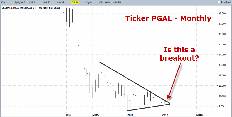
In Figure 1 we see the Monthly chart for PGAL. Clearly the Portugal stock market took a major hit in recent years.  But most recently, it appears to potentially be breaking out of a narrowing consolidation phase (or did price just happen to pop up above a line a arbitrarily drew on a price chart?). 1Figure 1 – PGAL Monthly (breakout or fake out?) (Courtesy ProfitSource by HUBB)

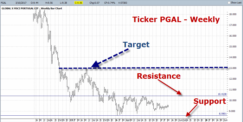
Figure 2 displays the weekly chart for PGAL.  As you can see I have labeled two price levels – one as support the other as resistance.  The support level is objective and sits at the low for the multi-year decline.  The resistance level is more subjective (as another trader might choose a different level).  We also see a potential (and yes, subjectively derived) profit-target near $13 a share.2Figure 2 – PGAL Weekly (Courtesy ProfitSource by HUBB)

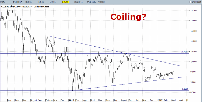
Figure 3 displays the daily chart for PGAL. Here you see the same support and resistance level as shown in Figure 2.  You also see my subjectively drawn “narrowing range.”3Figure 3 – PGAL Daily (coiling before a breakout?) (Courtesy ProfitSource by HUBB)

(See also Playing Whack a (VXX) Mole)

Summary

So what is the point of all this?  Simple – it looks to me like PGAL is establishing a long-term consolidation pattern.  From my own experience I know that this type of consolidation often (though certainly not always) sets the stage for a breakout to the upside and the next big advance.

For the record, I have no idea if it will play out that way here or not (and I am not actually “predicting” anything).  But I do know the “Uncle” point (below the recent low of $8.59).  So from here a trader has several choices:

  1. Forget PGAL and move on to something else
  2. Buy PGAL and place a stop below $8.59 a share (approximate risk from current level = -10.5%)
  3. Wait for an upside breakout of either the down sloping trend line in Figure 3 or the horizontal resistance line drawn in Figure 2 and 3 at $10.41 a share.

For the record – except in hindsight – there is no “right” or “wrong” answer, only the one that a trader is most comfortable with.

In reality -a better thing to do first, for those intrigued by this pattern – would be to look through historical bar charts or similar setups and get a feel for how this setup typically plays out.

Jay Kaeppel


Disclaimer:  The data presented herein were obtained from various third-party sources.  While I believe the data to be reliable, no representation is made as to, and no responsibility, warranty or liability is accepted for the accuracy or completeness of such information.  The information, opinions and ideas expressed herein are for informational and educational purposes only and do not constitute and should not be construed as investment advice, an advertisement or offering of investment advisory services, or an offer to sell or a solicitation to buy any security.
Taking What the (Bond) Market Gives You

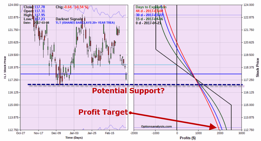
In this article I wrote about an example trade to take advantage of a potential decline in t-bond prices.  So far so, er, well, bad for t-bonds but good for the example trade.  See Figure 1 (for sake of example this trade is based on a 7-lot which risks $973 instead of a 1-lot that risks $139).1Figure 1 – TLT Apr 120-115 bear put spread (Courtesy www.OptionsAnalysis.com)2Figure 2 – Equity curves for TLT Apr 120-115 bear put spread ; Risk of loss remains (Courtesy www.OptionsAnalysis.com)

The good news is that this trade has generated a profit of 76% in just 7 trading days and there is a great deal of additional profit potential (roughly $1,800) if t-bonds do in fact decline to the target price level of $112.78.

(See also It’s Hard With ‘Oil’ These Choices)

The bad news is that t-bonds neared a support level and rallied intraday (suggesting that the decline may stall, at least for a while).  The other bad news is that this trade could still turn into a 100% loss of premium if t-bonds were to rally from here.

What to Do, What to Do?

The simplest choice is to do nothing and let it ride. But in reality, it comes down to one’s priorities.  To wit:

*If you really think that bonds will continue to sell off then “letting it ride” makes sense at this example trade offers good additional profit potential.

*On the other hand, if you wish to “let it ride” while also “reducing or eliminating the risk of loss” then an adjustment may be in order.

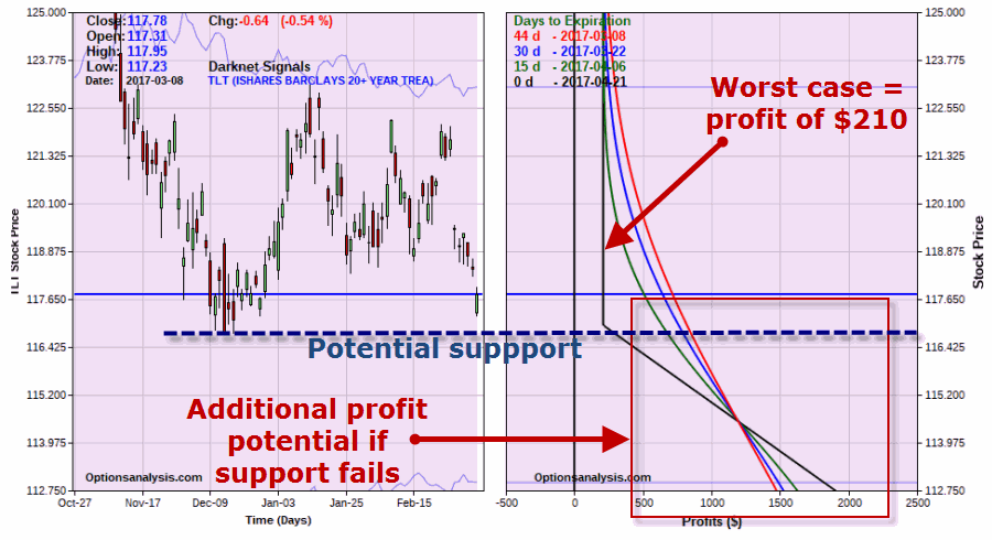
So for example’s sake, one (of many possible) adjustment is shown in Figures 3 and 4.  This example involves a strategy known as “rolling down”.

*Sell 7 TLT Apr 120 puts

*Buy 7 TLT Apr 115 puts

*Buy 4 TLT Apr 117 puts

*Sell 4 TLT Apr 112 puts

The particulars for this adjusted position appear in Figures 3 and 4.3Figure 3 – TLT adjusted bear put spread (Courtesy www.OptionsAnalysis.com)4Figure 4 – TLT adjusted bear put spread risk curves (Courtesy www.OptionsAnalysis.com)

(See also With Retailers, it’s ‘When’ Not ‘What’)

Things to note:

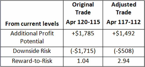
*The worst case scenario for this new position is a profit of $210 (versus a risk of loss of -$973 for the original position).

*The maximum profit potential falls from $2,527 to $2,210.

So in a nutshell:5

Figure 5 – Reward-to-Risk Tradeoffs from current levels

Summary

The purpose of this article and the original one in the link above is not to advise you and tell you what to do in t-bonds.  The purpose is simply to educate you regarding the many ways possible to trade various markets without risking large sums of money – as well as how to adjust a position to look in a profit and/or to  improve the reward-to-risk tradeoff.

Jay Kaeppel

Disclaimer:  The data presented herein were obtained from various third-party sources.  While I believe the data to be reliable, no representation is made as to, and no responsibility, warranty or liability is accepted for the accuracy or completeness of such information.  The information, opinions and ideas expressed herein are for informational and educational purposes only and do not constitute and should not be construed as investment advice, an advertisement or offering of investment advisory services, or an offer to sell or a solicitation to buy any security.


Beans, Bonds and BPounds, Oh My

There are a lot of “interesting” things going on in the markets these days.  Granted, alot of people may think of the words “soybeans”, “t-bonds” and “british pounds”  and then think “that word – interesting – I do not think it means what you think it means.”  But hey, for us market geeks they can be some of the most “exciting” words around.

So let’s take a look.

(See also The 40-Week Cycle Recycles)

Soybeans

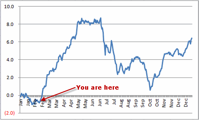
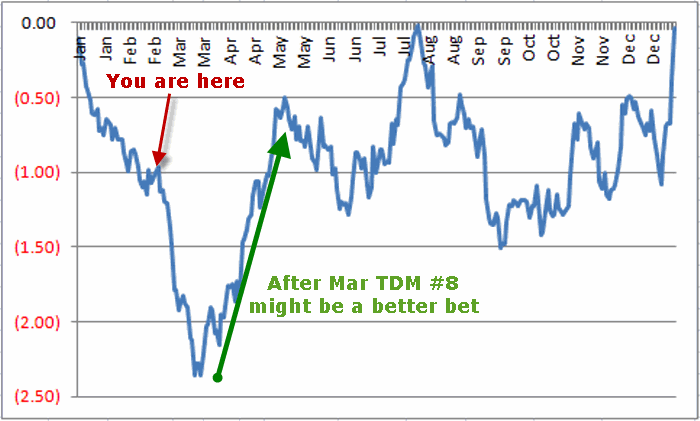
As I wrote about here, soybeans have long showed a propensity to rally during late winter into spring.  Figure 1 displays the annual seasonal trend for soybean futures.  It is important to note that this is a historical representation of what has happended in the past and is NOT a roadmap for what will happen this time around.

1Figure 1 – Soybeans Annual Seasonal Trend

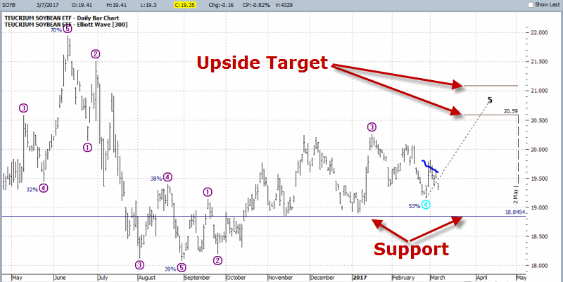
Figure 2 displays ticker SOYB – an ETF that tracks soybean futures.  As you can see the Elliott Wave count is projecting a Wave 5 up. The upside target is the projected range of $20.59 to $21.09 a share.  Support can be found at the recent low near $18.85.  Please note that there is no guarantee that the bullish seasonal tendency will “win the day” this time around.  But the setup is in place – so it’s”soon or never” for beans this time around.2Figure 2 – Ticker SOYB (Courtesy ProfitSource by HUBB)

See also (January Barometer Flashes a ‘Buy’. Now What?)

T-Bonds

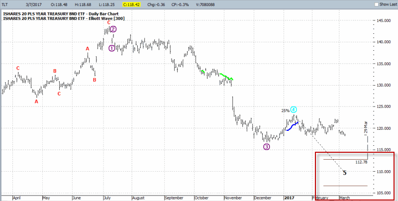
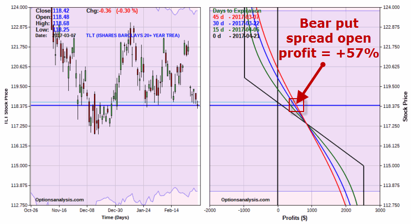
In this article I wrote about the possibility for a decline in t-bonds and an example option trade.  As you can see in Figure 3, bonds have declined since then and a price target projection of $112.78 a share remains intact. 3Figure 3 – T-Bonds (ticker TLT) “DOWN”….. (Courtesy ProfitSource by HUBB)

0Figure 4  – ….April TLT bear put spread “UP” (Courtesy www.OptionsAnalysis.com)

(See also The Sordid Past of Years Ending in ‘7’)

British Pound

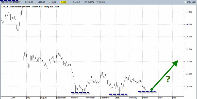
In this article I noted the tendency for the british pound to decline towards the 8th trading day of March – and then rally into mid-May.  As with any seasonal trend, this is a “tendency” and not a “certainty”.  Still, a glance at Figure 5 may suggest that a “multiple bottom” (as we technical analysis geek types like to say) or perhaps even an “inverse head-and-shoulders bottom” (as we technical analysis geeks who like to think we’re pretty sophisticated like to say).

4 Figure 5 – A potential head-and-shoulders bottom may be forming in Ticker FXB (ETF that track the british pound) (Courtesy ProfitSource by HUBB)

The annual seasonal trend chart in Figure 5 suggests a potential reversal of fortune from bearish to bullish as of the close on March Trading Day #8, which is Friday, March 10th.

2Figure 5 – British Pound Annual Seasonal Trend

 Summary

No one should assume that soybeans and the british pound are certain to rally soon, or that t-bonds are destined to trade lower from here.  All that I have done here is to highlight trends and tendencies.

Identifying potential opportunities is only one part of the investing/trading equation.  Determining “whether or not” to exploit a given potential opportunity, exactly “how” to exploit said opportunity and how to “manage the risk” associated with said opportunity are equally important.

So do not consider what I have written hear as “recommendations”.  They are simply ideas that fit into the “spot opportunity” category.  Nothing more, nothing less.

Jay Kaeppel

Disclaimer:  The data presented herein were obtained from various third-party sources.  While I believe the data to be reliable, no representation is made as to, and no responsibility, warranty or liability is accepted for the accuracy or completeness of such information.  The information, opinions and ideas expressed herein are for informational and educational purposes only and do not constitute and should not be construed as investment advice, an advertisement or offering of investment advisory services, or an offer to sell or a solicitation to buy any security.


When Sugar is Not So Sweet

OK, I will grant you that when it comes to the financial markets, sugar is not everyone’s “cup of tea” (although for the record, its pretty good “in” a cup of tea, but I digress).

So maybe the following will be useful or maybe it will be “a fun fact to know and tell”, but whatever – here goes:

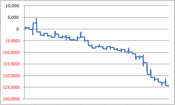
Figure 1 displays the cumulative gain/loss for holding a long position in sugar futures between the end of March Trading Day #9 and the end of April Trading Day #10 starting in 1978.

1Figure 1 – Cumulative $ +(-) for Sugar futures between the end of March Trading Day #9 and the end of April Trading Day #10 (1978-2016)

(See also Speculating in T-Bonds)

For the record:

*# time UP = 13 (33% of the time)

*# times DOWN= 26 (67% of the time)

*Average $ gain during UP periods = +$681

*Average $ loss during UP periods = (-$1,283)

(See also March – ‘Springtime for Retailers’ (typically))

Summary

So is sugar destined to decline between March 13th and April 14th this year?  Not necessarily.  In fact this “seasonally unfavorable” period has seen sugar futures decline during each of the last 7 years.  So maybe it is time for a rally this time around.

But the real point is that anyone looking to speculate on the long side of a commodities market might want to  look for an opportunity with slightly higher odds of success.

Jay Kaeppel

Disclaimer:  The data presented herein were obtained from various third-party sources.  While I believe the data to be reliable, no representation is made as to, and no responsibility, warranty or liability is accepted for the accuracy or completeness of such information.  The information, opinions and ideas expressed herein are for informational and educational purposes only and do not constitute and should not be construed as investment advice, an advertisement or offering of investment advisory services, or an offer to sell or a solicitation to buy any security.


March – ‘Springtime for Retailers’ (typically)

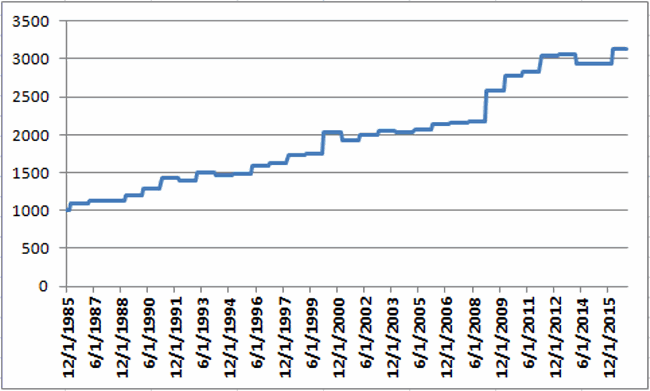
The month of March is often (though not always) “Springtime for Retailers”. Figure 1 displays the growth of $1,000 invested in Fidelity Select Retailing (ticker FSRPX) only during the month of March since FSRPX started trading in 1986.1Figure 1 – Growth of $1,000 invested in Fidelity Select Retailing (FSRPX) only during the month of March (1986-2016)

For the record:

*# of years March was UP = 25 (80.6%%)

*# of years March was DOWN = 6 (19.4%)

*Average % gain during March when March is UP = +5.3%

*Average % loss during March when March is UP = (-2.3%)

*Best March = +19.1% (2009)

*Worst March = (-4.9%) (2001)

Year-by-Year Results for FSRPX in March

Year FSRPX % +(-)
1986 9.0
1987 3.0
1988 1.3
1989 4.8
1990 8.2
1991 10.4
1992 (2.0)
1993 7.7
1994 (2.1)
1995 1.1
1996 7.4
1997 1.3
1998 6.9
1999 1.7
2000 15.5
2001 (4.9)
2002 3.0
2003 3.1
2004 (0.9)
2005 1.8
2006 3.1
2007 1.4
2008 0.3
2009 19.1
2010 7.7
2011 1.9
2012 7.0
2013 0.8
2014 (3.9)
2015 (0.0)
2016 6.1

Figure 2 – FSRPX in March

Investment Alternatives

*Fidelity Select Retailing (FSRPX)

*Profunds Consumer Cyclical (CYPIX)

*Rydex Retailing (RYRIX)

*SDPR S&P Retailing ETF (XRT)

*HOLDRS Retailing ETF (RTH)

Summary

As always, this blog offers “information” and not “recommendations”.  So for the record, I am not “predicting” that retail stocks will rise in March 2017 (as if I had the ability to do so), I am merely pointing out how they performed over the previous 31 months of March.

Jay Kaeppel

Disclaimer:  The data presented herein were obtained from various third-party sources.  While I believe the data to be reliable, no representation is made as to, and no responsibility, warranty or liability is accepted for the accuracy or completeness of such information.  The information, opinions and ideas expressed herein are for informational and educational purposes only and do not constitute and should not be construed as investment advice, an advertisement or offering of investment advisory services, or an offer to sell or a solicitation to buy any security.