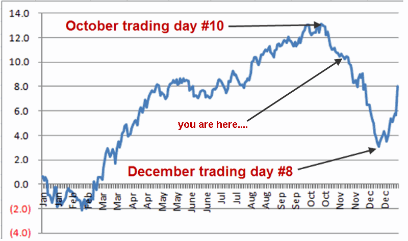
Monthly Archives: November 2016

The One Asset Class Per Month Strategy

If you have read any of my stuff in the past then you probably know that I spend a lot of time trying to determine “what goes up (or down) when”.  What follows are the results of one such test.

While the results are initially impressive on the face of it (if I do so say myself, and I think I just did) there are a number of important caveats. To put it another way, do NOT be impressed with the results WITHOUT first seriously considering some of the significant caveats mentioned below.  To put it in the most standard terms possible – past results DO NOT guarantee future results.

See also Is The Santa Claus Rally Nigh?

The Test

*I looked at variety of assets classes (listed at the end of the article) using mutual fund data and/or index data from January 1993 through April 2007.  The data was monthly total return data from Callan Associates.

*I’ve created my own proprietary formula for measuring performance during a specific month.  The factors include: average monthly return, median monthly return, standard deviation, largest monthly decline and a variety of ratios amongst these factors (but I am a lot of fun at parties.  No seriously.)

*I used my proprietary formula to rank performance for each asset class for each month and took my “top pick”.  In a nutshell, the “top pick” is not the one that showed the largest average monthly gain but the one that showed the best tradeoff between risk and reward.

*I ran a backtest using mutual fund and/or index data for the top ranked asset for each month from January 1993 through May 2007. The results for Jay’s One Asset Class per Month strategy (heretofore JOAC) appear in Figure 1.1Figure 1 – Equity Curve for Jay’s One Asset Class per Month Strategy; 12/31/92-5/31/2007
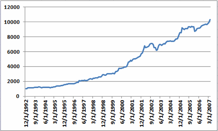
The average 12-month return was +17.8% and the maximum drawdown (using month-end data) was -12.7%

While the results look good it is now time for those dreaded “caveats”:

*These results could not be exactly duplicated in real trading for a couple of reasons: First, some of the results were generated using index data and not mutual fund data.

*Also, many of the mutual funds used in the test (particularly Vanguard and Fidelity funds) cannot be traded one month at a time.  Most have a minimum holding period of 30 to 90 calendar days).  So buying in one month and selling out the next would likely result in fees and/or future trading restrictions.

Moving Forward JOAC using ETFs

ETFs have no switching restrictions so starting in May 2007 I switched to an all ETF portfolio, using a particular ETF each month to attempt to track the top asset class for that month.  That portfolio appears in Figure 2. 2a
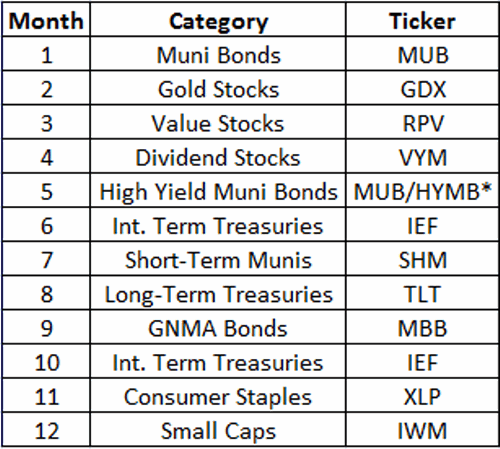
Figure 2 – JOAC monthly ETF Portfolio

*-MUB traded in May 2007-2010; HYMB traded in May starting in 2011

Once again using monthly total  return data from Callan Associates I tested the 2007-2016 period using the tickers listed in Figure 2.  The results appear in Figure 3.
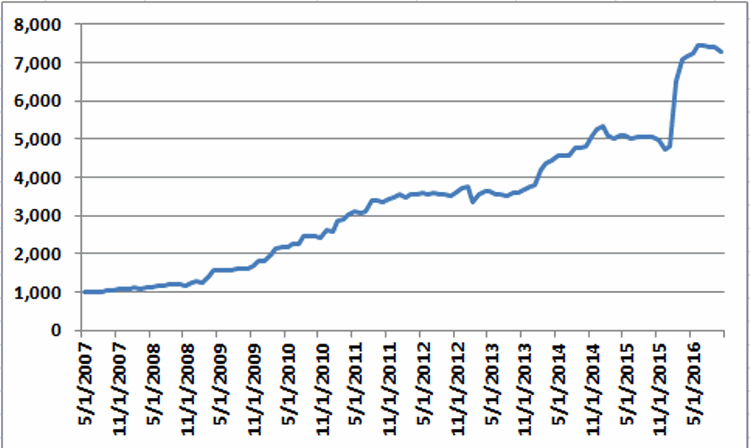
2Figure 3 – Equity Curve for Jay’s One Asset Class per Month Strategy; 5/31/2007-10/31/2016

*The average annual gain starting in 2008 (the 1st full year of data) is +25.8%

*The maximum drawdown (using monthly data) is -11%.

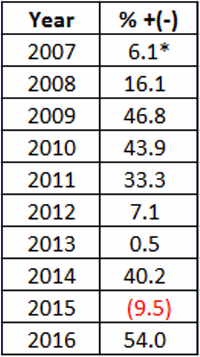
Annual results in appear in Figure 4.  These results do not include any transaction fees

4

Figure 4 – JOAC ETF Strategy Annual Results

*May 31st/2007-12/31/2007

So is this the greatest thing since sliced bread?  Probably not.  Why not? Time for more of those pesky caveats:

*Buying and holding only one ETF per month does not offer a lot of diversification (or any diversification at all for that matter)

*The test period using ETFs is relatively short

*Intramonth volatility and drawdowns will undoubtedly be greater than what appears in the Figures above

This strategy fits squarely in the “(almost certainly) high risk, (potentially) high reward” category.

Summary

So as I stated earlier, no one should assume that they can just start buying the ETFs listed above and start making 25% a year ad infinitum into the future.  The results displayed in this article should probably be thought of more as a starting point for further analysis rather than a finished product.

In essence, the real point is that – as with all things – there is a time and a place or everything, including (apparently) asset classes.

Jay Kaeppel


               Categories
Consumer Staples Stocks
Dividend Stocks
Equal Weighted Stock Index
Gold Stocks
Russell 1000 Large Caps Index
Russell 2000 Small Caps Index
S&P 500 Index
S&P 400 MidCap Index
Stock/Bond Hybrid Fund
Utility Stocks
Growth Stocks
Value Stocks
GNMA Bonds
Int. Term Treasuries
Junk Bonds
Long-Term Treasuries
Muni Bonds
Muni Bonds High Yield
Muni Bonds Intermediate-term
Muni Bonds Short-term
Muni Bonds Long-term


Surveying the Wreckage in Energy

Energy, the environment and the climate are “hot” topics these days.  On one end of the spectrum there are people that just want the cheapest energy possible in order to spur economic gains, the environment be damned.  On the other end of the spectrum are people who want to severely curtail certain forms of energy in order to “save the planet”, cost be damned.  And in between are the rest of us schlubs just trying to muddle through our days and stay warm (or cool as geography and season dictate).

And last but not least are a few schlubs (“Hi, my name is Jay”) who mostly just want to figure out how to make a few bucks – hopefully before the planet actually disintegrates.

See also Is The Santa Claus Rally Nigh?

Energy (From an Investment Standpoint)

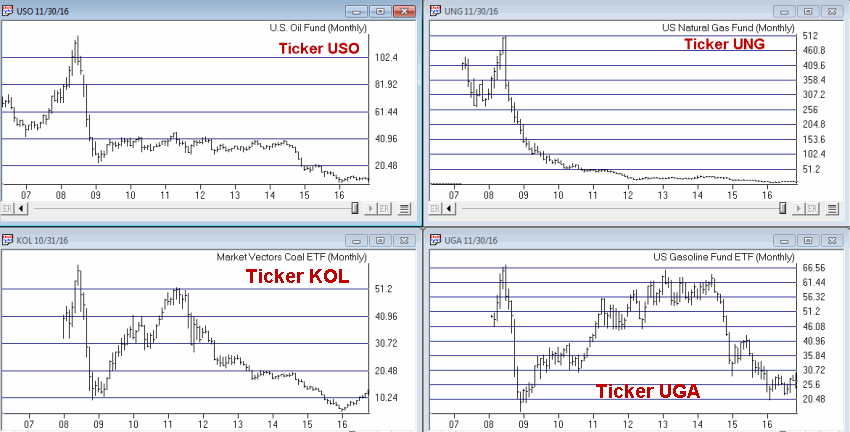
In a nutshell, there are “traditional” forms of energy (powered by crude oil, natural gas, coal) and “new” forms of energy (wind, solar, biomass – whatever the heck that is – etc.).  At the moment there are no “winners” in the energy field – at least not from an investment point of view.

In Figure 1 we see the action of 4 ETFs from the “traditional” field.  These cover crude oil (USO), natural gas (UNG), unleaded gas (UGA) and coal (KOL).  While each has tried to rebound at some point in the last year, the wreckage is pretty clear.1Figure 1 – ETFs representing traditional forms of energy (Courtesy AIQ TradingExpert)

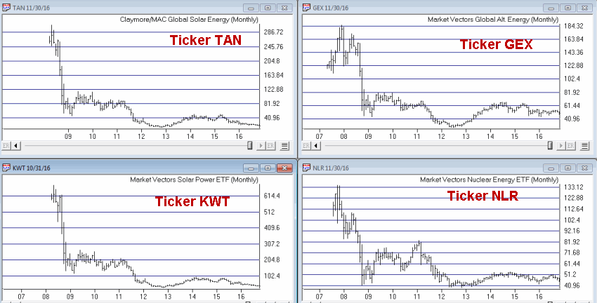
Figure 2 displays ETFs representing “alternative” forms of energy.  Ticker KWT and TAN represent the solar industry, ticker GEX represents a variety of “alternative” forms of energy and NLR represents the nuclear energy sector.

2Figure 2 – ETFs representing alternative forms of energy (Courtesy AIQ TradingExpert)

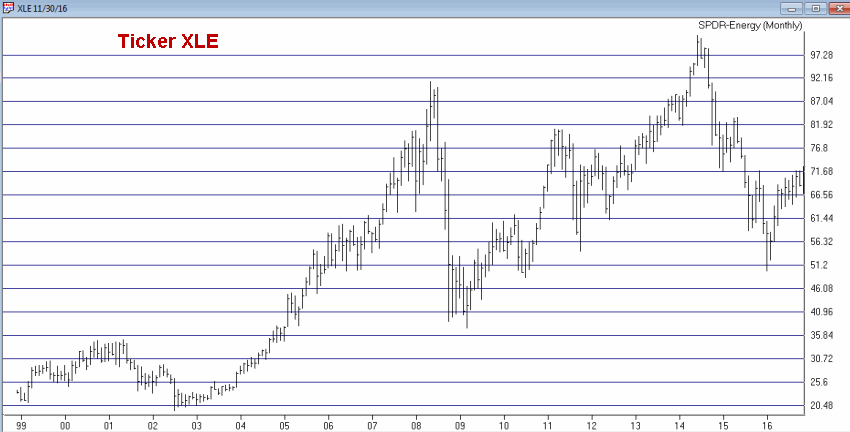
One thing should be abundantly clear from a simple perusal of Figures 1 and 2 – the energy sector has gotten its clock cleaned in recent years.  Looking at “big picture” in Figure 3 we see ticker XLE – an ETF that represents a board swath of energy related companies.  The “Boom/Bust” nature of the energy sector is pretty obvious.3Figure 3 – Ticker XLE (Courtesy AIQ TradingExpert)

So what is an investor to do?

My best thought at the moment is “nothing”.  OK, I will grant you that is not exactly an inspiring response.  But there is a time and a place or everything.  Whether “traditional” forms of energy will once again become predominant or “alternative” forms of energy will become ascendant is unclear at this moment in time.

Two things we do know are:

a) This is typically not a “wonderful time of the year” for the energy sector

b) The energy sector typically performs best in late winter into spring

Figure 4 displays the average seasonal trend for Fidelity Select Energy Sector (ticker FSENX).  Certainly not every year follows this script exactly (or even closely from time to time).  Still, it is clear that we are presently in a “vulnerable” period (late November into early December).   Things tend to bottom out in lateJanuary/early February.

5Figure 4 – Annual Seasonal Trend for Fidelity Select Energy Sector (ticker FSENX)

Summary

I am steering clear of the energy sector at the moment.  However, I have been around long enough to know that major economic sectors (think energy, finance, health care, retail, technology) will not soar in perpetuity nor languish forever.

Given that the energy sector has essentially been laid to waste in the past 8+ years I would think that a buying opportunity is not too far off.  I plan to check back sometime in late January 2017.

Until then I am just going to try to stay warm.

 Jay Kaeppel

Is The Santa Claus Rally Nigh?

Much has been written and said about something that many refer to as “The Santa Claus Rally”.  Also a lot of pundits use a lot of different definitions as to what time period is supposed to constitute the SCR.  For me, I like to think in terms of “the Holiday Season” so I cast a pretty wide net.

The SCR Time Period (by my standards)

In my book the SCR time period includes the last 6 trading days of November and extends through the last trading day of December.  OK, I realize that to hope for a bullish stock market throughout this entire period is a lot to ask of “The Big Guy”.  But if history is a reasonable guide, he may be up to the task.

The Test

For this test I simply looked at price data (not total return data, which presumably would generate higher numbers since it would include any dividends) for the Dow Jones Industrials Average starting in 1942.

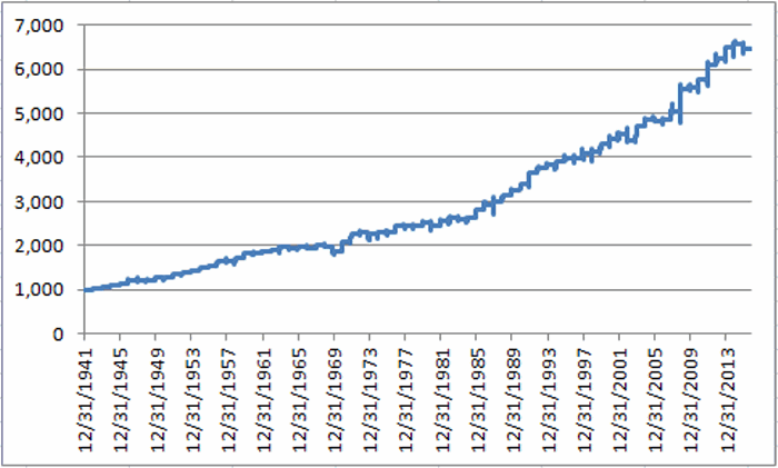
Figure 1 displays the growth of $1,000 invested in the Dow ONLY during the last six trading days of November and the entire month of December each year starting in 1942.1Figure 1 -Growth of $1,000 invested in the Dow ONLY during the last six trading days of November and the entire month of December.

The Good News is that we can characterize the results displayed in Figure 1 as a “bullish long-term seasonal trend.”

The Bad News is that we can in no way refer to it as “a Sure Thing”.

Still, the overall results are worthy of note.

Things to note:

* # Years UP = 62 (83.8%)

*#Years Down = 12 (16.2%)

*Average UP Year = +3.45%

*Average DOWN Year = (-1.80%)

*Largest Gain = +11.0% (1970)

*Largest Loss = (-4.7%) (1969)

Summary

So can we count on Santa Claus to deliver higher stock prices between the close on November 21, 2016 and December 31st, 2016?

As always, time will tell.

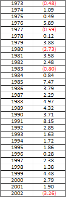
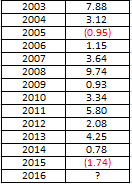
(prior yearly results appear below)

Jay Kaeppel

2

3

4

Silver Stocks Shine in the Dead of Night

Alternate Title: What do Vampires and Silver Stocks Have in Common? (Answer: they both melt in the light  of day)

Bedtime checklist:

*Lock the doors, check.

*Brush teeth, check.

*Turn out the lights, check.

*Own silver stocks, huh?

Oh, and remember to sell those shares in the morning. In fact, you might even want to go ahead and sell short.

See also The Trend, the Trend, the Trend

OK, this is one of those admittedly “out of left field” trading ideas that seems too quirky to actually be of use in the real world. Still…..

The Comparison

This strategy involves Global X Silver Miners ETF (ticker SIL) that tracks a basket of silver mining stocks.

*Strategy A involves:

1. Buying ticker SIL at the close of trading each trading day and

2. selling at the next open.

*Strategy B – for comparisons sake – involves:

1. Buying ticker SIL at the open of trading each trading day and

2. selling at the close.

For the first test we simply:

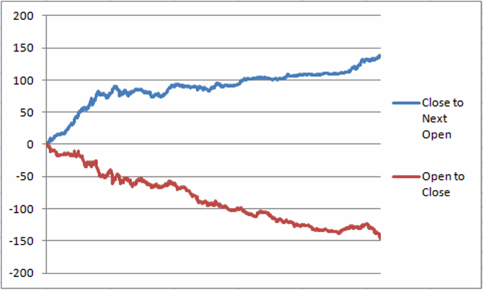
*Subtract yesterday’s close price from today’s open price and keep a running total of the gain or loss (see the blue line in Figure 1)

*Subtract today’s open price from today’s close price and keep a running total of the gain or loss (See the red line in Figure 1)1Figure 1 – Raw $ per share gain (loss) for ticker SIL from holding a long position overnight (blue line) versus holding a long position between open and close (red line); 4/20/2010 to 11/14/2016

There clearly appears to be a positive bias to the “overnight” period (i.e., from the previous day’s close to the next day’s open) and a decidedly negative bias to the “daytime” period (i.e., from the open to the close each day).

Results

Let’s look at the same data a different way.

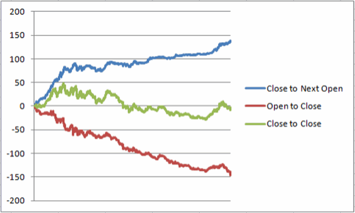
Since closing at $44.26 on its first day of trading on 4/20/2010:

*Ticker SLV has lost -$9.04 a share (closing at $35.22 on 11/14/2016)

*The cumulative gain from each day’s close to the next day’s open was $136.31

*The cumulative loss from each day’s open to the close of the day was (-$145.35)

See Figure 2

2Figure 2 – SIL shares have lost -$9.04 since inception (green line).  Lots of gain overnight (blue line); lots of loss intraday (red line)

Summary

I can’t say for sure if there is a tradable edge to holding silver stocks overnight. But I will say this – if you are planning today trade ticker SIL I sincerely urge you to play the short side of the market.

Jay Kaeppel

The Trend, the Trend, the Trend

In real estate, it’s “Location, Location, Location.” In the financial markets it’s “the Trend, the Trend, the Trend.”  There is a great deal of certainty about what will happen next in stocks, bonds and gold.  But the key to successfully navigating these turbulent times starts not with predicting the future but rather with identifying the current trend in the here and now and going from there.  So let’s take a look at, well, what else, the trends.

See also Please Don’t Buy That S&P 500 Index Fund

I have certain trend-following models that I follow to help me to determine which way to be leaning in the markets.  Like any trend-following method they are far from perfect (my stock market model for example, suffered not one but two significant whipsaws in the last year+).  But for me there is no expectation that they will be perfect.  The only goal is to catch most of the upside during major bull markets, and miss much of the downside during major bear markets.

Stocks

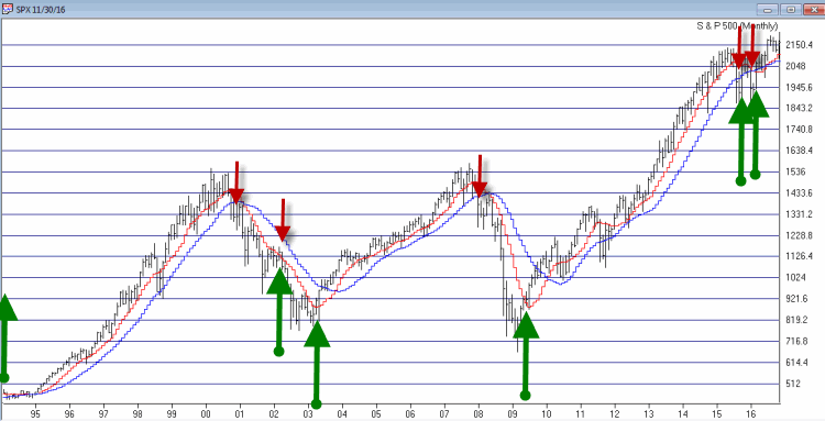
For stocks I look at the 10-month and 21-month moving averages for the S&P 500 Index and use the following rules:

*A sell signal occurs when the S&P 500 closes 2 consecutive months below its 21-month moving average AND is also below its 10-month moving average

*Following a sell signal a new buy signal occurs when the S&P 500 registers a monthly close above its 10-month moving averagestock-trendFigure 1 – Stock Market trend-following signals (Courtesy AIQ TradingExpert)

This method avoided much of the 1973-1974, 2000-2002 and 2008 bear market destruction.  That’s the good news.  The bad news is that it sold at the end of September 2015 and at the end of February 2016 – both just prior to powerful upside reversals (like I said, trend-following models ain’t perfect).

The most recent signal was a buy signal on 3/31/2016.  

So the trend for stocks is presently BULLISH

Bonds

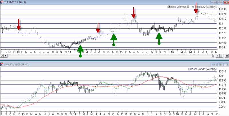
I have written several posts about this in the past.  My favorite bond timing indicator is Japanese stocks.  No seriously.  They have a string tendency to trade inversely to the 30-yr US t-bond.  I track ticker EWJ and watch the 5-week and 30-week moving averages.  Because Japanese stocks and t-bonds trade inversely I use the following rules:

*A buy signal for bonds occurs when the 5-week moving average for EWJ drops below the 30-week moving average for EWJ

*A sell signal for bonds occurs when the 5-week moving average for EWJ rises above the 30-week moving average for EWJ

The most recent signal was a sell signal for t-bonds on 6/10/2016

So the trend for bonds is presently BEARISH

bond-trendFigure 2 – Bond trend-following signals(Courtesy AIQ TradingExpert)

Gold

For gold I use two moving averages on a weekly chart for something I refer to as Jay’s Anti-Gold Index.  Rather than go into a long explanation I will link to the original article on the topic and offer a short explanation.  In AIQ TradingExpert I created a ticker comprised of 4 other tickers (GLL, RYSDX, SPX and YCS) which all trade in a negatively correlated manner to the price of gold (er, usually).

One moving average I call the “FrontWeighted36DayMA” (“FrontWeightedMA” for short.  The calculations are based on someone else’s work – unfortunately I cannot recall the person’s name so cannot give proper credit.  Hopefully Karma will work and somewhere that person will  Have a Nice Day without really knowing why.  The calculations are a bit long-winded so the AIQ TradingExpert code appears at the end of this article.

The other is the 55-week exponential moving average.

(CAVEAT: Because some of these tickers did not exist until 2006 trading signals began on 12/31/1996, so yes, it is by my standards a relatively short test period for a long -term moving average method.  To put it another way, don’t bet the ranch on  gold basedon this one indicator)

The trading rules are as follows:

*When the FrontWeightedMA closes a week BELOW the 55-week MA then a BUY signal for gold occurs.

*When the FrontWeightedMA closes a week ABOVE the 55-week MA then a BUY signal for gold occurs.

gold-signals-3Figure 3 – Gold Trading Signals (Courtesy AIQ TradingExpert)

The most recent signal was a buy signal on 3/18/16.

So the trend for gold is presently BULLISH.

Summary

These indicators do NOT represent “my opinion as to where the markets are headed next” (because the truth is I don’t know).  There are objective, mechanical measures of where things stand today.  Nothing more, nothing less.

Also, none these indicators falls into the “World Beater” or “You Can’t Lose in Investing” categories.  But then again they are not really designed to (BTW if you do posses methods that do fit into either of the aforementioned categories, I would love to hear from you – off the record, of course).  What they do achieve is to offer a decent frame of reference during times of doubt.

And that is one of the most powerful tools any investor can possess.

So in sum, the current trend (at least according to what you’ve seen here) for stocks and gold is bullish and the current trend for bonds is bearish.

How long any of these trends will remain in place is anyone’s guess.  So enjoy them while they last.

Jay Kaeppel

Code for JKma moving average

Bar34 is val([close], 34) * 0.01.

Bar33 is val([close], 33) * 0.01.

Bar32 is val([close], 32) * 0.01.

Bar31 is val([close], 31) * 0.01.

Bar30 is val([close], 30) * 0.01.

Bar29 is val([close], 29) * 0.01.

Bar28 is val([close], 28) * 0.01.

Bar27 is val([close], 27) * 0.01.

Bar26 is val([close], 26) * 0.01.

Bar25 is val([close], 25) * 0.02.

Bar24 is val([close], 24) * 0.02.

Bar23 is val([close], 23) * 0.02.

Bar22 is val([close], 22) * 0.02.

Bar21 is val([close], 21) * 0.02.

Bar20 is val([close], 20) * 0.02.

Bar19 is val([close], 19) * 0.02.

Bar18 is val([close], 18) * 0.02.

Bar17 is val([close], 17) * 0.03.

Bar16 is val([close], 16) * 0.031.

Bar15 is val([close], 15) * 0.031.

Bar14 is val([close], 14) * 0.031.

Bar13 is val([close], 13) * 0.031.

Bar12 is val([close], 12) * 0.031.

Bar11 is val([close], 11) * 0.031.

Bar10 is val([close], 10) * 0.031.

Bar9 is val([close], 9) * 0.031.

Bar8 is val([close], 8) * 0.031.

Bar7 is val([close], 7) * 0.006.

Bar6 is val([close], 6) * 0.006.

Bar5 is val([close], 5) * 0.07.

Bar4 is val([close], 4) * 0.07.

Bar3 is val([close], 3) * 0.07.

Bar2 is val([close], 2) * 0.07.

Bar1 is val([close], 1) * 0.07.

Bar0 is [close] * 0.079.


OneFrontWeighted36BarMA1 is bar34 + bar33 + bar32 + bar31 + bar30 + bar29 + bar28 + bar27 + bar26 + bar25 + bar24 + bar23 + bar22 + bar21 + bar20 + bar19 + bar18.


TwoFrontWeighted36BarMA2 is bar17 + bar16 + bar15 + bar14 + bar13 + bar12 + bar11+ bar10 + bar9 + bar8 + bar7 + bar6 + bar5 + bar4 + bar3 + bar2.


ThreeFrontWeighted36BarMA3 is bar1 + bar0.


FrontWeighted36DayMA is OneFrontWeighted36BarMA1 + TwoFrontWeighted36BarMA2 +ThreeFrontWeighted36BarMA3.


h15 is expavg([high],15).

l15 is expavg([low],15).

hl15 is (h15+l15)/2.


JKma is (FrontWeighted36DayMA+hl15)/2.


(I know, fun right?)


Please Don’t Buy That S&P 500 Index Fund

Well thank goodness that whole “election thing” is over with.  I do not discuss politics here but based on my own in-depth pre and post election analysis I have discerned that there is  almost exactly a 50% chance that I did not like your candidate and that you did not like mine (come to think of it I didn’t really like my candidate either). But enough about all that.  Let’s get back to the markets.

See also Crude Oil Plunges (and What to do When Things Go Right)

It always bums me out a little when I talk to someone who is holding or is considering buying and holding an S&P500 index fund.  I call this a “drifting with the tide strategy.”  If the market is drifting higher that’s great. But when the market is drifting lower your only choice is to “sit and take it.”  Sorry, but not my cup of tea.

If you have read any of my work you know I have no problem with employing “timing” techniques to avoid the huge plunges that occur from time to time.  But I recognize that market timing is not everyone else’s cup of tea. So if you are hankering to buy-and-hold the S&P 500 Index please consider any or all of the 3 (actually 4) alternatives described next.

3 (actually 4) Alternatives to Buying and Holding the S&P 500 Index

*S&P 500 Equal Weighted Index (can be traded using ticker RSP)

*S&P 500 Pure Value Index (can be traded using ticker RPV)

*S&P 500 Low Volatility Index (can be traded using ticker SPLV)

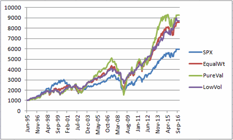
Figure 1 displays the growth of $1,000 invested in each of the indexes listed above versus the S&P 500 Index itself since July1995 (the earliest month of data for S&P 500 Pure Value Index).1Figure 1 – S&P 500 versus 3 alternatives; growth of $1,000 (7/95 to present)

*The most obvious thing to note is that all 3 indexes outperformed the S&P 500 Index by 44%, 56% and 45% respectively.

Other items that need to be considered:

*All 3 alternative indexes underperformed the S&P 500 index during the late 1990’s

*All 3 alternative index experienced significant drawdowns in 2008

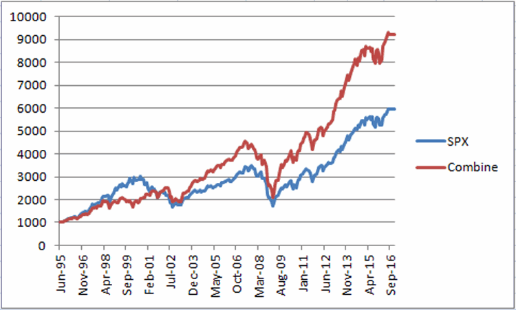
*One other excellent alternative to picking and choosing among these 3 is simply to hold all 3 alternative indexes and to rebalance once a year. Figure 2 displays the results of this approach versus buying and holding the S&P 500 Index.2Figure 2 – Growth of $1,000 in S&P 500 Index versus a combination of 3 alternatives (with a rebalance at the end of each year)

Figure 3 displays the year-by-year results for the S&P 500 Index versus 3 alternatives and a combination of those 3 alternatives.

Year SPX Combine EqualWt PureVal LoVol
1996 23.0 17.9 20.8 22.1 11.5
1997 33.4 31.3 27.8 35.3 30.8
1998 28.6 10.5 14.1 8.5 8.8
1999 21.0 0.4 10.3 (3.5) (5.7)
2000 (9.1) 15.9 (1.7) 17.1 36.1
2001 (11.9) 4.9 5.3 13.6 (3.2)
2002 (22.1) (14.4) (13.8) (22.1) (6.6)
2003 28.7 35.1 47.6 47.5 13.2
2004 10.9 20.3 12.1 20.3 29.6
2005 4.9 7.9 11.1 8.1 4.4
2006 15.8 18.5 15.6 14.2 26.4
2007 5.5 (0.5) 3.9 (4.9) (0.4)
2008 (37.0) (36.3) (40.9) (46.2) (22.3)
2009 26.5 40.2 54.5 89.6 (3.4)
2010 15.1 19.4 16.9 11.2 33.3
2011 2.1 4.6 (2.1) (3.7) 20.9
2012 16.0 17.8 23.2 32.5 0.5
2013 32.4 36.0 36.4 39.0 32.0
2014 13.7 14.9 14.3 3.4 29.2
2015 1.4 (2.0) (1.9) (6.3) 2.0
2016 7.8 9.8 10.8 16.8 2.8
Total % Gain +495% +822% +755% +826% +772%
Average 9.9 12.1 12.7 13.8 11.9
Std Dev 18.7 18.0 20.9 28.0 16.9
Ave/StdDev 0.53 0.67 0.61 0.49 0.70
MaxDD (50.9) (54.7) (53.3) (62.3) (48.2)

Figure 3 – Year-by-Year results

Summary

The “Combine” strategy gained +822% from the end of June 1995 through the end of September 2016 versus +495% for the S&P 500 Index.

In sum, if you have decided to buy-and-hold a stock index fund or ETF as a part of your portfolio, the results discussed above strongly suggest considering alternatives to a straight S&P 500 index fund.

Jay Kaeppel

Crude Oil Plunges (and What to do When Things Go Right)

On 10/25 I published an article detailing an example trade designed to make money if crude oil declined in price.  The trade simply involved buying a deep-in-the-money December put option on ticker USO with the goal of achieving point-for-point movement with the underlying shares.

In the immortal words of whoever said it first, “so far, so good.”

See also My 100% Guaranteed Accurate Prediction for the Stock Market

As you can see in Figure 1, the original example trade (buying 12 December 13 strike price puts on ticker USO – an ETF that purports to track the price of crude oil) is showing an open profit of +$1,560, or +76.5% on an investment of $2,040.1Figure 1 – Original example USO trade showing a sizeable gain (Courtesy www.OptionsAnalysis.com)

Which raises that age old question of “What to do, what to do?”  As you can see in Figure 2 – which was essentially the catalyst for this trade – the seasonal trend for crude oil remains extremely bearish throughout November and into December. 2aFigure 2 – Annual Seasonal Trend for Crude Oil (Courtesy www.OptionsAnalysis.com)

So this raises three distinct possible actions:

1) Let it ride

2) Sell everything and take the profit before it gets away

3) Something else

The advantage of #1 is that there is still a ton of additional profit potential if price continues to sink.  The disadvantage is that the trade could give up its profit and end up a loser.

The advantage of #2 is that you take a 76% profit in 9 calendar days. The disadvantage is that you have no additional profit potential if crude oil continues to fall (which Figure 2 suggests is a distinct possibility).

So I will choose Door #3, i.e., an “adjustment” to the original trade designed to “locking in a profit” while still allowing further profit potential.

Just as there is no “one best way to trade”, likewise there is no “one best trade adjustment”. In other words, a trader has to make a somewhat subjective decision based on:

Expected outlook (if any) for the underlying security in question

Personal priorities regarding reward and risk.

Example Adjustment

In this example we are going to replace our “deep-in-the-money” put option position with an “at-the-money” put option position, as follows:

*Sell 12 December 13 puts

*Buy 12 December 10 puts

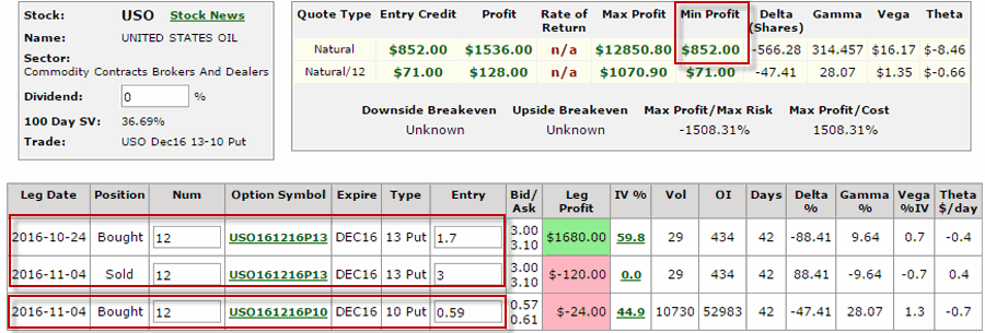
The particulars for this position after the adjustment appear in Figures 3 and 4.3Figure 3 – Adjusted USO position (Courtesy www.OptionsAnalysis.com)

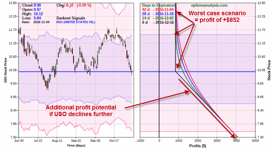
4Figure 4 – Risk curves for adjusted USO position (Courtesy www.OptionsAnalysis.com)

As you can see this new position locks in a profit while still allowing for additional profits.

Current Open profit = +$1,560 Maximum profit potential = Unlimited

Minimum Profit = $852

Summary

There are an almost unlimited number of other potential adjustments that could have been made to this trade.  But this one accomplishes dual goals of

1) Eliminating the risk of the trade ending in a loss

2) Still allowing for additional profit if USO declines further between now and early December.

Jay Kaeppel

My 100% Guaranteed Accurate Prediction for the Stock Market

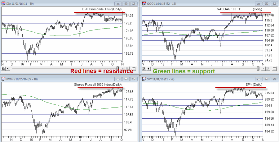
I guess because I am a “market guy” people keep asking me lately what my prediction is for the market given the recent volatility (or lack thereof) and the upcoming election.  So I am happy to provide my “100% Guaranteed Accurate Prediction” below.  But first take a glance at Figure 1.

See also 4th Quarter Trends I Have Known and Loved

In it you will find bar charts for ETFs which track four major market indexes.  Each chart displays a red horizontal line at the recent highs and a 200-day moving average below the current price.key-price-pointsFigure 1 – Four Major Market Index ETFs

OK, so here goes with my prediction: I predict that eventually price will either:

A) Breakout above the red resistance lines

B) Breakout below the 200-day moving averages

Until either A or B occurs, everyone’s predictions for the market – in the immortal words of whoever said it first- “don’t mean diddly”.

So be patient, keep a close eye and ”go with the trend” – whatever that trend may turn out to be.

Jay Kaeppel