Monthly Archives: April 2016

Dead Dollar, Soaring Silver and a Lesson in Trading Success

Today’s piece is an object lesson in that age-old (and entirely correct) trading adage that states, “Cut your losses and let your profits run.”  It could also be subtitled “How to use options to limit your dollar risk and to be able to adjust an initial position to lock in profits while still allowing profits to run.”

Clearly “Cut your losses and let your profits run” is a better choice.

U.S. Dollar

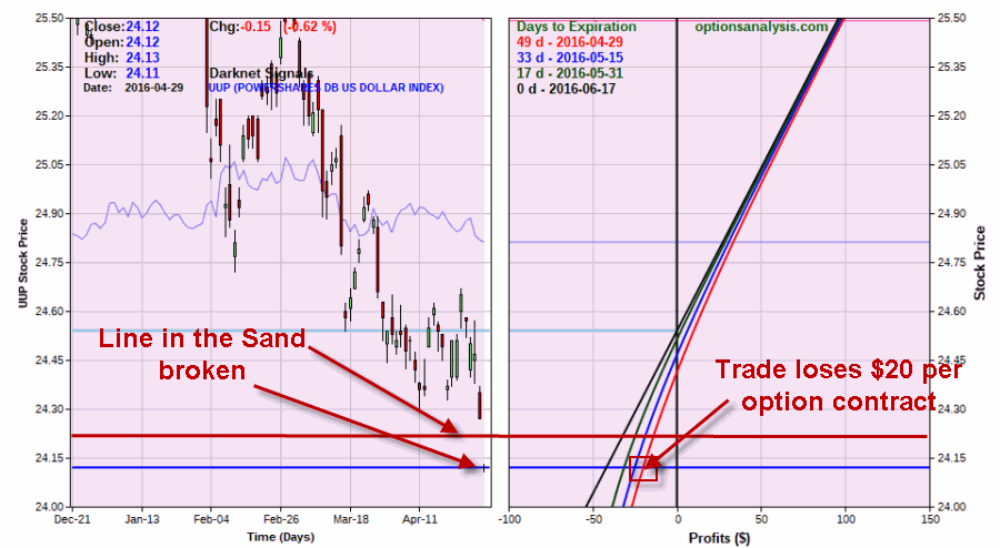
In this piece I noted that the U.S. Dollar (using ETF ticker UUP as a proxy) had drawn a “line in the sand”.  So I wrote about buying a cheap call option as a way to, a) make money if the line held and UUP rallied, and, b) limit risk to a very small dollar amount if the line fails to hold.

The line failed to hold.  As you can see in Figure 1, on 4/29 UUP fell below our “Uncle” price of $24.19.  At that point the trade could be exited with a loss if sold at the market is -$20 per contract.  A good thing?  No.  A disastrous thing?  Hardly.1Figure 1 – U.S. Dollar breaks down; call option loses “a couple of bucks” (Courtesy www.OptionsAnalysis.com)
This seems like a good point to invoke:

Jay’s Trading Maxim #41: A properly managed losing trade – i.e., one that does not lose more than you can (stomach and) afford – is simply “a cost of doing business”.  Nothing more, nothing less.

Silver

I don’t want to say that I “picked the bottom” in silver and rode the 2016 rally all the way up (mostly because if I ever do make statements like that something bad usually follows – Murphy’s Law being what it is and all).  Still, for the record in this article dated 1/13/16, I highlighted a bullish position using options on the ETF ticker SLV (which tracks the price of silver bullion).  Likewise, in this article dated 2/9/16 I wrote about an “adjustment” to the initial trade that:

a) Locked in a profit

b) Allowed for greater upside potential

c) Extended the holding period from a few months to almost 11 months

Given the recent rally in SLV things are going well at the moment.  See Figures 2 and 3.

2Figure 2 – SLV soars, adjusted option trade accumulates profits (Courtesy www.OptionsAnalysis.com)3Figure 3 – SLV soars, adjusted option trade accumulates profits (Courtesy www.OptionsAnalysis.com)
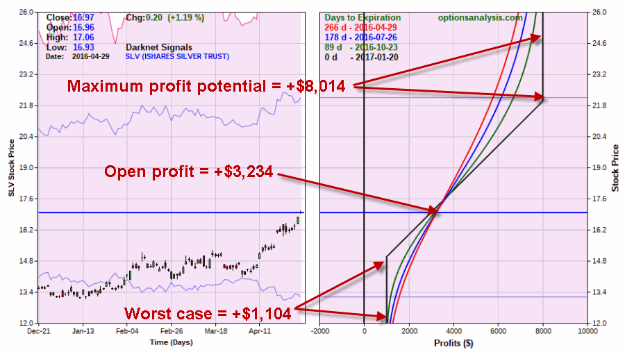
The trade presently shows an open profit of $3,234 and SLV appears to potentially be breaking out to the upside.

Summary

So here is the point of the lesson.  Two trades.  One a winner, one a loser.  50/50 certainly doesn’t impress anyone.  But the point is:

*The losing trade lost a “couple of bucks”

*The winning trade has made a whole lot more, can make a whole lot more than that, and the worst case is a decent profit.

Here ends the lesson.

 Jay Kaeppel
 

A ‘Simple Hedge’ as Market ‘Bumps it’s Head’

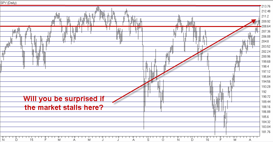
The S&P 500 has “bumped its head” in a clear resistance level.  The VIX Index has dropped into a familiar support level.  Is the party over?  I hope not.  I would love to see the stock market keep heading higher.  But hey, warning signs are warning signs right?

(See also The U.S. Dollar and The Line in the Sand and The Value of the ‘Perspective’ Indicator)

So should we all panic?  Not necessarily.  Still – and fortunately – there is a difference between “being panicked” and “being prepared”.  So let’s talk about a simple hedge “just in case” the stock market decides to sell off in the not too distant future.

Figure 1 displays ticker SPY with a fairly obvious resistance range highlighted. As the verbiage on the chart asks, “will you be surprised if the market pauses or worse here?”1Figure 1 – Ticker SPY at in resistance zone (Courtesy AIQ TradingExpert)

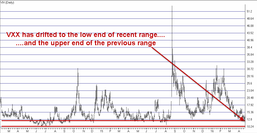
Figure 2 displays ticker VXX (the ETF that ostensibly tracks the VIX Index).  From a completely and entirely subjective point of view it can be argued that the VIX is in “the calm before the storm” mode.2Figure 2 – Ticker VXX at support zone (Courtesy AIQ TradingExpert)

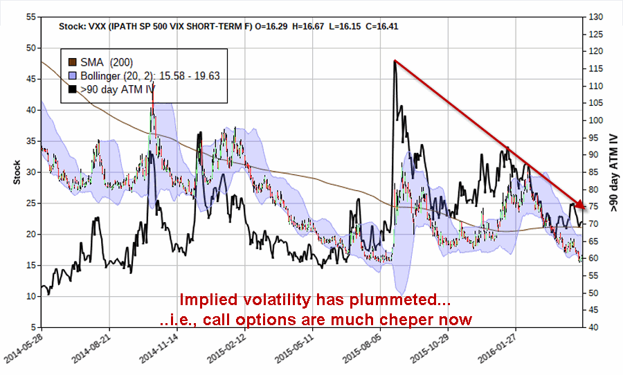
Figure 3 displays that the implied volatility for options on ticker VXX has fallen significantly and that VXX options are relatively cheap.3Figure 3 – VXX option implied volatility has fallen hard (Courtesy www.OptionsAnalysis.com)

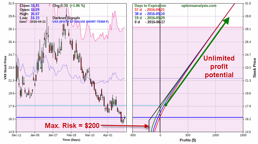
So what about buying the June VXX 16 call for $200 as a hedge against the stock market suffering a hit between now and June option expiration?

Figure 4 displays the particulars and Figure 5 displays the risk curves.4Figure 4 – VXX June 16 call (Courtesy www.OptionsAnalysis.com)5Figure 5 – Risk curves for VXX June 16 call (Courtesy www.OptionsAnalysis.com)

Summary

As always I am not “recommending” this trade I am simply pointing out that several factors (S&P at resistance, VIX at support, option premiums relatively low, and don’t forget “Sell in May” which is just around the corner) may be coming together to make considering a hedge a reasonable idea.

The questions to ask yourself are:

*Do I think there is a chance/likelihood that the S&P will suffer a selloff in the next 7 weeks or so?

*Am I willing to risk $200 if it doesn’t?

 Jay Kaeppel


The U.S. Dollar and the Line in the Sand

A lot of people seem to think that speculation is anywhere from “foolish” to downright “evil”.  I disagree.  I believe that “risking a couple of bucks” in hopes of making “a whole lot more” makes a lot of sense.  I especially like to emphasize the “risking a couple of buck’s part”.  Once Old School, always Old School I guess.

A “speculative” position in my dictionary is one that stands a chance of going against me at any moment.  In other words, if I enter a speculative position I must stand ready to exit immediately if my exit criteria is hit – even if that occurs on Day 1 (I have experienced this and can verify that it is not fun).

The key is to limit how much you risk.  One great way to do this is to use options. Let’s consider an example.

(See also The Value of the ‘Perspective’ Indicator)

The U.S. Dollar

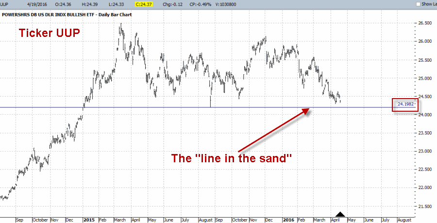
The U.S. dollar enjoyed a strong advance from mid-2014 into March of 2015.  Since that time it has moved sideways to lower and is now close to a critical support level.  Figure 1 displays a bar chart for ticker UUP – an ETF that tracks the U.S. dollar.  The critical support level is $24.19 a share, which I have labeled as the “line in the sand”.  I refer to it this way for two simple reasons:

*As long as price holds above this line there is the potential for higher prices

*If price drops below this level then all bets are off.

1Figure 1 – Ticker UUP (Courtesy ProfitSource by HUBB)

Speculating with Call Options

The truth is that I have no idea whether or not this line will hold – not for a day, a week, a month or more.  But I do know that by buying a call option on UUP it is possible to obtain a profit-to-risk potential of at least 2-to-1.  Figures 2 and 3 show the particulars of buying the June 24 strike price call option.2Figure 2 – UUP June 24 call (Courtesy www.OptionsAnalysis.com)3Figure 3 – UUP June 24 call option risk curves (Courtesy www.OptionsAnalysis.com)

As you can see in Figure 3:

If price falls below $24.19 the loss will be somewhere between -$18 and -$35 per option contract depending on how soon the breakdown occurs.

If price reaches the first profit target of roughly $25.25 (which represents a 1-standard deviation move in price) the profit would be roughly +$75 per option contract.

If price reaches the second price target of $25.57 (which represents the recent high made on 3/2) the profit would be roughly +$110 per option contract.

Summary

Is it a good idea to risk money on a bullish position in the U.S. dollar right this very minute?  I am not saying that it is or isn’t.  The point of this article is simply to point out the potential to turn a speculative situation into one with:

*A profit-to-risk potential of at least 2-to-1

*A clearly defined exit point

*Limited risk

Hey maybe this Old School stuff isn’t so crazy after all….

Jay Kaeppel


The Value of the ‘Perspective’ Indicator

Not every indicator that you look at needs to generate exact buy and sell signals.  There are many useful indicators that offer “perspective” more than “precision market timing.”  It can be very helpful to track some of these. The downside of course is that the more indicators you follow the more you can be susceptible to “analysis paralysis” – plus at some point you do have to have “something” that tells you “make this trade NOW!”

(See also A Portfolio for the Month of May)

But the basis for considering tracking certain “perspective indicators” is that they can help to keep you from falling for those age-old pitfalls, “fear” and “greed”.  As the market falls – and especially the harder it falls – the more likely an investor is to start to feel fear.  And more importantly, to start to feel the urge to “do something” – something like “sell everything” to alleviate the fear. On the flipside, when things are going great there is a tendency to ignore warning signs and to “hope for the best”, since the money is being made so easily.

In both cases a perspective indicator can serve as – at the very least – a slap upside the back of the head that says “Hey, pay attention!”

So today let’s review one of my favorites.

The JK HiLo Index

OK, I will admit it is one of my favorites because I developed it myself.  Although in reality the truth is that it simply combines one indicator developed long ago by Norman Fosback and another that I read about in a book my either Martin Pring or Gerald Appel.

I first wrote about this indicator in the October 2011 issue of Technical Analysis of Stocks and Commodities magazine and I believe it is available via Bloomberg.

The calculations are as follows:

A = the lower of Nasdaq daily new highs and Nasdaq daily new lows

B = (A / total Nasdaq issues traded)*100

C = 10-day average of B

D = Nasdaq daily new highs / (Nasdaq daily new highs + Nasdaq daily new lows)

E = 10-day average of D

JK Hi/Lo Index = (C * E) * 100

In a nutshell:

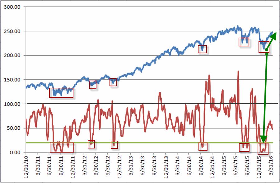
*High readings (90 or above) suggest a lot of “churning” in the market and typically serve as an early warning sign that a market advance may be about to slow down or reverse.  That being said, a close look at Figure 1 reveals several instances where high readings were NOT followed by lower prices.  However, as a perspective indicator note the persistently high reading starting in late 2014.  This type of persistent action combined with the “churning” in the stock market could easily have served as a warning sign for an alert investor.

*Low readings (20 or below) indicate a potential “washout” as it indicates a dearth of stocks making new highs.  Readings under 10 are fairly rare and almost invariably accompany meaningful stock market lows.

Figure 1 displays the Nasdaq Composite (divided by 20) with the JK Hi/Lo Index plotted since 2011.1Figure 1 – JK HiLo Index (red line) versus Nasdaq Composite (/20) since 2011

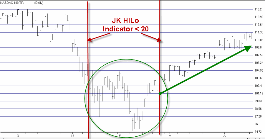
Regarding the difference between a “timing” indicator and a “perspective” indicator, note the two red lines in Figure 2.  The JK HiLo Index first dropped below 20 on the date marked by the first red line.  It finally moved back above 20 on the date marked by the second red line.  2Figure 2 – JK HiLo Index (red line) versus Nasdaq Composite (/20) since 2015 (Courtesy AIQ TradingExpert)

Can we say that the JK HiLo Index “picked the bottom with uncanny accuracy”?  Not really.  The Nasdaq plunged another 10% between the first date the indicator was below 20 until the actual bottom.

Still, can we also say that it was useful in terms of highlighting an area where price was likely to bottom?  And did it presage a pretty darn good advance?  I think a case can be made that the answers to those questions are “Yes” and “Yes”.

Summary

The bottom line is that while there was a great deal of fear building in the market during January and February, an indicator such as this one can help alert an investor the fact an opportunity may be at hand.

Jay Kaeppel


A Portfolio for the Month of May

OK, I understand that it not even the 15th of April yet.  So yes, talking about a portfolio for the month of May is a tad premature.  And sure I would love to claim that I am “ahead of the curve” and “actively proactive” (if you are by chance playing a drinking game at home I believe this would call for two shots).  But the sad reality is that if I don’t write about this topic today while I am thinking about it there is a good chance that I will forget to do so before the end of April.  Soooooooo……………

(See also JayOnTheMarkets.com: Soybeans, Crude Oil and Gold, Oh My)

The May Portfolio

Here is my suggestion submitted for your approval – or disapproval as the case may be (and please note the lack of of phrases like “Sure Thing”, “Lead Pipe Cinch”, “You can’t lose trading sector funds” and words like “recommendation”), with 25% going into each fund:

FDFAX – Fidelity Select Consumer Staples

FSHCX – Fidelity Select Health Care Services

FSPHX – Fidelity Select Health Care

FGOVX – Fidelity Government Income Fund

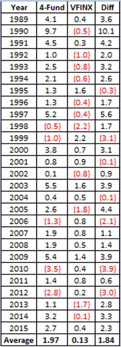
Figure 1 displays the growth of $1,000 invested only in this portfolio and only during the month of May (no interest is added while out of the market) versus $1,000 invested only in ticker VFINX (Vanguard S&P 500 Index Fund).1Figure 1 – Growth of $1,000 invested in Jay’s 4 Fidelity fund portfolio (blue) versus VFINX (red) during the month of May; 1989-2015

As you can see in Figure 1, money invested in the S&P 500 during the month of May for the past 27 years has essentially been “dead money”.  The Fidelity portfolio on the other hand has tended to show a steadier rate of growth.

Figure 2 displays the year-by-results and comparisons.

2

Figure 2 – Year-by-Year Results

A few things to note:

*The Fidelity portfolio average was +1.97%

*The S&P 500 Index fund average was +0.13%


*The Fidelity portfolio showed a gain 22 times (81% of the time)

*The S&P 500 Index fund show a gain 16 times (59% of the time)


*The Fidelity portfolio showed a loss 5 times (19% of the time)

*The S&P 500 Index fund show a gain 11 times (41% of the time)


*The Fidelity portfolio outperformed the S&P 500 Index fund 20 times (74% of the time)

*The Fidelity portfolio underperformed the S&P 500 Index fund 7 times (26% of the time)

Summary

*Is the 4 fund portfolio I listed above sure to make money this year in May?  Nope

*Is the 4 fund portfolio I listed above sure to outperform the S&P 500 Index this year in May?  Nope

Still, investing is a game of probabilities.  Investing in an S&P 500 Index fund during the month of May has generated a gain of +3.4% over the last 27 years.

Not exactly the kind of returns most of us are looking for.  Therefore it might make sense to consider some alternatives.  Um, like this one.

Jay Kaeppel


Soybeans, Crude Oil and Gold, Oh My

Well I have not been writing a lot lately.  The truth is I am a little “out of sync” with the markets these days.  And I prefer to write when I feel like I have at least some idea of what the heck is going on.  Which is a good thing I think.

So for today let’s just review and update some relevant things that I have written about in the past.

Soybeans

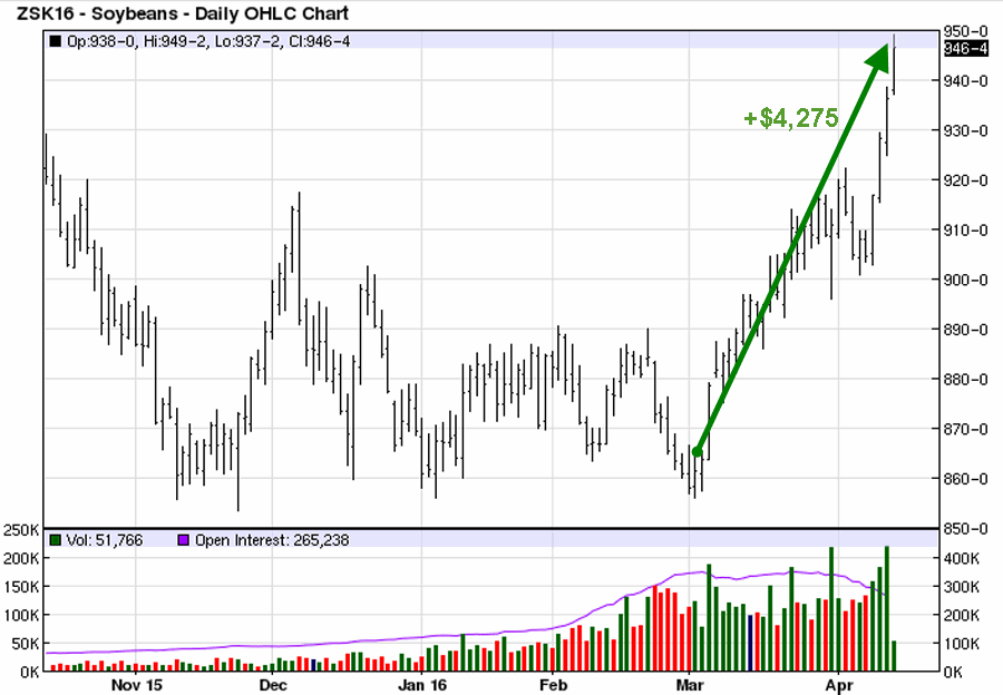
In this article I suggested a bullish position in May soybean futures.  Under the category of “One for the Good Guys”, beans have rallied nicely as shown in Figure 1.  1Figure 1 – May Soybeans (Courtesy: www.Barchart.com)

At this point a trailing stop – or selling half into strength and using a trailing stop on the remaining position – sounds like a good idea to me.  It should also be noted that “First Notice Day” for May soybeans is 4/29.  Bottom line, unless you want someone to dump 5,000 bushels of soybeans in your front yard (OK, it doesn’t really work like that but it is fun envision that it does), then you need to exit any and all long positions in May beans before that date.  This can involve taking profits, rolling into July or both.

Crude Oil (ETF ticker USO)

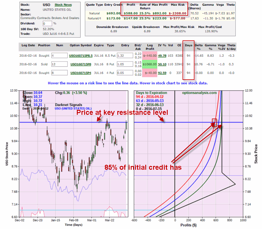
In this article I wrote about entering a somewhat bullish position using put options on ticker USO.  As you can see in Figure 2, it is “so far so good”.  At this point the trade has captured $588 of the initial $689 credit.2Figure 2 – USO put position (Courtesy www.OptionsAnalysis.com)

One position management note: USO is at a key price level as you can also see in Figure 2.  If USO fails to break through to the upside I would consider taking some (or even all) profits and moving on to the next trade, rather than waiting another 3 months in hopes of capturing the remaining profit potential.

Gold

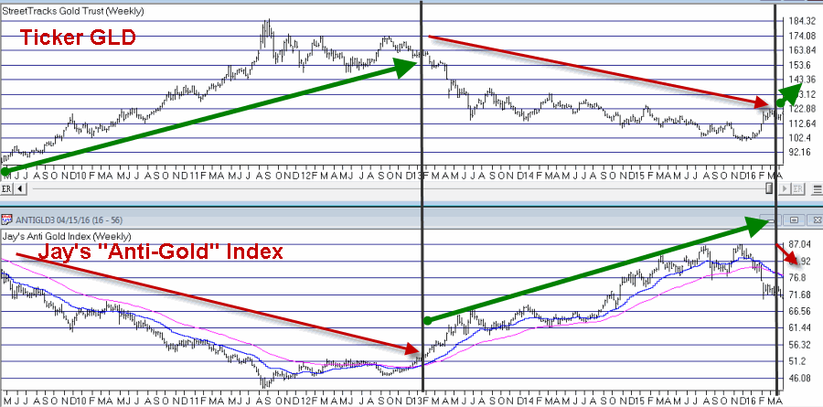
In this article I wrote about a relatively crude moving average method I use to help identify the trend of gold.  As you can see in Figure 3, my “Anti-Gold” index recently flipped back to being “bullish” for gold (by virtue of the fact that the “anti-gold” index flipped to being bearish).3Figure 3 – Ticker GLD vs. Jay’s “Anti-Gold” Index (Courtesy AIQ TradingExpert)

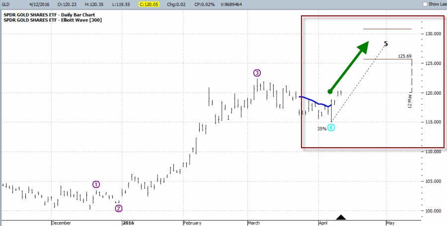
So does this mean it is “clear sailing” for all things gold related?  Not at all.  All moving average systems are susceptible to whipsaws.  This one is no exception.  In the short-term gold and gold stocks appear to be overbought.  Still, as you can see in Figure 4, the Elliott Wave count for ticker GLD is suggesting the possibility for higher prices in the not too distant future.4Figure 4 – Bullish Elliott Wave count for GLD (Courtesy ProfitSource by HUBB)

Jay Kaeppel

Maximizing Reward, Minimizing Risk in MRK

When it comes to trading and investing, knowing what strategy to use when is often half the battle.

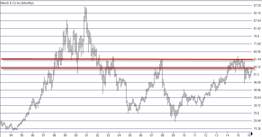
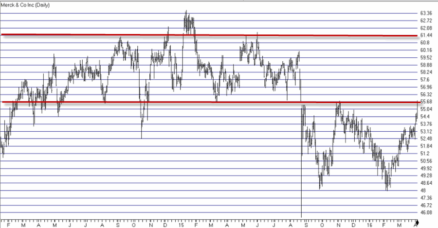
Take a look at ticker MRK in Figures 1 and 2.  As you can see, following the recent rally MRK is once again “bumping its head” on a familiar resistance area between roughly $56 and $61.1Figure 1 – MRK Weekly (Courtesy AIQ TradingExpert)2Figure 2 – MRK Daily (Courtesy AIQ TradingExpert)

Now different traders may look at these charts and have different reactions.  Some might say “it’s time to sell” or possibly even say “it’s time to sell short”.  On the other hand others may look at this and say “gee, if it can just break through resistance it could run to a much higher level.”

The other side of the equation involves asking how much money a trader is willing to risk in order to express that opinion.  So for the sake of example (and as always, please remember that this is an example and not a recommendation) let’s say that a trader wants to establish a bullish position in case MRK does manage to breakout to the upside, but that he or she doesn’t wish to risk much money.

The Bull Call Backspread

The strategy we will use is an option strategy known most commonly as a “backspread”.  This strategy involves selling a lower strike price call option and using some or all of the proceeds to buy 2 or higher strike price calls.  In our example we also want to give MRK some time to work its way higher, so we will consider longer-term rather than shorter term options.

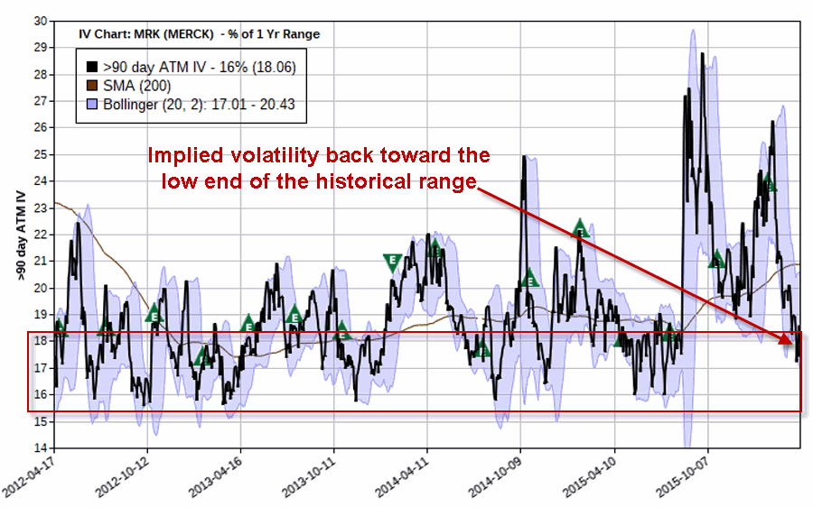
One other note regarding the backspread strategy.  At the time the trade is entered, the lower the implied volatility for the options the better (after the position is entered, a rise in volatility can increase the profit potential and/or reduce the shorter-term risk, and vice versa).  As you can see in Figure 3, the implied volatility for MRK options is not at “rock bottom” levels, but it has fallen back down to the low end of the historical range.3Figure 3 – Implied volatility for MRK options has fallen recently (Courtesy www.OptionsAnalysis.com)

The particulars of our example trade appear in Figure 4.4Figure 4 – MRK call backspread (Courtesy www.OptionsAnalysis.com)

Key things to note:

*There are 198 days left until option expiration

*The trade holds unlimited upside potential

*The maximum risk is -$826, however, that amount of loss would only be incurred if we are still holding this trade on October option expiration day AND MRK closes on that day at exactly $57.50.  In other words, in order to negate that risk all we have to do is resolve to exit the trade prior to October expiration.

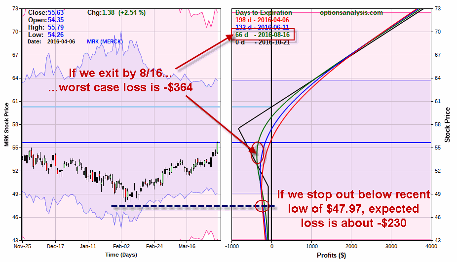
Figure 5 looks at the risk involved with this position.5Figure 5 – Risks involved with MRK call backspread (Courtesy www.OptionsAnalysis.com)

As you can see, if we resolve to exit the trade by 8/16 for example (the risk curve for this date is represented by the green line in Figures 5 and 6):

*This gives MRK over four months to make some kind of a move to the upside AND

*The worst case loss is approximately -$364 (this is approximate because a decline in volatility could result in a slightly larger loss and a rise in volatility could result in a slightly small loss).

Also note that we can give MRK a lot of room on the downside.  A close look at the risk curve lines in Figure 5 reveal that as MRK price falls lower the dollar risk actual decreases.  So if we use the recent low of $47.97 as a stop-loss point, by the time MRK falls to that price our risk is only approximately -$230 (again depending somewhat on any changes in volatility).

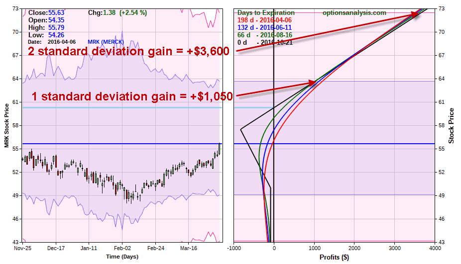
Now let’s consider the profit potential as displayed in Figure 6.6Figure 6 – MRK call backspread profit potential (Courtesy www.OptionsAnalysis.com)

As you can see in Figure 6 if MRK moves one standard deviation higher to roughly $64 a share the trade will generate a profit of approximately $1,050. And if MRK was able to break out above the 2015 high of $63.62 and rally two-standard deviations then profit potential soars to much higher levels.

Summary

The trade presented herein is an example of a call backspread with a reasonably good reward-to-risk profile – nothing more, nothing less.  That being said please note that I am note “predicting” that MRK will in fact breakout to the upside.  The 56 to 61 price range has been a rally killer on numerous occasions in the past and there is no reason to think it can’t be again.  This is important to consider because the bottom line is that if the stock does not rally further to the upside this trade will lose money.

But not much.  And that really is the point.  This trade represents an example of one way to play a potential continuation for MRK while essentially only “risking a couple of bucks.” Like I said,  knowing what strategy to use when is often half the battle.

Jay Kaeppel