Monthly Archives: November 2015

Real Estate = A Real Good Time

OK, I will admit I am a bit late with this one.  I’ll go ahead and blame “The Holidays”.  Anyway, if you were wondering when it might be a good time to hold real estate stocks, the answer might well be, um, “Now”.

(Jay Kaeppel Interview at BetterSystemTrader.com)

Favorable Seasonal Period for Real Estate Stocks

*A favorable seasonal period for real estate stocks tends to occur between the close of the 14th trading day of November (back on 11/19/15 this year)

*The favorable period extends through December 31st of the current year

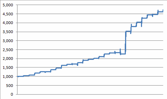
We will use Fidelity Select Real Estate (ticker FRESX) as a proxy.  However, other funds and ETFs are listed a little later.  Figure 1 displays that growth of $1,000 invested in FRESX only during the November-December period listed above since 1988.1Figure 1 – Growth of $1,000 invested in FRESX during Seasonally Favorable Period (1988-2015)

Figure 2 displays the year-by-year results

2

Figure 2 – FRESX +(-) during Seasonally Favorable Period (1988-2015)

For the record, this period as seen:

*A gain 26 times (96.3%)

*A loss 1 time (3.7%)

*Average %+(-) = +6.25%

*Median %+(-) = +4.16%

For the record, a 96% success  rate is what we “quantitative analyst types” refer to as  “statistically significant”.

A Few Alternatives

Beyond FRESX traders might also consider:

*ProFunds Real Estate fund (REPIX)

*Rydex Real Estate fund (RYRIX)

*iShares Dow Jones Real Estate ETF (IYR)

*Vanguard REIT ETF (VNQ)

Summary

Like I said, I am a little late with this one.  As of 11/27 FRESX was already up +2.1% from its close on 11/19.  So is it already too late to get into real estate stocks?

It beats me.

As I always say, the one “catch” with using seasonals as a stand-alone strategy is that there is never any guarantee that a particular trend with  work “this time around”.

Nevertheless,  as a wise man somewhere probably once said, “96.3% is 96.3%, what more do you want from me?”  So short-term traders might consider looking at any short-term weakness in real estate stocks as a potential buying opportunity.

(Jay Kaeppel: Portfolio Manager for New Investment Program)

Jay Kaeppel

When Santa Meets a Pre-Election Year

In this previous article I noted the fact that the Santa Claus Rally (as I define it) has seen the Dow post a gain during 55 of the previous 66 years.  Of course, in case you hadn’t noticed this is a pre-election year (also for what it’s worth, according to recent polling data results Trump is leading Clinton by 2 points among people whose last names starts with a “G” and who live in a state that has the letter “S” in it when polled on a day of the week that starts with a “T”.  But, hey, it’s a little too early to draw any conclusions) and pre-election years have by far been the best historical performer among the four years in the Election Cycle.

(Jay Kaeppel Interview at BetterSystemTrader.com)

So does this tendency hold true for the Santa Claus rally portion of the year?  Let’s take a closer look.

By the Election Cycle Year

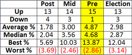
To reiterate, I define the Santa Claus Rally period as the time between the close of trading on the Friday prior to Thanksgiving (11/20/15 this year) through the close of the third trading day of the next year (1/6/16).  Figure 1 displays the summary of results broken down by each year in the election cycle starting in November 1949.

1

Figure 1 – Santa Claus Rally by Election Cycle Year

As you can see in Figure 1 the Pre-Election Year Santa Claus Rally period has seen the Dow advance 15 out of 16 times with an average and median gain just under 5%.

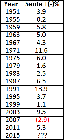
Figure 2 displays the actual % gain or loss during each of the past 16 pre-election years.2

Figure 2 – Santa Claus Rally Period % Gain/Loss (Pre-Election Years)

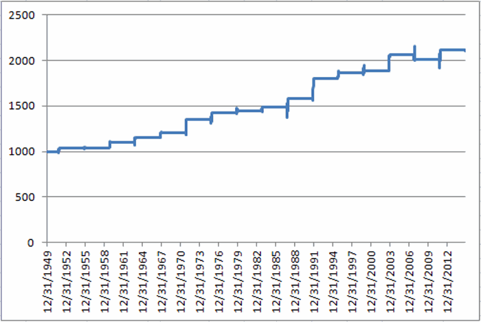
Figure 3 displays the growth of $1,000 invested in the Dow only during the Pre-Election Year Santa Claus Rally period since 1951.3Figure 3 – Growth of $1,000 during Santa Claus Rally Period (Pre-Election Years)

Summary

There are several different possible ways to interpret the information in this piece.

Improper Interpretation: There is a 94% probability that the Dow will be about 5% higher on 1/6/16 than it was on 11/20/15.  Um, no.  Unfortunately, historical results are just that.

Proper Interpretation: It might make sense to give the bullish case the benefit of the doubt for the next roughly six weeks.

Hey, Santa Claus know what we want.  Now we just have to wait and have faith that the Big Guy will deliver the goods.  For what it’s worth…he’s got a pretty good track record.

In the meantime, wishing you all a very Happy Thanksgiving – and thank you for read JayOnTheMarkets.com!

Jay Kaeppel

Jay Kaeppel Interview at BetterSystemTrader.com

Click here for BetterSystemTrader.com Interview with Jay Kaeppel

From: BetterSystemTrader.com:

Hi there, this time of year we often start hearing about the Santa Claus rally and a host of other seasonality tendencies so this week we’re talking to Jay Kaeppel, author of Seasonal Stock Market Trends, about seasonality and how it applies to trading models.  Even if you’re not interested in trading seasonality directly it could be handy to be aware of these tendencies in the market so be sure to take a listen!

Click here for BetterSystemTrader.com Interview with Jay Kaeppel

Jay Kaeppel has worked as the Head Trader for a CTA and published a number of popular trading books on Futures, Options and Stock Market Seasonality.

He also spent a number of years writing a weekly column titled “Kaeppel’s Corner” and publishes ideas and research on his blog “Jay On The Markets”.

In this episode we discuss a number of seasonal tendencies, how they can be integrated into a trading model, the applications of the Known Trend Index and the reasons why most traders fail.

Topics discussed

  • The Santa Claus rally – what it is and how to trade it
  • How to use seasonality to complement other models
  • Seasonality tendencies around holidays
  • Monthly seasonal tendencies and a simple monthly seasonal system that vastly outperforms stock index returns
  • Boiling down the trading process into 4 simple words
  • Using leveraged ETFs for seasonality trades
  • The worst performing month of the year (it’s not October)
  • Converting seasonal tendencies into a trading model
  • A simple seasonal sector system that takes only 6 trades per year
  • Diversification vs Specialisation and the impact it can have on trading and drawdowns
  • Are seasonal trading strategies just data mining?
  • The Known Trends Index (KTI) and how it can be used in trading
  • Why most traders fail

Click here for BetterSystemTrader.com Interview with Jay Kaeppel

Please bookmark http://bettersystemtrader.com/


So Who Wants to Pick a Bottom in Gold Stocks?

“Everybody knows” that trying to pick the exact bottom in anything is stupid.  I mean what are the odds that you’ll actually get it right?  Still, human nature is a pesky thing, no?.  So who is willing to call “the bottom” in gold and gold stocks?

(Jay Kaeppel Interview at BetterSystemTrader.com)

Well, not me necessarily.  Of course, I’ve never been very good at predictions in the first place.  Back in the early days I must admit I thought I could stare into my crystal ball of indicators/oscillators/chart patterns/etc and see what was coming next.  Alas, I stared into that damn thing for a long time before I realized that it wasn’t actually working.

Still – as just another victim of that aforementioned “human nature” – I “feel the urge” once in awhile.  Now if you are like me (and like most other traders) when you get the urge to pick a bottom (or top) you get the one voice on one shoulder saying “Go for it!  Bet the ranch!  Make a killing!”  And the voice on the other shoulder that says, “You know better than to do something so foolish.  Besides that trick never works.”

Here’s what I have found (and recommend) as a compromise to the voice in my, er, your head.  Allocate up to (but no more than) 10% of your investment capital to “Speculation/Hedging”.  You get the urge to “take a shot”.  By all means, go ahead.  But don’t risk more than a small portion of your investment capital.  If it turns out that you are actually pretty good at “taking a shot” the big payoffs on your small bets can add up to a lot of money over time.  And if the voice on the other shoulder is right, well, hey you’ve allowed yourself some discretion, you took your shot (granted you failed) but hey, it didn’t really hurt you financially.

So how about the gold market?

Here is my “analysis” of gold:

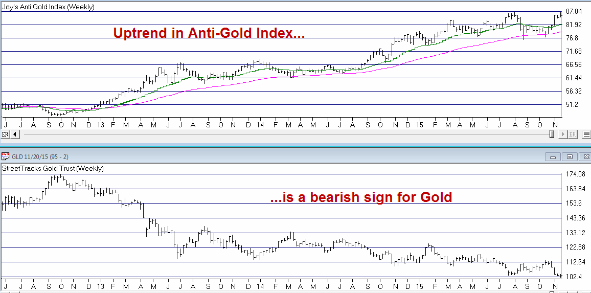
As you can see in Figure 1, my Anti-Gold Index remains in an undeniable uptrend.  As this is an inverse indicator, this trend is bearish for gold.  So make no mistake that what we are about to discuss is a “counter trend” trade is every sense of the word.1Figure 1 – Jay’s Anti-Gold Index versus ticker GLD (Courtesy: AIQ TradingExpert)
Gold broke out to the downside on 11/17 and 11/18 but then closed back above the downside breakout point on 11/19 as you can see in Figure 2.  Technical theory suggests that this could ultimately prove to mark an important double bottom (Well it could).
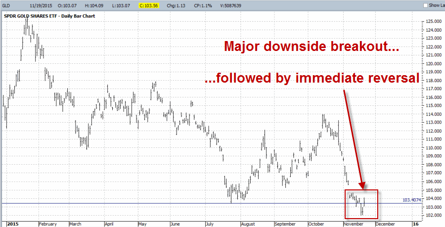
2Figure 2 – A false breakdown and bullish reversal for GLD??? (Courtesy: www.ProfitSource.com)

So is this the bottom?  I have to go with my standard answer here – “It beats the heck out of me.”  But I am not so much interest in “the bottom” as I am interested in “a bottom” (i.e., one that holds for at least 29 calendar days for reasons we will get to in a moment) But someone might think so.  So let’s highlight one possible way to play.

Switching to Gold Stocks

In Figure 3 we see ticker GDX, an ETF that tracks gold mining stocks rather than gold bullion.  Gold stocks did not break down below support and have spent the better part of four months trying to build a base.3Figure 3 – Ticker GDX; Gold stocks forming a base (Courtesy: AIQ TradingExpert)
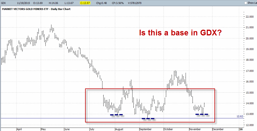
If nothing else we can identify the price of $12.62 a share as the “line in the sand” for ticker GDX.  Believe it or not, this simple designation opens the way to a potential option trade.

One Way to Play

OK, first the CYA disclaimers: I am not saying that gold stocks have bottomed.  I am not telling you that you should think gold stocks have bottomed.  I am not “recommending” that you make the trade I am about to highlight.  The purpose of this example is simply to highlight one way to use options to speculate on a position that can make money if the security in question remains above an objectively identified “line in the sand” ($12.62 on GDX in this instance).  OK, backside sufficiently covered, let’s move on.

The overarching “theme” for this trade is that everything hinges on GDX remaining above $12.62 a share.  If that price is broken to the downside then the premise for making this trade evaporates and defensive action is in order.  We are not even forecasting that GDX is going to rise substantially in price.  So we want a position that will make money so long as GDX holds above our “line in the sand.”

First let’s assume that a trader has a $50,000 account, is willing to commit 8% to a single trade, and is willing to speculate that GDX will hold above $12.62 through December option expiration (12/18/15).

The bull put spread trade displayed in Figures 4 and 5:

*Sells 46 December 12.5 puts

*Buys 46 December 11.5 puts

*Has a maximum profit potential of $598

*This represents a maximum profit % of 14.98% on risk capital and 1.2% of total capital

*The maximum risk is -$4,002 (we will look at reducing this risk in a moment by adding a stop-loss point)

*With GDX at $13.97 the breakeven price on the trade is $12.37.  So essentially, this trade will show a profit if GDX does anything besides fall -11.5% over the next 29 days.

4Figure 4 – GDX Dec 12.5/11.5 Bull  put spread (Courtesy www.OptionsAnalysis.com)5Figure 5 – Risk Curves for GDX Dec 12.5/11.5 Bull  put spread (Courtesy www.OptionsAnalysis.com)
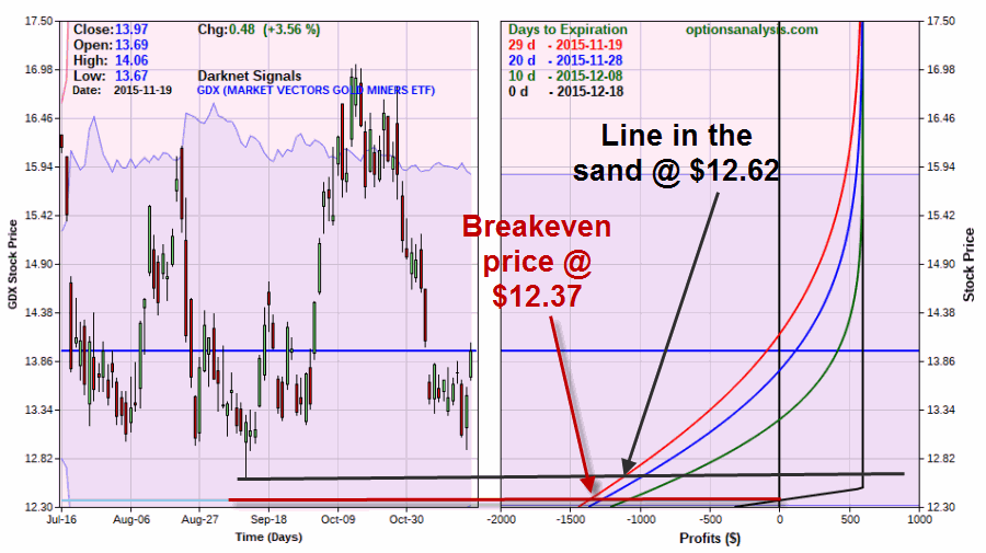
For a trader putting on this trade (and again I am not recommending that you do, only that you use this example to learn what factors are most important in managing a trade such as this – hey, we take CYA seriously here at JayOnTheMarkets.com), the first and foremost decision is “where to place a stop-loss?”  There are two possibilities that make sense:

*At some price below the recent low of $12.62: This makes sense because as I stated earlier, once 12.62 is broken the rationale for being in the trade is essentially gone.

*At or below the actual breakeven price of $12.37.  This makes sense because the reality of this trade is that GDX can take out its low of 12.62 and still generate a profit.

Another piece of good advice I got a long time ago: Upon entering a trade ask yourself “what is the worst case scenario, what will I do if it happens and can I handle the loss?”

*In this case, the worst case is if immediately after this trade is entered GDX plummets to the $12.37.  In this case the trader would be confronted with an open loss of approximately -$1,145 (note where the two red lines connect in Figure 5).  So a trader is essentially risking roughly $1,145 to make roughly $600.

*As you can see in Figure 5, the risk curves move to the right which highlights the fact that as time goes by time decay begins to work in our favor.

*Once the trade is entered and a stop-loss point is selected the thing to do is “nothing”.  In other words, as long as the stop-loss point is not hit, no action needs to be taken as the position will slowly but surely become more profitable as option expiration.

Summary

Is attempting to pick a bottom in gold stocks even a good idea?  Conventional wisdom says “No.”  And given gold stocks track record over the past several years, bottom picking certainly seems like a foolish idea.

Make no mistake – this is the kind of trade that can make you look real stupid, real fast.

Still, for a trader who is willing to speculate with a small portion of his or her trading capital, the trade highlighted herein can make money as long as GDX does anything but drop 11.5% or more over the next over the next 29 calendar days (hypothetically speaking of course).

Jay Kaeppel
Seasonal Trends Favorable Through Year-End

In my book “Seasonal Stock Market Trends” I combined a number of, well, seasonal stock market trends (what else?) from pioneers such as Yale Hirsch and Norman Fosback, Peter Eliades and whoever else I could think to steal, er, I mean “learn” from.

The end result was something I refer to as the “Known Trends Index” or KTI for short.  The KTI is comprised of 13 different seasonal trends.  Each day I simply add up the number of seasonal trends in the index that are presently rated “Favorable” for the stock market. Interpretation is pretty straightforward:

*KTI >= +5 = Good

*KTI <= +1 = Bad

*KTI +2, +3, +4 = Mostly good but best to add another confirming indicator as a filter (for example Dow Industrials above 200-day MA)

Historical Results

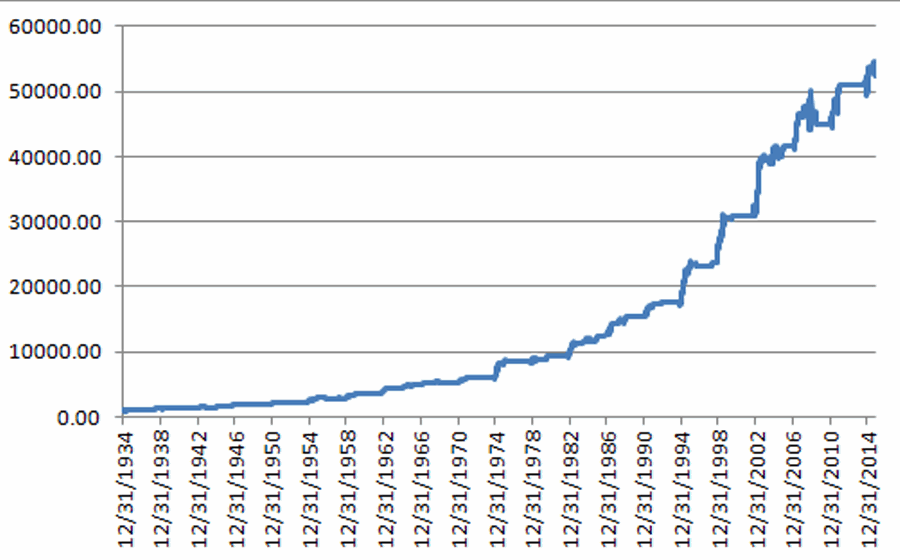
Figure 1 displays the growth of $1,000 invested in the Dow Jones Industrials Average only on those days when the KTI is +5 or higher since 12/31/1934.  No interest is assumed while out of the market. 1Figure 1 – Growth of $1,000 invested in DJIA only while KTI >= +5 (since 12/31/1934)

To better appreciate the lower left to upper right trend displayed in Figure 1, now let’s consider Figure 2.  Figure 2 displays the growth of $1,000 invested in the Dow Jones Industrials Average only on those days when the KTI is +1 or less since 12/31/1934.  Again, no interest is assumed while out of the market. 2Figure 2 – Growth of $1,000 invested in DJIA only while KTI <= +1 (since 12/31/1934)

For the record:

*While the KTI has been +5 or higher the Dow has gain +5,297%

*While the KTI has been +1 or lower the Dow has lost -96%

This difference is what we “quantitative analyst types” refer to as “statistically significant.”

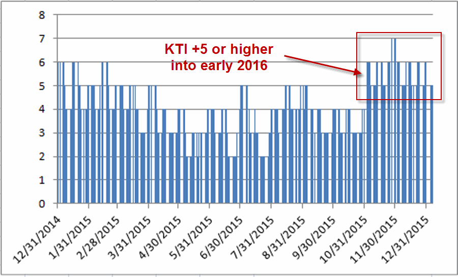
Figure 3 displays the daily KTI readings between now and the first part of 2016.3Figure 3 – KTI Index readings

As you can see, the KTI readings are all +5 or higher, i.e., seasonally favorable, through 1/6/2016.

Summary

So does a KTI reading of +5 or higher guarantee higher stock prices?  Not at all.  Alot of things can wrong between now and then.  Still, based on the historical results displayed in Figure 1, I am giving the bullish case the benefit of the doubt.

Jay Kaeppel

The Santa Claus Option (Trade)

In my last article I wrote about the “Santa Claus Rally”.  One way to play is to buy a stock index mutual fund or ETF.  Another is to trade using options.  Let’s explore this avenue a little more closely.

On 11/21/2014 (the Friday before Thanksgiving week – i.e. the start of the Santa Claus Rally period) a trader wishing to play the Santa Claus Rally might have:

*Bought 100 shares of ticker SPY at $206.68 for $20,668

*Bought 1 January 206 call option at $3.62 for $362

The good news with buying a stock index fund or ETF is that once you buy it, if the index goes up 1% you make 1%.  If you bought say an at-the-money call option and the index went up 1% you might actually lose money on the option due to time decay.  Of course the fact that one trade costs $20,000+ to enter while the other costs only $362 is also an interesting trade off.

So let’s consider an alternative strategy and compare it to simply buying shares of SPY.

For this experiment, Trader A will buy a bull call spread using SPY options and Trader B will buy a “delta equivalent” position in SPY shares.  OK, a little explanation is clearly in order.

“Delta” is a Greek symbol used in options.  For our purposes, the delta of an option tells you roughly the equivalent position in stock shares.  For example, if a particular call option has a delta of 50 that means that buying one call option will give you a position that will behave like a position buying 50 shares of stock.  The big difference is cost, as you will see in a moment.

Jay’s Santa Claus Rally Option Strategy

At the close on the Friday before Thanksgiving:

*Buy the January SPY call option with a Delta closest to 80

*Sell the January SPY call option with a Delta closest to 15

*Exit the trade at the close of the last trading day of the year.


Example of Strategy compared to buying shares of SPY

At the close on the Friday before Thanksgiving:

Trader A:

*Buy the January SPY call option with a Delta closest to 80

*Sell the January SPY call option with a Delta closest to 15

Trader B:

*Will buy a number of SPY shares equal to the delta on Trader A’s option trade above.

For example, if Trader A bought a call option with a delta of exactly 80 and sold an option with a delta of exactly 15, then the net delta for the option trade would be 65 (80-15).  Thus, for comparative purposes, Trader B would buy 65 shares of SPY.

*The trades will be exited at the close on the last trading day of the year.

Example Trades from 2010

Trader A:

*Bought 1 Jan 2011 SPY 112 call @ 9.28

*Sold 1 Jan SPY 127 call @ 0.58

*Cost = $870; Delta = 64

Trader B:

*Bought 64 shares of SPY @ 120.29

*Cost = $7,699; Delta = 64

Both Trader A and Trader B have a position with a Delta of 64 (i.e., if SPY goes up $1 in price both positions should gain $64).  However Trader B put up $7,699 to buy the shares while Trader A put up only $870 to trade the options.

On 12/31/2010:

*SPY closed at 127.39

*Jan 2011 SPY 112 call closed at 14.04

*Jan 2011 SPY 127 call closed at 1.31

Trader A:

*Bought the 112 call at 9.28 and sold it at 14.04

*Sold the 127 call at 0.58 and bought it back at 1.31

*Net gain = $403

*Original cost = $870

*% gain/loss = +46.3% (i.e., $403/$870)

Trader B:

*Bought 65 shares of SPY at $120.29 and sold the shares at $127.39

*Net gain = $349

*Original cost = $7,699

*% gain/loss = +4.5% (i.e., $349/$7,699)

So in this one example, Trader A:

*Made more money ($403 versus $349)

*Committed 88% less capital ($870 versus $7,699)

*Earned a higher % return on capital (+46.3% versus +4.5%)

Does it always work out this way? Not a chance. But you get the idea – i.e., commit far less capital for a roughly equivalent position.

2014 Trade

a

b

c

d

Figure 1 – Santa Claus Option Trade on 11/21/14 (Courtesy www.OptionsAnalysis.com)

2010 through 2014 Comparative Results

For those who are interested the results of this strategy from 2010 through 2014 appear below for illustrative purposes.

aaFigure 2 – The Santa Claus Option Trade versus buying shares of SPY

For the record all back testing was done with the software that I use for all of my option strategy analysis, www.OptionsAnalysis.com

Summary

The stock market has shown a pretty strong tendency to gain ground between the week ending before Thanksgiving and the end of the year.  The option strategy I have detailed here is nothing more than an idea regarding “one way to play” – a way that allows a trader to commit a significantly smaller amount of capital than would be required to buy shares of a mutual fund or ETF, while still enjoying roughly the same upside potential.

Please note that this information is printed for educational purposes only and there is no guarantee that this idea will generate a profit between 11/20/2015 and 12/31/2015.

Jay Kaeppel

Santa Claus is Coming to Town (I Hope!!)

The renowned “Santa Claus Rally” is second only to “Sell in May” in generating a flood of articles from us “market analyst types”.  But I haven’t seen too many Santa Claus Rally articles so far this year so I’ve decided to try to beat the crowd.  Plus “rally time” is (hopefully) just a short ways away.

Different “market analyst types” define the Santa Claus Rally time period differently.  Here is how I define it:

The “bullish” Santa Claus Rally period extends:

*From the close of trading on the Friday before Thanksgiving;

*Through the end of trading on the third trading day of the next calendar year.

So in this case, it extends from the close on 11/20/15 through the close on 1/6/16.

This begs the obvious question: Should we really be putting any faith in way too simple idea?  Let’s let the numbers help you to decide.

The Santa Claus Rally Results

The test below involves holding the Dow Jones Industrials Average only during the time period described above, every year starting in November 1949.

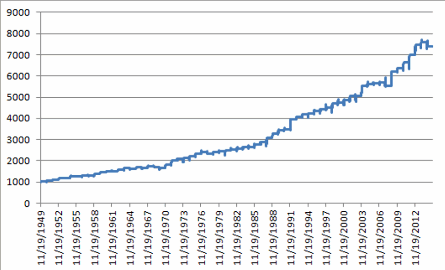
Figure 1 displays the growth of $1,000 on a cumulative basis (no interest is assumed during the times when out of the market).1Figure 1 – Growth of $1,000 invested in the Dow Industrials only during the Santa Claus Rally period each year (11/19/49-11/13/15)

Figure 2 displays the annual results on a year-by-year basis.

Period Ending DJIA % +(-)
1/5/50 3.6
1/4/51 4.0
1/4/52 3.9
1/6/53 4.6
1/6/54 2.9
1/5/55 5.1
1/5/56 0.2
1/4/57 3.7
1/6/58 (0.0)
1/6/59 5.7
1/6/60 5.8
1/5/61 3.2
1/4/62 (1.0)
1/4/63 5.0
1/6/64 5.0
1/6/65 (1.2)
1/5/66 3.0
1/5/67 (0.5)
1/4/68 4.3
1/6/69 (3.1)
1/6/70 (2.4)
1/6/71 10.0
1/5/72 11.6
1/4/73 3.4
1/4/74 2.0
1/6/75 3.6
1/6/76 6.0
1/5/77 3.1
1/5/78 (3.7)
1/4/79 3.6
1/4/80 1.6
1/6/81 1.5
1/6/82 0.9
1/5/83 2.3
1/5/84 2.5
1/4/85 (0.3)
1/6/86 5.7
1/6/87 4.3
1/6/88 6.5
1/5/89 6.2
1/4/90 5.4
1/4/91 0.6
1/6/92 13.9
1/6/93 2.4
1/5/94 2.8
1/5/95 0.9
1/4/96 3.7
1/6/97 1.5
1/6/98 1.8
1/6/99 4.2
1/5/00 1.1
1/4/01 2.7
1/4/02 4.0
1/6/03 (0.4)
1/6/04 9.5
1/5/05 1.3
1/5/06 1.1
1/5/07 0.4
1/4/08 (2.9)
1/6/09 12.0
1/6/10 2.5
1/5/11 4.6
1/5/12 5.3
1/4/13 6.7
1/6/14 1.6
1/6/15 (2.5)

Figure 2 – % Gain/Loss for Dow Industrials during Santa Claus Rally period year-by-year

Figure 3 displays the “Summary” results

Measure Result
Number Times UP 55
Number Times DOWN 11
% Times UP 83.3%
% Times DOWN 16.7%
Average % +(-) All Yrs. 3.24%
Average % +(-) UP Yrs. 4.08%
Average % +(-) DOWN Yrs. -1.62%
Best Up Year (1991-92) 13.90%
Worst Down Year (1977-78) -3.70%

Figure 3 – Santa Claus Rally by the numbers

Summary

In a nutshell, over the course of the previous 66 years the Santa Claus Rally time period has witnessed the Dow generate 83% winners with an average win/average loss ratio of 2.5-to-1.

*The good news is that that is a pretty darn good “real time” track record.

*The bad news is that there is no guarantee that Santa will come through for us this year.

Folks, now more than ever, “We have got to believe!!”

Jay Kaeppel

Updates on Crude Oil and Brazil Option Trades

A lesson in options trading today.  If you are not an “options guy (or gal)” – er, wait, political correctness requires me to restate that – If you are not an “options person”, (phew, that was close) then class is dismissed.  Unless of course you would like to know something more about how to make money when a security remains unchanged or moves only slightly against you.  In which case, read on.

Update #1: Crude Oil (Ticker USO)

On 9/30/2015 I wrote this article detailing a hypothetical trade using call options on ticker USO – an ETF that is intended to track the price of crude oil.

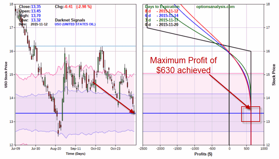
After that date USO rallied pretty sharply for about a week – $14.68 to $16.20.  Since then the bottom has pretty much dropped out again nd as of the close on 11/12 USO was trading at $13.35.  As you can see in Figures 1 and 2 it is time to close this trade as both options have essentially no value left and the maximum profit target has been reached.

1Figure 1 – USO Nov 17-16 Bear Call Spread (Courtesy www.OptionsAnalysis.com)

2Figure 2 – USO Nov 17-16 Bear Call Spread Risk Curves (Courtesy www.OptionsAnalysis.com)

Update #2: Brazil Stock Market (Ticker EWZ)

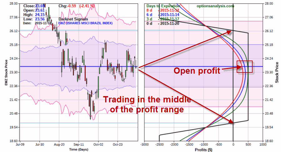
On 10/27/2015 I wrote this article detailing an “iron condor” spread using options on ticker EWZ that tracks an index of stocks in Brazil.   3Figure 3 – EWZ Nov 19-20-26-27 Iron Condor (Courtesy www.OptionsAnalysis.com)

4Figure 4 – EWZ Nov 19-20-26-27 Iron Condor Risk Curves (Courtesy www.OptionsAnalysis.com)

With 8 days left until November expiration this trade has an open profit of $270 (out of a maximum of $510).  As of the close on 11/12 EWZ was trading at $23.69 with breakeven points of $26.17 and $19.83.

Nothing to do here but “sit and wait (and hope, as in hope EWZ doesn’t go crazy in one direction or the other during the next week).

Jay Kaeppel

Daylight is Bad for Gold Stocks (Apparently)

Well, at least as far as I can tell.  To understand what I am talking about consider the following results generated using daily open/high/low/close data for ticker GDX (an ETF that tracks gold mining stocks).

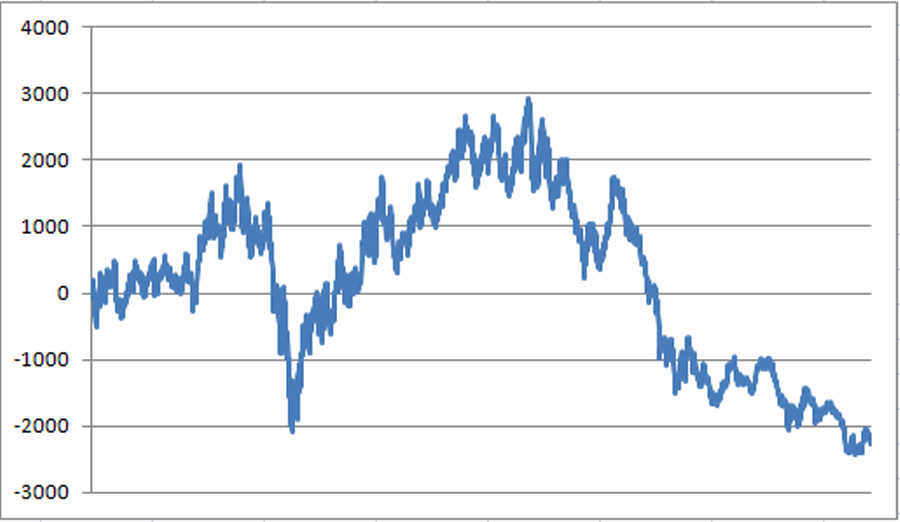
Figure 1 displays the cumulative $ gain/loss achieved by holding 100 shares of ticker GDX since it started trading in May 2006.1aFigure 1 – $ gain/loss from holding 100 shares of ticker GDX since 5/22/06

From May 2006 into September 2011, 100 shares gained $2,940.

Since then it has lost -$5,201 for a net cumulative loss of -$2,261.  So that is our “baseline”.

GDX Overnight

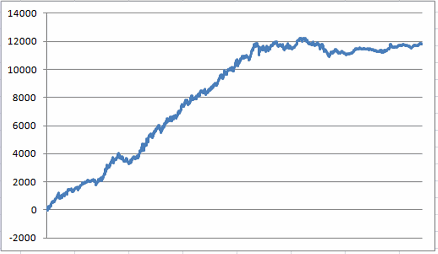
Figure 2 displays the $ growth achieved using the following test.

Test #1:

Buy 100 shares of GDX at the close of trading each and every single trading day.  Sell those shares at the open of the following trading day (this test does not deduct trading commissions.  The sole intention is to display trading results achieved overnight).2aFigure 2 – $ gain/loss from holding 100 shares of GDX from each day’s close until the next day’s open

The net result is a gain of +$11,809.  Through September 8, 2011 the gain was +11,827.  Since then there has been a loss of -$18.

GDX in the Light of Day

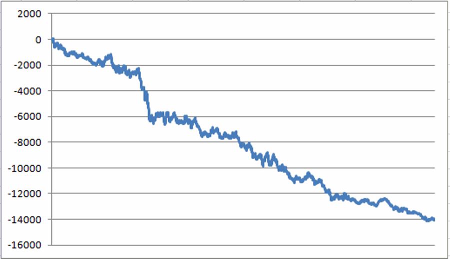
Figure 3 displays the growth achieved using the following test:

Test #2:

Buy 100 shares of GDX at the open each and every single trading day.  Sell those shares at the close of trading the same day.3aFigure 3 – $ gain/loss from holding 100 shares of GDX from each day’s open through the close of the same day

The net result is a loss of -$14,070.  Through September 8, 2011 the loss was -$8,887.  Since then there has been a further loss of -$5,183.

Go figure.

Summary

If you are considering buying gold stocks at the open this morning – you might want to consider sleeping in instead.

Jay Kaeppel

Long Bond Nears Critical Juncture

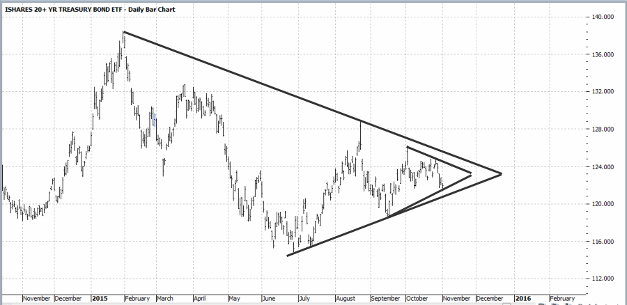
When it comes to trading, I am all about “quantifying” things.  Still, the fact remains that a lot of useful information can be gleaned from simple observations.  Take the chart in Figure 1 for instance.  It displays a daily bar chart for ticker TLT, the exchange traded fund that tracks the 20+ year Treasury bond.

See also (Jay Kaeppel to Speak to MTA Chicago Chapter on 11/10)

[click to enlarge]1Figure 1 – TLT Contracting/Compressing/Coiling/[Your description here] (Source: www.Profit.Source.com)

As you can see in Figure 1, ticker TLT is presently experiencing what we “trader types” refer to as “contraction” (except for those “other trader types” who refer to it as “compression”). Now drawing trend lines on a bar chart is typically as much “art” as it is “science”.  But in this case it is a fairly objective action to draw what (some of us) “trader types” refer to as “triangle inside a triangle”.  In other words, not only has price now contracted into a larger triangle it has also squeezed down into another triangle inside the larger triangle.  Now that’s contraction!

Quite often (though not always, alas) this type of “coiling” (just in case “contraction” or “compression” do not float your boat”) action sets the stage for a significant price move.  Once the triangle patterns are broken bonds could be ready to embark on their next major trend.

The obvious questions are:

“Which way?”

And

“How to play?”

I am not going to make any predictions.  I will simply lay out several potential scenarios for your consideration.

Scenario #1: Wait for a Breakout from the Pattern

One obvious choice is simply to wait for price to break out of the triangle pattern and then trade in the direction of the breakout.  The primary concern here is a potential “whipsaw” – where price breaks out one way and then reverses.  In any event, if you choose this scenario then there is nothing to do right now…..except wait.

Scenario #2: Buy a Straddle

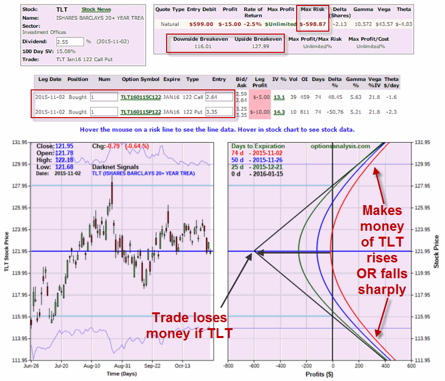
This is NOT a recommendation, just an illustration of one of the choices.  A trader who believes that TLT will break out within the next few months and will make a significant price move might consider buying a straddle – i.e., buying a call and a put option.  An example of this type of trade appears in Figure 2 and involves buying the January 122 call and put.

[click to enlarge]2Figure 2 – TLT Jan 122 Straddle(Courtesy www.OptionsAnalysis.com)

This trade costs $599 and has upper and lower breakeven prices of 127.99 and 116.01 respectively.

Scenario #3: Bet on a Huge Breakout in a particular direction

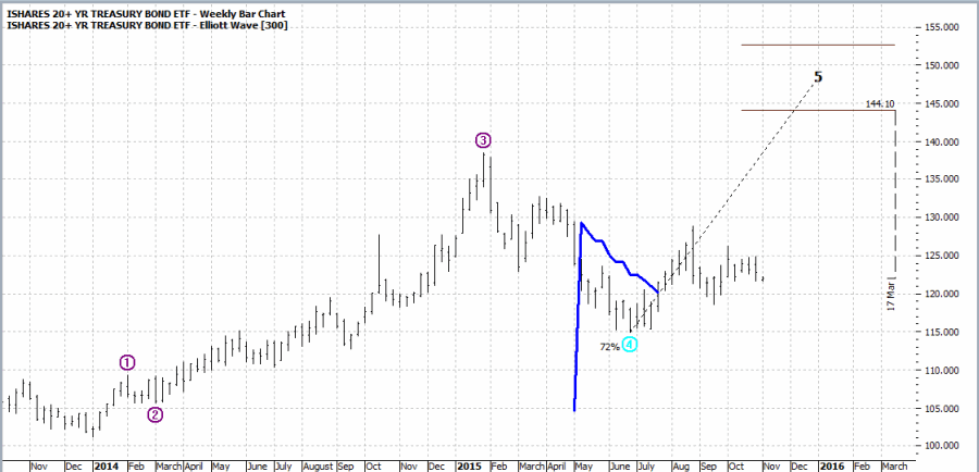
This scenario is for “speculators only”.  In Figure 3 we see that the Elliott Wave projection on the weekly TLT bar chart is pointing to sharply higher prices (be forewarned that these types of “bold” projections have a tendency of not playing out exactly as “projected”.  Still, for a speculator risking a small amount of capital that’s not a deal breaker).

[click to enlarge]3Figure 3 – Weekly TLT Elliott Wave projection pointing higher (Source: www.Profit.Source.com)

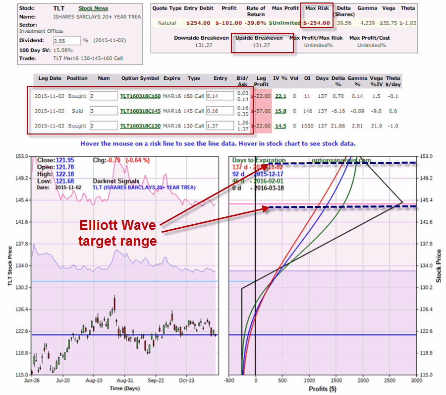
One way to play this potential scenario – without risking much money – is a strategy known as the “Out-of-the-Money Butterfly”.  The trade highlighted in Figure 4 involves:

*Buying 2 Mar 2016 130 calls

*Selling 3 Mar 2016 145 calls

*Buying 2 Mar 2016 160 calls

The details and risk curves for this trade appear in Figure 4.

[click to enlarge]4Figure 4 – TLT Mar 2016 OTM Butterfly(Courtesy www.OptionsAnalysis.com)

As you can see in Figure 4 this trade risks only $254 and enjoys significant upside potential if the price of TLT does in fact fulfill the Elliott Wave projection displayed in Figure 3.  The catch of course, is that anything less than a rip-roaring advance will result in this trade experiencing a loss.

Choose wisely.

Jay Kaeppel