Monthly Archives: September 2015

A “Crude” Setup

Alright if you are not an options trader you are dismissed from class…

…..BUT WAIT!!!!

Before you run off, are you aware that there are limited risk ways to play potential tops or bottoms in things like crude oil and silver….even in extremely volatile markets? If you want to know more, maybe stick around.

(See also Check on Tech in Late October)

Before proceeding I must emphasize that what I am about to show you is an “example” and not a “recommendation.”

A Setup in Crude Oil

As you can see in Figures 1 and 2, both the weekly and daily Elliott Wave counts for ticker USO – an ETF that is designed to track the price of crude oil – are pointing lower.
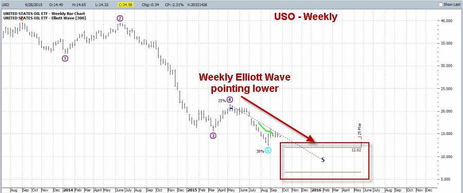
1Figure 1 – Weekly USO Elliott Wave count pointing lower (Courtesy: ProfitSource by HUBB)
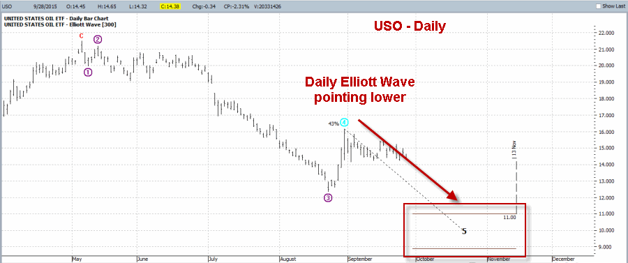
2Figure 2 – Daily USO Elliott Wave count pointing lower (Courtesy: ProfitSource by HUBB)

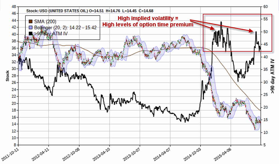
One possibility for a trader who wants to play the bearish side is to sell short shares of USO.  This is the most direct play on lower prices but does involve the use of margin and theoretically also involves unlimited risk. Another possibility is to buy a put option. This can cost very little and enjoys limited risk.  However, as you can see in Figure 3, the implied volatility for options on USO is presently at the high end of the historical range.

What this means to option traders is that there is an above average level of time premium built into USO options, i.e., USO options are “expensive”.  So if you buy a put option and volatility declines you can end up losing money due to volatility induced time premium decay, even if USO declines slightly in price.3Figure 3 – USO implied option volatility is extremely high (i.e., time premium levels are high, i.e., selling options makes sense)  (Courtesy www.OptionsAnalysis.com)
(See also Keep a Close Eye on, Um, the World (?))

A Trade to Take Advantage of USO Setup

The example trade for today is as follows:

*Sell 30 November 16 calls @ $0.47

*Buy 30 November 17 calls @ $0.26

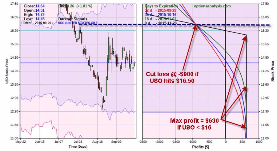
This maximum potential profit on this trade is $630 and the maximum potential risk is $2,370.  However, as we will see in a moment we will make plans to cut our loss at a much lower figure.

Also, with USO trading at $14.64 as this is written, the breakeven price for this trade is $16.21 and the full profit of $630 will be realized if USO is $16 a share or lower as of November expiration.

The particulars appear in Figures 4 and 5.4Figure 4 – November USO Bear Call Credit Spread (Courtesy www.OptionsAnalysis.com)
5Figure 5 – November USO Bear Call Credit Spread (Courtesy www.OptionsAnalysis.com)

Summary

Repeating now, this is an example and not a recommendation.  But for the record, the trade highlighted herein is well suited to profit if the Elliott Wave projections shown in Figures 1 and 2 pan out at all.  The primary concerns with this position are:

A) You are risking roughly $900 (and possibly more) in order to make $630.

B) You must be willing to act to cut your loss if USO does rise above the August high of $16.45.

The good news is that this trade can make money even if USO rises by as much as 10+%.

How will it all play out?  Only time will tell.

Jay Kaeppel

Check on Tech in Late October

Alright things are a bit disheartening out there in the stock market at the moment.  So let’s take a look ahead to a potential bright spot looming in the not too distant future.

See also JayOnTheMarkets.com: Keep a Close Eye on, Um, the World (?)

Believe it or not I am talking about technology stocks.  And why not? I mean who doesn’t like technology (especially when it works!)?  Sure the tech sector can be a scary place when the overall market is headed south.  Still, as it turns out, there is a time for everything.

Technology Seasonality

So why am I bringing up technology now of all times you may ask?  Do I, as a “professional market analyst” foresee “a coming boom” that will propel the majority of tech stocks based on “fundamental improvements” and a “new wave of new age”, well, whatever?  Um, not exactly.  OK, actually, not at all.  For I am a fairly strong adherent of:

Jay’s Trading Maxim #201: It is OK to make all the predictions you’d like regarding the financial markets.  Just don’t be stupid enough to risk a lot of money thinking that you’ll be right (more succinctly: Predicting the future is really hard).

So rather than taking up space spelling out all of my really amazing “predictions” for the world of technology and the profound impact that all of this will have on the performance of technology stocks, let me just put this out there:

Since October 1988:

-$1,000 invested in FSPTX between the close of October Trading Day #19 and February Trading Day #11 (or roughly 26% of all trading days) grew to $8,229 (or +723%).

-$1,000 invested in FSPTX during all other trading days (i.e., from mid-February into late October, or roughly 74% of all trading days) grew to $3,266 (or +227%).

So to put it another way:

-Tech stocks gained +723% during 26% of all trading days (late Oct. to mid Feb.)

-Tech stocks gained +227% during the other 74% of all trading days (mid Feb. to late Oct.)

So my trusty calendar reminds me to check back on tech stocks during late October….and not before then.

Jay’s Seasonal Technology Trading Strategy

Here is one way to play the typical seasonal strength in tech stocks between late October and early February:

-Using FSPTX as a proxy and as a trading vehicle (alternatives discussed later)

-Buy at the close on the 19th trading day of October (10/27/12 this year)

-Sell at the close the following day if FSPTX registers a gain of +12% or more

-Sell at the close the following day if FSPTX register a loss of -15% or more

-If neither target nor stop is hit, sell at the close of February Trading Day #11

Figure 1 displays the year-by-year results.  The years when the 12% profit target was hit are highlighted in green.  The years when the 15% stop-loss was triggered are highlighted in red.

.1

Figure 1 – Year-by-Year Results of Jay’s Seasonal Technology Strategy

All told:

*24 winners (89%)

*3 losers (11%)

*Average trade = +9.1%

*Median trade = +12.4%

*Worst loss = -17.3%

*# times +12% profit target hit = 17

*# times -15% stop-loss hit = 1

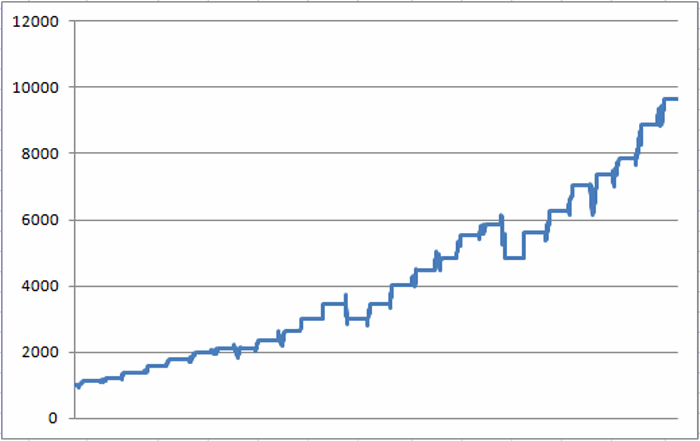
Figure 2 displays the daily equity curve for this system since 1988.

2Figure 2 – Growth of $1,000 using Jay’s Seasonal Technology Trading System (1988-Present)

Trading Alternatives

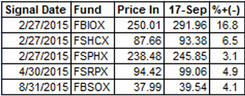
 Because it has certain switching restrictions – and because not everyone has a Fidelity account, it may be useful to consider alternative investment vehicles. Figure 3 lists a few potential choices.  There are others so you might want to do some homework, and just for the record I am not a fan of using leveraged ETFs for most strategies that last more than a few days.  But again, do your own homework before applying a leveraged fund to the strategy I’ve detailed.

3Figure 3 – Technology related alternatives to FSPTX

Summary

Remember that the seasonally favorable period for tech stocks does not begin until the close of trading on October 27th, 2105.  So this is just a “heads up” and I caution you against “jumping the gun”.  Even after October 27th, are technology stocks certain to embark on a meaningful advance?  Certainly not.  Should anyone “bet the farm” on technology stocks based on a reasonably strong seasonal trend?  Same answer.  But these are not the real questions.

The real questions are:

-Does it make sense to risk a reasonable amount of capital on a strategy that has generated 88% winning trades (21 of 24)?

-Even if that strategy involves nothing more than a calendar, a profit target and a stop-loss trigger?

I leave you to ponder your own answer.

Jay Kaeppel


Jay Kaeppel

Keep a Close Eye on, Um, the World (?)

See also Fighting the Urge to Jump into Gold Stocks (For Now)

In the world of technical analysis, there are a lot of techniques that one can consider. One common one works something like this:

1) A security declines sharply in price then bottoms.

2) After the bottom the security bounces higher

3) After the bounce the security turns down again and heads back toward the previously established low.

And then it gets interesting.  Because from there one of a couple of things typically happens.  Either:

4a) The previous low is broken and price begins another meaningful down leg, or;

4b) The previous low holds and a decent rally begins.

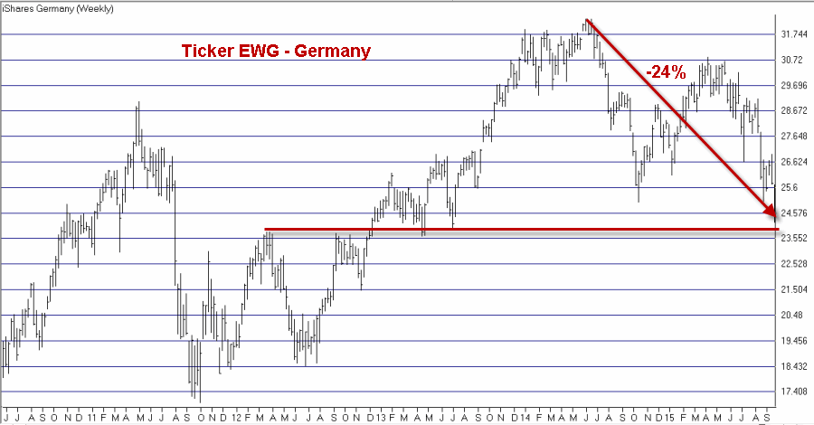
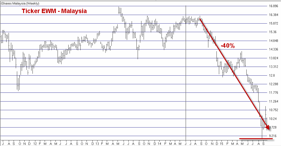
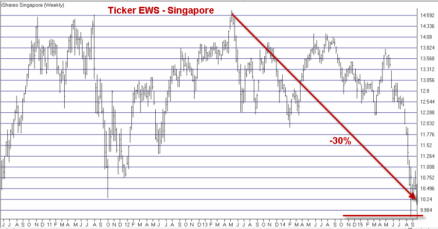
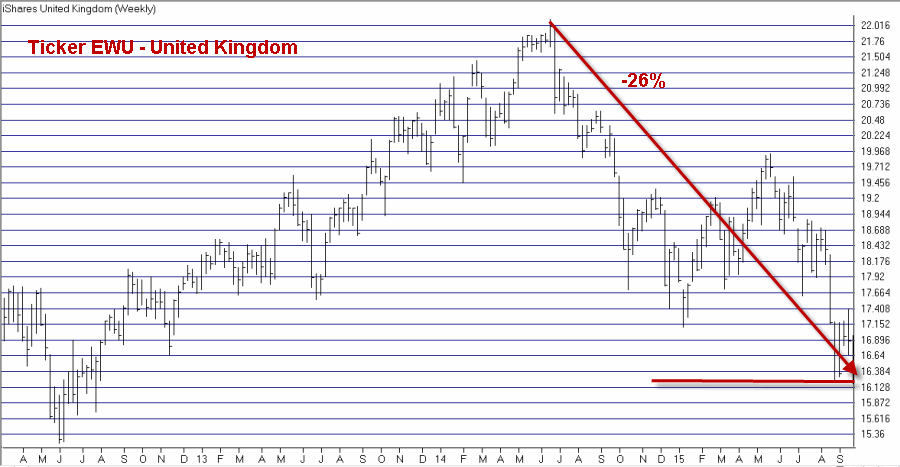
Stock market indexes around the globe are presently in Stage 3 above and headed for Stages 4a or 4b.  What happens from here is extremely important, so I suggest you keep a close eye on things in the near future.

A Glance Around the Globe

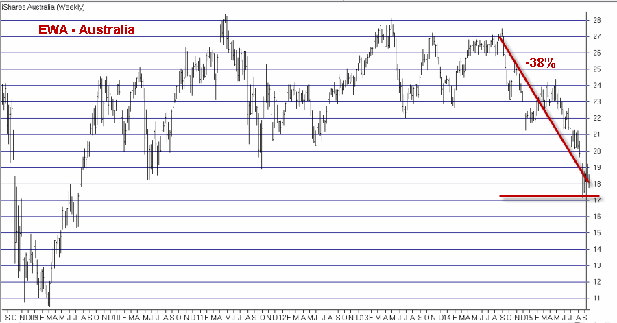
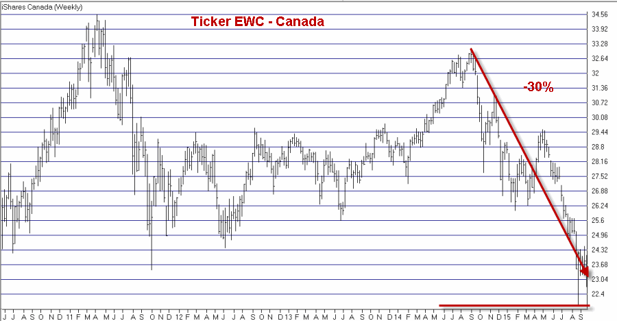
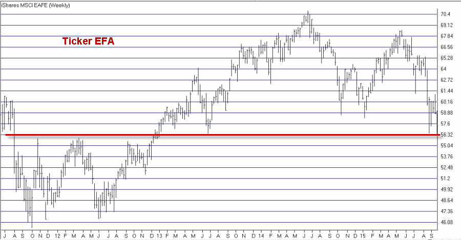
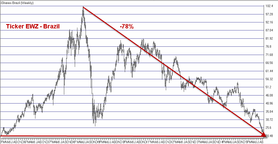
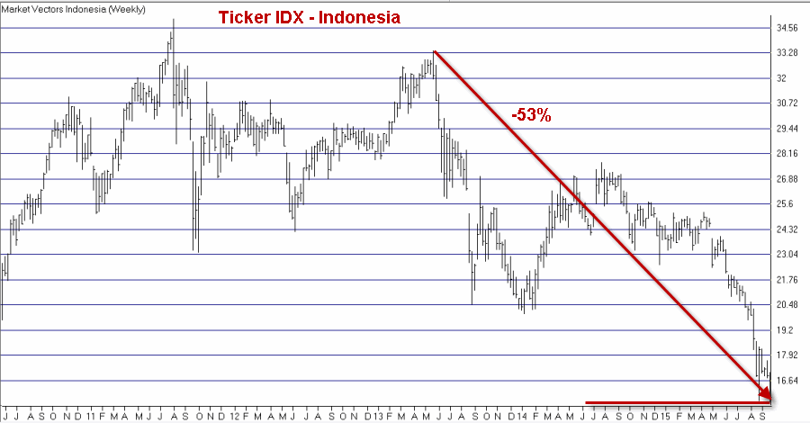
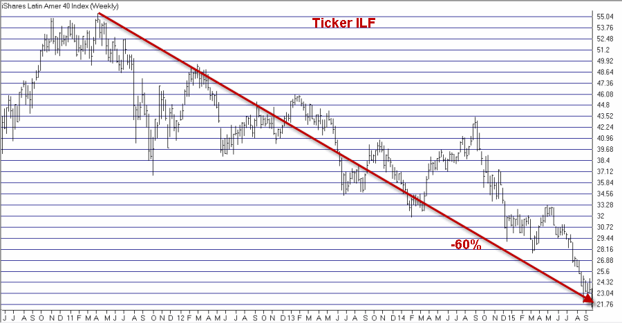
Just for “fun” please scroll through the charts below and for each one note that:

A) They have taken a significant hit

B) They have each a very tenuous “line in the sand” just below current levels.

1ewaFigure 1 – Australia (EWA) (Courtesy: AIQ TradingExpert)

1ewcFigure 2 – Canada (Ticker EWC) (Courtesy: AIQ TradingExpert)

1efaFigure 3 – MSCI EAFE (ticker EFA) (Courtesy: AIQ TradingExpert)

1ewgFigure 4 – Germany (Ticker EWG)(Courtesy: AIQ TradingExpert)

1ewmFigure 5 – Malaysia (Ticker EWM) (Courtesy: AIQ TradingExpert)

1ewsFigure 6 – Singapore (Ticker EWS) (Courtesy: AIQ TradingExpert)

1ewuFigure 7 – United Kingdom (Ticker EWU) (Courtesy: AIQ TradingExpert)

1ewzFigure 8 – Brazil (Ticker EWZ) (Courtesy: AIQ TradingExpert)

1idxFigure 9 – Indonesia (Ticker IDX) (Courtesy: AIQ TradingExpert)

1ilfFigure 10 – Latin America (Ticker ILF) (Courtesy: AIQ TradingExpert)

Summary

I am not too good at “predicting” things so I will not offer an opinion as to what happens next.  The key point I am trying to make here is that we have arrived (in my opinion) at a “critical juncture”.  Either:

A) These major market averages will hold at or above their recent lows and a meaningful rally can ensue,

OR

B) These major market averages will break below their recent lows and then stage a quick reversal, which would likely lead to a meaningful rally

OR

C) These major market average will break down below the red lines drawn on Figures 1 through and things are going to get a whole lot uglier.

So now – i.e., the days and weeks just ahead – is an important time to keep your eye on the, um, balls (?)

Jay Kaeppel

Fighting the Urge to Jump into Gold Stocks (For Now)

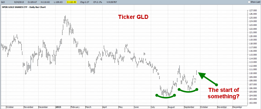
Gold just experienced a nice “pop” to the upside, advancing $20 an ounce on 9/24.0Figure 1 – Is gold turning around?

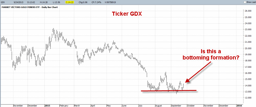
In addition, as you can see in Figure 2, it is possible to argue that gold stocks (using ETF ticker GDX as a proxy) are attempting to form some sort of a “multiple bottom”.0aFigure 2 – Are gold stocks forming a bottom?

Although I agree that there is much wisdom in the “never try to pick a bottom” line of reasoning, the truth is that as an option trader I have no problem with the idea of entering a limited dollar risk trade in hopes of catching a quick windfall if price reverses sharply.

So given the apparent reversal in gold bullion and the potential bottoming action in gold stocks (and the fact that I have always sort of had a “thing” for gold stocks – “Hi, my name is Jay and I am a volatility junkie”, but I digress) I am drawn to the long side of gold stocks.

But for now I am fighting the urge to act.

GDX under the Microscope – Technical

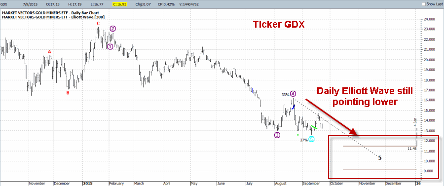
At the moment there are two concerns that are keeping me out of gold stocks – one technical and one seasonal.  In Figure 3 you can see that in the software that I use for Elliott Wave analysis (ProfitSource by HUBB), the daily Elliott Wave count for GDX is still projecting lower prices.2Figure 3 – Daily Elliott Wave count for GDX still pointing lower (Courtesy: ProfitSource by HUBB)

Now the truth is that Elliott Wave counts are a lot like a lot of other technical tools – i.e., there are great when they work.  So I only give a certain amount of weight to any Elliott Wave projection.  Also note this important distinction – in this case I am using Elliott Wave as weight of the evidence to keep me “out” of something and to avoid risking hard earned money on a speculative, counter-trend trade.  That is a far different situation than if I decided to use this particular wave count to actually enter a bearish position in GDX.

GDX under the Microscope – Seasonal

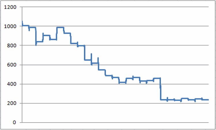
Another reason I am holding off on GDX is the fact that the bulk of October has often been quite unfavorable for gold stocks.  Figure 4 displays the growth of $1,000 invested in Fidelity Select Sector Gold (ticker FSAGX) only from the end of September through October Trading Day #19 every year since 1988.3Figure 4 – Growth of $1,000 invested in FSAGX from end of September through October Trading Day #19 (1988-present)

For the record during this period FSAGX:

*was UP 9 times (33% of the time)

*was DOWN 18 times (67% of the time)

*average UP period = +6.1%

*average DOWN period = (-9.6%)

*Net %+(-) = -76.6%

*# times UP was > +5% = 3

*# times DOWN was < -5% = 12

The bottom line is that early October is very often NOT a great time to be playing the long side of gold stocks.

So please also note that I am not “predicting” anything here – I am simply making a trading decision (or more accurately, a decision NOT to trade) based on the best information I have.

Summary

The “speculative fool” in me is crying out to take some sort of long position in gold stocks.  But the pragmatist in me looks at Figures 1 and 2 and says “there’ll be another opportunity coming along soon enough.”

That guy is just no darn fun at all.

Jay Kaeppel

The Heart of the Problem in Two Charts

First off, let me state that I must give all credit for this article to Gary Gordon who wrote an article titled “13 Economic Charts That Wall Street Doesn’t Want You to See”.

I suggest you read his article in its entirety.

But for my own purposes, I just want to highlight two of the charts in Gordon’s article because I think they represent…

The Heart of the Problem

I don’t suppose this will shock anyone but (in my opinion) the heart of any and all economic problems in America today is the fact that there simply not enough people working.  Period. End of story.  OK, at least in my opinion.

Figure 1 displays the Labor Participation Rate which has been trending steadily lower since the economic peak in 1999.1

Figure 1 – U.S. Labor Participation Rate

Gordon said it best in his article – “94 million potential workers are no longer contributing to the growth of the U.S. economy.”  Think about it – if people are not working they are either:

A) Starving

B) Living off of government largesse (i.e., the taxpayers)

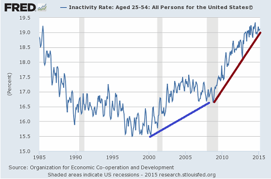
Even more disturbing is Figure 2 which shows the “Inactivity Rate for people in the U.S. age 25-54” – in other words, people who are in their prime earning years.2

Figure 2 – Inactivity Rate for people Age 25-54

As Gordon points out correctly  in his article, this tells us that the declining participation rate shown in Figure 1 is NOT simply a matter of Baby Boomers retiring.

When people who should be at the height of their productiveness are “inactive”, well, all kidding aside. that is a profoundly sad thing.

Summary

Until we (“we” being our government and business, ahem, “leaders”) unleash economic forces that lead to greater job creation, the U.S. economy will continue to chug along at the very best.

And I am sure that whenever they get done doing whatever it is they are doing now, they will get right on this…..

Have a nice day.

Jay Kaeppel

Hoping for the Best (Preparing for the Worst) Part II

This article picks up where this article left off.  Now let’s look at one example way to “prepare for the worst”.

QQQ Out-of-the-Money Directional Butterfly

Now in all candor I find that when I use phrases like “QQQ Out-of-the-Money Directional Butterfly” a fair number of people either stop reading right away or at least tart to “drift off” in terms of concentration.  So for the benefit of those readers let me just say DO NOT STOP READING!!!

The only way to learn to be a better trader and investor is to consider new ideas that maybe don’t initially fit into your “comfort zone.”  That does not mean that you have to accept and utilize every new idea you come across. In fact, if you already have a pretty good approach to the markets then most news ideas “should” ultimately be discarded.  But closing your mind to new trading ideas is a surefire way to, er, “stunt your growth” as a trader.

So here goes:

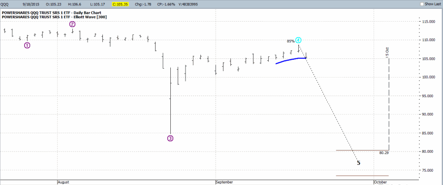
As you can see in Figure 1, the Elliott Wave count for QQQ is signaling the potential for a very sharp decline and soon. aFigure 1 – Elliott Wave count for QQQ projecting lower (Courtesy: Profitource by HUBB)

Here is something important to remember: Just because a piece of software that you use regularly “projects” something, it does not necessarily mean that it will happen.

So here are the important questions regarding the QQQ Elliott Wave projection shown in Figure 5:

Question #1) do you think there is a possibility that QQQ will sell off in the near term?

Question #2)How confident are you that it will fall as far as the projection is, well, projecting (i.e., down to the 73.50 – 80.29 price range)?

Question #3) How much are you willing to risk to hedge against whatever your downside expectations might be?

If by chance your answers to these questions are:

#1) Yes

#2) Maybe, maybe not

#3) Not a whole lot

Then the example trade below may be to interest to you.  This trade involves:

*Buying 2 QQQ November 107 puts

*Selling 3 QQQ November 98 puts

*Buying 2 QQQ November 89 puts

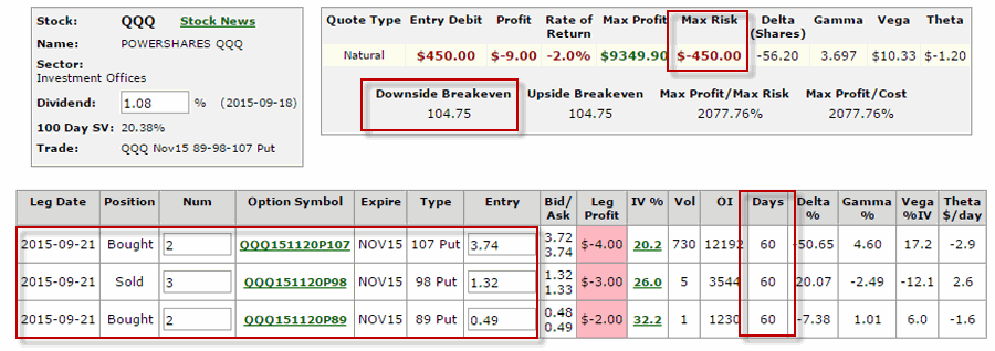
The cost of this trade (to buy one 2x3x2 position) is (or at least, was) $450.

bFigure 2 – QQQ OTM Put Butterfly  (Courtesy www.OptionsAnalysis.com)

As you can see in Figure 2:

*The cost to enter and the maximum risk on this trade is $450

*There are 60 days left until November expiration

*The breakeven price is 104.75 for QQQ (trading at 106.50 as this is written)

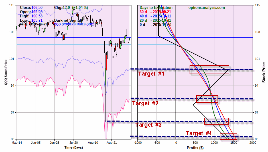
Figure 3 displays the risk curves for this trade.  It also lists four potential price targets as follows:

Target #1: A one standard deviation price decline

Target #2: A 2 standard deviation price decline

Target #3: A retest of the recent low

Target #4: The upper boundary of the Elliott Wave price range projection shown in Figure 1 ($80.29)

Each colored line in the clip on the right hand side of Figure 3 represents the expected $ profit or loss ($ values listed at bottom of right hand clip) for this trade based on:

A) a given price for QQQ (listed on the left-side axis)

B) a given date (dates listed in upper left hand corner of right clip in Figure 3 under “Day to Expiration”)

c1Figure 3 – QQQ Risk curves and potentia price targets (Courtesy www.OptionsAnalysis.com)

As you can see in Figure 3:

*The worst case scenario for this trade is that you hold it until November option expiration, QQQ is above 107 and the trade loses 100% (100% in this case = $450)

*You can see the profit potential for the trade at each target level in Figure 3.

Summary

As always, this is NOT a “recommendation”, only an “example”.  The key points to take away are these:

*The stock market “may” be setting up for a retest (or worse) of recent lows (of course then again, it may not)

*If a trader fears that this is a strong possibility, the trade highlighted here sees as an example of one way to “risk a little” in order to “hedge a lot”.

Jay Kaeppel
 

Hoping for the Best (Preparing for the Worst)

It is Monday morning and the stock market is higher and that’s fine with me.  I like higher stock prices.  In fact, given the recent oversold readings from some indicators there is a chance that we have seen the “bottom” and that the next leg of the bull market is now underway.

However, as I wrote about in this article, I am “concerned” that another down leg – and a potential test of recent lows – may be in the offing for the stock market.  While I claim no ability whatsoever to “predict” the future, I do like to try to be prepared.

Keep a close eye on this current advance.  If it fails – for reasons I will detail in a moment – there is (at least in the opinion of one straining as always to remain objective writer) a chance that things could get ugly fairly quickly.  So my best advice (such as it is) at the moment is:

Pay close attention and be prepared to act

So here is what I see and one way to hedge against just such an event (some of this is updated from this article).

The Current Market Setup

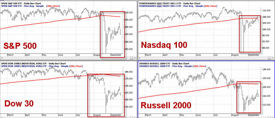
Old Concern #1 – The major market averages are below their respective 200-day moving averages.200masFigure 1 – Major market averages all below respective 200-day moving averages (i.e., the trend is “down”

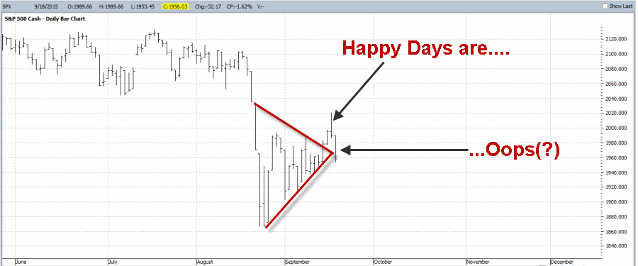
Updated Concern #2 – SPX appeared to break out to the upside from a small triangle and that breakout out may have failed.failed breakoutFigure 2 – A failed upside breakout often (though not always) portends trouble

Old Concern #3 – From the end of September Trading Day #13 (9/18/15) through the end of the month, the Dow has lost ground 40 times in the last 60 years with a net loss of -45%.2

Figure 3 – Growth of $1,000 invested in Dow ONLY after September Trading Day #13 through the end of September (1955-Present)

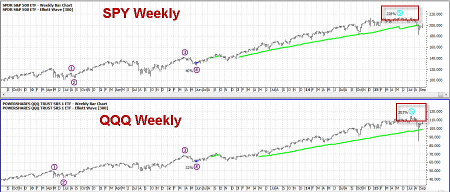
New Concern #4 – Weekly Elliott Wave counts for SPY and QQQ have completed 5 waves up.4Figure 4 (click to enlarge) – SPY and QQQ Weekly Elliott Wave (completed 5 waves up)

New Concern #5 – Daily Elliott Wave counts for SPY and QQQ are signaling the potential for a very sharp decline in the near term.5Figure 5 (click to enlarge) – SPY and QQQ Daily Elliott Wave (projecting sharply lower)

My ability to “predict” the future is essentially non-existent.  However (and fortunately) I can recognize “potential danger” when I see it.  Given the litany above and especially with the major averages all trading below their 200-day moving averages, it is critical to respect the trend and to prepare for a possible retest of recent lows.

That being said, it is also not necessary to “bet the ranch” on the downside.  Investors and traders can use options to “risk a little” to “hedge a lot”.

In my next piece I will highlight an example of one way to “risk a little” to “hedge alot”.

Jay Kaeppel
An Update on Jay’s Pure Momentum Sector Fund System

Today’s article is an update on this oldie but goodie.

When people ask me if momentum investing “works”, at this point – because I am older and (even) crankier than I used to be – I typically refer them to the linked article above and grunt “decide for yourself.”  Sorry, it’s just my nature.

(See also: The Signpost Up Ahead: The September Danger Zone)

So today is an update picking up from the end of 2013.  Repeating from the original article:

In 2001, I published an article in “Technical Analysis of Stocks and Commodities” magazine titled “Trade Sector Funds with Pure Momentum”, which detailed one specific and simple trading method.  While in fact this is only one of many sector trading systems that I have developed over the years – and not necessarily the best one – it remains one of my favorites.  Probably because it is just so gosh darn simple.  When I was young my Momma told me to be a simple kind of man.  Or was it a Freebird she told me to be?  Well, in any event, here are the “simple kind of rules” using Fidelity Select Sector funds:

-After the close of the last trading day of the month identify the five Fidelity Select Sector funds that have the largest gain over the previous 240 trading days.

-For this system, ignore Select Gold (ticker FSAGX).  If FSAGX appears in the top 5 funds then skip it and include the 6th highest rated funds.

-If fewer than five funds showed a gain over the previous 240 trading days, then hold cash in that portion of the portfolio (i.e., if only 3 funds showed a gain, then 60% of the portfolio would be in those funds and 40% of the portfolio would be in cash).

UPDATE FROM ORIGINAL ARTICLE: I have heard from many individuals who cannot easily get access the 240-day change in price action but can easily get access to a simple 12-month change in price action. It is perfectly acceptable to use 12-month instead of 240-trading days.  There will inevitably be some differences but it should not have a meaningful impact on long-term results. So take your pick.

-If you sell more than one fund at the end of a month, then rebalance the proceeds in the new funds being purchased (example, you are selling Funds A and B and buying Funds C and D.  You have $12,000 in Fund A and $10,000 in Fund B.  Split the difference and put $11,000 each into funds C and D).

UPDATE FROM ORIGINAL ARTICLE: I had one individual claim that rebalancing the portfolio every month generated superior results.  This may be true, however, I was unable to replicate the numbers he sent me so under the category of “old dog, new tricks” I have simply stuck the original rebalancing method just described above.  You on the other hand are free to experiment with more frequent portfolio rebalancing.

And that’s all there is to it.

Year 2013

The original article was published on January 6, 2014 and the return for 2013 was reported as +48.0%.  After correcting a few mutual fund data points, it turned out that the actual result was +49.5%.

Years 2014 and 2015 to-date

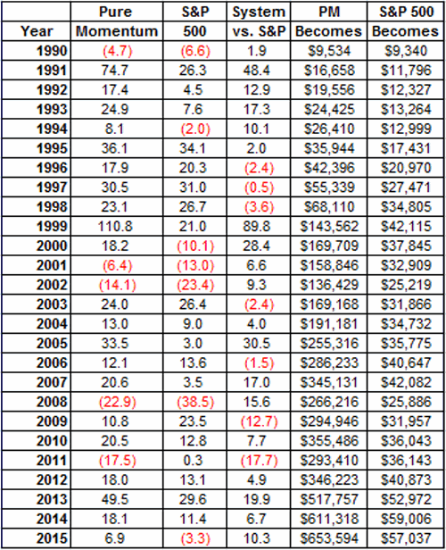
During Calendar Year 2014 the Pure Momentum System gained +18.1%.  Through 9/17/15 the Calendar Year return for 2015 is +6.9%.  This compares nicely to +11.4% and -3.3% for 2014 and 2015 for the S&P 500 Index.

The Current Portfolio

1

Figure 1 – the current Pure Momentum Portfolio

The Important Caveats

The outsized gains registered in 2014 and the fact that the system is “Up” in 2015 while the market is “Down” will certainly curry favor in support of this as a viable investment approach.  Nevertheless, it is important for me to point out – and for you Dear Reader – to acknowledge the bad that comes with the good.

So note that:

*In 2008 this system suffered a roughly 45% drawdown so it by no means an “all weather” method that can “easily ride out bear markets.”

*In 2011 this system lost a whopping -17.5% while the S&P 500 gained +0.3%.  That’s just serious underperformance.

The Overall Picture

Still, if you are able to view and execute this strategy as a long-term approach, since at least 1990 the “good” has overall far outweighed the “bad”.  As you can see in Figure 2:

*$10,000 invested in Jay’s Pure Momentum System has grown +6,436%

*$10,000 invested in Jay’s Pure Momentum System has grown +470%

The disparity in long-term returns from this mechanical system versus simple buy-and-hold is what we “quantitative analyst types” refer to as “statistically significant.”2

Figure 2 – Year-by-Year “Jay’s Pure Momentum” versus SPX Buy-and-Hold

Disclaimers:  Past results in no guarantee future results.  All figures presented in this article are generated using data from sources that are assumed to be accurate.

Jay Kaeppel
The Signpost Up Ahead: The September Danger Zone

Investors may soon take a “Ride into the Danger Zone” as the middle of September passes into late September.   There are several reasons to be wary.  In terms of overall Dow performance the month of September ranks #12 (out of 12).  Also – and as we will see in a moment – performance often gets worse as the month wears on.  While there is no guarantee that things will end badly this time round, it does make sense to recognize the potential danger and to prepare accordingly.

More specifically, present concerns include:

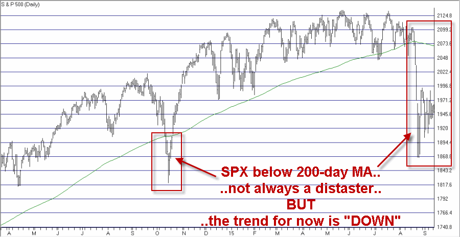
1) The S&P 500 is below its 200-day moving average

As you can see in Figure 1, there is no reason to panic as sometimes a price break below the 200-day average is just temporary.  But the fact remains that major bear markets play out with price below the 200-day moving average.  So for the moment, the trend is “down” and investors (and traders) should respect the trend.

0Figure 1 – SPX below 200-day moving average (Courtesy: AIQ TradingExpert)

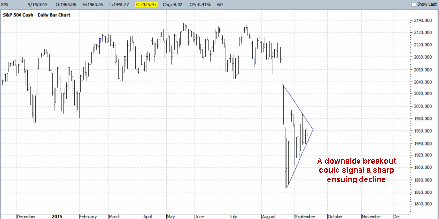
2. Triangle pattern forming

As you can see in Figure 2, price action for SPX is forming an ever tighter triangle formation.  Investors and traders should pay close attention to see if price breaks to the downside.  If it does breaks out to the downside between now and the end of September, extreme caution is then in order as a sharp decline could unfold quickly.

1Figure 2 – SPX Triangle – Which way the breakout? (Courtesy: ProfitSource by HUBB)

Historical Dow Performance after September Trading Day #13

Between the end of September Trading Day #13 and the end of the month, the performance of the Dow has been very poor over the past 60 years.  To wit, see Figure 3 which displays the growth (?) of $1,000 invested in the Dow Jones Industrials Average only between the close of September Trading Day #13 and the end of September, every year since 1955:

2Figure 3 – Growth of $1,000 invested in Dow ONLY after September Trading Day #13 through the end of September (1955-Present)

For the record:

*$1,000 invested in the Dow only between the end of September Trading Day #13 and the end of the month declined to $553 (a loss of -44.7%)

*# Times UP = 20 (33.3% of the time)

*# Times DOWN = 40 (66.7%)

Average UP period = +1.23%

Average DOWN period = (-2.05%)

# Times UP period gain exceeded +2% = 3

# Times DOWN period loss exceeded -2% = 16

# Times UP period gain exceeded +3% = 1

# Times DOWN period loss exceeded -3% = 10

Summary

The good news is that there is no guarantee that the stock market will fall between now and the end of September.  The bad news is that it does have a pretty ugly history of doing just that.  For the record, the 13th trading day of September 2015 is 9/18/2015.

With the price trend currently “down” and a history of “falling hard” during this time period, a break out to the downside from the current triangle forming in SPX should not be ignored as a warning sign of a “clear and present danger”.

While I am hopeful that the market will break to the upside, and that none of these concerns will matter, the truth for now is that – in the immortal words of Dorothy Gale – “I’m frightened Auntie Em, I’m frightened.”

Jay Kaeppel
You Think the Energy Sector Looks Bad Now? Stick Around…

Well if you follow the markets at all then you certainly don’t need me to tell you that the energy sector has been pummeled over the past 14+ months.

(See also Life Beyond Buy and Hold)

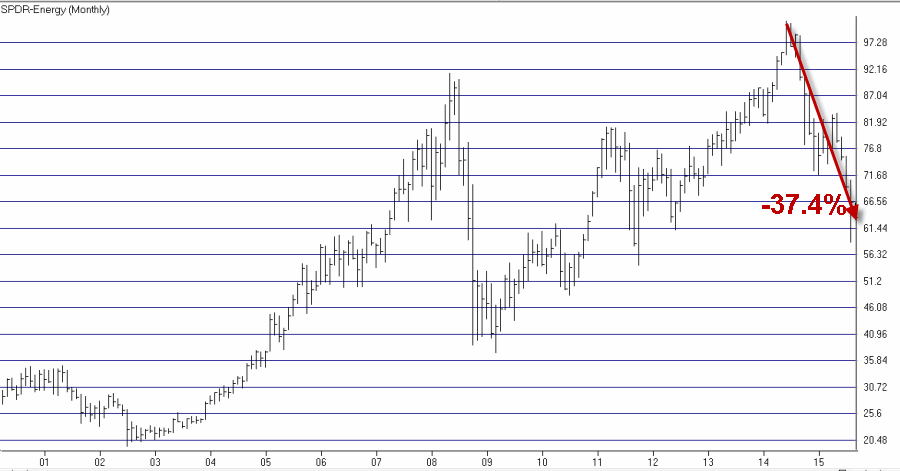
As you can see in Figure 1 (unless you are the squeamish sort, in which case may I suggest you simply avert your eyes and pick up reading after Figure 1…Oh, and definitely do NOT look at Figure 2), ticker XLE – an ETF that tracks stocks in the energy sector – has lost over 37% of its value since the high in June 2014.1Figure 1 – Energy sector stocks (ticker XLE) have taken a beating (Courtesy: AIQ TradingExpert)

There is a great deal of speculation regarding the outlook for energy stocks – both in the near-term and going forward.  If you scan the internet you can find compelling arguments of why energy stocks are now a bargain – and equally compelling arguments that much worse is still to come.

I don’t have any “predictions” to offer. I mostly just stick to trying to identify the trend “right now” (which by the way works pretty well) and look for clues from the past as to what the future “may” hold.  While the energy sector has bounced off of a low in recent weeks there can be little argument that on a trend-following basis, the sector is still in a downtrend.

In addition to this, consider the following seasonal trend for energy stocks.

A Bearish Seasonal Trend for Energy Stocks

Energy stocks have demonstrated a tendency to perform poorly between:

*The end of September Trading Day #10 (in this case, September 15, 2015)

*The end of November Trading Day #14 (November 19, 2015).

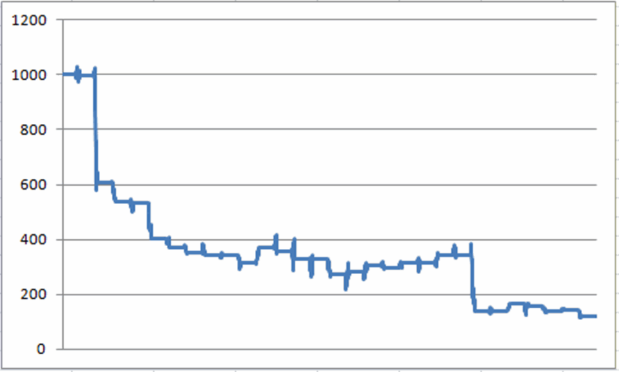
How poorly, you ask?  To measure historical results we will use Fidelity Select Energy Services (ticker FSESX) which started trading in December 1985.  The growth of $1,000 invested in FSESX only between September Trading Day 10 and November Trading Day #14 every year starting in 1986 is displayed in Figure 2.2Figure 2 – Growth of $1,000 invested in FSESX only from Sep Trading Day 10* through November Trading Day 14* (1986 to present)  (*As of close on designated trading day of the month)

For the record:

*$1,000 declined to $120, or a net return of -88%

*$1,000 invested in FSESX on a buy and hold basis grew to $7,994, a gain of +699%

*$1,000 invested in FSESX during all days EXCEPT this unfavorable period grew to $66,595, a gain of +6,560%

Figure 3 displays the annual gain or loss achieved by FSESX during the unfavorable September TD 10 through November TD 14 period each year since 1986.

1986 (0.1)
1987 (39.1)
1988 (11.9)
1989 (1.0)
1990 (24.0)
1991 (7.7)
1992 (5.2)
1993 (2.9)
1994 (0.4)
1995 (7.5)
1996 17.0
1997 (3.4)
1998 (7.7)
1999 (0.1)
2000 (17.5)
2001 4.2
2002 7.1
2003 (3.1)
2004 6.8
2005 0.4
2006 8.5
2007 (0.1)
2008 (60.1)
2009 0.6
2010 20.6
2011 (5.9)
2012 (11.9)
2013 2.9
2014 (15.2)

Figure 3 – Energy “Unfavorable” period year-by-year

For the record:

*This period showed a gain 9 times (31% of the time)

*The average gain during these 9 years was +7.6%

*This period showed a loss 20 times (69% of the time)

*The average loss during these 20 years was -11.2%

Summary

So are energy prices certain to plunge between now and mid-November?  Certainly not. As badly beaten down as energy stocks are a new bull market could begin at any moment.

However:

*The trend at the momeht is inarguably “down”, and

*The seasonal tendency for the next two months has not historically been favorable.

We all make choice as investors and traders and we have to live with those choices.  At this point I am OK with waiting a little while longer before looking to play the long side of the energy sector.  If a big rally unfolds in the meantime, so be it.

The current trend of energy stocks and the historical performance of energy stocks during late fall suggest that a little bit of patience may be in order.

Jay Kaeppel