Monthly Archives: April 2015

Biotech – Buying Opportunity or the End-of-the-Line?


If you want to talk “performance”, it’s pretty tough to beat that of biotech stocks in recent years. A quick glance at Figure 1 – a monthly bar chart for ticker IBB, the iShares biotech ETF – is sure to leave many investors shaking their heads wondering “how the heck did I not get in on that?”1Figure 1 – Ticker IBB Monthly (Courtesy: AIQ TradingExpert)
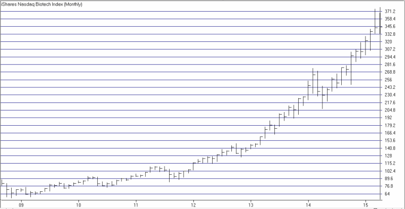
It doesn’t get much better than that.

Are the Good Times Really Over for Biotech?

Still, perspective is always in the eye of the beholder (no wait, that’s “beauty”.  Well, you get the idea). A glance at Figure 2 – a daily bar chart for IBB – clearly shows a stock that has lost momentum and seemingly “run out of steam”.2Figure 2 – Ticker IBB Daily with MACD and Rate-of-Change indicators (Courtesy AIQ TradingExpert)
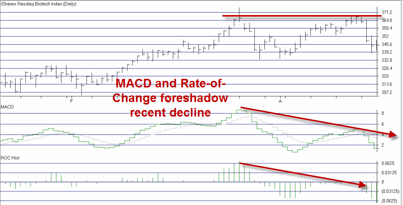
So is this finally “The Top” for biotechs? Well, it’s possible. But as a good little trend-follower, there is at least one other way to view recent biotech action.

A Buying Opportunity in Biotech?

Figure 3 displays ticker IBB along with my RSI Everything Indicator and a 200-day moving average. RSI Everything readings of -32 or less have highlighted a number of good buying opportunities in the recent past.3Figure 3 – Ticker IBB with 200-day moving average and RSI Everything readings under -32 (Courtesy AIQ TradingExpert)
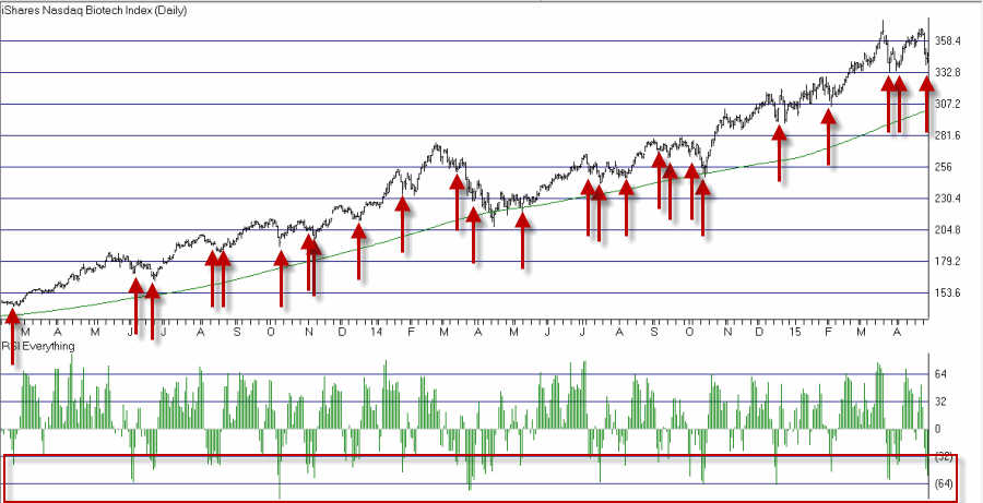
Sometimes the -32 reading has been a little “early” and a further decline followed. But on many occasions the -32 reading proved to be an excellent time to buy biotech.

Factoring in Seasonalilty

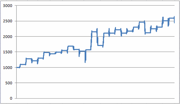
Biotech stocks (with performance measured using Fidelity Select Biotech, ticker FBIOX) have showed a tendency to perform well between the end of the 5th trading day of April and the 4th trading day of June.

The growth of $1,000 invested in ticker FBIOX only during this period since 1989 appears in Figure 4.4Figure 4 – Growth of $1,000 invested in ticker FBIOX from April Trading Day 5 through June Trading Day 4 (1989-present)
What To Do, What To Do?

The clear take away from the information shown so far is simple: there is no way to know for sure if the recent top in biotech was “the Top” or if the recent decline is a buying opportunity. But given the recent history of IBB and the slightly favorable seasonal trend, there is a way to play for a trader who at the very least feels that biotech is not about to collapse”

Figures 5 and 6 are generated from www.OptionsAnalysis.com and display a strategy known as a “bull put spread” using options on ticker IBB. Two important points should be made up front:

1. This is not a “Recommendation”. It is intended to serve only as an example of “one way to play the game.”

2. Options on ticker IBB have some seriously wide bid/ask spreads. This trade assumes that, a) a limit order was used and managed to get filled, b) at the midpoint of bid/ask spread for the two options used in the trade.

*This trade involves selling the June 315 put and buying the June 305 put.

*The profit potential for a 1-lot is $150 (or 17.65%)

*The maximum risk is $850

*As this is written ticker IBB is trading at $344.81 and the breakeven price for this position is $313.50.5Figure 5 – IBB June 315-305 Bull Put Spread (Courtesy: www.OptionsAnalysis.com)
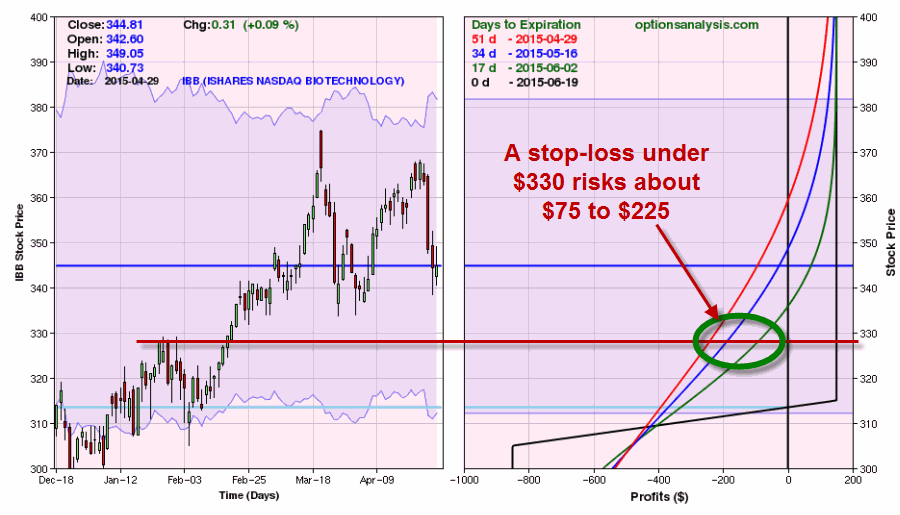
6Figure 6 – IBB June 315-305 Bull Put Spread (Courtesy: www.OptionsAnalysis.com)

While the maximum risk on this trade is $850, a close look at Figure 6 reveals that a trader could presumably cut is or her loss at a much lower amount. For example, if a trader decided to exit the position if IBB falls under say $330, the expected loss would be somewhere between $75 and $225, depending on whether the break occurs later or sooner.

A trader could also consider giving biotech a “wider berth” and hold on unless and until IBB drops below the 315 strike price.    In that case the risk would be roughly $400 (Reminder for Traders: these are decisions that should be made BEFORE you enter a trade, not during the “heat of battle”).

Summary

The reason that markets “fluctuate” is because different investors and traders can view the exact same situation in different ways. As we have seen here, it is possible to make a good case that the long, large advance in biotech stocks has finally run out of steam. It is also possible to make a good case that the recent decline in biotech stocks is just another buying opportunity.

We have also seen that it can be possible – via the use of options – to make money as long as biotech stocks don’t completely come apart.

At least, that’s how I see it.  How about you?

Jay Kaeppel
A Simple Stock Market Hedge (Part 2)


In Part 1 I wrote about a simple hedging strategy known as the Out-of-the-money (or OTM) put butterfly spread.

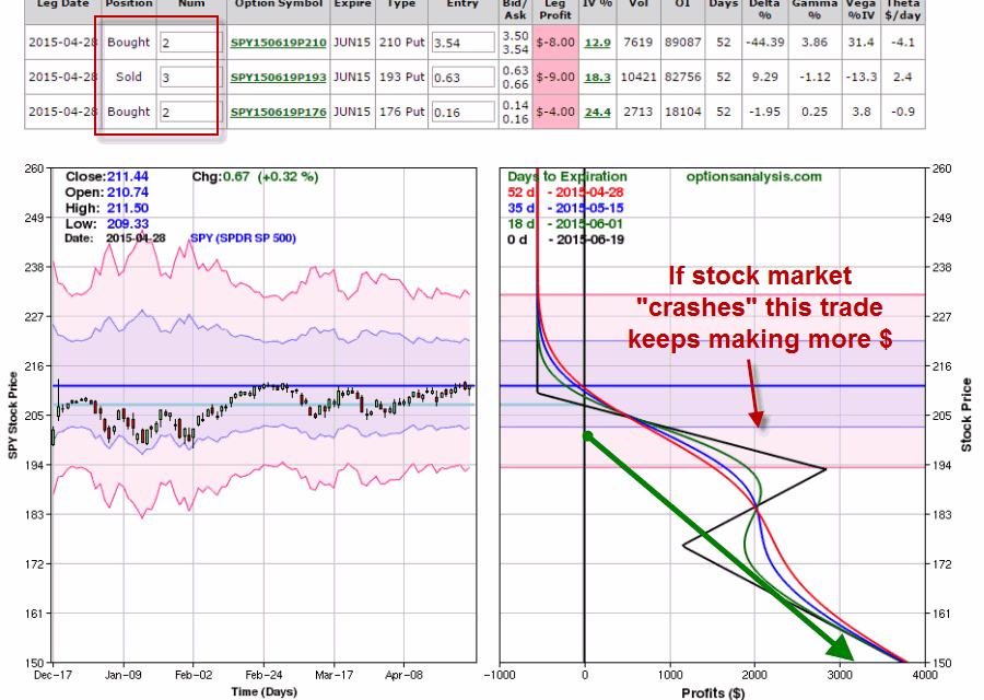
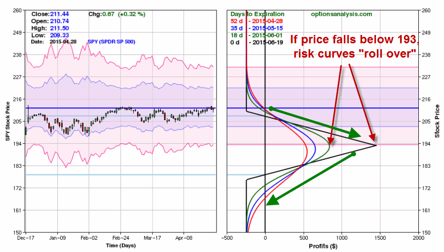
In the example I showed the trade reached its maximum profit if ticker SPY declined in price by two standard deviations.  There is one additional point to be made regarding this strategy: Once that maximum profit potential price is reached a trader should consider taking profits or adjusting the trade.  To understand why please see Figure 1.1Figure 1 – SPY OTM Put Butterfly “rolls over” at $193 per share (Courtesy: www.OptionsAnalysis.com)

As you can see in Figure 1, while profits climb as price declines between 210 and 193, once price falls below 193 the profit profile “rolls over” and starts to head back down.  So a trader who enters into any directional butterfly type spread needs to pay attention to the trade while it is open and be prepared to act if price reaches the middle strike price for the butterfly spread.

“Open Ending” Profits

For a trader who is willing to put more money into a trade there is a simple alternative that creates an OTM butterfly that enjoys unlimited profit potential.  Figure 2 displays the same position as above (long June 210 put, short June 193 put and long June 176 put).  However in this case:

*Instead of a long 1 210, short 2 193 and long 1 176 position

*The trade holds a long 2 210, short 3 193 and long 2 176 position

The risk curves for this new trade appears in Figure 2.

2Figure 2 – SPY Directional (2 x 3 x 2) butterfly spread (Courtesy: www.OptionsAnalysis.com)

Instead of $244 for a 1 x 2 x 1, this 2 x 3 x 2 position would cost $551.  The key difference however is that the trader holding the 2x3x2 position does not have to be concerned about SY falling “too far” and turning a winning trade back into a loser as is the case with the 1x2x1 position in Figure 1.

Summary

So which position is better – 1x2x1 or 2x3x2.  As you might expect me to say, there is no “correct” answer.  If you think:

A) A standard “market correction” is in the offing

B) Are looking for a “cheap hedge”

C) Are willing to act if price reaches middle strike price

D) And/or if you don’t expect the middle strike price to be reached

Then the 1x2x1 is an excellent choice.

On the other hand, if your goal is to hedge against “something worse” – i.e., a deep sell off or even a market “crash” then the 2x3x2 affords you unlimited profit potential and alleviates any concerns about  your position “rolling over” and turning back into a loss – at a price.

Jay Kaeppel
A Simple Stock Market Hedge


If you scan the internet for ideas on the stock market it is virtually impossible to not come across something that warns that “the stock market is topping” and that “an impending market collapse is just around the corner”.  And we are told we should engage in “hedging.”  “Hedging” is a code word typically used in place of the phrase “I’m scared to death that I’m going to lose my a$%, but I am equally afraid of selling everything and risking getting left behind.”

It’s a complicated world we live in, no?

The Out-of-the-Money Butterfly Spread

In “option jargon”, an OTM butterfly spread involves:

*Buying, well, an out-of-the-money put option (what else?)

*Selling two lower strike price put options

*Buying on even lower strike price put

The idea behind this strategy is to risk a relatively small dollar amount but to also have the potential to make money quickly if your perceived worst case scenario unfolds.

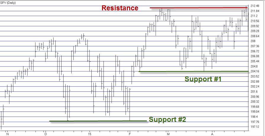
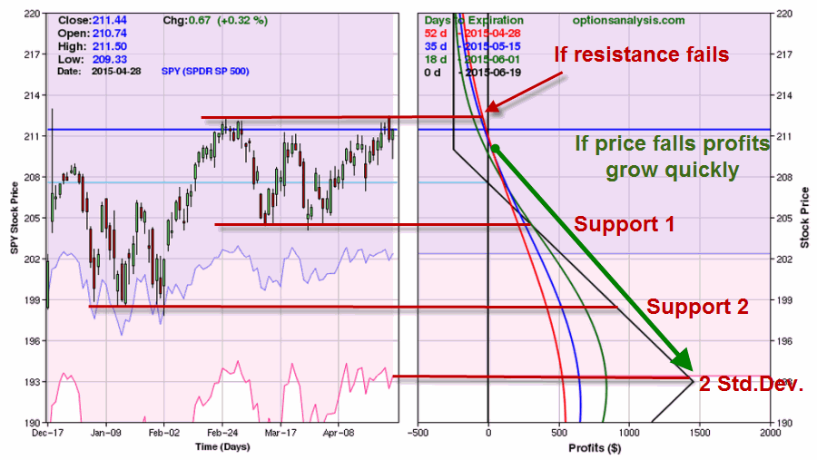
Figure 1 displays ticker SPY. Technical analyst might argue that a multiple top formation has been formed and that the upper red line on the chart could act as “resistance.”  On the downside there are two potential “support” areas displayed.

1Figure 1 – Ticker SPY with potential support and resistance levels (Courtesy: AIQ TradingExpert)

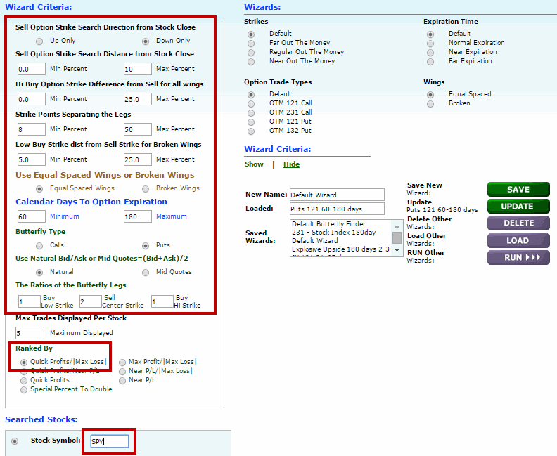
So a trader may desire to hedge against a decline down to one of those resistance levels, but may not want to risk a lot of money.  So let’s turn to www.OptionsAnalysis.com and the built in OTM Butterfly Finder routine.

The input screen appears in Figure 2.2Figure 2 – OTM Butterfly Finder Input screen at www.OptionsAnalysis.com

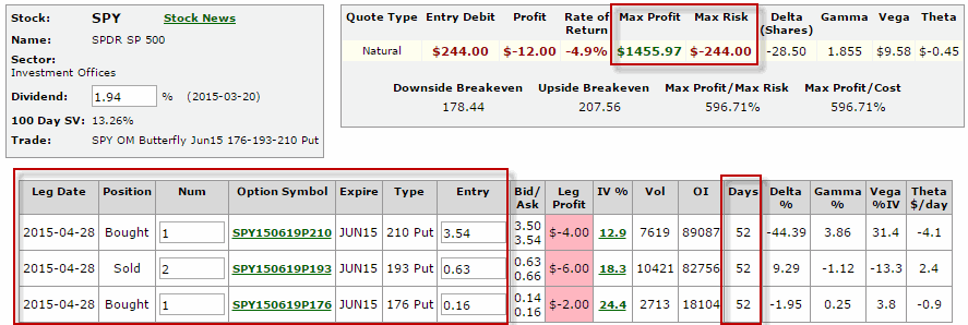
Figures 3 and 4 display the details of the top ranked OTM Put Butterfly for ticker SPY.3 Figure 3 – SPY Jun 210-193-176 OTM Butterfly  put  spread (courtesy: www.Optionsanalysis.com

4Figure 4  – Risk curves for SPY Jun 210-193-176 OTM Butterfly  put  spread (courtesy: www.Optionsanalysis.com

The four colored lines on the right-hand side of the chart in Figure 4 displays the profit/loss expectations for this trade at different price levels for SPY on four different dates leading up until June option expiration.

The Outlook

Please note that I am not “predicting” a stock market pullback here.  I am merely highlighting an example of a potential hedge position that:

A) Risks only a maximum of $244.

B) Might be exited with an even smaller loss if price breaks out above resistance prior to expiration.

C) Can generate a profit of $250 to $350 if price falls to Support 1.

D) Can generate a profit of $400 to $900 if price falls to Support 2.

E) Can generate a profit of $500 to $1400 if price falls 2 standard deviations.

Summary

Hedging can feel at times like a “lose/lose” proposition.  If the thing you are hedging against (for example a decline in the stock market) does not occur you may come away feeling like you wasted money by entering into a hedge position.  Likewise, if the thing you are hedging against does occur, in many cases your hedge will cover only a portion of your portfolio loses, thus while you may be glad you hedged, in the end you still may have suffered an overall loss.

As a result, it is important to remember:

Jay’s Trading Maxim #202: The first rule of hedging is “risk a little to cover a lot.”

Whether the example trade I’ve highlighted here ultimately makes money or not is not the key point. The key point is that (at least in my troubled mind) it is a “good hedge” regardless of whether or not it ends up making money for the simple reason that is does what it is supposed to do – i.e., risk a little to hedge against a decline in the stock market.

See Part 2 of A Simple Stock Market Hedge

Jay Kaeppel
Ford Part 2: How to Avoid Losing 99.3% in Ford

The Good News is that the results I am about to show you will quite possibly leave you stunned and amazed.

The Bad News is that I am not entirely sure that it will actually do you any good.

In my last article I noted that during the months of August, September and October, Ford stock has lost roughly 95% since 1973.  Well as it turns out, if we take an even deeper look “under the hood” (Oh God, not again with the bad car puns!) things get even more “revved up” (Argh!).

Difficult Days (of the Month) for Ford

First let me state for the record that, Yes, I am aware that I can be accused of “curve-fitting” with what I am about to show you next.  Still, the trends have been so persistent over the last 40+ years (and I have to write about something) that I can’t help but to think that there is “something there” (although in all candor I can’t for the life of me figure out what that something might be).

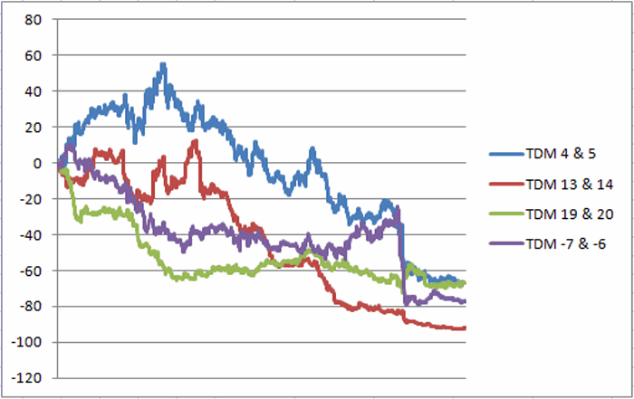
For this test we will look at each trading day of the month sequentially and note the cumulative performance of Ford stock on that particular trading day of the month.  In particular:

*Trading Days 4 and 5

*Trading Days 13 and 14

*Trading Day 19 and 20

*Trading Days -7 and -6

Trading Days -7 and -6 are arrived at by counting backwards from the last trading day of the month (which is Trading Day -1).  During many months Trading Days 13 and 14 may overlap with Trading Days -7 and -6. For now and for illustrative purposes we will look at these two periods separately.

Figure 1 display the cumulative percentage gain or loss (with a big emphasis on the word “loss”) achieved by Ford stock on these particular trading days of the month.1Figure 1 – Cumulative % return for various Trading Day of the Month Periods; Ford stock 1973-2015

For the record:

*Trading Days 4 and 5 = (-66.8%)

*Trading Days 13 and 14 = (-92.2%)

*Trading Day 19 and 20 = (-67.2%)

*Trading Days -7 and -6= (-77.2%)

These returns (or perhaps I should say “lack of returns”) are what we “Quantitative Analyst types” refer to in our highly technical terms as “not very good.”

The “No Go Zones” for Ford

So let’s try this: Forgetting for the moment slippage and commissions, what if an investor had started with $1,000 in 1973 and invested in Ford stock only during these “not very good”?

The results appear in Figure 2 (although if you are the least bit squeamish you might wish to avert your eyes at this point).

2Figure 2 – Growth of $1,000 invested on Ford stock only during “Bad Day” of the month (1973-2015)

For the record:

*5-year rolling rates of return showed a loss 92% of the time and a gain just 8% of the time.


*The original $1,000 invested this way since 1973 would now be worth $6.61.  That represents a loss of -99.3%.

Which is the kind of “return” most investors try to avoid.

Summary

I mentioned earlier that I wasn’t sure that this information would actually do you any good.  Just to make the point, to be out of Ford stock during all of the days listed earlier and in Ford stock all of the rest of the time involves somewhere in the range of 75 or so trades per year.  So obviously not for everyone.

Still, -99.3% is -99.3%

Jay Kaeppel
How to Avoid Losing 95% in Ford

No, we’re not talking resale value here (in which case losing 95% of your original investment is a distinct possibility).  We are talking about stock ownership.  In a nutshell, the answer is fairly simple:

*It is OK to drive a Ford in late summer into fall.  But it is NOT OK (apparently) to own Ford stock during late summer into fall.

The History

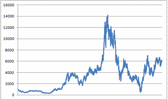
In Figure 1 you see the growth of $1,000 invested in Ford stock on a buy-and-hold basis since January 1, 1973 (“When a Ford and a Chevy would still last 10 years like they should”; a spontaneous Merle Haggard Moment.  Sorry.)1Figure 1 – Growth of $1,000 invested in Ford buy-and-hold since 1/2/73

As you can see, there were a few, um, ups and downs along the way.

But now let’s – please forgive me for this one, but you didn’t really expect me to pass it up did you….

Take a Look Under the Hood

For reasons that I wish I could explain – and yes, there is a part of me that wants to weave some BS explanation, but alas, nothing particularly plausible comes to mind – the three-month period comprised of August, September and October have been – for lack of a better phrase – a “wreck on the side of the road.”

The Summary numbers appear in Figure 2. 2

Figure 2 – Ford performance during July 31st through October 31st every year since 1973

As you can see in Figure 2, this 3-month period has seen Ford decline 63% of the time.  And the average loss was 1.36 times the average gain. Clearly not good numbers, but when presented in this form one may come away thinking “bad, but not terrible”.

Wrong, carburetor breath!

A Picture is Worth, Um, A Thousand Miles (?)

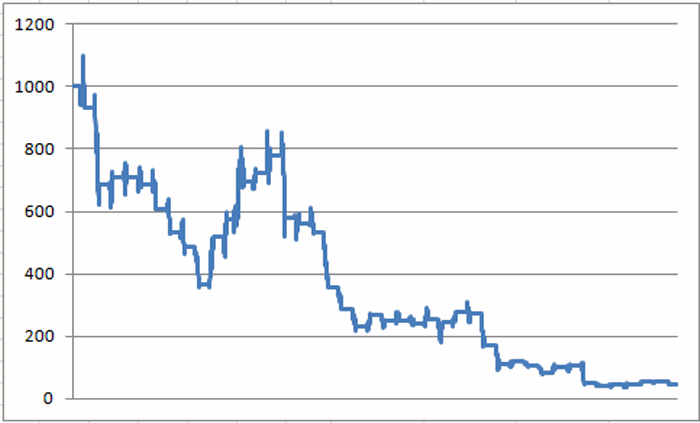
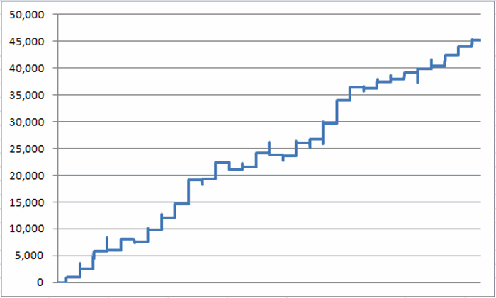
In Figure 3 we see the cumulative performance of $1,000 invested in Ford stock only during the months of August, September and October starting in 1973.

Even a crash test dummy wouldn’t be willing to ride this one out.3Figure 3 – Growth of $1,000 invested in Ford stock only during August, September and October (1973-2014)

For the record, $1,000 invested in Ford stock only during the months of August through October since 1973 has declined to just $45 (or -95.5%).  Even a set of tailfins isn’t going to make this look any better.

The Net Effect

For our final “road test” (someone, please make me stop) we will consider the plight of Investor A and Investor B.

Investor A: Holds Ford stock 9 months out of every year, but is out of Ford stock during August, September and October every year.

Investor B: Is a buy-and-hold Ford stock investor (no truth to the rumor that one is born every minute).

The comparative results appear in Figure 4.

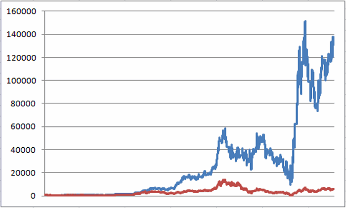
4 Figure 4 – Growth of $1,000 in Ford stock since 1/2/1973; Red line = Buy and Hold; Blue line = long Ford stock all months EXCEPT August, September and October

For the record:

Investor B – the buy and hold investor – has seen has seen his original $1,000 investment grow to $5,906 (or +490%).

 Investor A – out the same three months every year – has seen his original $1,000 investment grow to $131,433 (or +13,043%).

Investor A gained roughly 26.5 times the profit of Investor B.  Talk about a “Performance Vehicle”……

Summary

So is this “strategy” guaranteed to be a winner going forward?  Not necessarily.  Heck, if history is a guide then there is a 37% chance that Ford will show a gain during August through October of 2015.

Still, while your results may vary, historically Ford stocks “mileage” during August through October has [insert your bad auto related pun here, I’m all out].

Jay Kaeppel

About those Best Days in Bonds….

I have written a couple of articles recently about “Good Days in Bonds.”  One period of note is the last 5 tradng days of the month.  In the articles I brushed with a broad stroke – to avoid exceeding a certain level of curve-fitting – including all 12 months.  For the record though, FYI, not all months are created equal.

Figure 1 shows the $ gain or loss a long position of 1 t-bond futures contract during the last 5 trading days of each month, from 12/31/1983 through 3/31/2014.

1

Figure 1 – $ gain during last 5 trading days of each month; T-Bond futures, 12/31/1983-3/31/2014

As you can see, holding a long position during the last 5 trading days of March, April and December since 1983 has showed a net loss, as opposed to during all other months.

So:

*Does this mean a trader should avoid these months?

*Does this mean that the 5 trading days of this month are destined to show a loss instead of a gain?

*Are the last 5 trading days of next month more likely to show a gain than the last 5 trading days of this month?

Answers: Not necessarily, No and again, not necessarily.

Still, at least now you know.

For the Record

Another FYI tidbit: The month that has showed the best performance during the last 5 trading days of the month has been August.  Figure 2 displays the cumulative results.2Figure 2 – $ gain during last 5 trading days of August; T-Bond futures, 12/31/1983-3/31/2014

*# years showing a gain = 26 (84%)

*# years showing a loss = 5 (16%)

*Average gain during Up years = $1,829

*Average loss during Down years = -$578

*Win/Loss Ratio = 5.2 to 1

*Average gain/average loss = 3.16

So:

*Does this mean a trader always hold a long position in t-bonds during the last 5 trading days of August?

*Does this mean that the 5 trading days of August 2015 are destined to show a gain?

*Are the last 5 trading days of August 2015 more likely to show a gain than the last 5 trading days of this month?

Answers: Not necessarily, No and again, not necessarily.

Still, at least now you know.

Jay Kaeppel
RSI Everything Calculations

Below is a compilation of the calculations involved in arriving at RSI Everything.  For the record, RSI Everything was created because I simply couldn’t figure out which of the four RSI based indicators was “the best” – so simply combined them into one “everything and the kitchen sink” indicator, for better or worse.

!#######################################

!Code for RSIAll:

!In English: Add the current 2-day, 3-day and 4-day RSI values and divide  by 3

Define days2 3.

U2 is [close]-val([close],1).

D2 is val([close],1)-[close].

AvgU2 is ExpAvg(iff(U2>0,U2,0),days2).

AvgD2 is ExpAvg(iff(D2>=0,D2,0),days2).

RSI2 is 100-(100/(1+(AvgU2/AvgD2))).

Define days3 5.

U3 is [close]-val([close],1).

D3 is val([close],1)-[close].

AvgU3 is ExpAvg(iff(U3>0,U3,0),days3).

AvgD3 is ExpAvg(iff(D3>=0,D3,0),days3).

RSI3 is 100-(100/(1+(AvgU3/AvgD3))).

Define days4 7.

U4 is [close]-val([close],1).

D4 is val([close],1)-[close].

AvgU4 is ExpAvg(iff(U4>0,U4,0),days4).

AvgD4 is ExpAvg(iff(D4>=0,D4,0),days4).

RSI4 is 100-(100/(1+(AvgU4/AvgD4))).

RSIAll is (RSI2+RSI3+RSI4)/3.

!#######################################

!#######################################

!Code for RSIROC:

!In English: calculate the 3-day change in the standard 3-day RSI value and add it to (the current 3-day RSI minus 50).  RSIROC is a 2-day exponential average of that value. 

 ThreeDayROCRSI is (RSI3-valresult(RSI3,3)).

RSIPlusROCRSI is (RSI3-50)+ThreeDayROCRSI.

RSIROC is (expavg(RSIPlusROCRSI, 2)).

!#######################################

!#######################################

!Code for RSIq2:

!In English: calculate the 3-day change in the standard 14-day RSI value and subtract it from (14-day RSI minus 50).  RSIROC14 is a 2-day exponential average of that value. Add (14-day RSI minus 50) to RSIROC14 and multiply by 2 to get current RSIq2 value.

ThreeDayROCRSI14 is (RSI14-valresult(RSI14,3)).

RSIPlusROCRSI14 is (RSI14-50)+ThreeDayROCRSI14.

RSIROC14 is (expavg(RSIPlusROCRSI14, 2)).

RSI14mid50 is RSI14-50.

RSIq2 is (RSIROC14+RSI14mid50)*2.

!#######################################

!#######################################

!Code for TDREI

In English: Um, try Googling “Tom Demark Range Expansion Index” – sorry.

Hitoday is [high].

H2 is val([high], 2).

H5 is val([high], 5).

H6 is val([high], 6).

Lotoday is [low].

L2x is val([low], 2).

L5 is val([low], 5).

L6 is val([low], 6).

Closetoday is [close].

C7 is val([close], 7).

C8 is val([close], 8).

TD1 is [high] – h2.

TD2 is [low] – l2x.

TD3 is iff(([high] >= l5 or [high] >= l6) and ([low] <= h5 or [low] <= h6), 1, 0).

TD4 is iff((h2 >= c7 or h2 >= c8) and (l2x <=c7 or l2x <=c8), 1, 0).

TD6 is td1 + td2.

TD5 is iff((td3 + td4) >=1, td6, 0).

TD7 is abs(td1) + abs(td2).

TDREI is ((TD5 + valresult(TD5, 1) + valresult(TD5, 2) + valresult(TD5, 3) + valresult(TD5, 4)) / (TD7 + valresult(TD7, 1) + valresult(TD7, 2) +valresult(TD7, 3) + valresult(TD7, 4))) * 100.

!#######################################

!#######################################

!Code for TD Everything:

!In English: Add the four indicator values together and divide by 4

!Note: 50 is subtracted from RSIAll here to make 0 neutral as with the other indicators

RSIEverything is (((RSIAll-50) +RSIROC +RSIq2 +TDREI) / 4)

!#######################################

Jay Kaeppel
Trading Weekly Charts Using RSI Everything

A while back I wrote two articles that ultimately culminated in an indicator that I call (clearly for the lack of a better name) “RSI Everything”)

This time out let’s look at a simple method to use this indicator using weekly bar charts.  As always this information is “food for thought” and not “an automated system guaranteed to generate profits beyond the Dreams of Avarice” (although for the record I am still working on it).

It might serve as “a good place to look” for trading ideas for “Weekend Warriors”, i.e., those who don’t have a lot of time to follow the markets during the week so do most of their analysis over the weekend.

Notes

*The AIQ TradingExpert Design Studio code is posted in the articles linked above.  It can be easily adapted to other trading software (at least by trading system code junkies that are into that kind of thing – “Hi, my name is Jay”).

*This method is probably best used with sector ETFs and index ETFs rather than with individual stocks – but traders are encouraged to experiment.

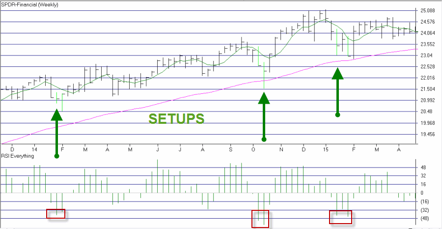
The Setup

At the end of the current week:

  1. The 5-week simple moving average is above the 55-week exponential moving average.
  2. RSI Everything registers a weekly close of -32 or below.

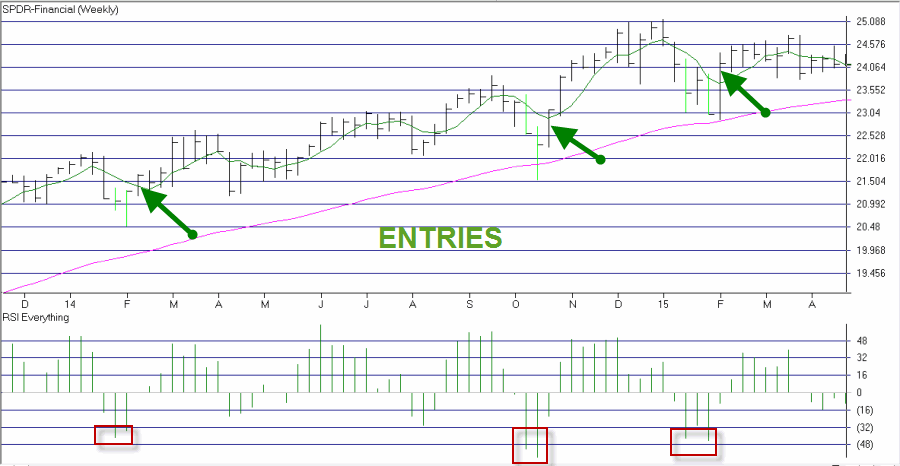
The Trigger

  1. Buy shares or the ETF (or stock) in question when it hits the previous week’s high price plus $0.02 per share.

The Exit

  1. Close the trade at a profit on the first profitable weekly close.
  2. Close the trade at a loss if price falls $0.02 or more below the previous week’s two week low.
  3. Close the trade – whether at a profit or a loss – if the 5-week simple moving average closes below the 55-week exponential moving average.

More Notes

*A trader might also consider using a hard percentage of trading capital stop to cut a loss rather than waiting for the two week low to be hit.

*It may take a few weeks after the initial setup before price actually triggers an entry signal by taking out the previous week’s high.

Example

Figures 1 through 4 highlighted this method using ticker XLF1 Figure 1 – Ticker XLF with Indicators (Courtesy: AIQ TradingExpert)

2Figure 2 – Ticker XLF with Setups (Courtesy: AIQ TradingExpert)

3aFigure 3 – Ticker XLF with Entries (Courtesy: AIQ TradingExpert)

3 Figure 4 – Ticker XLF with Exits (Courtesy: AIQ TradingExpert)

Even More Notes

There is nothing magic about:

*5-day simply and 55-day exponential moving averages;

*Previous week’s close +$0.03

*First profitable weekly close

*Two-week low – $0.02

So industrious traders are encouraged to experiment.

Also, traders may also consider trading call options as a potential low cost alternative to buying ETF shares. If you choose to go this route consider using www.OptionsAnalysis.com.

Summary

As always, remember that this is “an idea” and not “a system.”  In the end, the method described herein is simply another entry in the well established approach of “buying after a pullback.”

Same as it every was……um, but different…..sort of.

Jay Kaeppel
More Good Days for Bonds

Back in March I wrote an article called “Good Days for T-Bonds” that basically highlighted the fact that the last five trading days of the month have historically been the best time to be long t-bonds. And so of course, Murphy immediately invoked his pesky rule and the last five days of March showed a fairly sizable loss.  But I refuse to surrender.  So let’s take things one step further.

Jay’s Seasonal T-Bond System

If A) the Current Month is May, June, August or November AND the Current Trading Day of Month is 1, 2, 3, 10, 11, 12,

OR

B) If today is one of the last five trading days of the current month then…..

Trading Signals

*If A or B is true then hold a long position in T-bonds.

*If neither A or B is true then hold no position in T-Bonds.

So what the heck does all of this accomplish?

 Results using T-Bonds Futures Daily Value Change Data

To test this “system”, we will do the following.  If indicator A or B above is true then we will assume that a long position of one t-bond futures contract is held that day, and we will add (or subtract) the daily change in the nearest futures contract month for that day (a 1-point change in price is worth $1,000).

*No slippage or commissions are deducted from these results.

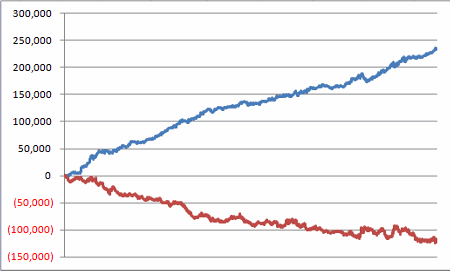
In Figure 1 the blue line represents the cumulative gain in t-bonds during the “Bullish Days”.

In Figure 1 the red line represents the cumulative loss in t-bonds during “All Other Days”.1 Figure 1 – Gain for t-bond futures during “Bullish Days” (blue line) versus “All Other Days” (red line); 12/31/1983 through 4/17/2015

For the record, the “Bullish Days” registered a gain of $234,000 while “All Other Days” registered a loss -$117,500.

This disparity in results is what we “Highly Quantitative Analyst Types” refer to as “statistically significant.”

Using ETF ticker TMF

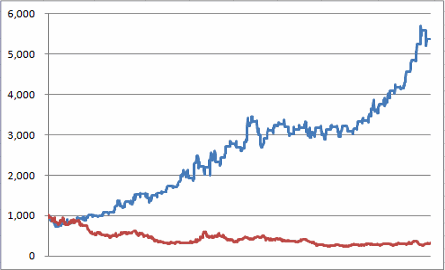
Ticker TMF is a triple-leveraged ETF that tracks the daily change in the long t-bond times 3.  For the record, triple leveraged ETFs are NOT for everyone.  To trade without leverage consider ticker TLT.  Nevertheless, the results in Figure 2 show the growth of $1,000 invested in ticker TMF only during “Bullish Days” since TMF started trading on 4/16/2009.

2 Figure 2 – Growth of $1,000 holding a long position in ticker TMF during “Bullish Days” (blue line) versus “All Other Days” (red line); since 4/16/2009

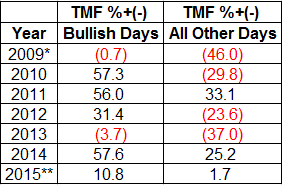
For the record, $1,000 invested only during the “Bullish Days” grew to $5,384, while $1,000 invested in TMF only during “All Other Days” declined to $310.

So for the record:

*TMF during “Bullish Days” = +438%

*TMF during “All Other Days” = (-69%)

9

*starting on 4/16/09

**through on 4/17/15

Ticker TLT is a non-leveraged ETF that tracks the long t-bond and trades much greater volume than TMF.  TLT also enjoys decent option volume.  So one other strategy that a trader might consider (although this is suggested as “food for thought” and not as a recommendation) is buying call options on TLT rather than buying shares of TMF or TLT.  By doing so a trader can commit a great deal less capital and therefore enjoy less dollar risk during those times when the so-called “Bullish Days” don’t pan out.

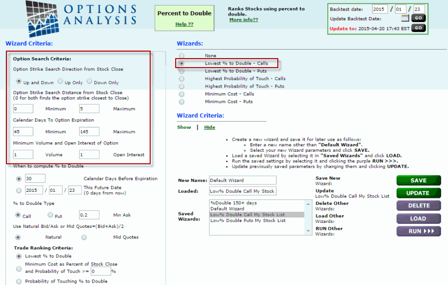
So let’s look at an example of buying a call option on TLT as a substitute for buying shares of ticker TLT.  For this we will use www.OptionsAnalysis.com. 1/23/2015 was the sixth day prior to the end of the month so we will buy a call option on that date and hold it until the close on the last trading day of January. One way to find a trade using call options is the “Percent to Double” routine.  The input screen appears in Figure 3 (you can click on Figures 3 through 8 for a closer look). 3 Figure 3 – Input screen for “Percent to Double” routine at www.OptonsAnalysis.com

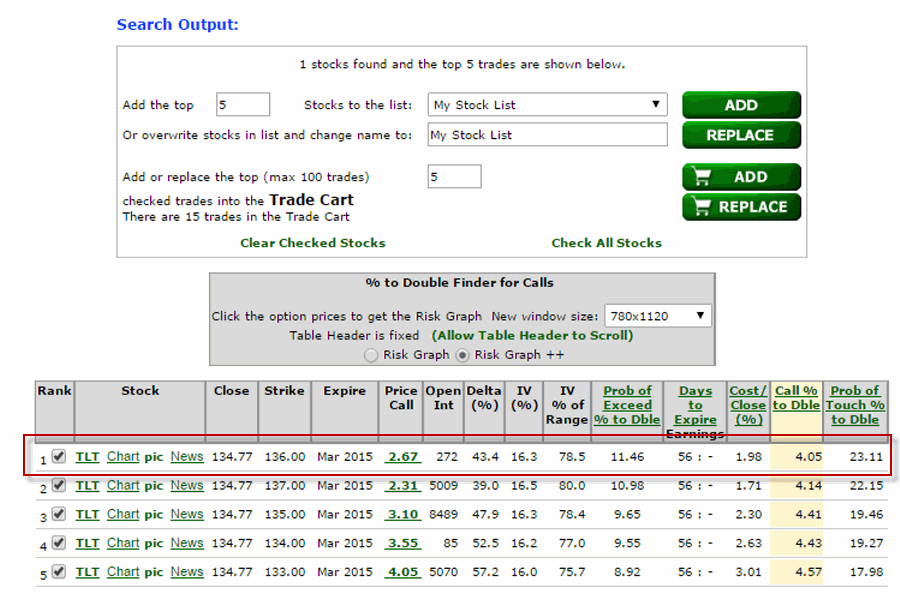
The output screen appears in Figure 4 with buying the March 136 call highlighted as the top suggested trade.

4Figure 4 – Output screen for “Percent to Double” routine at www.OptionsAnalysis.com

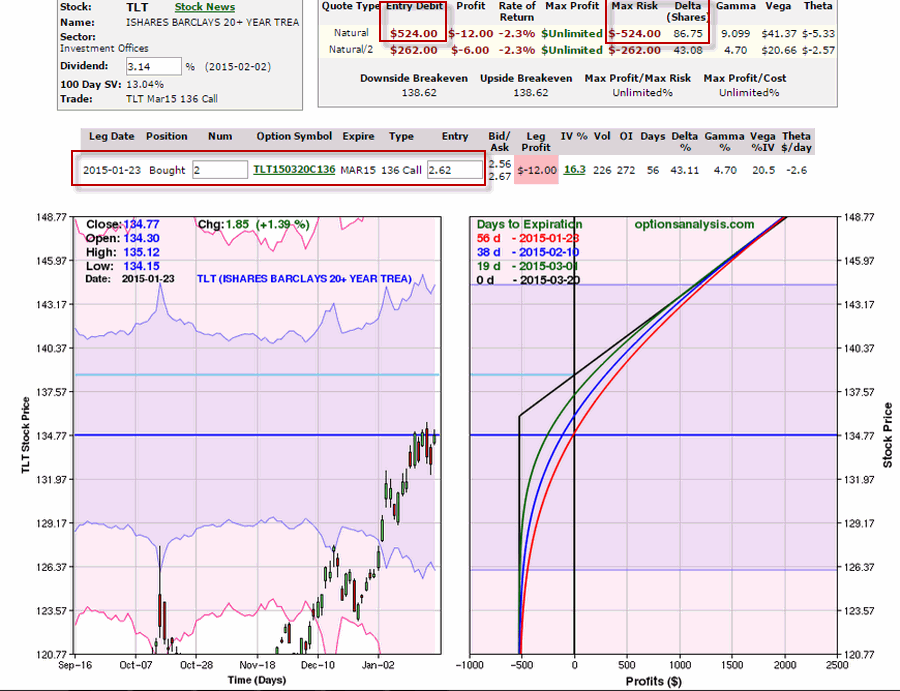
Figure 5 displays the particulars for the trade.  We will buy 2 call options for a cost of $524.  This trade will have a “Delta” of 87 (which simply means that it will react similarly to a position of buying 100 shares of TLT).

5Figure 5 – Long 2 Mar TLT calls: Cost $ and Maximum Risk = $524; Position Delta = 87 (www.OptionsAnalysis.com)

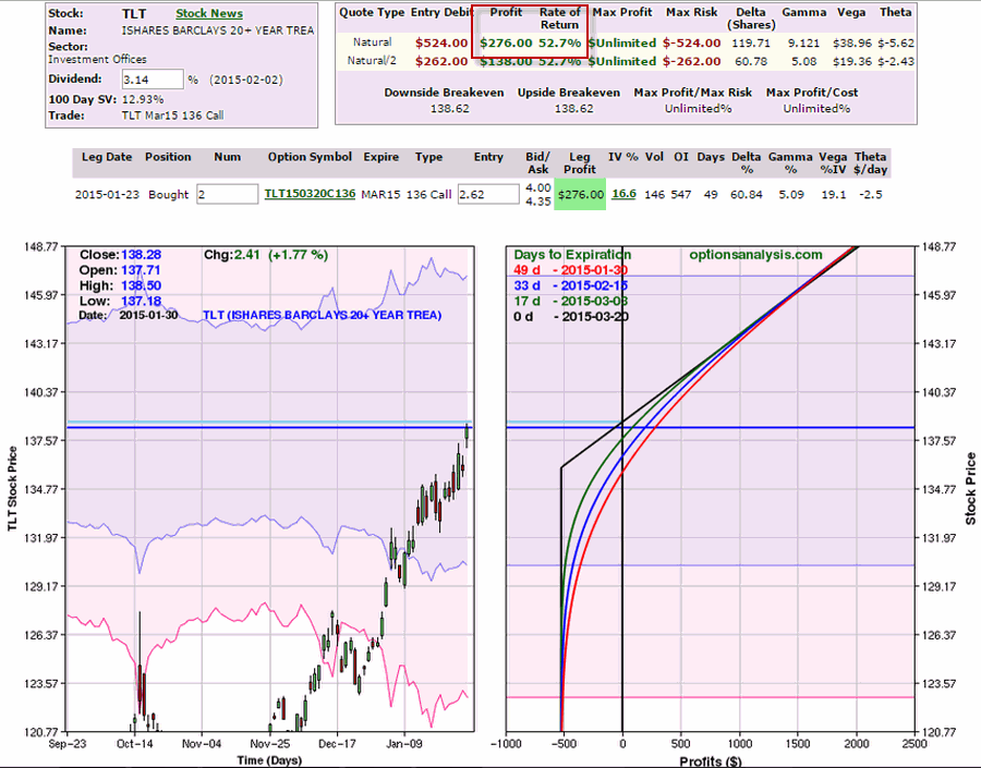
Five trading days later – at the close on 1/30/2015 the options could be sold at $4 a contract, for a profit of $276 ($4.00 – 2.62) x 100 x 2.  This is a 52% return on the $524 of capital actually commit to the trade as seen in Figure 6.

6Figure 6 – Long 2 Mar TLT calls – 5 days later (www.OptionsAnalysis.com)

To see how this compares to buying shares of TLT, see Figure 7.  In order to get the same Delta as being long 2 March 136 calls (i.e., 87) we would buy 87 shares of TLT.  With TLT trading at $134.77 a share, it would cost $11,725 to buy the 87 shares – versus just $524 to buy an “equivalent position” in the March 136 call option.  This trade appears in Figure 7.

7Figure 7 – Long 87 shares of TLT at $134.77 a share (Cost: $11,725) (www.OptionsAnalysis.com)

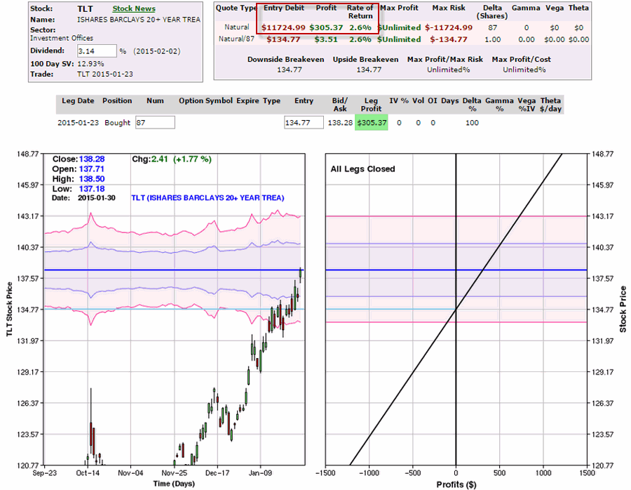
As you can see in Figure 8, five trading days later this position could be sold at a slightly higher dollar profit of $306.  But remember, the trader who bought 87 ETF shares had to put up $11,725 of capital in order to make $306 while the option trader put up (and risked a total of) $524 in order to make a profit of $276.

8Figure 8 – Sold 87 shares of TLT 5 days later (www.OptionsAnalysis.com)

Summary

So will the trading days highlighted in this article generate superior returns ad infinitum into the future?  Ah, there’s the rub.  The truth is that there is no way to know for sure.  Still, if you had to bet……which of course, you don’t have to do.  In any event, the long-term difference in performance between “Bullish Bond Days” and “All Other Days” is pretty stark so there may be something to it.

Also, the other part of the lesson is that are ways to use options to maximize profitability while simultaneously limiting risk.

Jay Kaeppel

Gold Stocks at a Critical Juncture

Please be sure to read Words to Trade By

There is something about gold mining stocks that causes some traders to act somewhat irrationally at times (“Hi, my name is Jay”). Maybe it’s the volatility and their ability to move sharply higher (and alas, much lower) quickly and the adrenaline rush that that can cause. Maybe it’s just the overall “mystique” about gold. Whatever.

The bottom line is that gold stocks can cause a person who is typically very disciplined trend followers into raving “I think I can pick the bottom” maniacs (repeating now, “Hi, my name is Jay”). Now most traders have been told time and again that trying to “pick a bottom” in a down trending security is a fool’s errand. And the truth is that there is a lot of, well, truth to that notion. But there are “ways to do things”.

The Current Situation in Gold Stocks

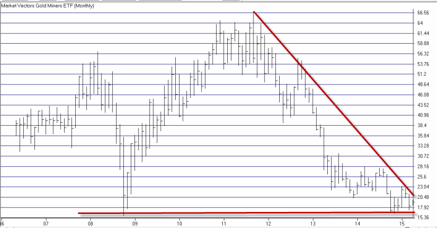
In Figure 1 you can see the monthly action in ticker GDX (an ETF that tracks a portfolio of gold mining stocks).

1
Figure 1 – Monthly ticker GDX (Courtesy: AIQ TradingExpert)

Two things to note in Figure 1:

1) Price is quite close to a multi-year low
2) It wouldn’t take much of an advance to break above a multi-year downtrend

Hence the “critical juncture” reference in the title.

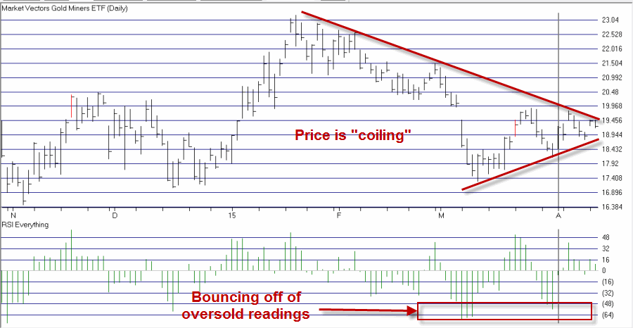
In Figure 2 we see a daily chart for GDX.3Figure 2 – Daily ticker GDX with RSIEverything (Courtesy: AIQ TradingExpert)

As you can see in Figure 2, GDX appears to be “coiling” within a triangle pattern, an action that get’s traders very excited about what might happen next (again, “Hi, my name is………..oh, never mind). Also, while the overall trend is inarguably “down”, recent oversold reading in my RSIEverything indicator have been followed by “bounces” in the price of GDX. Both of these factors point to the potential for a move higher.
So one of three things will happen:

1) Price will break out to the upside
2) Price will continue to consolidate and move sideways
3) Price will break down to a new multi-year low.

So what is a trader who “wants to believe” (that gold stocks will rally) to do?

Using Options to Trade Gold Stocks

While picking a bottom as a regular diet is not a good idea, via the use of options a trader can “take a shot” without betting the ranch. So based on the three possibilities listed above, I want to look for a trade that:

1) Will make a high rate of return if gold stocks move higher
2) Will not “waste away” if price moves sideways for a while
3) Won’t lose a ton of money if price falls apart

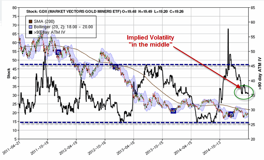
Before selecting an option trade let’s consider the current level of implied volatility in GDX options. This is important because the level of implied volatility tells us whether the amount of time premium built into the price of GDX options is “high”, “low” or somewhere in between.

Figure 3 is a screen shot from the software that I use for my options analysis (ironically titled www.OptionsAnalysis.com) displays the price chart for GDX for roughly the last four years along with the implied volatility for 90 day options on GDX.2

Figure 3 – GDX with 90-day implied option volatility (Courtesy: www.OptionsAnalysis.com)

As you can see at the moment we are currently smack dab “somewhere in between” high and low. This tells us that there is no significant advantage to “buying premium” (which is favored when implied volatility and time premium is low) or “selling premium” (which is favored when implied volatility and time premium is high).

So under these circumstances I want to look for a trade that:
1) Has more upside potential then downside risk
2) Involves buying premium, but;
3) May also involve selling premium in order to offset some of the cost of the options purchased.
4) Leaves a lot of time before I have to worry about time decay adversely affecting the position (since two of the three potential scenarios I listed earlier involve something other than “gold stocks going up”).

A Bull Call Spread

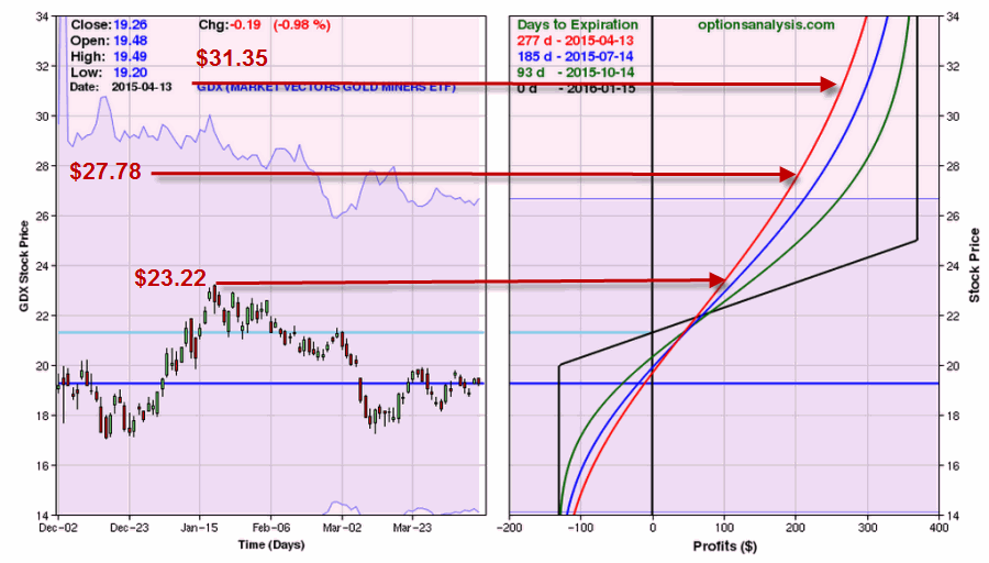
In this example, I am going to highlight one possibility which involves a “Bull Call Spread” using January 2016 call options. The particulars are highlighted in Figures 4 and 5.4Figure 4 – GDX Jan16 Bull Call Spread (Courtesy: www.OptionsAnalysis.com)5Figure 5 – Risk Curves for GDX Jan16 Bull Call Spread (Courtesy: www.OptionsAnalysis.com)

At the time I looked at this trade it could be bought for $130 for a 1-lot. So if GDX falls apart the worst thing that can happen is that the trade loses $130 per 1-lot. This trade has 177 days until expiration so whether GDX rallies now or rallies later is not really of critical importance. However, please note that once the trade moves into profitable territory, time decay actually helps the profitability of this trade due to the fact that the option sold will lose time premium at a faster rate than the option purchased.

If GDX reaches:

1) Its recent high of $23.22 this trade will show a profit of between $80 and $180 (depending on how long it takes to reach that price).

2) Its July 2014 high of $27.78 this trade will show a profit of between $200 and $370 (depending on how long it takes to reach that price).

3) Its August 2013 high of $31.35 this trade will show a profit of between $270 and $370 (depending on how long it takes to reach that price).

Summary

As always the trade I have highlighted is not a “recommendation”, only an example of one way to use options to take advantage of a particular outlook (OK, more like a “Hope” in this case) without risking large amounts of trading capital. It also highlights several factors that traders should consider before entering into an option trade (i.e., what are the likely scenarios and how will this position be affected in each case) and the importance of considering implied volatility when electing an option trading strategy.

Jay Kaeppel