Monthly Archives: October 2014

Is Gold “Waving” Goodbye?

Typically, I don’t like to rain on other people’s parades – you know, karma being what it is and all.  And when it comes to analyzing the financial markets and trading, I am a proud graduate of “The School of Whatever Works.”  So if someone tells me that the key to their success comes from analyzing the ratio between the VIX Index and the price of arugula, I say “more power to ‘em.”  (OK, this is a made up example.  Please DO NOT email me and ask me if I have back data for the price of arugula.  I do not.  At least not that I am aware of.  Maybe I do.  I should look. Wait, no!).

So anyway, what follows is not meant to denigrate anybody else’s analysis.  But one thing that has always bugged me is when people arbitrarily draw all kinds of things on a price bar chart and then say “Aha!” One notorious example is a guy I used to know who was a big believer in Gann and Fibonacci (not that there is anything wrong with that).  So if we were to talk (assuming we were still talking) about the gold market he might send me a chart that sort of resembles the one that appears in Figure 1.  This is a weekly bar chart for ticker GLD – an ETF that tracks the price of gold bullion – with a Gann fan and Fibonacci Retracement lines drawn. gld w gann and fibFigure 1 – Ticker GLD with a Gann Fan and Fibonacci Retracements (Courtesy: ProfitSource by HUBB)
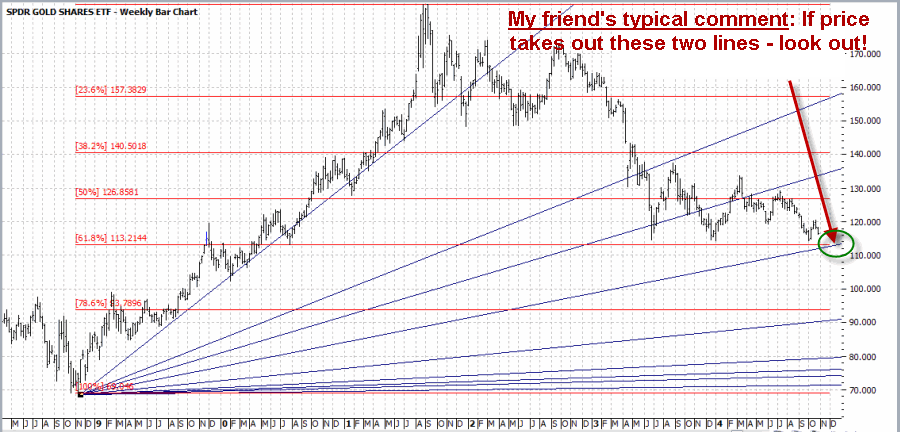
As you can see in Figure 1 there is in fact a point where the 61.8% “Fib line” (as we “professional market analysts” like to refer to them) will intersect with the, well, one of the Gann Fan lines.  Is this actually significant in any way?  [Insert your answer here].  But I would likely respond to him by saying something constructive like, “Interesting analysis.  Hey what about the other 50 lines you’ve drawn on this chart?”  To which he would likely respond by saying something equally constructive like “$%^ you.” (You kind of get the idea why we don’t talk much anymore). 

For the record please note that at no time did I denigrate his analysis (well, maybe in a sneaky, snarky sort of way – sorry, it’s just my nature).  But if it works for him, that’s great.  But seriously, what about the other 50 lines?  And please remember that for the sake of clarity I did not include the 4 to 6 “key” moving averages that he would normally include on a typical bar chart.  Anyway, in the end it seems like an appropriate time to invoke:

Jay’s Trading Maxim #102: If you draw enough lines on a bar chart, price will eventually touch one.  This may or may not signify diddly squat.

or the addendum:

Jay’s Trading Maxim #102a: The market may not care that you’ve drawn a particular line on a particular chart.  Just saying.

So with this in mind, let’s turn to the price of gold and Elliott Wave Analysis.

Gold and the Elliott Wave

I always feel compelled to point out that I am not now, nor have I ever been a true “Elliotthead.”  But I know enough traders whom I respect who are serious users of Elliott Wave analysis that I do try to pay attention.  So let’s take a look at a recent example, in this case using the ticker GLD.

The biggest problem I always had with Elliott Wave is figure out when one wave is – um, waving goodbye and another wave is about to crest.  So I rely on ProfitSouce from HUBB to do the work for me.  In Figure 2 you see a bar chart for ticker GLD with ProfitSource’s version of the latest Elliott Wave count drawn.  As you can see in Figure 2, the indicated wave count just crossed down into a bearish Wave 5 (although most of the people I know who follow Elliott Wave refer to this as a “Wave 4 Sell”.  Go figure).gld ewFigure 2 – GLD and Elliott Wave w/Wave 4 Sell signal (Courtesy: ProfitSource by HUBB)
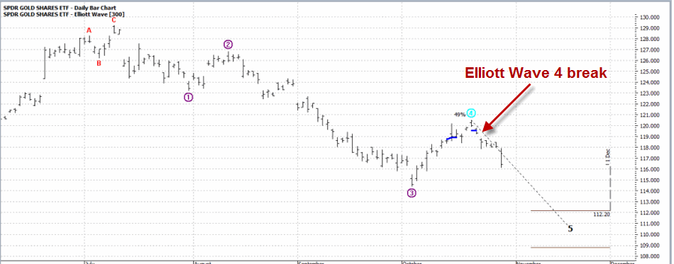
So let’s assume that a person wanted to play the short sort of gold based on this one signal (for now we will ignore the question of whether or not this is wise).  One avenue would be to sell short 100 shares of GLD at $119.34.  This transaction would involve putting up margin money of roughly $6,000 and assuming unlimited risk to the upside (Remember that if you sell short shares of GLD and gold decides for some reason to open $20 higher tomorrow your stop-loss to buy back your short GLD shares at $125 is not necessarily going to limit your risk).

My preferred play would be to use put options on ticker GLD.  Of course, with options there is always “more than one way to play.”  So let’s look at two.

Strategy #1: The “I Want to be Short Gold” Strategy (Buy a Deep-in-the-Money Put)

The objective with this strategy is to get as close to point-for-point movement with the underlying security (i.e., shares of GLD) as possible, at a fraction of the cost.  In this example, the trade in Figures 3 and 4 involves buying the December 127 put at $8.40. gld put1Figure 3 – Buying Deep-in-the-money GLD Put (Source: www.OptionsAnalysis.com)gld put2 Figure 4 – Buying Deep-in-the-money GLD Put (Source: www.OptionsAnalysis.com)
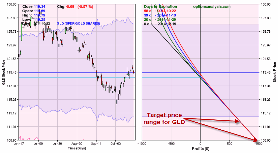
This trade costs $840 – which represents the maximum risk on the trade and has a delta of -79.77.  This means that this trade will act roughly the same as if you had sold short 80 shares of ticker GLD (which would entail putting up margin money of roughly $4,800 and the assumption of unlimited risk. 

If GLD falls to the upper price target range indicated in Figure 2 (112.20) this trade will generate a profit of roughly $700.  As this is written, GLD has fallen from    119.34 to 115.76 a share and the December 127 put is up from $8.40 to $11.40 (+36%).

Strategy #2: The “I’m Willing to Risk a Couple of Bucks in Case the Bottom Drops Out of Gold” Strategy (buy an OTM Put Butterfly)

This strategy is for people who are willing to speculate and risk a few dollars here in there in hopes of a big payoff.  Now that phraseology probably turns a few people off, but risking a few bucks in hopes of a big payoff is essentially the definition of intelligent speculation.  

So for this I turn to www.OptionsAnalysis.com which helpfully has an OTM Butterfly Finder routine built in.

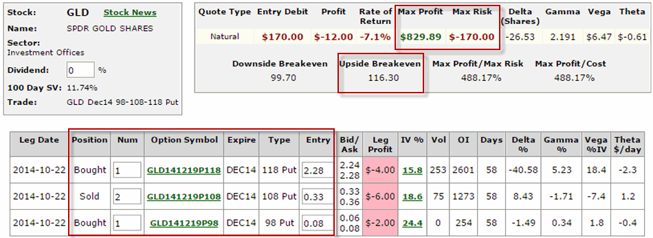
This trade involves:

Buying 1 December 118 put

Selling 2 December 108 puts

Buying 1 December 98 put

The cost of this trade is only $170. gld put 3Figure 5 – Buying OTM Butterfly spread in GLD (Source: www.OptionsAnalysis.com)
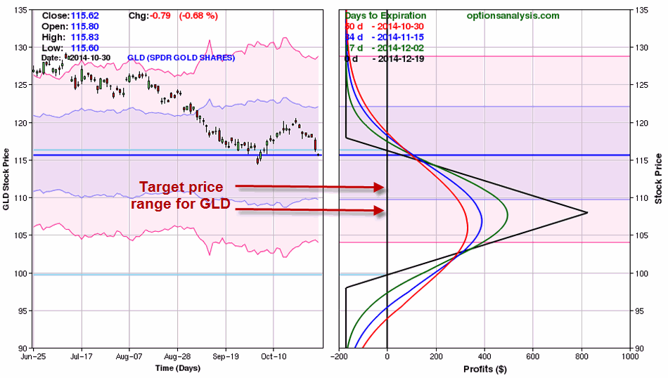
gld xFigure 6 – Buying OTM Butterfly spread in GLD (Source: www.OptionsAnalysis.com)

As you can see, if GLD does fall into the price range projected by the Elliott Wave count shown in Figure 2, this trade can make anywhere from $250 to $700 or more based on $170 of risk.

As I write, GLD is trading at $115.76 and this open position shows a profit of $94 (+55%).

Summary

There sure are a lot of ways to analyze and play the financial markets.  As a proud graduate of “The School of Whatever Works” (our school motto is “Whatever!”) I am not here to tell you what tools you should use (nor how many lines you should draw on a bar chart) or what type of trading strategies you should use to act on any particular trading strategies.  My only purpose in this blog is to provide food for thought.

Whether or not a single particular Elliott Wave count constitutes a valid trading signal is up to each trader to decide.  But whatever the indicator, once a signal to play the short side is given, more choices arise.  In this example, three choices are to:

1) Sell short shares of GLD (putting up margin money and assuming significant risk),

2) Buy an in-the-money put option to track the price of GLD without as much cost and with limited risk

3) Risk less than $200 to gain exposure to the downside in GLD

Food for thought.  Feel free to “chew on that” for awhile.

Jay Kaeppel
It Doesn’t Have to be Rocket Science (Part 312)

Seems like I have used this title before.  That’s probably because I have.  It’s also because every once in awhile I lift my head up from “crunching numbers” – in pursuit of that “one great market timing method” – and remember that there really is no such thing and that having a general sense of the overall trend of the markets and adding a touch of common sense can get you pretty far as an investor and trader.

Of course, that’s been easier said than done of late.  At times its seems that common sense would dictate doning a Hazmat suit and curling up in the fetal position in a corner until – you know, whatever – passes.  With an election coming up we have been informed by both sides that if the other side wins then that will pretty much be the end of humanity as we know it.  Which leaves us exactly where?  But I need to watch my blood pressure so I will steer clear of politics.

My Writing (or Lack Thereof) of Late

I have been writing very little of late.  The good news for me is that JayOnTheMarkets.com is not a paid site and there are no deadlines and no one is waiting for me to tell them what to do next in the markets.  Which is probably a good thing since the truth is that I have never been more unsure of exactly what the h?$% is going on in the markets (or the world around us, come to think of it) than I have been of late.   Hence the lack of more frequent updates.  As the saying goes, “If you don’t have something intelligent to say, don’t…” – well come to think of it I have never really adhered to that rule in the past.  Never to late to start, I guess.  In any event, thank goodness I am a systematic trader.

In trying to make sense of things, on one hand a perusal of the evidence in recent months led me to think that a major top was forming.  On the other hand, the trend (except for a recent short-lived dip by some of the major averages below their 200-day moving averages) has remained “up” and we are now in what has historically been a very bullish seasonal period (also the standard most bullish 6 months of the year starts on November 1st).  

So the bottom line is that if you want to be bullish you can make a pretty good case.  On the other hand, if you want to be bearish you can also make a pretty good case. 

What’s a guy or gal to do? 

Well hopefully your answer is the same as mine: Continue to follow your objective, well thought out trading plan – one that incorporates some risk controls in case things don’t go the way you planned. 

Sounds so simply when its put that way, doesn’t it?  Towards that end, let me offer a simple “Non Rocket Science” method for identifying the long-term trend of the stock market.

Jay’s Non-Rocket Science Stock Market Trend Identification Method (JTIM)

Notice that this ridiculously long title (hence JTIM for short) includes the phrase “Trend Identification” and not the phrase “Market Timing”.  If I were truly interested in full disclosure the title would actually be something like “Jay’s Non-Rocket Science Let’s Not Ride the Bear Market All the Way to the Bottom for Crying Out Loud” Method.  But that one was really long winded. 

The purpose of this method is simply this, nothing more, nothing less: to avoid riding an extended bear market all the way to the bottom all the while hoping that one day it will bounce back.  When this method gives a sell signal it simply means that it “may be” time to play defense.  That might mean selling a few stock market related holdings, that might mean selling everything related to the stock market, or it might mean hedging and existing portfolio.

It also means that there is a chance that you may take defensive action and later end up wishing that you had not.  Sorry folks, that just kind of the nature of trend following.  But one thing I have learned since, well, the time I had a lot of hair until now, is that selling now and buying back in at a slightly higher price is typically preferable to riding a 20%, 30% or 40% or more drawdown.

Now some people may respectfully disagree with that opinion.  But these types of drawdowns can scar an investor’s psyche – and adversely affect their judgement in the future – for  a long time – even after their portfolio eventually bounces back.  In addition, riding a massive drawdown like DiCaprio and Winslet riding the final plunge of the Titanic opens an investor to one of the most devastating mistakes of all – i.e., selling at or near the bottom (Though fortunately not to hypothermia like DiCaprio – and just for the record, seriously, couldn’t Winslet have just schooched over a little bit and made enough room for both on that door or whatever it was she was floating on? But I digress).

This reminds me to remind you of:

Jay’s Trading Maxim #78: Drawdowns make people act stupid (the more the drawdown, the more the stupid).

So here are the (granted, imperfect) JTIM rules:

*If the S&P 500 Index closes for two consecutive months below its 21-month moving average AND also closes below its 10-month moving average, the trend is deemed “Bearish”.

*While the trend is deemed “Bearish”, if the SPX 500 Index closes one month above its 10-month moving average then the trend is deemed “Bullish.”

That’s it.

JTIM Results

The results must be measured based on what the method is trying to achieve – i.e., avoiding massive, long term drawdowns – so as to avoid “acting stupid” (and to avoid ending up like DiCaprio, but I repeat myself).  Over the course of time the results look pretty good.  Of course, it also depends to some extent on how you define “good”, because from time to time – and over certain extended periods of time between the beginning and end – the results don’t look so good.  Allow me to explain.

In general terms, it goes like this:

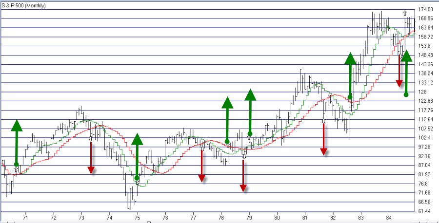
Good: This method avoided most of the 1973-1974 bear market.

Not So Good: Between 1977 and 1991 there were 5 “sell” signals.  In all 5 cases an investor who “sold everything” based on these signals would have bought back in at a higher price.  An investor would have missed drawdowns of -9.6% in 1977-78 and -12.7% in 1981-82.  But all other sell signals during the great bull market of the 80’s and 90’s witnessed drawdowns of no more than -4.0%. 

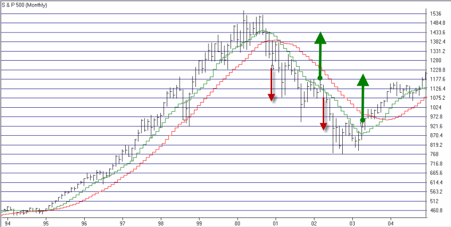
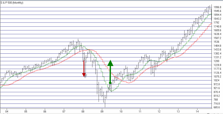
Good: The last three sell signals (2000, 2002, and 2008) were followed by drawdowns of -28%, -29% and -50%, respectively.   

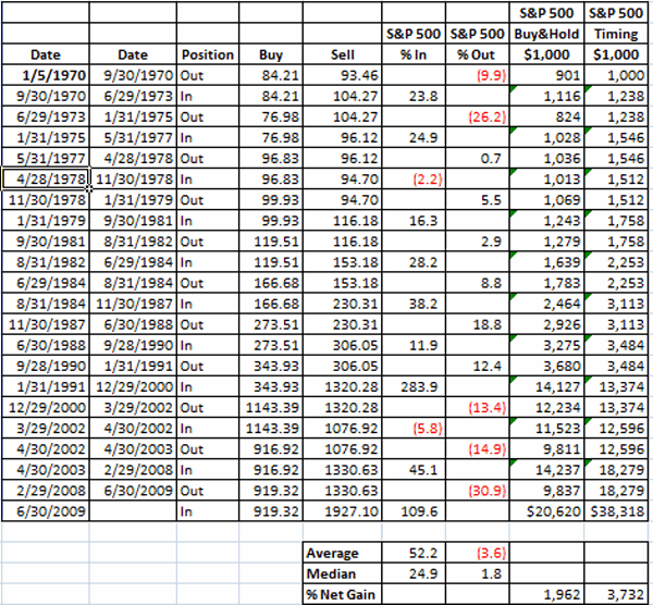
Figure 1 displays the results in tabular form:spx timing Figure 1 – Jay’s Trend Identification Method Signals

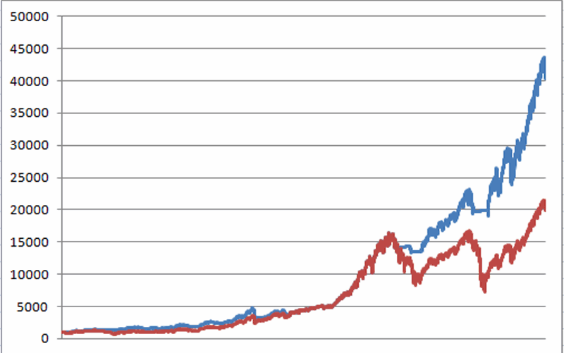
The key thing to note is that over the past 40+ years this method outperformed buy-and-hold (by almost 2-to-1 if interest earned while out of the market is added in; See Figure 6).

Figures 2 through 5 display the signals on SPX monthly bar charts. SPX Timing 1Figure 2 – SPX with JTIM Signals 1970-1984 (Courtesy: AIQ TradingExpert)

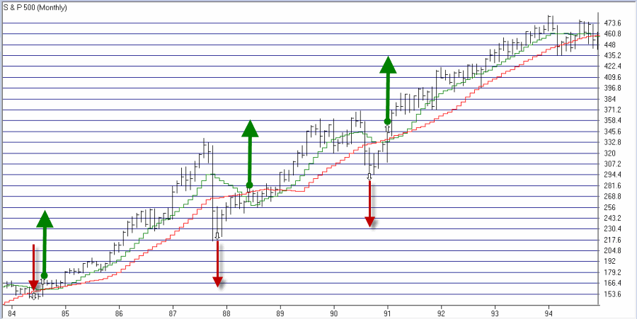
SPX 2 Figure 3 – SPX with JTIM Signals 1984-1994 (Courtesy: AIQ TradingExpert)

SPX 3 Figure 4 – SPX with JTIM Signals 1994-2004 (Courtesy: AIQ TradingExpert)SPX 4 Figure 5 – SPX with JTIM Signals 2004-2014 (Courtesy: AIQ TradingExpert)

Figure 6 displays the growth of $1,000 using JTIM (adding 1% of interest per year while out of the market) versus buy-and-hold since 1970.Figure 6 Figure 6 – Growth of $1,000 using JTIM (blue line) versus buy-and-hold (red line) since 1970

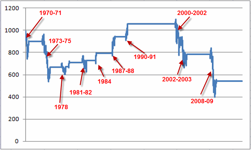
And just to complete the picture Figure 7 displays the growth of $1,000 invested in SPX only when the system is bearish.  Figure 7Figure 7 – Growth of $1,000 when JTIM is bearish (1970-present)

For the record, had an investor bought an held the S&P 500 only during those period when JITM was bearish since 1970, an intitial $1,000 investment would now be worth only $540 (i.e., a loss of -46%).  Or as we “professional market analysts” refer to it – Not So Good.

Summary

So is this the “be all, end all” of market timing?  Clearly not.  During most of the 80’s and 90’s, getting out of the market for any length of time typically cost you money.  Still, since nothing of the “be all, end all” variety actually exists  some investors may find it useful to note the status of this simple model, at the very least as an alert that:

a) a lot of bad news can typically be ignored if the model says the trend is “up”, and,

b) some defensive action may be wise if the  model says the trend is “down.”

Alright, excuse me, I have to get back into my Hazmat suit.

Jay Kaeppel

Light at the End of the Tunnel? (or do I hear a Train Whistle?)

Wow, does Murphy hate my guts, or what?

So I write an article all about how the stock market gets all bullish during the middle 18 months of the decade (September 30th – Mark Your Calendar) – i.e., starting at the close on September 30th of the mid-term election year – and what does Murphy go and do?  He (She? Hmmm, that might explain a few things) invokes his (her?) dreaded Law and the market gets hammered right out of the box in early October.

Fortunately for me I have made enough mistakes in the market over the years that I don’t even bother to feel stupid anymore when things go exactly the opposite of what I might have anticipated.  This leads me to invoke a maxim I adopted (after a long, painful process) a long time ago:

Jay’s Trading Maxim #412: Murphy hates you.  Plan accordingly.

To put it into other terms, it essential for any trader or investor to give some thought as to  what might go wrong before taking any particular action and to come up with an answer to the following question:

“What is my worst case scenario and what specific action will I take to mitigate the damage should this scenario unfold?”

Sounds like such an obvious question to ask and answer doesn’t it?  But here is another question that will likely make a lot of readers squirm:

“Do you have an answer to the question above?  Every time you make a trade?”

OK granted that’s two questions, but you get my drift.

Where to From Here?

So here is the part of the article where most “highly trained professional market analysts” tell you why the market is almost certain to rise (or fall) from here. Unfortunately, the bad news for me is that I am not very good at predicting the future (plus let’s face it, I can’t risk pissing Murphy off again).  So while it “feels” like the market could melt down at any moment, I have little choice but to simply follow my plan and give the bullish case the benefit of the doubt.  So two things to note:

#1. October through December in Mid-Term Election Years

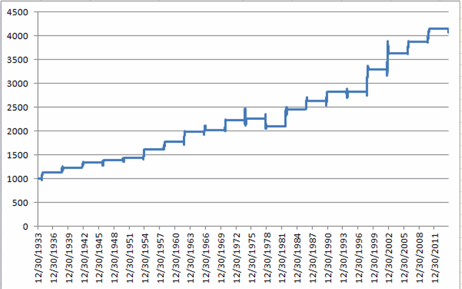
In Figure 1 you can see the growth of $1,000 invested in the Dow Jones Industrials Average only during the months of October, November and December during mid-term election years, starting in 1934 (i.e., 1934, 1938, 1942, etc.)oct-dec midterm 1 Figure 1 – Growth of $1,000 invested in DJIA Oct-Nov-Dec of Mid-Term Election Year (1934-present)

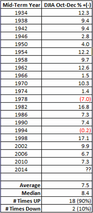
Figure 2 shows the year-by-year results

oct-dec midterm 2

Figure 2 – DJIA performance Oct through Dec of Mid-Term Election Years

As you can see, this period has showed a gain 90% of the time.  Granted a few were pretty miniscule, still the median gain was in excess of 8% and the worst previous performance was -7%.

#2. Short-Term Oversold

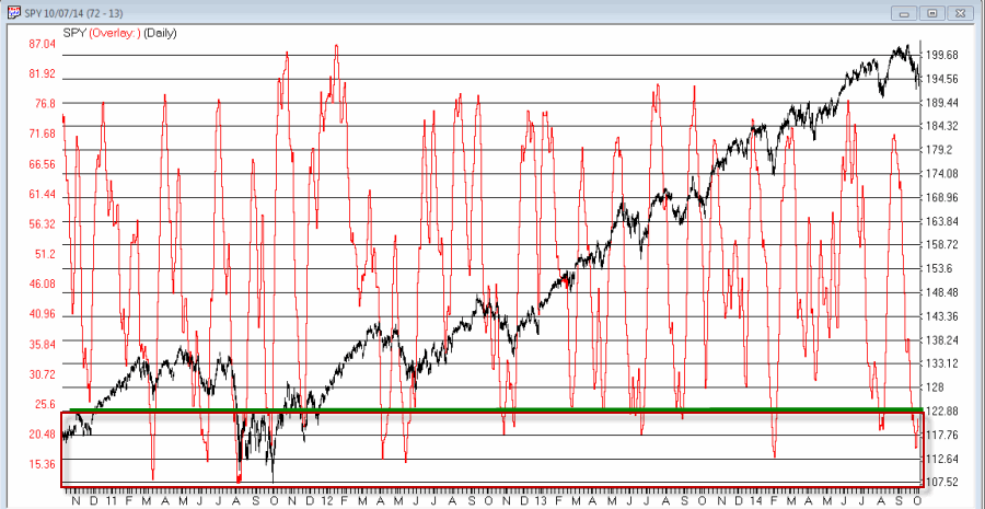
Well I could hardly refer to myself as a highly trained professional market analyst if I didn’t have my own proprietary  overbought/oversold indicator, so, voila, surprise, surprise, my own proprietary overbought/oversold indicator (cleverly named JKOBOS) appears in Figure 3.jkobos Figure 3 – Jay’s Overbought/Oversold Indicator is flashing an oversold (i.e., theoretically bullish) signal at the moment (Chart courtesy of AIQ TradingExpert)

A close look at the chart in Figure 3 reveals that JKOBOS readings below 25 tend to highlight decent buying opportunities.  With the indicator presently standing at 21.8, this qualifies as at least a “bullish alert”.

Summary

So is the combination of a bullish seasonal trend (i.e., October through December of Mid-Term election years) and an oversold market (based on a reading from my own overbought/oversold indicator) telling us that another rally is in the near future? 

The honest answer is “not necessarily”.  The optimistic answer however, is that despite the fear and loathing that seems to permeate the market these day (or maybe partly because of it), there is a chance that the market could surprise to the upside.  As a dutiful trend follower I personally have little choice but to continue to give the bullish case the benefit of the doubt.

Just don’t anyone tell Murphy I said that………sssshhhh!

Jay Kaeppel