Monthly Archives: April 2014

2014 Might Be a Good Year….to Sell in May

I have to admit I am a little surprised.  It is the last day of April and so far I have only seen a couple hundred thousand “Sell in May and Go Away” related articles, as opposed to the usual several hundred bazillion such articles that usually make their appearance about his time each year.  Still, what with May due to pop up at midnight tonight it seems like as good a time as any to chime in.

What You Probably Already Know

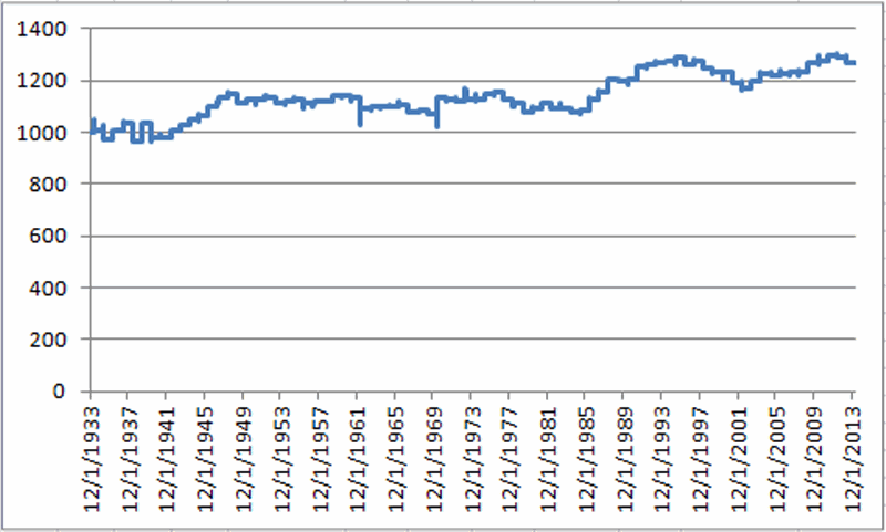
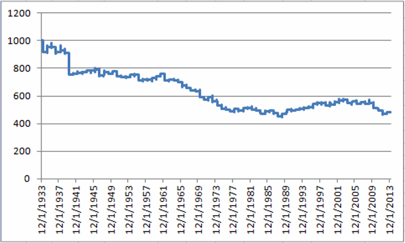
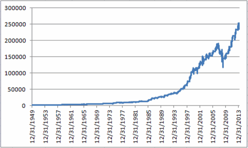
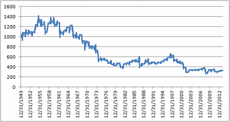
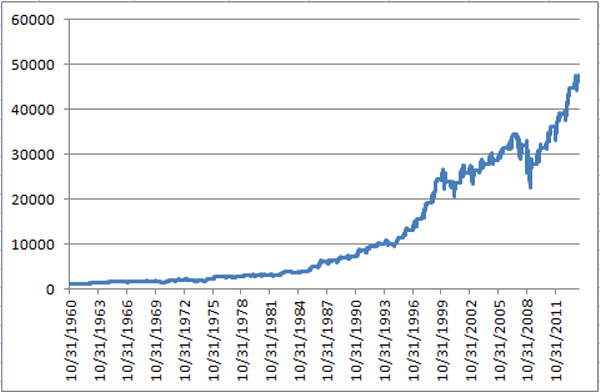
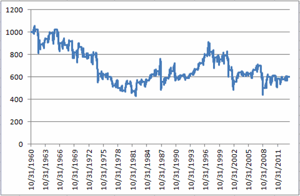
Historically the stock market has performed much better between the end of October and the third trading day of May that it has between the third trading day of May and the end of October. To wit, sees Figure 1 and 2.jotm20140430-01Figure 1 – $1,000 in the Dow from October 31st through 3rd trading day of May (1960-present)jotm20140430-02Figure 2 – $1,000 in the Dow from 3rd trading day of May to October 31st (1960-present)
Starting on 10/31/60:

* $1,000 invested in the Dow Industrials each year at the close of trading on the last trading day of October and held through the close of the third trading day of May grew to $47,280.

* $1,000 invested in the Dow Industrials each year at the close of trading on the third trading day of May and held through the close of the last trading day of October decreased to $599.

So to put it in blunt terms:

October to May = +4,628%

May to October = (-40%)

So clearly there is something to the “Sell in May” thing.  There is a caveat, however.  As you can see from a perusal of Figure 2 it is not as though the stock market declines each and every year during the May to October period.  So during many years selling in May and getting back in at the end of October would cause your returns to trail that of the overall market (and we can’t have that now can we?).

So that explains why roughly half of the bazillion annual “Sell in May” related articles warn against blindly selling in May.

What You Probably Don’t Know

Like they always say, sometimes it’s not what you know but who you know that counts.  Or in this case, not even someone I have personally met but do associate with.  Rob Hanna is the head of Hannah Capital Management (www.QuantifiableEdges.com) and is a colleague of mine in AAPTA (American Association of Professional Technical Analysts).  Rob revealed in some of his work the following “guide” for determining whether to “sell in May” or not:

-If the S&P 500 experiences a drawdown of 5% or more between December 31st and April 30th, then sell in May.

-If the S&P 500 DOES NOT experience a drawdown of 5% or more between December 31st and April 30th, then DO NOT sell in May.

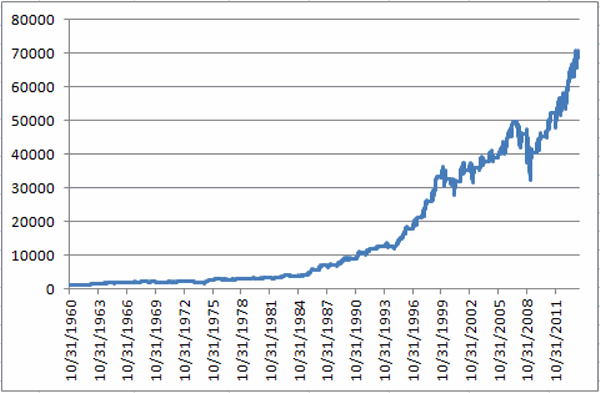
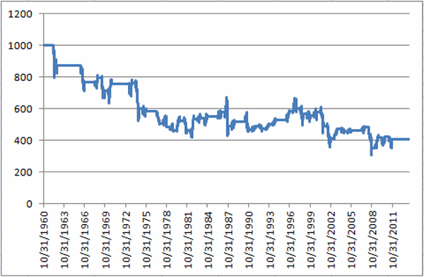
Doesn’t get much simpler than that. Since 1960 there have been 14 years during which the S&P 500 did not experience a 5% drawdown and an investor would have simply remained in the market.  The results appear in Figures 3 and 4. jotm20140430-03Figure 3 – $1,000 in the Dow during bullish periods applying Hanna Sell in May Filter (1960-present)jotm20140430-04Figure 4 – $1,000 in the Dow during bearish periods applying Hanna Sell in May Filter (1960-present)
In cold hard numbers:

* $1,000 invested in the Dow Industrials each year durung the “bullish” periods described grew to $70,244.

* $1,000 invested in the Dow Industrials each year duirng the “beairsh” periods describeed decreased to $403.

So to put it in blunt terms, applying Rob Hanna’s Sell in May Filter:

*October to May (plus May to October when no Sell in May IS NOT triggered) = +6,924%

*May to October (only during years when Sell in May IS triggered) = (-59.7%)

Here’s The Bad News

As you can see in Figure 5, the S&P 500 experienced a drawdown of -5.76% between the end of December and the end of April.  And -5.76% is greater than -5% (OK, mathematically speaking -5.76 is technically LESS than 5%, but you get my drift – there was a drawdown in excess of 5%).jotm20140430-05 Figure 5 – S&P 500 for 2014
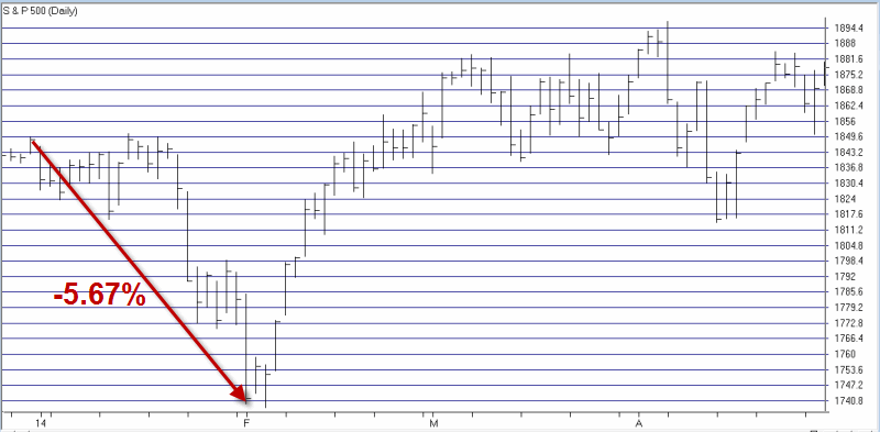
So by that rule, the Sell in May model that I prefer says to sell at the close on the third trading day of May and to buy back in at the end of October (although for the record, buying at the end of September is typically better in a mid-term election year, but that’s a topic for another article).

Summary

So because the S&P 500 experienced a -5.76% drawdown is the stock market absolutely, positively doomed to decline between May and the end of October? Of course not.  But the historical odds seem to suggest that caution may be in order.

Jay Kaeppel

The Middle of May is ‘Mush’

In my book (WARNING: Shameless self plug to follow) “Seasonal Stock Market Trends”, I highlighted the fact that the very beginning, very end and very middle of the month tends to be bullish for stocks, and everything in between, well, not so much.  The month of May as it turns out it a slight exception to the rule (OK, in the immortal words of Bill Murray, it’s actually more of a “guideline” than a “rule”, but I digress).

In any event, while the stock market has in fact showed a historical tendency to perform well during the beginning and end of the month of May, the entire time in between is pure “mush.”

The Beginning and End of May

 The first three days of May have followed the historically tendency for the first three days of most any month to perform reasonably well.  The growth of $1,000 invested in The Dow Industrials only during the first three days of May every year starting 1934 appears in Figure 1.jotm20140428-01 Figure 1 – Growth of $1,000 invested in Dow during 1st 3 days of May

All told, the first three days of May have showed a gain of +47.8% since 1934.  Is this “good” or “bad”?  Well, here is where a little perspective goes a long way.  In any event, in the immortal words of whoever said it first, “I’ve seen woise.”

Now let’s look at the end of May.  For this test we will look at trading days 17 and up.  In other words, we will assume that one bought the Dow Industrials Average at the close on the 16th trading day of May every year since 1934 and held through the end of the month.  The results for this test appear in Figure 2. JOTM20140428-02Figure 2 – Growth of $1,000 invested in Dow after trading day 16 during the month of May

This end of the month period for May has showed a +27.0% gain since 1934.

The Middle of May

Now let’s take a look at the historical performance during the middle of May – or as you may soon refer to them – The Bad Old Days.

Figure 3 displays the growth (or perhaps I should say “destruction” of $1,000 invested in the Dow only between the end of trading day #3 and trading day #16 every May since 1934.jotm20140428-03 Figure 3 – Growth of $1,000 invested in Dow during May trading days 4 through 16

As you can see the original $1,000 invested only during the middle of May declined -51.9% to $481. 

Figure 4 displays the growth of $1,000 during the beginning and end of May (blue line) versus the middle of May (red line). jotm20140428-04Figure 4 – The beginning and end of May versus the “Mush” in the middle

Notice any difference?

Summary

So is the beginning and end of May guaranteed to be “up” and is the middle of May guaranteed to be “down”?  Not at all.  Historically the beginning and end periods have seen the Dow gain a little over 70% of the time and the “middle” period – as I have defined it in this article has seen the Dow gain 47% of the time.  So as always, there are no “sure things” in the stock market.  Still, probabilities and historical tendencies can be useful.

In any event, do not be lulled into a false sense of security if the end of April, beginning of May time frame witnesses an advance in the stock market.

Remember, “beware the mush.”

Jay Kaeppel

A Simple Strategy for Growth & Income Investors

For better or worse, some people are just market “junkies” (Hi, my name is Jay).  Stocks, options, futures, ETFs, sure, whatever.  Bring it on.  Hey why not throw some FOREX in there too (just to make my head hurt as I try or the umpteenth time to wrap my head around currency conversions)?  Bottom line, whatever it is, as long as it relates to the financial markets, we’re interested.

But not everyone is like this (Or so I’m told).  Some people like to put their money into something and just kind of leave it there and let it grow over time.  And as I avert my eyes momentarily from a quote screen I can see that this approach has a certain simple elegance to it.  So today, let’s touch on a simple strategy “for the other half” (or as they are more commonly known outside of “market junkie” circles – “normal people”).

Growth & Income

For most “normal people” there are basically two ways to make money in the financial markets – buy something and watch it grow in value and sell it later at a profit, and/or invest in something that pays interest and or dividends along the way, thus generating a potential “stream of income.”

A lot of investors also combine the two concepts and invest in things that not only can “grow” but which can also generate “income.”  (The mutual fund industry figured this out a long time ago and sometime during the 1980’s helpfully launched approximately 12,356 mutual funds titled “[Mutual Fund Family Name Here] Growth & Income Fund.” )

So sure that’s one way to go.  Here is another.

Utilities & Intermediate-Term Government Bonds

Lots of people buy utility stocks because they tend to pay a higher dividend yield than the average stock.  Likewise, during bull markets they tend to go up in price.  Additionally, lots of people buy intermediate-term U.S. government bonds because they are considered “safe” in terms of payment of principal and interest (although since they are issued by the largest debtor in the history of this particular planet, I suppose it can be argued that, “I do not think that word means what you think if means”).  In any event, a lot of people do it.  So let’s look at a simple strategy that combines the two ideas.

Jay’s Growth & Income System

Here are the rules:

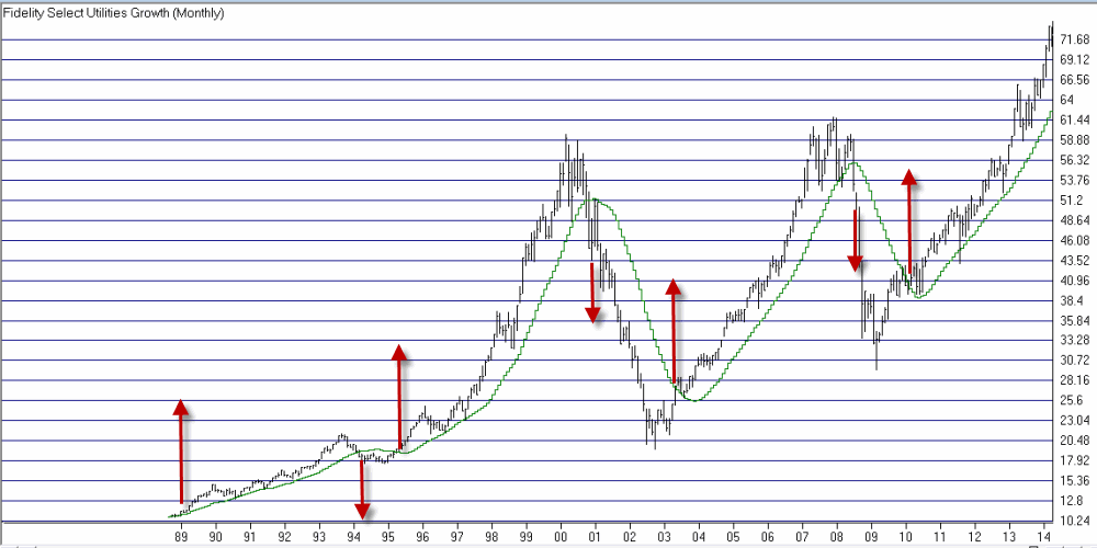
1) If Fidelity Select Utilities Growth (ticker FSUTX) closes the end of the month above its 21-month moving average (of monthly closing prices), buy and/or continue to hold utility stocks.

2) If Fidelity Select Utilities Growth (ticker FSUTX) closes below its 21-month moving average (of monthly closing prices) for two consecutive months, then sell utility stocks and buy intermediate-term government bonds.

3) Repeat.

Starting at the end of 1988, there have been 3 full round turns (buying and selling utility stocks) and the “system” is still holding long utility stocks on the 4th round turn.jotm20140421-01Figure 1 – Jay’s Growth & Income System Buy and Sell Signals (Chart courtesy of AIQ TradingExpert)

Results

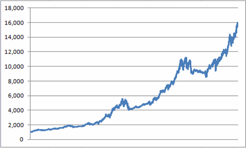
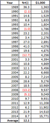
For the record, the results that appear in Figures 2 and 3 reflect the gain or loss achieved by switching between Fidelity Select Utilities Growth (ticker FSUTX) and Fidelity Government Income (ticker FGOVX).  The results do not include any dividends paid by these funds along the way. jotm20140421-02Figure 2 – Growth of $1,000 (12/31/88 – 4/17/14)

 jotm20140421-03

Figure 3 – Annual Results

Note that the system is by no means without risks.  There were 5 calendar years that witnessed a loss (including a worst of -13.2% in 2008).    Still, for better or worse,  the average annual gain (not including fund dividends paid) was 12.1%.

Summary

Maybe 12.1% a year (plus dividends) floats your boat and maybe it doesn’t.  That’s for each investor to decide for themselves.  The real point of this particular article is not to convince you to utilize the method I have highlighted.  The real point is simply to illustrate the fact that there are some pretty simple methods out there that can allow “normal people” (and I think you know who you are) to generate some relatively steady rates of returns without fixating on every gyration of the stock or bond market.  

Now if you will excuse me, I think the EuroYen just moved two pips…

Jay Kaeppel

What, Me Worry? You Bet

OK, first off you have to admit that we are getting a little bit soft, don’t you think? I  mean, after marching relentlessly higher to the tune of 34% since the November 2012 low, the Dow pulls back about 4.3%. And from all of the racket you would think that the end of the freaking world is apparently just around the corner.  We used to be made of sterner stuff.  Or so it seemed.

So there is a part of me that wants to shout “Buck up, people”.  As a TFF (“Trend Followin’ Fool”) from way back, I would like to think that given the fact that the major stock market averages are above their respective long-term moving averages, we should stop all of the hand wringing and simply acknowledge that (at least for now) the major trend of the stock market is still bullish. 

And when I say “I would like to”, I mean I really would “like to”.  But the truth is there are a lot of good reasons to be keeping a close eye on the exits.  To wit:

Indexes vs. Moving Averages

There is nothing magical about the relationship between the price of an asset/stock/index and its 200-day moving average.  That being said, I sure do rely on it a lot – maybe because the interpretation is pretty darn simple:

Price > 200-day moving average = GOOD

Price < 200-day moving average = BAD

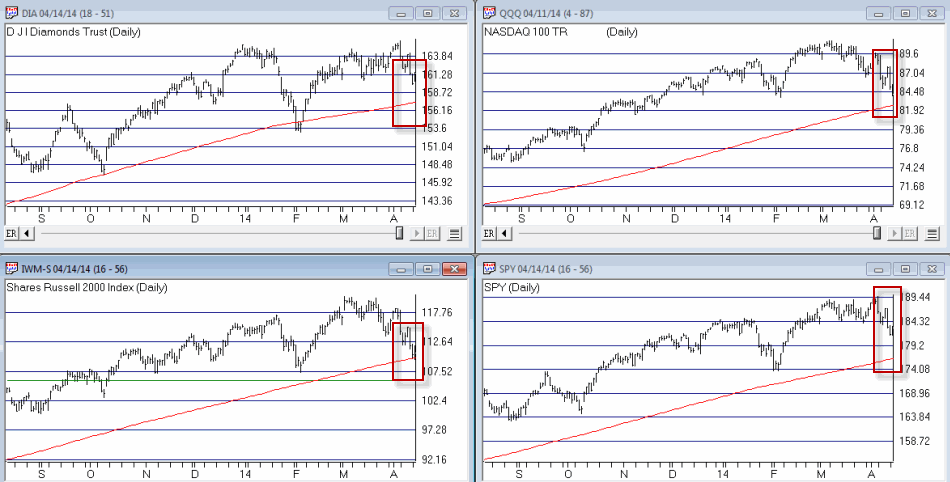
In Figure 1 we see four major stock market indexes (the Dow, the Nasdaq 100, the S&P 500 and the Russell 2000 clockwise from upper left).jotm20140415-01Figure 1 – Major stock indexes versus their 200-day moving averages (Courtesy: AIQ TradingExpert)

The thing to note is that with the exception of the Russell 2000 – which is only slightly above it’s MA – they are still well above their respective 200-day moving averages. Now granted this could change quickly if prices keep heading south.  But the point is that for now, an objective trend-follower still has to designate the major trend as “up.”

Alright, I hope you enjoyed the “Good News”

 Is Elliott Wave Waving “Goodbye” (to the Bull)?

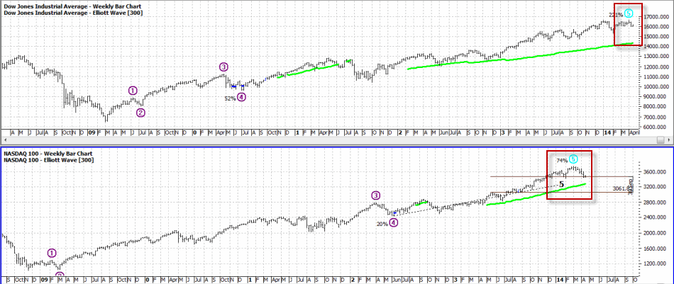
Figure 2 displays the Elliott Wave count for the Dow and the Nasdaq 100 as calculated mechanically by ProfitSource by HUBB.jotm20140415-02Figure 2 – Dow and Nasdaq completing Elliott Wave 5? (Source: ProfitSource by HUBB)

OK, a few things. For the uninitiated, the Elliott Wave Theory is based on work by – who else, a guy named Elliott – that suggests that price moves up in 5 waves – 3 waves up, 2 waves down – and then declines in 5 waves – 3 waves down and 2 waves up.  Now the truth is that a lot of Elliott Wave counts don’t pan out.  But I known a lot of people who’s market opinion I respect who follow “the Wave”. 

As you can see in Figure 2 both the Dow and the Nasdaq 100 appear to have formed or are in the process of forming a completed 5-wave “up” pattern. The implication going forward is for lower prices ahead.

Sell In May – with MACD Filter (SMMF)   

The “Sell in May” pattern was first reported by Yale Hirsch and since then The Hirsch Organization’s Stock Trader’s Almanac has kept track of an updated – and improved version – that uses the MACD indicator to determine the exact entry and exit dates. 

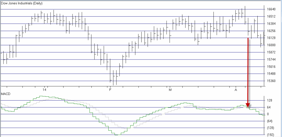
By my calculations, this SMMF method issued an early “sell” signal on 4/7/14 as shown in Figure 3.  This sell signal remains in effect until at least the end of September (which is significant, as we will see shortly).jotm20140415-03Figure 3 – Early “Sell in May” signal on 4/7/14 as MACD Oscillator turns negative (Courtesy: AIQ TradingExpert)

Why does this SMMF signal matter?  In Figures 4 and 5 you can see the growth of $1,000 during bullish and bearish periods as signaled by the “Sell in May with MACD Filter” Method since 12/31/1949. jotm20140415-04Figure 4 – Growth of $1,000 invested in Dow Industrial when SMMF Method is bullish jotm20140415-05Figure 5 – Growth of $1,000 invested in Dow Industrial when SMMF Method is bearish

Notice any difference?  For the record – and excluding any interest earned while of the market:

Bullish Phase gain = +24,753%

Bearish Phase loss = (-68%)

This method is now deemed”bearish.”  ‘Nuff said.

 Mid-Term Election Time of Year

 Let me sum up the historical trend for mid-term election years as succinctly as possible by stating:

“Everything until September 30th is a crapshoot, but ignore any bad news after that.”

This summary is nicely illustrated in Figure 6.

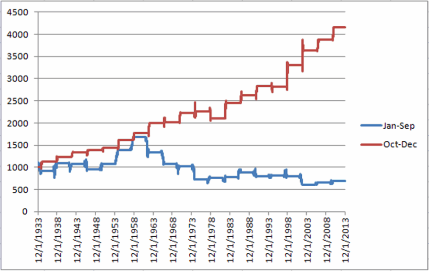
*The blue line in Figure 6 displays the growth of $1,000 invested in the Dow between December 31st of the post-election year and September 30th of the mid-term election year.

* The red line in Figure 6 displays the growth of $1,000 invested in the Dow between September 30th of the mid-term year and December 31st of the mid-term year.jotm20140415-06Figure 6 – Stock market shows bullish trend September 30 of mid-term election year through December 31st (Red line)

Again, the interpretation is fairly simple:

Jan 1 to Sep 30 – “Whatever”

Oct 1 to Dec 31 – “Bullish (usually)”

Summary

As a dutiful trend follower – and with the major indexes still holding above their long-term moving averages – I am still wearing the “brave face” and hoping that the stock market will continue to move higher.  But if weakness persists or accelerates, it would appear that investors might be wise to take some defensive action (hedge, raise cash, go short) and to check back around September 30th of this year.

Sounds like a good time to invoke one of the most useful old adages:

“Hope for the best, prepare for the worst”

Jay Kaeppel

A Simple Signal for Bond Traders

I haven’t written anything in a while as I have been off at an “undisclosed location” on “important” business (Oh, which reminds me, Mickey and Minnie say “Hi”).  Anyway, last time out I touched on a “simple” indicator.  Please note that I did not say “World Beater” indicator, and the words “you can’t lose” never passed from my lips, er, fingertips in this case.  But there is something about “simple” that can often be very “useful” when it comes to trading.

So while all eyes remains focused on the stock market as traders wonder “will it or won’t it?”, let’s turn our attention to the bond market. 

A Simple Method for Bonds

In last week’s article (http://jayonthemarkets.com/2014/03/30/a-simple-buy-signal-for-traders/) I wrote about a simple method for using the Commodity Channel Index (or CCI for short). 

In an article dated 9/8/13 (http://jayonthemarkets.com/2013/09/08/t-bonds-and-japanese-stocks-inversely/) I wrote about the fact that (for whatever reason) t-bonds tend to move inversely to Japanese stocks.  So this time out let’s combine the two ideas as follows:

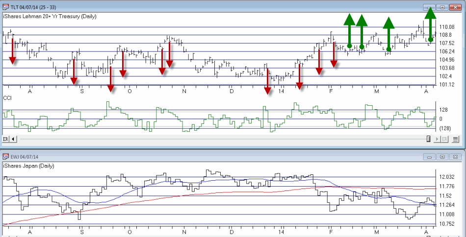
-If the 25-day moving average for ticker EWJ (ETF that tracks Japanese stocks) is below the 150-day moving average we will look for bullish signals on ticker TLT (ETF that tracks the long treasury bond) when the CCI drops below -100 and then turns up for one day.

-If the 25-day moving average for ticker EWJ (ETF that tracks Japanese stocks) is above the 150-day moving average we will look for bearish signals on ticker TLT (ETF that tracks the long treasury bond) when the CCI rises above +100 and then turns down for one day.

Did I mention this was “easy?”

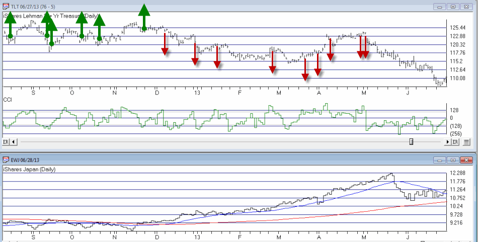
So how does it look just eyeballing things?  Not too bad as you can see in Figures 1 and 2.  In both of these charts, ticker EWJ appears on the bottom with the 25 and 150 day moving averages plotted.  Remember, when EWJ is in a downtrend we are looking for bond buying opportunities and vice versa.

The down red arrows on the TLT chart highlight potential shorting opportunities and the green up arrows highlight potential buying opportunities.   jotm20140408-02Figure 1 – TLT on Top, EWJ on the bottom (Courtesy: AIQ TradingExpert) jotm20140408-01Figure 2 – TLT on Top, EWJ on the bottom (Courtesy: AIQ TradingExpert)

Trading It with Options

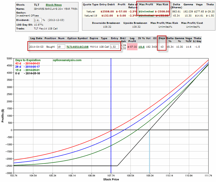
You didn’t think I was going to get through this without mentioning options did you?  To look at one possible way to play this method, let’s just look at the last buy signal that occurred at the end of Figure 2 on 4/3/14. 

Let’s consider buying the call option with at least 40 days left until expiration and the highest gamma among call options for that expiration.  A trader willing to risk roughly $2,500 could have bought 19 of the May 108 TLT calls with 43 days left until option expiration as shown in Figure 3. jotm20140408-03Figure 3 – Long 19 TLT May 108 Calls (Courtesy: www.OptionsAnalysis.com)

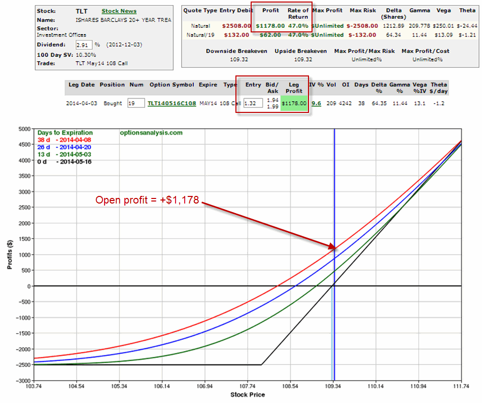
Over the course of the following three trading days ticker TLT rose from 107.74 to 109.37 (or +1.5%).  During the same time the TLT May 108 call rose from $1.32 to $1.94 (or +47%) and the trade shows an open profit of +$1,178. jotm20140408-04Figure 4 – Long 19 TLT May 108 Calls (Courtesy: www.OptionsAnalysis.com)

What to do with this trade from here is a whole other topic.

Summary

So is the simple system displayed in Figure 1 and 2 the greatest thing since sliced bread?  And is it guaranteed to crank out an endless string of trades like the one shown in Figures 3 and 4? 

No and No (sadly).

Still, it sure is simple, no?

Jay Kaeppel