Although I do a lot of my own analysis, I also recognize that there is a heck of a lot that I don’t know and a lot that I don’t see unless someone else points it out. So here is a handful that caught my eye.
Stock Market Valuation
While I am primarily a trend follower and am in the “the major trend is still bullish” camp, I also recognize that over time the stock market swings from undervalued to overvalued and – much to the chagrin of everyone – back again. At this point in time there are two things to keep in mind:
1) When the stock market gets overvalued something bad invariably follows
2) The stock market is presently near the high end of the long-term valuation range
Figure 1 is from Advisors Perspective at dshort.com and displays an index of various valuation measures at the top and the subsequent 10-yr average rate of return for stocks going forward.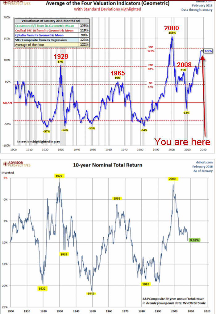 Figure 1 – Stock Market Valuation and subsequent 10-year average annual returns (Beware); (Source: Advisors Perspectives; www.dshort.com)
If you feel that the stock market is impervious and that there is little downside risk in the next several years I encourage you to analyze this chart closely. The two things I mentioned above will become fairly obvious.
This chart is NOT a reason to panic, nor to “sell everything.” But it should serve as a reminder that when the next bear market rolls around it will likely be “one of the painful kind.”
Commodities Cheap Relative to Stocks
I wrote about this in greater detail here, but in a nutshell, over time there is an interplay between hard assets (commodities, real estate) and paper assets (stocks in particular). One vastly outperforms for awhile, and then everything reverses.
Figure 2 strongly suggests that commodities are extremely cheap compared to stocks. History strongly suggests that this relationship is not permanent.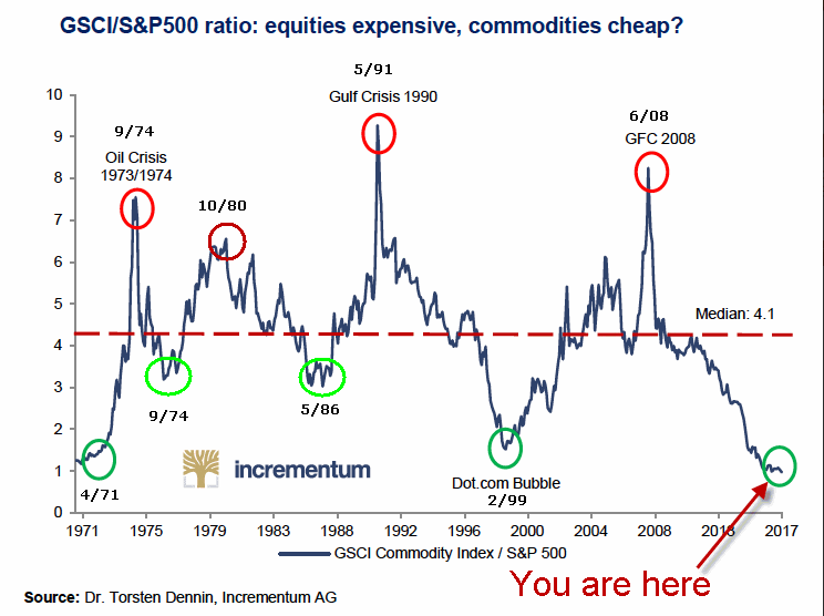 Figure 2 – GSG/SPX Ratio (i.e., commodities versus stocks) (Source: Dr. Torsten Dennin, Incrementum AG)
The upshot of Figure 2 is that investors should NOT be surprised if commodities (which can be traded as, well, a commodity, using ETFs such as GSG, DBC or RJI) vastly outperform stocks over the next 5-10 years. I am not “ringing a bell” and shouting “sell stocks, buy commodities” – but am simply pointing out that the tide will eventually turn – likely in a significant way.
Bonds May Be Overdone on the Downside
I recently subscribed to www.sentimentrader.com and absolutely love the wealth of hard market data they provide. The one chart I want to point out here displays the 10-day average of their “Investment Grade Bond Up Issues Ratio” (i.e., low readings mean most bonds are declining) versus ticker LQD – which is an ETF that tracks an index of investment grade corporate bonds. As you can see in Figure 3, sentiment is getting very negative. Likewise, previous readings down in this range have typically been followed by upside reversal in price.
This potential setup fits well with what I wrote about here and here.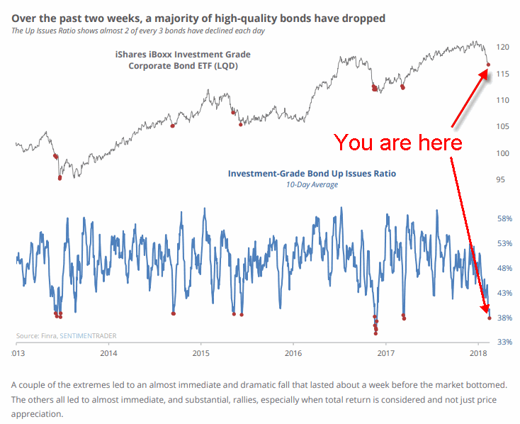 Figure 3 – Sentiment may be suggesting that bonds are overdone on the downside and are due for a bounce (Source: www.sentimentrader.com)
Two caveats: 1) there is no guarantee that will happen this time, and 2) history suggests that bonds could sell of even more before finding a bottom. So don’t take this as a buy signal but simply as an alert that a buying opportunity may soon be at hand.
Jay Kaeppel
Disclaimer: The data presented herein were obtained from various third-party sources. While I believe the data to be reliable, no representation is made as to, and no responsibility, warranty or liability is accepted for the accuracy or completeness of such information. The information, opinions and ideas expressed herein are for informational and educational purposes only and do not constitute and should not be construed as investment advice, an advertisement or offering of investment advisory services, or an offer to sell or a solicitation to buy any security.

