Monthly Archives: December 2017

The ‘Boring Bond Index’ for Low-Risk Investors

OK, the truth is that I prefer to write about stuff that is at least “potentially” exciting, i.e., things that perhaps have a chance to accumulate well above average profits. But “boring” (and “consistent”) isn’t so bad for a lot of investors in a lot circumstances.

A 10-Month a Year Bond Index (Plus 2)

This “index” was developed by Dr. Jerry Minton, the President of Alpha Investment Management, Inc. It works like this:

*30% in short-term (1-3 yr.) treasuries

*40% in intermediate-term (3-7 yr.) treasuries

*30% in high-grade corporate bonds

10 Months: The original “index” of bonds is held from the close on December 31st through the close on the following October 31st (i.e., buy and hold for 10 months) and then rebalanced on December 31st.

Plus 2: For the purposes of this article we will assume that 100% of the portfolio is held in short-term (1-3 yr.) treasuries during November and December each year.  Then the money will be reallocated using the 30/40/30 split shown above.

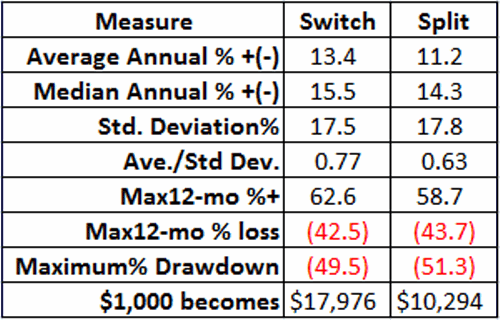
Figure 1 displays the cumulative growth of $1,000 since 12/31/1975.1
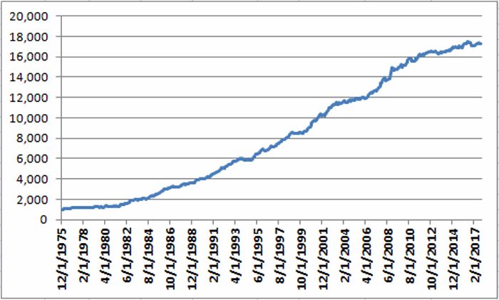
Figure 1 – Growth of $1,000 invested using “Boring Bond Index” Method; 12/31/1975-11/30/2017

The key thing to note is the consistent “lower left to upper right” slope of the equity curve in Figure 1.  Since 12/31/1975:

*The average 12-month return is +7.2%

*The worst 12-month period was -5.2% (12-mos ending 3/31/1980)

*The largest drawdown was -9.2% (month ending 2/29/1980)

*The largest maximum drawdown since 1982 was a mere -3.8% (in 1994)

*90.4% of all 12-month periods showed a gain

Other Considerations

One caveat here is that bonds have (at least until recently) been in a bull market for roughly 35 years.  Still, for the record the period from 12/31/1975 also includes:

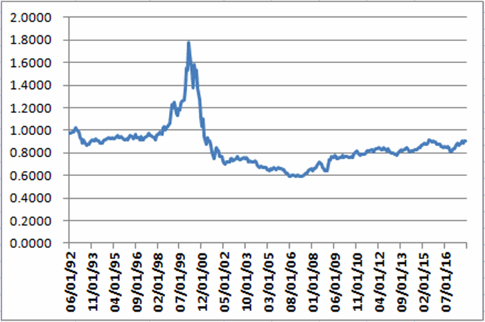
*The 1977-1981 period that saw interest rates “spike” from roughly 6% to over 14% (the prime rate hit 15%). See Figure 2.

2a

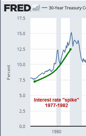
Figure 2 – 30-Year Treasury interest rate; 1977-1982

(Source: https://fred.stlouisfed.org/series/DGS30)

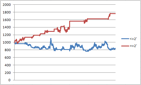
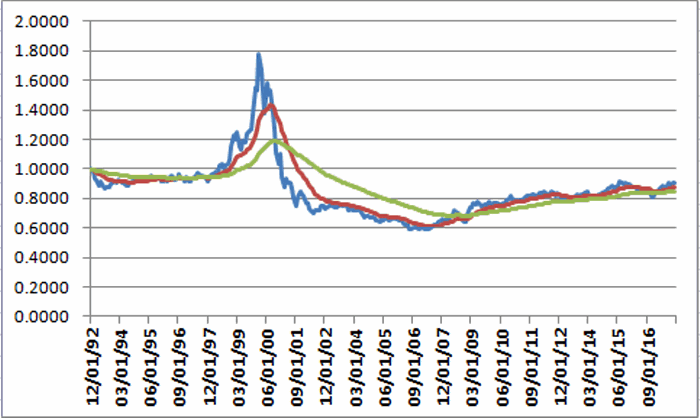
Figure 3 displays the 8/31/1977 through 8/31/1982 period for Boring Bond Index (blue) versus long-term treasury bonds (red).

2
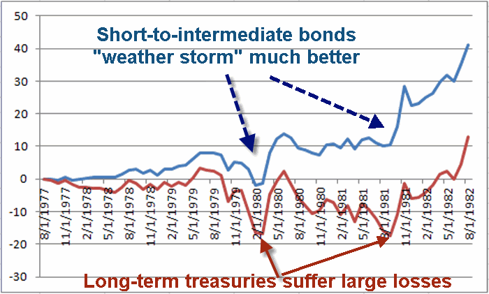
Figure 3 – Cumulative % Total Return for Boring Bond Index (blue) versus Long-Term Treasuries (red); 8/31/1977-8/31/1982

In a sharply rising rate environment long-term bonds are an awful place to be as they are most susceptible to price declines as rates rise.  As you can see in Figure 2, short-to-intermediate bonds – thanks to their lower volatility and – can “weather an interest rate storm” much more favorably.

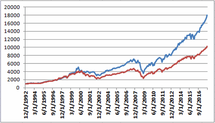
*The 2016-present period during which interest rates have essentially been sideways to higher.  Figure 4 displays the cumulative total for the Boring Bond Index versus long-term treasuries since 7/31/2016.3

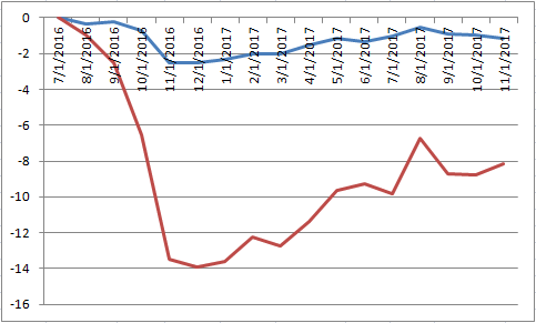
Figure 4 – Cumulative % Total Return for Boring Bond Index (blue) versus Long-Term Treasuries (red); 7/31/2016-11/30/2017

As you can see in Figure 3, long-term bonds took a hit and have remained quite volatile relative to short-to-intermediate-term bonds.

Summary

What is presented above is not a “make big gobs” of money strategy. It is simply an example of a long-term approach for low risk investors to invest in the bond market through “all kinds of weather.”

Jay Kaeppel

Disclaimer:  The data presented herein were obtained from various third-party sources.  While I believe the data to be reliable, no representation is made as to, and no responsibility, warranty or liability is accepted for the accuracy or completeness of such information.  The information, opinions and ideas expressed herein are for informational and educational purposes only and do not constitute and should not be construed as investment advice, an advertisement or offering of investment advisory services, or an offer to sell or a solicitation to buy any security.

Too Soon for Energy?

Even in light of an extended bull market, and even despite the fact that the energy sector is roughly 50% above its 2016 low, overall the energy sector continues to be something of “laggard.”

Will that change? Well, of course.  Um, eventually.  But let’s take a closer look at where things stand right now.

Figure 1 displays the growth of $1,000 invested in the S&P 500 Index (SPX) versus $1,000 invested in Fidelity Select Energy (FSENX) since FSNX started trading in July 1981.1aFigure 1 – Growth of $1,000 invested in SPX (blue) versus FSENX (red); 6/30/1981-11/30/2017

As you can see, at the moment the overall market as represented by SPX has far outpaced the energy sector.  In fact the SPX has gained FSENX 3.2 times as much (+4,663% to +1,466%) over 36+ years.

Figure 2 displays the FSENX/SPX ratio.  This ratio is derived by dividing the red line in Figure 1 by the blue line Figure 1).

When the line is rising it means that FSENX is outperforming SPX and vice versa.  As you can see, FSENX has spent a lot of time underperforming.2aFigure 2 – FSENX/SPX Ratio; 6/30/1981-11/30/2017

In a nutshell:

*FSENX consistently underperformed SPX for about 17.5 years between 1981 and 1998

*FSENX vastly outperformed SPX for about 8.5 years from 1999 into mid-2008.

*FSENX has vastly underperformed SPX ever since.

Two key points:

*The trend favoring SPX over FSENX is still very much in force

*Eventually that trend will end and the line in Figure 2 will turn up again

A Way to Follow this Trend

Figure 3 displays the same line as shown in Figure 2 (i.e., the FSENX/SPX Ratio) but also adds a 7-month and a 36-month exponential moving average.3aFigure 3 – FSENX/SPX Ratio with 7-month and 36-month exponential moving averages

As with any moving average or set of moving averages, there will be whipsaws as well as lags in terms of identifying trends.  But this does give us some way of objectively declaring the FSENX/SPX ratio as “up” (i.e., favoring FSENX) or “down” (i.e., favoring SPX).  To wit:

*If the 7-month EMA is above the 36-month EMA then FSENX is favored

*If the 7-month WMA is below the 36-month EMA then SPX is favored

For the purpose of building a system we will also add a 12-month EMA to both SPX and FSENX as shown in Figures 4 and 5.4aFigure 4 – Growth of $1,000 invested in SPX with 12-month exponential moving average

5aFigure 5 – Growth of $1,000 invested in FSENX with 12-month exponential moving average

*If SPX is above its 12-month EMA it is considered to be in an “uptrend”, if it is below its 12-month EMA it is considered to be in a “downtrend”

*If FSENX is above its 12-month EMA it is considered to be in an “uptrend”, if it is below its 12-month EMA it is considered to be in a “downtrend”

*We will also add the Bloomberg Barclays Intermediate-Term Treasury Index to the mix for those times when neither index qualifies using the rules detailed in a moment.

Building a System

Here are the rules:

If:

*FSENX/SPX 7-month EMA is above the 36-month EMA

AND

*FSENX is above its 12-month EMA THEN hold FSENX

If:

*FSENX/SPX 7-month EMA is below the 36-month EMA

AND

*SPX is above its 12-month EMA THEN hold SPX

Else: hold intermediate-term (3-7 years) treasuries

As a benchmark we will split money 50/50 between SPX and FSENX and rebalance at the end of each year.

The cumulative growth of $1,000 invested using the rules above appears in Figure 6.  The blue line represents the growth of $1,000 using the rules above.  The red line represents the growth of $,1000 generated by buying and holding both SPX and FSENX and rebalancing every year.6aFigure 6 – Growth of $1,000 invested using “System” (blue) versus growth of $1,000 split between SPX and FSENX at rebalanced annually; 6/30/1981-11/30/2017

For the record:

*$1,000 invested in the “system” grew to $135,884 between 6/30/1981 and 11/30/2017

*$1,000 invested in the “buy/hold and rebalance annually” method grew to $37,395 during the same time

Summary

Also for the record I am not recommending that anyone adopt the above as an actual investment method. The purpose of everything above is simply to highlight:

*That there is an interplay between energy (or any sector for that matter) and the broader stock market

*There may be ways to take advantage of that interplay

This article simply represents one place to start looking.

Jay Kaeppel

Disclaimer:  The data presented herein were obtained from various third-party sources.  While I believe the data to be reliable, no representation is made as to, and no responsibility, warranty or liability is accepted for the accuracy or completeness of such information.  The information, opinions and ideas expressed herein are for informational and educational purposes only and do not constitute and should not be construed as investment advice, an advertisement or offering of investment advisory services, or an offer to sell or a solicitation to buy any security.


World, Meet Resistance

I track an index comprised of 33 single-country ETFs. The chart of that index appears in Figure 1.

(click to enlarge)1Figure 1 – Jays World Index (Courtesy AIQ TradingExpert)

Two things stand out:

*World stock markets have enjoyed a terrific run since the low in early 2016.

*World stock markets (in aggregate) are fast approaching a significant resistance level (clearly marked in Figure 1).

Figure 2 drills down a little and breaks the overall index into four regions:

*North/South America

*Europe

*Asia/Pacific

*Middle East

The charts for each of the groups appear in Figure 2.

(click to enlarge)2aFigure 2 – Jay’s Regional Indexes (Courtesy AIQ TradingExpert)

Middle East markets have been a laggard (although for the record that index is roughly 20% above its late 2016 low) but the others have witnessed a substantial run up in price.

Unfortunately, they are also all running into – or are close to running into – a major area of resistance as you can see in Figure 2.

Where to from Here

One of three things will ultimately happen:

*Markets will keep rallying and break decisively through the marked resistance levels on the way to higher new highs

*Markets will run into resistance and then turn choppy for a period of time as they decide which way to go

*The markets will run into resistance, fail to break through in any meaningful way, thus triggering a meaningful price decline

I would love to tell you which one of these scenarios is about to unfold but I am pretty lousy at “predicting” things.  I am pretty decent though at identifying current trends and also areas of potential risk.

With that in mind:

*Figure 3 displays a daily chart of the 33 ETF World Index.  This is clearly an index still in a strong uptrend.  So do not look at Figures 1 and 2 and assume that upside is limited and that it is time to sell.3Figure 3 – Jay’s World Index daily chart; resistance at 300 (Courtesy AIQ TradingExpert)

*At the same time, the resistance level marked on Figure 1 is at about the 300 level (the index itself is presently in the 292 range).  So “it won’t be long now” before the index “bumps its head.”

So pay close attention for clues as to whether the worldwide bull market will continue unabated – or if maybe we are “on the brink” (of something different).

Jay Kaeppel

Disclaimer:  The data presented herein were obtained from various third-party sources.  While I believe the data to be reliable, no representation is made as to, and no responsibility, warranty or liability is accepted for the accuracy or completeness of such information.  The information, opinions and ideas expressed herein are for informational and educational purposes only and do not constitute and should not be construed as investment advice, an advertisement or offering of investment advisory services, or an offer to sell or a solicitation to buy any security.

Junk Bonds – History Says ‘Go’, Chart Says ‘No(?)’

I have come across a number of pieces lately from people voicing their concerns over the prospects for junk bonds. And there may be something to their concerns. Still, history appears to suggest that the time to head for the exits may still be a little ways away.

First the Bad News

The yields on junk bonds are about as low as they have every been (at least within about 65 basis points or so).  When I went to copy and paste the chart I found I came across some intense copyright warning so click here to see the chart from the St.Louis Fed website (also click “Max” on the screen that comes up to see roughly 20 years of history).  In addition, the spread between junk bond yields and high grade corporate bond yields is also at or near a multi-year low.

Finally, the price chart for junk bond ETFs is causing some angt as well.  See Figure 1.  There are some fairly obvious support and resistance levels. Moving out above support looks like a challenge and if one or more of the support levels breaks – well, charting theory suggest that there could be trouble.1Figure 1 – Ticker JNK – which way out? (Courtesy AIQ TradingExpert)

Finally, despite the fact that December has typically been a good month for junk bonds (Vanguard High Yield ticker VWEHX has been up in December 30 of the past 38 years using monthly total return data), December 2017 is off to a rocky start as you can seen Figure 1.

Now the “Not So Bad News”

Junk bonds are much more highly correlated to stocks than they are to interest rates and/or treasury bonds.  And stocks tend to perform well during the December through April period.  So do junk bonds. Typically.  And they typically perform much better than straight intermediate-term treasury bonds.

Figure 2 displays the growth of $1,000 invested in ticker VWEHX only during the months of December through April every year starting in January 1979.2Figure 2 – Growth of $1,000 invested in ticker VWEHX ONLY during December through April; 12/31/1978-11/30/2017

For the record, December (inclusive) through April since 1979 using monthly total return data for ticker VWEHX:

*Up 34 times (87% of the time)

*Down 5 times (13% of the time)

*Average UP = +5.9%

*Average DOWN = (-2.3%)

*Maximum UP = +16.0%

*Maximum DOWN = (-3.3%)

To put this performance into perspective, Figure 3 displays the same line from Figure 2 (blue line) along with the total return growth of $1,000 invested in intermediate-term treasuries (red line).3Figure 3 – Growth of $1,000 for VWEHX (blue line) versus intermediate-term treasuries (red line) Total Dec-Apr return; 12/31/1978-11/30/2017

Summary

So will “history” win out as junk bonds break out to the upside between now and the end of April?

Or is this destined to be one of those “exception to the rule” kind of years?

It might be wise to keep an eye on the $35.90 to $36.10 support area for ticker JNK.  A break below that level might signal trouble.  Unless and until that happens, history suggests giving junk bonds the benefit of the doubt in the months just ahead.

Jay Kaeppel

Disclaimer:  The data presented herein were obtained from various third-party sources.  While I believe the data to be reliable, no representation is made as to, and no responsibility, warranty or liability is accepted for the accuracy or completeness of such information.  The information, opinions and ideas expressed herein are for informational and educational purposes only and do not constitute and should not be construed as investment advice, an advertisement or offering of investment advisory services, or an offer to sell or a solicitation to buy any security.


Holiday/New Year’s Fizzle (Not Fizz) Typical for KO

This time of year is typically one of good cheer.  Particularly in the stock market (see here and here).  But there are always a few “Grinches” out there.  Take for instance Coca-Cola stock (ticker KO).  An iconic company and arguably one of the most recognizable brands of all time to be sure.  Also one of the most “seasonal” stocks of all-time (see here, here, here and here).  But awfully “stingy” around the holidays and early in the New Year.

The “Fizz Free” New Year Period

Extends from the close on December trading day #17 through the close of January trading day #20.  Figure 1 displays the growth of $1,000 invested in ticker KO ONLY during this period every year since 1982.1Figure 1 – Growth of $1,000 invested in KO from December trading day #17 through January trading day #20; 12/23/198112/15/2017)

For the record, the initial $1,000 has declined -65% down to $350.

During this period:

*KO was unchanged one year (1991)

*KO was up 6 times (17% of the time)

*KO was down 29 times (81% of the time)

*Average gain was +3.9%

*Average decline was -4.3%

The next “unfavorable” period begins at the close on 12/26/2017 and extends through 1/30/2018.

One Possible Strategy

This unfavorable period might be a good time for investors who hold KO stock to consider writing a covered call against their stock holdings.  There are several factors to consider:

*Presumably you are holding KO shares and are not in a hurry to sell them.

*You have a plan in place regarding what you will do if KO shares rise above the strike price of the option you sell (i.e., will you buy back  the call – possibly at a loss, or will you let the stock shares be called away?).

One example from last year appears in Figures 2, 3 and 4.  This position assumes that an investor holds 1000 shares of KO stock and sells 5 covered calls against those shares (for the record, an investor holding 1,000 shares of stock could sell anywhere from 1 to 10 covered calls).2Figure 2 – KO covered call on 12/23/2016 (long 1000 shares, short 5 Feb2017 42 calls) (Courtesy www.OptionsAnalysis.com)3Figure 3 – KO covered call risk curves (Courtesy www.OptionsAnalysis.com)

Between December 23, 2016 (Dec TDM #17) and January 31, 2017 (Jan TDM#20) KO stock shares moved from $41.60 a share to $41.57.  While the price move for the stock shares was negligible the Feb2017 42 call fell in value from $0.81 to $0.33.  If the investors bought back the 5 calls at that price he or she would have added $240 of income to their account ($0.81-$0.33= $0.48 x 5 calls x 100 shares per call = $240).

4Figure 4 – KO covered call on 1/30/2017 (Courtesy www.OptionsAnalysis.com)

Summary

There is no guarantee that KO shares will fall hard – or even fall at all – between 12/26/2017 and 1/30/2018. So a serious speculative position (shorting KO shares, buying KO put option, selling a call bear spread, etc.) may or may not generate positive results.

I do not offer “recommendations” and therefore am not recommending that KO shareholders sell covered calls.  But I do try to present ”ideas”.  And writing a covered call against a stock when it may “churn” for awhile is one potential way to gain an edge.

Jay Kaeppel

Disclaimer:  The data presented herein were obtained from various third-party sources.  While I believe the data to be reliable, no representation is made as to, and no responsibility, warranty or liability is accepted for the accuracy or completeness of such information.  The information, opinions and ideas expressed herein are for informational and educational purposes only and do not constitute and should not be construed as investment advice, an advertisement or offering of investment advisory services, or an offer to sell or a solicitation to buy any security.


Setting a Gold Stock ‘Volatility Time Bomb’

Let’s start with a simple question: Do you have $110 bucks you are willing to use to speculate in gold stocks for the next 13 months?

If you answered “No”, thanks for checking in and please come back soon.  If you answered “Yes” (or at least “well, maybe”) then a brief lesson is the first order of business.

(Disclaimer: What follows is not intended to be a specific trade recommendation but rather an example of “one way to play a particular situation)

The Implications of Volatility

Figure 1 displays 1000 days of price data for ticker GDX with the “implied volatility” for 90+ day GDX options overlaid.1Figure 1 – GDX price with 90-day option implied volatility (Courtesy www.OptionsAnalysis.com)

If we asked 100 traders to state where they though GDX price was headed in the year ahead chances are we would get a lot of different answers. On the other hand if we asked 100 traders whether IV on GDX options is “high” or “low” my guess is that at least 99 of them would say “low”. And therein lies a potential opportunity.

Here is another rhetorical question: “Do you think there is a possibility that GDX IV will rise sometime in the next 13 months?”  If you think “Yes”, or at least “well, maybe”, that’s where the $110 bucks comes into play.

But first, let’s finish the lesson:

*The price for an out-of-the-money option is comprised of “intrinsic value” and “extrinsic value” (heretofore referred to as “time premium”.

*Out-of-the-money options are comprised solely of “time premium”.

*Time premium is the amount of money an option writer demands from the option buyer in order to induce the writer to assume the risk of writing the option in the first place.  Think of it as the premium an insurance company charges to induce them to write a policy.

*IMPORTANT: Low implied volatility = low time premium (i.e., options are “cheap” and strategies that buy premium and/or benefit from a subsequent rise in IV are favored).

*Longer-term options have more time premium built into their price than shorter-term options, thus changes in IV will move longer-term option prices much more than changes in IV will move shorter-term options.

*A calendar spread involves buying a longer-term option and selling a shorter-term option.  It benefits from, a) the passage of time and/or, b) a subsequent increase in implied volatility

A “Far Out” Strategy

Consider the following trade:

*Buy 1 Jan2020 GDX 34 call @ $1.07

*Sell 1 Jan2019 GDX 36 call @ $0.24

*Buy 1 Jan2020 GDX 12 put @ $0.27

Figure 2 displays the particulars and Figure 3 the initial risk curves

2Figure 2 – GDX trade particulars (Courtesy www.OptionsAnalysis.com)

3Figure 3 – GDX risk curves (Courtesy www.OptionsAnalysis.com)

At first blush it appears that this trade is simply a speculative bet that GDX will make a large price move in one direction or the other sometime between now and January 2019 (400 days from now). But what we are really betting on here is volatility. Look at Figure 4.

4aFigure 4 – GDX IV tends to”spike” (Courtesy www.OptionsAnalysis.com)

There were 2 big ”spikes” in IV in recent years – one saw IV rise 64% and the other IV rise 123%.  Also, not shown in Figure 4 are two other spikes in 2012 and 2013 of 52% and 73%, respectively.  So what we’re really betting on here is another spike of that variety sometime in the next 13 months. The average of these four previous “spikes” was 78%.  In other words, IV on GDX options bottomed out and then increased on average by 78%.

So what would happen to our example trade if GDX IV rose 78% from current levels?  In Figure 5 we are going to change the “IV Multiplier” in order to increase the IV for all GDX options by 78%.

5

Figure 5 – Changing the IV Multiplier to see effect of higher IV (Courtesy www.OptionsAnalysis.com)

The results?  See Figures 6 and 76Figure 6 – GDX trade particulars if IV rises 78% (Courtesy www.OptionsAnalysis.com)

7Figure 7 – GDX risk curves if IV rises 78% (Courtesy www.OptionsAnalysis.com)

As you can see, a big spike in GDX IV anytime in the next 400 days would have a very positive impact on this hypothetical trade.

Summary

Option prices can fluctuate from “cheap” to “expensive”.  And vice versa. With IV on GDX currently at an all-time low, these options are “cheap.”  I am in no way suggesting that the trade highlighted herein represents “a good idea.”  The example trade detailed herein is simply an example of one way to set a “Volatility Time Bomb” for a very low dollar risk.

If GDX continues to meander and/or IV never picks up over the course of the next 13 months then this trade may lose $110.  However, if GDX moves significantly, and/or if IV “spikes” from current levels, this trade trade can make a great deal more.

I am not suggesting that either of these things will happen,I am simply illustrating “one way to play.”

In terms of real world trading realistic expectations are in order.  There is every chance that nothing much of anything will happen soon. GDX price may continue to drift sideways and IV may continue to drift lower.  And this trade will lose a little due to time decay every single day.  Also, if and when IV does spike it may all happen very quickly and the time window to take profit may be short.

Bottom line: This type of “oddball” trade  may be little psychological gratification along the way.  Prepare accordingly.

Jay Kaeppel

Disclaimer:  The data presented herein were obtained from various third-party sources.  While I believe the data to be reliable, no representation is made as to, and no responsibility, warranty or liability is accepted for the accuracy or completeness of such information.  The information, opinions and ideas expressed herein are for informational and educational purposes only and do not constitute and should not be construed as investment advice, an advertisement or offering of investment advisory services, or an offer to sell or a solicitation to buy any security.


A Useful Inflation Indicator (and a Decent Bond Market Model)

There are plenty of things available for people to worry about these days. I won’t even begin to list them out as they are too numerous to really mention. Interestingly though, one thing that I hear very few people being concerned about these days is inflation.  Anyone who still bears the emotional scars of the high inflation of the late 70’s and early 80’s (“Hi, my name is Jay”) may be somewhat wary still. But for just about everyone else, inflation concerns are nowhere on the radar.

Now typically this is where the author pivots to the “Aha, you fools” argument and begins to list all of the reasons that inflation is “just around the corner” and all of the “inevitable” impending devastating effects. Alas, I don’t really have enough ammunition to make any kind of argument along those lines. At the moment inflation is pretty tame and my crystal ball that I would normally use to peer into the future broke a long time ago (unfortunately I continued to stare into the damn thing long before I realized it didn’t actually work, but I digress).

Still, it never hurts to “be prepared”. So here goes.  “TIPS” stands for “Treasury Inflation Protected Securities” (some marketing guy or gal somewhere must have gotten a decent bonus for coming up with that one).  If you want to know all about them I suggest Google. For our purposes just know that the interest rate paid on a TIPS bond can fluctuate higher if inflation rises – i.e., they offer some protection from higher interest rates that regular bonds do not.  TIP is an ETF that tracks an index of TIPS securities.

Ticker TLT tracks the standard 20+ year treasury bond. This bond has the most direct exposure to interest rate, i.e., if long-term rates go down a lot these bonds can go up a lot in price and if long-term rate go up  a lot these bonds can down a lot in price.

Figure 1 displays ticker TIP on the top and ticker TLT on the bottom. Note that sometimes they move together, sometimes they move apart and note also that TLT is almost always more volatile that ticker TIP.1Figure 1 – Ticker TIP divided by ticker TLT (daily, 12/5/2003-12/13/2017)

Figure 2 tracks the ratio of TIP divided by TLT from 12/5/2003 through 12/13/2017 along with the 2500-day exponential moving average.2Figure 2 – TIP/TLT Ratio with 2500-day exponential moving average (daily, 12/5/2003-12/13/2017)

The bottom line: If the ratio is trending lower and is below the 2500-day EMA then inflation fears are low and vice versa.  As you can see the ratio and the trend line are generally trending lower.  This suggests that perhaps people are right not to be too concerned about inflation at the moment.

A couple things to keep in mind:

*This by itself is not a “trading” indicator, only a “perspective” indicator. As long as the ratio is below the moving average there is probably not a big need to worry about “hedging your investments” against inflation.

*Once that changes though, the dangers of potential inflation should at least be considered.

As a Bond Market Indicator

As it turns out this indicator can be used to trade in the bond market – although the method is somewhat counter intuitive. Still, because I am only pointing out the possibilities and NOT recommending that you actually use it to trade bonds, here goes:

*Figure 3 displays the TIP/TLT ratio with 3 exponential moving averages (using daily data). They are the 10-day EMA, the 1200–day EMA and the 2500-day EMA (daily, 12/5/2003-12/13/2017).3aFigure 3 – TIP/TLT Ratio with 10-day, 1200-day and 2500-day exponential moving averages (daily, 12/5/2003-12/13/2017)

Our Test Bond Model works like this:

*If the 10-day EMA is below the 1200-day EMA then we add +1 point

*If the 1200-day EMA is below the 2500-day EMA then we add +1 point

*So for any given day our Test Bond Model can read 0, +1 or +2.

Figure 4 displays the growth of $1,000 since 2003 generated by holding ticker TLT depending on whether our Test Bond Model reads +2 (blue line) OR less than +2 (red line).  As you can see, the long-term bonds did pretty well when the Model was less than +2 and have been pretty choppy when the Model is at +2.

4

Figure 4 – Growth if $1,000 invested in ticker TLT when Test Bond Model < +2 (red line) versus growth of $1,000 invested in ticker TLT when Test Bond Model = +2 (daily, 12/5/2003-12/13/2017)

For the record:

*$1,000 invested in TLT ONLY when our Test Bond Model is less than +2 grew to $1,764, or a gain of +76%

*$1,000 invested in TLT ONLY when our Test Bond Model is equal to +2 declined to $841, or a loss of (-16%)

Despite these apparently useful results, no one should start trading long-term bonds using this simple method without doing so serious research on their own.

Summary

At the moment, scant fear of inflation seems reasonable based on the continued lower to sideways trend of the TIP/TLT ratio.  Likewise, the Test Bond Model is firmly planted at +2 so no position in TLT would be held based on this experimental model.

Jay Kaeppel

Disclaimer:  The data presented herein were obtained from various third-party sources.  While I believe the data to be reliable, no representation is made as to, and no responsibility, warranty or liability is accepted for the accuracy or completeness of such information.  The information, opinions and ideas expressed herein are for informational and educational purposes only and do not constitute and should not be construed as investment advice, an advertisement or offering of investment advisory services, or an offer to sell or a solicitation to buy any security.


Bitcoin May Rise Another 20-fold, But First….

First off, for the record I am an “Old Dog” and Bitcoin is a “New Trick”. That creates a problem right there.  The truth is also that can’t honestly say that I fully understand what Bitcoin actually is or how it actually works (which technically means I am in pretty good company with a lot of people who are actually trading it, but I digress).  And as a “grizzled veteran” (of the markets) there is a part of me that instinctively wants to dismissively shout “bubble” and sneeringly walk away.  It’s not like it hasn’t been seen before – tulip bulbs, the Nifty 50, silver, technology/dot.com stocks, interest only mortgages and so on.

Most of you know the drill:

*Some form of “investment” catches lightning in a bottle

*The investment world (for lack of a more professional phrase) “wet’s itself”

*Price soars beyond all rational levels

You know, sort of like what you see in Figure 1…

BitcoinFigure 1 – Bitcoin price (Bitcoin.com)

…And then it all ultimately plummets painfully to earth.

Well, at least temporarily. I mean sure tulip bubbles never ascended the heights again, but a lot of the Nifty 50 went on to still be major companies even after their stock cratered.  The same for a lot of the major dot.com era companies.  Silver is still trading as a serious commodity and real estate seems to have rebounded.

In sum: Is Bitcoin forming a price “bubble”? It’s hard to look at Figure 1 and not think so.  Of course, even if it is the questions no one can answer for sure are “When” and “from what level”?

The other question is “if it is a bubble and the bubble bursts, will crypto currencies go the way of tulip bulbs (as an investment) or is there a future for them in the long run?”

A Recent Bubble History Lesson

In the late 90’s into 2000 a bubble formed in tech stocks. And the bubble burst and it was ugly. And many “hot” companies folded and vanished. But not all of them and certainly not the major players.  And certainly not the industry as a whole.  Like I said before I don’t truly understand Bitcoin and crypto currencies. So I can’t say for sure if they are a “craze” – like tulip bulbs in the 1600’s during “Tulipmania” or something more viable and sustainable – like technology stocks.  To understand why this distinction matters, consider the stocks listed in Figure 2.aFigure 2 – Dot.com bubble stocks that survived and thrived

As you can see in Figure 2 through 7 each of these stocks experienced a “bubble” and a “crash”.  Interestingly, the companies themselves ultimately rebounded and thrived.

The average “crash” was -87% and the average post-crash advance (so far) is about 16,000%.aaplFigure 3 – Apple (Courtesy AIQ TradingExpert)

amznFigure 4 – Amazon (Courtesy AIQ TradingExpert)

msftFigure 5 – Microsoft (Courtesy AIQ TradingExpert)

nvdaFigure 6 – Nvidia (Courtesy AIQ TradingExpert)

pclnFigure 7 – Priceline (Courtesy AIQ TradingExpert)

Summary

The only thing we can say for sure is that some people will make a great deal of money from Bitcoin/crypto currencies and others will likely get wiped out.  The danger is obvious: whenever you have a lot of investors “chasing” something – especially something that many of them don’t even understand – it is a recipe for trouble.

That being said, in my (market addled) mind the real “long-term” question is, will crypto currencies still be “a thing” after the bottom falls out?  If Bitcoin is a bubble, then if history is a guide we can look or a decline in price somewhere in the 80% to 99% range after the top is ultimately made.

From there, if history is also a guide then depending on whether or not crypto currencies prove to be a viable thing, we can expect them to either:

a) Vanish altogether

OR

b) Rise 15-20 fold from the bottom

So here is my Bitcoin/crypto currency investing guide:

*It is OK to pile in and buy Bitcoin in hopes of getting rich (as long as you do not “bet the ranch”, invest only a small portion of your capital and acknowledge that a 100% loss is absolutely a possibility and that you are willing and able to accept that risk).

*It is also OK to sneer and shout “bubble” and not invest.  But if and when the bottom drops out and prices crater remember to peruse the wreckage.  There just might be an opportunity there (remember, Priceline lost -99% when the dot.com bubble burst, then gained 32,000%).

In any event, hold on tight people, this is NOT going to be a smooth ride.

Jay Kaeppel

Disclaimer:  The data presented herein were obtained from various third-party sources.  While I believe the data to be reliable, no representation is made as to, and no responsibility, warranty or liability is accepted for the accuracy or completeness of such information.  The information, opinions and ideas expressed herein are for informational and educational purposes only and do not constitute and should not be construed as investment advice, an advertisement or offering of investment advisory services, or an offer to sell or a solicitation to buy any security.

No, Value Investing is NOT Dead

Since I started in this business (back during the “Hair Era” in my life) certain debates are ongoing.  Large-cap versus small-cap, growth versus value, stocks versus bonds and so on.  And one of my pet peeves is when people starting pronouncing that “we have a winner” in one of the comparisons.

The latest incarnation is a spate of “Value Investing is Dead” themed articles and reports that I seem to be seeing a lot these days.  Rubbish.

Don’t get me wrong, I am not a died-on-the-wool “value guy”.  It makes no difference to me whether growth is outperforming value at the moment or vice-versa. But what is most important is to recognize that there is an ongoing ebb and flow between the two disciplines.

The Ebb and Flow of Growth versus Value

For our purposes we will use total monthly return data for the MSCI US Prime Market Growth Index versus the MSCI US Prime Market Value Index.  The relative performance of growth versus value since 1992 appears in Figure 1.

When the line in Figure 1 is rising it means that growth is outperforming value and vice versa.1Figure 1 – Relative Strength: Growth Index vs. Value Index; 1992-2017

What do we notice about this chart? Two things come to mind:

1. The line fluctuates.  Sometime is goes up (i.e., growth leads) and sometimes it goes down (i.e., value leads)

2. The line has been trending higher of late (i.e., growth has been outperforming value)

When you see an article purporting that “value investing is dead” what it means is that you are supposed to believe that the line in Figure 1 will trend higher from now on in perpetuity and will never turn down again (i.e., growth investing has vanquished value investing once and for all).

Maybe you believe that, but I don’t.  Like ying follows yang, some day momentum will shift and value will perform relatively better than growth. Of course, the one thing I can’t say is when this shift will happen.  But to think that such a shift will never happen is folly.

Figure 2 displays the same ratio (Growth vs. Value) shown in Figure 1 with a 16-month exponential moving average and a 60-month exponential moving average overlaid.2Figure 2 – Growth/Value Ratio with 16-month and 60-month exponential moving averages

For argument’s sake we will posit that when the 16-month EMA is above the 60-month EMA then growth is leading value and vice versa.

Figure 3 displays:

*The growth of $1,000 split between Growth and Index (red line)

*The growth of $1,000 invested in Growth when the 16-mo EMA in Figure 2 is above the 60-mo EMA, and invested in Value when the 16-mo EMA is below the 60-mo EMA (blue line).3Figure 3 – Growth of $1,000 invested using 16-month/60-month EMA crossovers (blue) versus buying and holding both indexes (red); 1992-2017

Figure 4 displays some comparative results using the simple switching method described above versus splitting money between the two indexes.4

Figure 4 – Comparative Results

Summary

This 16/60 method is not presented as a recommended strategy.  It is presented simply to illustrate that the there is an ongoing “struggle” between growth and value and that no permanent “winner” will likely ever be declared.

Don’t believe for a minute that value investing is “Dead”.  At the same time, don’t ever believe that growth investing is dead.  The stock market is like the tide – sometimes the waves come in and sometimes the waves go out.  Sometimes waves get so large – or the sea gets so calm – that one can’t imagine it being any different than it is right at the moment.

Those thoughts are always wrong.  Prepare instead for the next wave, whenever that may come.

Jay Kaeppel

Disclaimer:  The data presented herein were obtained from various third-party sources.  While I believe the data to be reliable, no representation is made as to, and no responsibility, warranty or liability is accepted for the accuracy or completeness of such information.  The information, opinions and ideas expressed herein are for informational and educational purposes only and do not constitute and should not be construed as investment advice, an advertisement or offering of investment advisory services, or an offer to sell or a solicitation to buy any security.


The Four Stages of Santa

Much has been written about the Santa Claus Rally (for instance here).  But even this period often has its own “personality”.  So let’s take a closer look.

The Periods

There are four “Periods” to the Santa Claus Rally.  Specifically:

Period 1: The last 6 trading days of November

Period 2: The 1st 6 trading days of December

Period 3: December trading days #7 through #11

Period 4: December trading day #12 through the end of the month

For our test we will use daily price data for the Dow Jones Industrials Average starting on 12/31/1933 and look at each period separately and together.

Figure 1 displays the growth of $1,000 invested in the Dow only during each of the four Periods listed above.1Figure 1 – Growth of $1,000 invested in the Dow during each pas o the Santa Claus Rally Periods 1, 2, 3 and 4;1934-2016

*Period 1 (Blue) was choppy into 1950 and has been mostly trending higher ever since.

*Period 2 (Red) had a down swing from 1974 through 1985 but mostly higher the rest of the time.

*Period 3 (Green) has some upswings here and there but has been underwater since the very beginning.  This is the weakest of the four periods.

*Period 4 (Purple) has been the strongest of the four periods and has tripled in value since 1933.

The “Bullish” Periods

Since Period 3 has been consistently underwater since the beginning let’s designate Periods 1, 2 and 4 as “Bullish”.

Figure 2 displays the growth of $1,000 invested only during Periods 1, 2 and 4 each year since 1934 – including so far in 2017 (in other words, we are in the market for the last 7 days of November, the first 6 days of December and during December trading day 12 through the end of the year, and out of the Dow during December trading days #7 through 11).3Figure 2 – Growth of $1,000 invested in Dow Jones Industrials Average ONLY during Favorable Periods 1, 2 and 4 of the Santa Claus Rally; 12/31/1933-12/6/2017

Figure 3 displays some comparative numbers for each of the individual periods and the combined bullish periods.2

Figure 3 – Facts and Figures; 1934-2016

Summary

In 2017, Period 1 ended on 11/30/17 with a gain of +2.9% for the Dow.  As this is written there are two days left in Period 2. At this point Period 2 is showing the Dow down -0.38%. So combined these two are showing a net gain of +2.5%.

Will the Dow rebound during Period 2? Will Period 3 show a loss? Will Period 4 show a gain thus locking in another Favorable Periods 1, 2 and 4 Santa Claus gain?

Stay tuned.

Jay Kaeppel

Disclaimer:  The data presented herein were obtained from various third-party sources.  While I believe the data to be reliable, no representation is made as to, and no responsibility, warranty or liability is accepted for the accuracy or completeness of such information.  The information, opinions and ideas expressed herein are for informational and educational purposes only and do not constitute and should not be construed as investment advice, an advertisement or offering of investment advisory services, or an offer to sell or a solicitation to buy any security.