Monthly Archives: November 2017

The Critical Impact of Volatility

Many option traders spend a lot of time focusing on volatility.  And rightly so. There is the volatility of the underlying security itself and there is the “implied volatility” of the options on that security. It can make a big difference to know when volatility “goes to extremes”.  Let’s illustrate this with an example.

(See also The Critical Importance of Understanding Risk (and Risk Control))

Ticker JNUG

Ticker JNUG is the Direxion Junior Gold Miners Bull 3x ETF. It tracks the MVIS Global Junior Gold Miners Index of gold mining stocks using leverage of 3-to-1.  In other words, if the index rises 1% today then JNUG should rise 3%. Our starting point is a double calendar spread involving the following positions:

*Buy 1 Jun 2018 JNUG 15 call @ 3.65

*Buy 1 Jun 2018 JNUG 20 call @ 2.41

*Sell 1 Jan 2018 JNUG 15 call @ 1.43

*Sell 1 Jan 2018 JNUG 20 call @ 0.36

IMPORTANT: As always, this position is an “example” and NOT a “recommendation.”

The initial particulars and risk curves are displayed in Figures 1 and 2.1
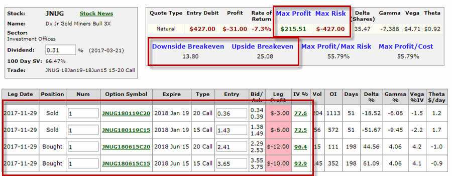
Figure 1 – JNUG Double Calendar Spread (Courtesy www.OptionsAnalysis.com)2
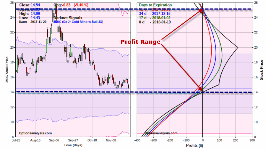
Figure 2 – JNUG Double Calendar Spread risk curves (Courtesy www.OptionsAnalysis.com)

Note that as initially configured the trade will show a profit if JNUG is anywhere between $13.80 and $25.08 at January option expiration on 1/19/2018.  In Figure 2 this range looks pretty wide.  However, when you look at it on wider price chart as in Figure 3, suddenly the profit range does not look quite so wide. But the real driving force behind this trade is implied volatility.3
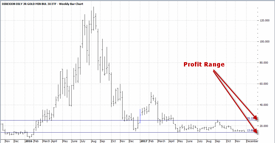
Figure 3 – JNUG (Courtesy ProfitSource by HUBB)

Implied Volatility on JNUG Options

Figure 4 displays 500 trading days of data for ticker JNUG along with the average implied volatility for 90+ day options on JNUG.4
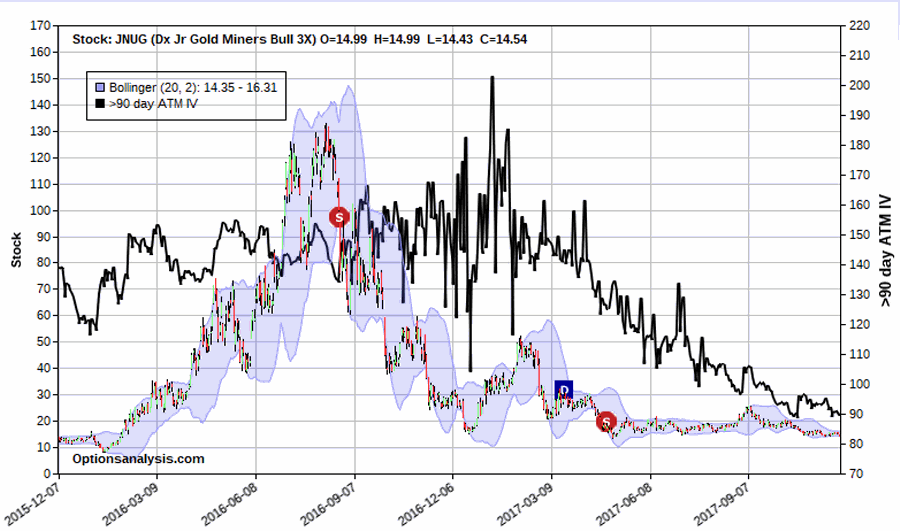
Figure 4 – JNUG price and Implied Volatility for 90+ day options (black line) (Courtesy www.OptionsAnalysis.com)

Note that IV is at the extreme low end of the range. The big question is “where to from here”. We already saw in Figure 2 what will happen if IV remains unchanged.  But what if IV continues to collapse?  And what if it spikes higher instead?

The Impact of a Decrease in Implied Volatility

Let’s assume that between now and January option expiration, IV falls another 30% from current levels.  This is probably unlikely but is useful in illustrating the effect of changes in implied volatility. Because longer term options are much more sensitive to changes in volatility (because longer term options have more time premium built into them) the June options will lose more value than the January options resulting in the risk curves you see in Figure 5.5
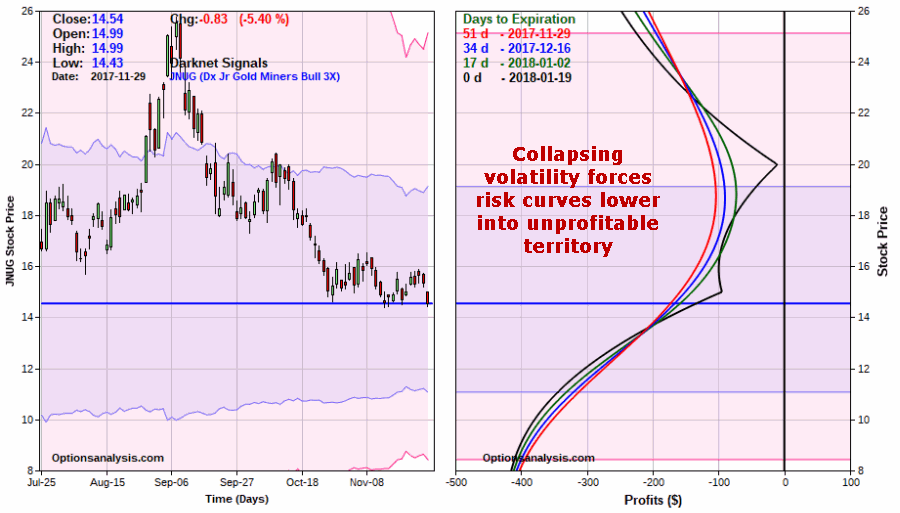
Figure 5 – If IV collapses 30% from current level profit potential disintegrates (Courtesy www.OptionsAnalysis.com)

MAKE THIS IMPORTANT MENTAL NOTE: If you enter a calendar spread and volatility subsequently declines, your potential to make money will be severely – and negatively – impacted.

The Impact of an Increase in Implied Volatility

Now let’s look at what would happen if IV reverses course and “spikes” 30% higher from current levels.  The risk curves for this scenario appear in Figure 6.6
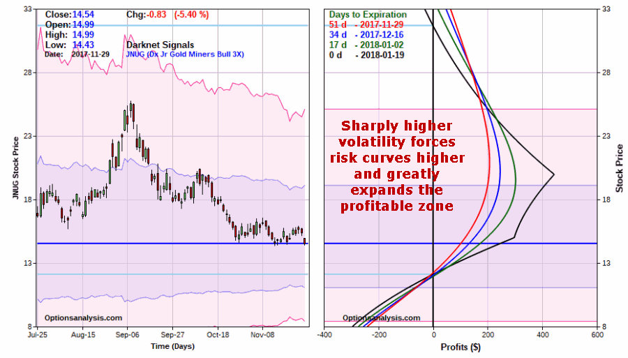
Figure 6 – If IV spikes 30% from current levels profit potential rises and profit range expands significantly (Courtesy www.OptionsAnalysis.com)

Note that if JNUG IV increased by 30%, the “profit range” for this trade would expand greatly – to $12.12 a share on the downside and $31.69 a share to the upside.

Summary

As always, it is important to emphasize that I am not “recommending” this trade.  It is presented solely as an example to highlight the potentially large implications of changes in implied volatility when utilizing certain strategies.

What we have seen here is that a calendar spread:

*Is best entered when IV is already low

*Will suffer if IV subsequently declines

*Will benefit if IV subsequently rises

Jay Kaeppel

Disclaimer:  The data presented herein were obtained from various third-party sources.  While I believe the data to be reliable, no representation is made as to, and no responsibility, warranty or liability is accepted for the accuracy or completeness of such information.  The information, opinions and ideas expressed herein are for informational and educational purposes only and do not constitute and should not be construed as investment advice, an advertisement or offering of investment advisory services, or an offer to sell or a solicitation to buy any security.


The Critical Importance of Understanding Risk (and Risk Control)

Well Good News and Bad News.  The Good News is that in this article I suggested that things were “too quiet” in the silver market and that a sharp move in price was likely forthcoming – and I nailed it to the day!  The Bad News is that in the example trade I included I got direction EXACTLY WRONG!

Since I offer only “examples” here and not “recommendations” I don’t feel too bad (although I still do marvel at times at the ability of Murphy’s Law to make me look like an idiot).  On the brighter side, this turn of events does offer the opportunity to highlight the importance of risk control and the potential benefits of trading options.

To wit:

Had one bought a March 2018 Silver futures contract, he or she would be sitting with an open loss of -$2,725 per contract as displayed in Figure 1.

7Figure 1 – Buying Mar2018 Silver futures show a big loss in just 2 days (Courtesy ProfitSource by HUBB)

On the other hand, had a trader instead entered into the call backspread position using options on ticker SLV (as highlighted in the original article), he or she would be sitting on an open loss of only -$100 as displayed in Figure 2.8Figure 2 – SLV call backspread; a lousy start but hardly catastrophic (Courtesy www.OptionsAnalysis.com)

In addition, the holder of the option position would still have unlimited profit potential on the upside and limited risk on the downside.

Which brings us to…

Jay’s Trading Maxim #22: Sometimes it’s not how much you make when things go right as it is how much you don’t lose when things go wrong.

Jay Kaeppel

Disclaimer:  The data presented herein were obtained from various third-party sources.  While I believe the data to be reliable, no representation is made as to, and no responsibility, warranty or liability is accepted for the accuracy or completeness of such information.  The information, opinions and ideas expressed herein are for informational and educational purposes only and do not constitute and should not be construed as investment advice, an advertisement or offering of investment advisory services, or an offer to sell or a solicitation to buy any security.


All (Too) Quiet on the Silver Front

The setup is as old as the markets themselves.  The price for a given security – be it a stock, an index, a commodity, whatever – moves sideways, first in a fairly wide range and then narrowing more and more into a tighter range. If options are traded on that security, typically implied volatility for those options declines to a very low level.  Then, just when it seems that that security will never stop drifting sideways the breakout comes.

In many cases – though most certainly not in all – the price move following the breakout can be surprisingly large.  These situations offer traders some potentially spectacular profit potential.

How to play these situations is a whole other topic.

Anticipation versus Reaction

Some traders will wait for a breakout and then “react” by trading in the direction of the breakout – long for an upside breakout or short for a downside breakout.  The disadvantage here is that:

1) In many cases you may miss a significant price move before getting in, and/or;

2) Occasional false breakouts are a fact of trading life and can lead to quick whipsaws and a need to act cut your loss quickly (and in all candor, painfully).

Anticipating a breakout can lead to large profits. The catch is that one typically needs to pick the right direction in order to profit. This disadvantage may at times be mitigated via the use of options.  Let’s consider a current example – the silver market.

Silver Futures and ETF Ticker SLV

As you can see in Figure 1 – which displays the front month in silver futures going back to the 1970’s – silver has a long history of “contracting” and then “expanding”.1Figure 1 – Monthly Silver Futures – a History of Contraction and Expansion (Courtesy ProfitSource by HUBB)

Ticker SLV is an ETF that tracks the price of silver futures. Figure 2 displays a weekly chart for ticker SLV.  You see the same type of “contraction” and “expansion” – including a significant contraction unfolding in the latest fortnight.2Figure 2 – Ticker SLV Weekly Chart (Courtesy AIQ TradingExpert)

So where to from here?  Will SLV ultimately break lower or higher?  I have to go with my usual answer of – “it beats me.”  Still, for what it is worth, in Figure 3 we see that the weekly and daily Elliott Wave counts (generated using an objective algorithm built into  ProfitSource by HUBB software) for ticker SLV are both suggesting that a move to the upside may be in the offing.  The weekly chart in the top clip of Figure 3 suggests that a weekly 5 wave down pattern may have been completed (which in “Elliott Speak” suggests that a 5 wave up pattern should follow next).  The daily chart in the bottom clip suggests that we may already be in a daily Wave 4 buy for SLV.4Figure 3 – Weekly and Daily Elliott Wave counts for ticker SLV (Courtesy ProfitSource by HUBB)

So for now we will lean towards playing the upside – with an eye on mitigating downside risk as much as possible.

Implied Option Volatility is Low

In Figure 4 we see 1000 days of SLV price and implied volatility data.  Clearly implied volatility is presently trading at the low end of its historical range.3Figure 4 – Implied volatility for SLV options at the low end of the historical range (Courtesy www.OptionsAnalysis.com)

Why does this matter?  Two reasons:

1) It tells us that the amount of time premium built into the price of SLV options is presently very low on a historical basis – i.e., SLV options are “cheap”, so “buying premium” offers a possible “edge”.

2) We might be able to enter a position whose reward/risk ratio can actually improve after the position is entered – if implied volatility rises after we enter the trade.

An Example Trade

Given everything we have seen so far:

*The propensity for silver to contract over a period of weeks or months and then move sharply in price over a subsequent period of weeks or months

*The current “contracting” status of ticker SLV

*The fact that weekly and daily Elliott Wave counts appear to be pointing to the upside

*The current low level of implied volatility for SLV options

Let’s consider a position that might allow us to take advantage if things play out properly – without assuming tons of risk.

Our example trade involves:

*Selling 1 SLV June 2018 11 call @ 5.25

*Buying 5 SLV June 2018 16 calls @ 1.11

This strategy is referred to as a “Call Backspread”.  In essence we are selling 1 in-the-money call option and using the proceeds ($525) to pay for (most of) our 16 strike price calls (cost = 1.11 x 100 x 5 = $555).

5Figure 5 – SLV backspread particulars (Courtesy www.OptionsAnalysis.com)

6Figure 6 – SLV backspread risk curves (Courtesy www.OptionsAnalysis.com)

Why this trade?  With the caveat that no implication is being made that this is the “best” trade firmly in mind, this trade is highlighted because:

*There are 200 days left until expiration – so there is plenty of time for “something to happen” with the price of SLV.

*The maximum risk (and the cost to enter the position) is $530.  However, this maximum loss would only occur if we were still holding this position on 6/29/2018 AND SLV closed at on that day at exactly $16 a share.

*Also, longer term options are more sensitive to changes in implied volatility.  So if implied volatility for SLV options does move higher in the months ahead that will serve to inflate the return on this trade (NOTE: in the upper right hand of Figure 4 we see that this position has a “Vega” of $22.84.  What this means is that if implied volatility rises 1 percentage point then this trade will gain $22.84 based solely on a change in volatility.  Our hope is to get higher SLV prices AND higher implied option volatility).

As you can see in Figure 6:

*This position has unlimited profit potential if in fact SLV does break out to the upside.

*If we are exactly wrong and SLV breaks to the downside our loss actually shrinks the further SLV falls.

*Our worst case scenario is if SLV remains unchanged between now and June 2018 option expiration.  This is OK because the impetus for the trade in the first place is the belief that SLV is setting up for a breakout somewhere in the months ahead – so we are in essence deeming “remaining unchanged” as our least likely scenario.

Summary

Is the SLV trade highlighted herein “guaranteed” to generate a profit.  Absolutely not!  In fact, we can’t even say that a profit is likely.  In the end, this particular position is nothing more than a speculative bet on higher prices (and possibly higher volatility) for SLV.

The bottom line: If SLV fails to move to the upside this trade will lose money.

But please remember that I am NOT “recommending” this trade.  It is simply an example. of one way to play a given set of circumstances.  What is important is to consider the thought process behind choosing this particular position.

Jay Kaeppel

Disclaimer:  The data presented herein were obtained from various third-party sources.  While I believe the data to be reliable, no representation is made as to, and no responsibility, warranty or liability is accepted for the accuracy or completeness of such information.  The information, opinions and ideas expressed herein are for informational and educational purposes only and do not constitute and should not be construed as investment advice, an advertisement or offering of investment advisory services, or an offer to sell or a solicitation to buy any security.


The 40-Week Cycle (Begin Again)

There are some things that can logically be explained.  And there are some things that cannot.  Welcome to the latter.

I first stumbled upon something known as the “40-Week Cycle” in the stock market sometime in the 1990’s. In all candor, I don’t even remember where I first read about it. And it is by known means “magical” or a panacea of the “you can’t lose in trading” variety.  But it is interesting.  And the latest “Bullish Phase” began at the close on 11/24/2017.

The 40-Week Cycle “System” Rules

*A new 40-week cycle begins every 280 calendar days with an original start date of 4/21/1967 (don’t ask me why that date, ask the guy who I can’t remember who wrote about it first).

*The 1st 140 calendar days of the cycle are considered “Bullish”

*The 2nd 140 calendar days of the cycle are considered “Something Other Than Bullish”

*The Bullish phase of the cycle ends after 140 calendar days OR after the Dow Jones Industrials Average suffers a decline of 12% or more in price from its price on the entry date (this has been triggered twice – in 1974 and in 2008)

*For “System” purposes the “System” holds the Dow Jones Industrials Average during “Bullish” periods and earns annualized rate on interest of 1% when not in the market.

FYI: The latest Bullish phse began at the close on 11.24.2017 and extednds through 4/13/2018 (or until the Dow closes below 20,731.03 if that occurs prior to 4/13/2018).

The Results

*$1,000 invested only during the “Bullish” phase as described above starting on 4/21/1967 grew to $42,301 through 11/24/2017

*$1,000 invested in the Dow Jones Industrials Average on a buy-and-hold basis starting on 4/21/1967 grew to $26,674 through 11/24/2017

$1,000 invested in the Dow Jones Industrials Average only during the “Other Than Bullish” phase starting on 4/21/1967 declined to $817

Figure 1 displays the “System” versus “Buy-and-Hold”.1Figure 1 – Growth of $1,000 invested using the 40-Week Cycle System (blue) versus Buy-and-Hold (red); 4/21/1967-11/24/2017

Figure 2 displays the growth of $1,000 only during the “Other Than Bullish” phase.  There is not a lot of rhyme or reason to the results during this phase – sometimes great, sometimes terrible, sometime in between.  Still, the bottom line is that the results are far worse than that generated during the “Bullish” phase.2Figure 2 –  – Growth of $1,000 invested in the Dow Jones Industrials Average only during the “Other Than Bullish” phase; 4/21/1967-11/24/2017

Figure 3 displays some summary results comparing the “Bullish” phase to the “Other Than Bullish” phase.

Measure Bullish Phase “Other” Phase
Average% +5.8% +0.2%
Median% +4.3% +0.9%
Std. Deviation% 9.3% 10.4%
Average%/Std Dev% 0.63 0.02
Maximum Gain % +42.0% +23.8%
Maximum Loss % (-13.2%) (-27.8%)
# Times UP 50 (76%) 36 (55%)
# Times Down 16 (24%) 30 (45%)

Figure 3 – “Bullish” phase versus “Other” phase

Figure 4 displays the period-by-period results

Start Bull End Bull Start Next Cycle DJIA Start Bull DJIA End Bull DJIA Start Next Cycle Bull% Other%
4/21/1967 9/8/1967 1/26/1968 883.18 907.54 865.06 2.8 (4.7)
1/26/1968 6/14/1998 11/1/1968 865.06 913.62 948.41 5.6 3.8
11/1/1968 3/21/1969 8/8/1969 948.41 920.00 824.46 (3.0) (10.4)
8/8/1969 12/26/1969 5/15/1970 824.46 797.65 702.22 (3.3) (12.0)
5/15/1970 10/2/1970 2/19/1971 702.22 766.16 878.56 9.1 14.7
2/19/1971 7/9/1971 11/26/1971 878.56 901.80 816.59 2.6 (9.4)
11/26/1971 4/14/1972 9/1/1972 816.59 967.72 970.05 18.5 0.2
9/1/1972 1/19/1973 6/8/1973 970.05 1026.19 920.00 5.8 (10.3)
6/8/1973 10/26/1973 3/15/1974 920.00 987.06 887.83 7.3 (10.1)
3/15/1974 7/8/1974 12/20/1974 887.83 770.57 598.48 (13.2) (22.3)
12/20/1974 5/9/1975 9/26/1975 598.48 850.13 818.60 42.0 (3.7)
9/26/1975 2/13/1976 7/2/1976 818.60 958.36 999.84 17.1 4.3
7/2/1976 11/19/1976 4/7/1977 999.84 948.80 918.88 (5.1) (3.2)
4/7/1977 8/26/1977 1/13/1978 918.88 855.42 775.73 (6.9) (9.3)
1/13/1978 6/1/1978 10/20/1978 775.73 840.70 838.01 8.4 (0.3)
10/20/1978 3/9/1978 7/27/1979 838.01 842.86 839.76 0.6 (0.4)
7/27/1979 12/14/1979 5/2/1980 839.76 842.75 810.92 0.4 (3.8)
5/2/1980 9/19/1980 2/6/1981 810.92 963.74 952.30 18.8 (1.2)
2/6/1981 6/26/1981 11/13/1981 952.30 992.87 855.88 4.3 (13.8)
11/13/1981 4/2/1982 8/20/1982 855.88 838.57 869.29 (2.0) 3.7
8/20/1982 1/7/1983 5/27/1983 869.29 1076.07 1216.14 23.8 13.0
5/27/1983 10/14/1983 3/2/1984 1216.14 1263.52 1171.48 3.9 (7.3)
3/2/1984 7/20/1984 12/7/1984 1171.48 1101.37 1163.21 (6.0) 5.6
12/7/1984 4/26/1985 9/13/1985 1163.21 1275.18 1307.68 9.6 2.5
9/13/1985 1/31/1986 6/20/1986 1307.68 1570.99 1879.54 20.1 19.6
6/20/1986 11/7/1986 3/27/1987 1879.54 1886.53 2335.80 0.4 23.8
3/27/1987 8/14/1987 12/31/1987 2335.80 2685.43 1938.83 15.0 (27.8)
12/31/1987 5/20/1988 10/7/1988 1938.83 1952.59 2150.25 0.7 10.1
10/7/1988 2/24/1989 7/14/1989 2150.25 2245.54 2554.82 4.4 13.8
7/14/1989 12/1/1989 4/20/1990 2554.82 2745.65 2695.95 7.5 (1.8)
4/20/1990 9/7/1990 1/25/1991 2695.95 2619.56 2659.42 (2.8) 1.5
1/25/1991 6/14/1991 11/1/1991 2659.42 3000.50 3056.40 12.8 1.9
11/1/1991 3/20/1992 8/7/1992 3056.40 3276.40 3332.18 7.2 1.7
8/7/1992 12/24/1992 5/14/1993 3332.18 3326.20 3443.00 (0.2) 3.5
5/14/1993 10/1/1993 2/18/1994 3443.00 3581.11 3887.46 4.0 8.6
2/18/1994 7/7/1994 11/25/1994 3887.46 3688.42 3708.27 (5.1) 0.5
11/25/1994 4/13/1995 9/1/1995 3708.27 4208.18 4647.54 13.5 10.4
9/1/1995 1/19/1996 6/7/1996 4647.54 5184.68 5697.11 11.6 9.9
6/7/1996 10/26/1996 3/14/1997 5697.11 6007.02 6935.46 5.4 15.5
3/14/1997 8/1/1997 12/19/1997 6935.46 8194.04 7756.29 18.1 (5.3)
12/19/1997 5/8/1998 9/25/1998 7756.29 9055.15 8028.77 16.7 (11.3)
9/25/1998 2/12/1999 7/2/1999 8028.77 9274.89 11139.24 15.5 20.1
7/2/1999 11/22/1999 4/7/2000 11139.24 11089.52 11111.48 (0.4) 0.2
4/7/2000 8/25/2000 1/12/2001 11111.48 11192.63 10525.38 0.7 (6.0)
1/12/2001 6/1/2001 10/19/2001 10525.38 10990.41 9204.11 4.4 (16.3)
10/19/2001 3/8/2002 7/26/2002 9204.11 10572.49 8264.39 14.9 (21.8)
7/26/2002 12/13/2002 5/2/2003 8264.39 8433.71 8582.68 2.0 1.8
5/2/2003 9/19/2003 2/6/2004 8582.68 9644.82 10593.03 12.4 9.8
2/6/2004 6/25/2004 11/12/2004 10593.03 10371.84 10539.01 (2.1) 1.6
11/12/2004 4/1/2005 8/19/2005 10539.01 10404.30 10559.23 (1.3) 1.5
8/19/2005 1/6/2006 5/26/2006 10559.23 10959.31 11278.61 3.8 2.9
5/26/2006 10/13/2006 3/2/2007 11278.61 11960.51 12114.10 6.0 1.3
3/2/2007 7/20/2007 12/7/2007 12114.10 13851.08 13625.58 14.3 (1.6)
12/7/2007 4/25/2008 9/12/2008 13625.58 12891.86 11421.99 (5.4) (11.4)
9/12/2008 10/6/2008 6/19/2009 11421.99 9955.50 8539.73 (12.8) (14.2)
6/19/2009 11/6/2009 3/26/2010 8539.73 10023.43 10850.36 17.4 8.2
3/26/2010 8/13/2010 12/31/2010 10850.36 10303.15 11577.51 (5.0) 12.4
12/31/2010 5/20/2011 10/7/2011 11577.51 12512.04 11103.21 8.1 (11.3)
10/7/2011 2/24/2012 7/13/2012 11103.21 12982.95 12777.09 16.9 (1.6)
7/13/2012 11/30/2012 4/19/2013 12777.09 13025.58 14547.51 1.9 11.7
4/19/2013 9/6/2013 1/24/2014 14547.51 14922.02 15879.11 2.6 6.4
1/24/2014 6/13/2014 10/31/2014 15879.11 16775.68 17390.13 5.6 3.7
10/31/2014 3/20/2015 8/7/2015 17390.13 18127.65 17373.38 4.2 (4.2)
8/7/2015 12/25/2015 5/13/2016 17373.38 17552.17 17535.32 1.0 (0.1)
5/13/2016 9/30/2016 2/17/2017 17535.32 18308.15 20624.05 4.4 12.6
2/17/2017 7/7/2017 11/24/2017 20624.05 21414.34 23557.99 3.8 10.0
11/24/2017 4/13/2018 8/31/2018
8/31/2018 1/18/2019 6/7/2019
6/7/2019 10/25/2019 3/13/2020
3/13/2020 7/31/2020 12/18/2020
12/18/2020 5/7/2021 9/24/2021
9/24/2021 2/11/2022 7/1/2022

Figure 4 – 40-Week Cycle; 1967-2017

Summary

For better or worse, the latest “Bullish” phase began at the close on 11/24/2017 and will last through 4/13/2018. Does this mean the stock market is guaranteed to keep rising?  Not at all.  But it may be one more potentially favorable sign.

Jay Kaeppel

Disclaimer:  The data presented herein were obtained from various third-party sources.  While I believe the data to be reliable, no representation is made as to, and no responsibility, warranty or liability is accepted for the accuracy or completeness of such information.  The information, opinions and ideas expressed herein are for informational and educational purposes only and do not constitute and should not be construed as investment advice, an advertisement or offering of investment advisory services, or an offer to sell or a solicitation to buy any security.

Tis’ the Season to ‘Get Small(Cap)’

A lot has been written lately about the tendency for small-cap stocks to outperform large-cap stocks during the upcoming time of the year (for example).  And rightly so.  For whatever reason, the relationship between large-caps and small-caps has shown itself to be highly seasonal over the years. Let’s take a closer look.

Jay’s Large-Cap/Small-Cap Calendar

The table below displays my calendar for when to hold large-cap stocks versus when to hold small-cap stocks.

*Note that TDM stands for “Trading Day of the Month” and NOT date of the month – i.e., Mar 10 means at the close on the 10th trading day of March small-caps are sold and large-caps are bought.

*Also, for June and September if there are less than 22 trading days in the month then the trade is made at the close on the last trading day of the month.

From Close on Trading Day of Month To Close on Trading Day of Month Hold
Mar 10 May 12 Large-Cap
May 12 Jun 22 Small-Cap
Jun 22 Aug 6 Large-Cap
Aug 6 Sep 22 Small-Cap
Sep 22 Nov 15 Large-Cap
Nov 15 Mar 10 Small-Cap

Figure 1 – Jay’s Large-Cap/Small-Cap Calendar

The Test

*For testing purposes we will use ticker RUI (Russell 1000 Large-Cap Index) and ticker RUT (Russell 2000 Small-Cap Index).

*First we will look at a buy-and-hold approach using both indexes, then will compare it to our switching method.

The Results

Figure 2 shows the growth of $1,000 invested in each index separately as well as combined since January 4, 1989.2Figure 2 – Growth of $1,000 invested in RUT and RUI (separately and “Split” between the two); 1/4/1989-11/21/2017

Figure 3 applies the calendar displayed in Figure 1 –  i.e., Ticker RUI is held from March TDM 10 through May TDM 12, the last trading day of June through August TDM 6 and the last trading day of September through November TDM 15 (with all switches being made at the close of the day). Ticker RUT is held during all other periods as indicated in Figure 1.

Note: The “red” line in Figure 3 is the “green” line from Figure 2 and represents splitting an initial $1,000 investment between RUI and RUT on a buy-and-hold basis.

Figure 3 then displays the “Switching” results versus the “Splitting” results (i.e., simply buying and hold both indexes).

3Figure 3 – $1,000 invested using “Switching” strategy versus “Splitting” money evenly between two indexes; 1/4/1989-11/20/2017

For the record, the “Switching” strategy gained +3,727% since 1989 versus +892% for the “Splitting” strategy.  While the Switching strategy return is 4.17 times greater than simply splitting money between both indexes, it does not come without risk and volatility. To wit:

*The average 12-month standard deviation of returns is actually higher (18.1%) using the Switching strategy versus splitting (16.8%)

*The Worst 12-month % decline for the Switching Strategy is still a whopping -45.8% – almost as much as the -49.0% for splitting.

Measure Switch Split
Average 12-mos. % +14.5% +9.2%
Median 12-mos % +14.8% +10.9%
Std. Deviation% 18.1% 16.8%
Average/Standard Deviation 0.80 0.55
Worst 12.mos. % (-45.8%) (-49.0%)
% 12-mos. UP 82.1% 76.3%
% of 12-month periods outperforms 84.1% 15.9%

Figure 4 – Comparative Results: “Switching” versus “Splitting”; 1/4/1989-11/20/2017

Figure 5 displays the year-by-year results.

Year Switch Split Diff $1,000 $1,000
1989 22.9 19.4 3.5 1,229 1,194
1990 (9.5) (14.1) 4.6 1,112 1,025
1991 40.7 35.3 5.4 1,565 1,387
1992 17.6 10.7 6.9 1,841 1,536
1993 13.1 12.0 1.0 2,082 1,721
1994 4.6 (2.8) 7.4 2,177 1,672
1995 31.0 30.3 0.7 2,852 2,179
1996 21.0 17.3 3.7 3,450 2,555
1997 32.6 25.7 6.9 4,577 3,213
1998 11.8 12.0 (0.2) 5,116 3,599
1999 14.8 18.5 (3.7) 5,873 4,266
2000 28.1 (6.2) 34.3 7,522 4,000
2001 3.8 (7.6) 11.4 7,807 3,695
2002 (17.0) (22.3) 5.4 6,483 2,870
2003 35.2 35.6 (0.3) 8,768 3,890
2004 27.2 13.1 14.1 11,157 4,401
2005 6.6 3.8 2.8 11,898 4,570
2006 18.1 15.2 3.0 14,053 5,263
2007 5.4 0.5 4.8 14,807 5,290
2008 (30.8) (37.0) 6.2 10,247 3,335
2009 24.6 25.3 (0.8) 12,765 4,180
2010 20.5 19.6 0.8 15,378 5,001
2011 (2.1) (3.1) 1.0 15,058 4,845
2012 21.0 14.2 6.8 18,220 5,535
2013 40.7 33.9 6.8 25,642 7,411
2014 14.8 7.1 7.7 29,437 7,936
2015 1.5 (3.5) 4.9 29,875 7,661
2016 12.0 14.6 (2.5) 33,475 8,779
2017 14.3 13.0 1.4 38,273 9,917

Figure 5 – Year-by-Year Results; 1/4/1989-11/20/2017

The next switch occurs at the close on 11/21 (15th trading day of November 2017 out large-caps and into small-caps).

Summary

The “system” (such as it is) described herein is by no means of the “you can’t lose” variety (note the “Worst 12-month % loss” of -45.8%).  Still, the fact that this entirely mechanical – and calendar-based – approach outgained a simple buy-and-hold approach by over 4-to-1 overall, and during 84% of all rolling 12-month periods – is nothing to sneeze at.

Jay Kaeppel

Disclaimer:  The data presented herein were obtained from various third-party sources.  While I believe the data to be reliable, no representation is made as to, and no responsibility, warranty or liability is accepted for the accuracy or completeness of such information.  The information, opinions and ideas expressed herein are for informational and educational purposes only and do not constitute and should not be construed as investment advice, an advertisement or offering of investment advisory services, or an offer to sell or a solicitation to buy any security.


Emerging Markets and the U.S. Election Cycle

It is widely known that the four-year U.S. Election Cycle has an influence on the U.S. stock market.  What is not so widely known is that other markets also seem to “walk to the beat”.  Take for example “emerging markets.”

The Test

For testing purposes we will use the MSCI Emerging Markets Index (Gross Dividend) Monthly Total Return from the PEP Database from Callan Associates starting in January 1988.

The ETF ticker EEM (iShares MSCI Emerging Markets ETF) started trading in May 2003 and can be used for trading purposes.

The EEM Election Cycle Calendar

Figure 1 displays my Emerging Markets Election Cycle Calendar. During months marked EEM, the Emerging Markets Index is held.  The same months are used over the course of each 4-year cycle.

1

Figure 1 – Jay’s Emerging Markets Election Cycle Calendar

To be clear, during each post-election year in the U.S. (i.e., 1989, 1993, 1997, etc.) we would hold the Emerging Markets Index during the months of January, April, May, July, September, November and December.  During all other months during that year we would NOT hold the Emerging Markets Index.

Figure 2 displays the growth of $1,000 invested in the MSCI Emerging Markets Index (actual results using EEM will likely be slightly lower due to ETF fees) ONLY during the months marked EEM during every 4-year U.S. presidential election cycle starting in 1988.2Figure 2 – Growth of $1,000 invested in MSCI Emerging Markets Index ONLY during Favorable Election Cycle Months; 1988-2107

Figure 3 displays the growth of $1,000 invested the MSCI Emerging Markets Index ONLY during the months NOT marked EEM during every 4-year U.S. presidential election cycle starting in 1988.3Figure 3 – Growth of $1,000 invested in MSCI Emerging Markets Index ONLY during non-Favorable Election Cycle Months; 1988-2107

For the record:

*$1,000 invested in the “favorable” months grew to $145,908 (+14,491%)

*$1,000 invested in the “other” months declined to $166 (-83%)

Figure 4 displays a few comparative values between holding the emerging markets index during the “Favorable” versus “Unfavorable” months.4

Figure 4 – 12-months returns for Favorable versus non-Favorable Months; 1988-2017

Summary

So is the calendar displayed in Figure 1 guaranteed to generate profits ad infinitum into the future?  Not at all. But the results displayed herein do suggest that there just might be something to this whole 4-year cycle “thing”.

Jay Kaeppel

Disclaimer:  The data presented herein were obtained from various third-party sources.  While I believe the data to be reliable, no representation is made as to, and no responsibility, warranty or liability is accepted for the accuracy or completeness of such information.  The information, opinions and ideas expressed herein are for informational and educational purposes only and do not constitute and should not be construed as investment advice, an advertisement or offering of investment advisory services, or an offer to sell or a solicitation to buy any security.


Dollar Downer?

The U.S. Dollar attempted to rally recently following a pretty relentless January into September decline.  Is that rally over?  And if so is there a play to be made?

Before proceeding further, there are two important things to note:

*I am very bad at making predictions (OK, technically I am very good “making” predictions, I’m just not that good at “being right” when I do).

*This blog DOES NOT offer investment advice. I just tell you what I know (or more accurately – what I think I know) or what I see and sometimes offer examples of ways to trade said items.

Are we clear?  OK, then let’s proceed.  Figure 1 displays ticker UUP – an ETF that tracks the U.S. Dollar Index.1Figure 1 – Ticker UUP (Courtesy ProfitSource by HUBB)

You can see the long decline in 2017, the recent rally, and now an Elliott Wave “Wave 4 Sell” as generated by ProfitSource by HUBB.  Does this guarantee that the next down leg in the dollar has begun?  Not at all.  First off, Elliott Wave counts can be a bit nebulous at times. Also, not every “Elliottician” will agree with the count as it appears in Figure 1 (in fact, trying to get to Elliott counters to agree on a given count is sort of like trying to get Republicans and Democrats to agree on – well, anything).  The reason I like using ProfitSource for this purpose is that – for better or worse – it has an objective built in algorithm for generating Elliott Wave counts.  Bottom line – it is far less subjective than anything I would come up with on my own.

Figure 2 displays the current Elliott Wave counts for four currency ETFs – FXA (Australia), FXB (British Pound), FXC (Canadian Dollar) and FXE (Euro).  As currencies (mostly) trade inversely to the U.S. Dollar it is interesting to note that all four of these recently generated “Wave 4 Buy” signals.2Figure 2 – Tickers FXA, FXB, FXC, FXE (Courtesy ProfitSource by HUBB)

As FXE is the most heavily traded – both in terms of shares and options – let’s take  a closer look as shown in Figure 3.3Figure 3 – Ticker FXE (Courtesy ProfitSource by HUBB)

As you can see – again, for better or worse – the ProfitSource wave count is projecting a move to the 118.78 to 124.40 range for ticker FXE between now and March 2018. IMPORTANT NOTE: I find these kinds of projections to be very enticing.  But remember, they are in fact nothing more than projections and NOT guarantees.  Bottom line: acting on an Elliott Wave projection requires something of a leap of faith and involves the assumption of speculative risk.

Example Trade

Once again, what follows is NOT a recommendation, only an example. Let’s assume one wants to speculate on a rise in ticker FXE.  In Figure 4 we see that the implied volatility for options on FXE is towards the low end of the historical range.4aFigure 4 – Ticker FXE with 90-day implied option volatility (Courtesy www.OptionsAnalysis.com)

This tells us two things:

*The amount of time premium currently built into FXE option prices is low

*One might be able to profit from an increase in IV

The example trade is called a “Call Backspread” and involves:

*Buying 2 Mar2018 FXE 115 calls @ 1.47

*Selling 1 Mar2018 FXE 113 calls @ 2.46

5Figure 5 – FXE backspread (Courtesy www.OptionsAnalysis.com)6Figure 6 –FXE backspread risk curves (Courtesy www.OptionsAnalysis.com)

As you can see in Figures 5 and 6:

*The cost to enter this trade – and the maximum risk – is $248.  However, a loss of -$248 would only occur if the trade is held until March expiration and FXE close that day at exactly $115 a share (i.e., we can eliminate the risk of a maximum loss simply by planning to exit the position prior to expiration).

*If FXE falls apart and collapses in price then the risk is only about -$55.

*If FXE rallies into the Elliott Wave projection range of 118.78 to 124.40 then the anticipated profit would be somewhere between +$150 and +$750, depending on how soon the move occurs and how high the price goes (sooner and higher are better).

One last item: if by chance implied volatility increases, this could inflate the profit potential for this trade.

Summary

Is the U.S. Dollar going to decline – and/or FXE going to rise?  I can’t predict that. But for what it is worth the current Elliott Wave projections are pointing in that direction.  The example trade discussed here is just one of many potential ways to  play such a move.

Jay Kaeppel

Disclaimer:  The data presented herein were obtained from various third-party sources.  While I believe the data to be reliable, no representation is made as to, and no responsibility, warranty or liability is accepted for the accuracy or completeness of such information.  The information, opinions and ideas expressed herein are for informational and educational purposes only and do not constitute and should not be construed as investment advice, an advertisement or offering of investment advisory services, or an offer to sell or a solicitation to buy any security.


When The Market is Up All Year

The S&P 500 Index has been up for the year the entire year of 2017.  Has this happened before?  And how did the market react the following year?

Rather than recreate someone else’s work I will simply include a link below to an article published at www.RealClearMarkets.com on 11/14.  The article – titled “The S&P 500 has been in the black all year — here’s what typically happens next” – was written by MarketWatch Writer Victor Reklaitis based on research done by Jani Ziedins of https://cracked.market.

For the record, I have to admit I was somewhat surprised by the results.  Rather than “give away” the somewhat surprising results, I will simply urge you to click the link below and read for yourself.

The S&P 500 has been in the black all year — here’s what typically happens next

Jay Kaeppel

Disclaimer:  The data presented herein were obtained from various third-party sources.  While I believe the data to be reliable, no representation is made as to, and no responsibility, warranty or liability is accepted for the accuracy or completeness of such information.  The information, opinions and ideas expressed herein are for informational and educational purposes only and do not constitute and should not be construed as investment advice, an advertisement or offering of investment advisory services, or an offer to sell or a solicitation to buy any security.


The Most Wonderful Time of the Year (80% of the Time)

It is not a little known fact that the stock market has showed a tendency to perform well during the end-of-year “Holiday Season”.  How well?  Let’s take a look.

The Test

Let’s first define “Holiday Season” as it relates to the stock market.  We will focus our attention on the following period:

*From the close on the Friday before Thanksgiving through the close on the last trading day of the year.

Figure 1 displays the growth of $1,000 invested in the Dow Jones Industrials Average only during this holiday season time period starting in 1942.1Figure 1 – Growth of $1,000 invested in Dow Industrials ONLY from close on Friday before Thanksgiving through close on last trading day of the year; 1942-2016

For the record:

*# of times UP = 60 (80% of the time)

*# of times DOWN =15 (20% of the time)

*Average UP% Gain= +3.3%

*Average DOWN% Loss = (-1.8%)

*#of Rolling 5-year periods showing a gain = 69 (97% of the time)

*# of Rolling 5-year periods showing a loss = 2 (3% of the time)

*#of Rolling 10-year periods showing a gain = 66 (100% of the time)

*# of Rolling 10-year periods showing a loss = 0 (0% of the time)

The good news is the long-term consistency of returns (80% of all 1-yr, 97% of all 5-yr. and 100% of all 10-yr. periods show a gain)

The bad news is that this is still no “sure thing” as 15 times in 75 years – or 20% of the time – this supposedly “bullish” seasonal period showed a loss.  The 5 worst losing periods were:

2002 (-5.3%)

1966 (-2.9%)

1969 (-2.8%)

1980 (-2.6%)

1968 (-2.4%)

While these losses seem small, it should be noted that a “mere” -2.4% decline from current levels would knock roughly 560 points off of the Dow. A -5.3% declines would total roughly 1,250 Dow points.  That would not exactly qualify as “wonderful”.

Figure 2 displays the year by year results.

Year Seasonal %+(-)
1942 3.5
1943 2.2
1944 4.3
1945 0.3
1946 7.3
1947 (0.6)
1948 (0.1)
1949 3.4
1950 1.6
1951 3.2
1952 4.5
1953 1.8
1954 7.0
1955 1.1
1956 4.7
1957 (1.6)
1958 4.3
1959 5.3
1960 2.0
1961 0.3
1962 2.6
1963 4.1
1964 (1.9)
1965 1.7
1966 (2.9)
1967 5.2
1968 (2.4)
1969 (2.8)
1970 10.2
1971 9.8
1972 1.5
1973 (1.4)
1974 0.2
1975 1.4
1976 5.9
1977 (0.5)
1978 0.9
1979 2.3
1980 (2.6)
1981 2.6
1982 2.5
1983 0.6
1984 3.2
1985 5.6
1986 0.1
1987 1.3
1988 5.1
1989 3.8
1990 3.6
1991 9.2
1992 2.3
1993 1.6
1994 0.5
1995 2.5
1996 (0.4)
1997 1.8
1998 0.2
1999 4.5
2000 1.5
2001 3.2
2002 (5.3)
2003 8.6
2004 3.1
2005 (0.5)
2006 1.0
2007 (1.8)
2008 9.1
2009 1.1
2010 3.3
2011 3.6
2012 3.2
2013 3.2
2014 0.1
2015 (2.2)
2016 5.9

Figure 2 – % gain(loss) for Dow Jones Industrials Average during 3 Trading Days prior to Thanksgiving through December 31st (Dow Jones Industrials Average)

Jay Kaeppel

Disclaimer:  The data presented herein were obtained from various third-party sources.  While I believe the data to be reliable, no representation is made as to, and no responsibility, warranty or liability is accepted for the accuracy or completeness of such information.  The information, opinions and ideas expressed herein are for informational and educational purposes only and do not constitute and should not be construed as investment advice, an advertisement or offering of investment advisory services, or an offer to sell or a solicitation to buy any security.

Bad Days for Electronics

In a recent series of articles (here, here and here) I wrote about certain days of the month that appear to be worse than others for the overall stock market.  The same is true for many stock market sectors.  Take the electronics-related sector, for example.

Bad Days for Semi’s/Electronics

For testing purposes we will use ticker FSELX (Fidelity Select Electronics).  However, because FSELX has switching restrictions another vehicle would need to be used for actual trading (see list of candidates further below).

Here are the “Bad Days” of the month for Electronics:

*Trading Days #5, 6 and 7

*Trading Days #13 and 14

*Trading Days -7, -6, -5

(The last trading day of the month is considered -1, the day before that -2 and so on)

How bad are they?

Figure 1 displays the growth of $1,000 invested in FSELX only on TDM 5, 6 and 71Figure 1 – FSELX on TDM 5, 6 and 7; 9/30/1988-11/7/2017

Figure 2 displays the growth of $1,000 invested in FSELX only on TDM 13 and 142Figure 2 – FSELX TDM 13 and 14; 9/30/1988-11/7/2017

Figure 3 displays the growth of $1,000 invested in FSELX only on TDM -7, -6 and -53Figure 3 – FSELX TDM -7, -6, -5; 9/30/1988-11/7/2017

Figure 4 combines all 3 “Bad Day” periods.4Figure 4 – FSELX TDM 5, 6, 7, 13, 14, -7, -6, and 5; 9/30/1988-11/7/2017

*From October 1988 into March 2000 FSELX gained +128% during the “Bad Days”, albeit in extremely volatile fashion.

*From March 2000 into May 2016, FSELX lost -94% during the “Bad Days”

*Since May 2016 FSELX has gained +36% during the “Day Days”

So no one should assume that FSELX is “doomed” to decline during these days.

Still, a net result of -81% is a net result of -81%.

The “All Other” Days

Figure 5 displays the growth of $1,000 invested in FSELX on ALL OTHER trading days each month since October 1988 versus buying and holding FSELX.5Figure 5 – Growth of $1,000 invested in FSELX during “All Other Days” versus Buy-and-Hold; 9/30/1988-11/7/2017

The comparative results appear in Figure 66Figure 6 – Avoiding the “Bad Days” versus Buy-and-Hold; Sep88-Nov2017

Alternative funds

Figure 7 – generated using the MatchMaker function in AIQ TradingExpert – displays a variety of funds and/or ETFs with a high correlation to ticker FSELX.  Most of these can be traded with no restrictions.7

Figure 7 – Alternative Funds/ETFs (Courtesy AIQ TradingExpert)

Summary

At first blush, the big returns generated by missing the “Bad Days” are pretty compelling.  Still, if we dig deeper there are questions to be answered.

The “Other” days underperformed buy-and-hold significantly into the Year 2000, and also since May 2016.  Also, one may question whether trading only the “Other” days is really a viable approach.  Consider:

*We are talking about at least 2 and sometimes 3 trades every single month no matter what

*The maximum drawdown (-47%) – while less than that of a buy-and-hold approach (-82.5%) – is well beyond the comfort zone for most traders

*This “System” – such as it is – can (and will) significantly underperform buy-and-hold over extended periods of time.

As always, I do not offer trading advice here, only information.  While there are questions to answers and doubt to overcome in this case, still a return of +33,700% using a completely objective approach versus +5,756% using buy-and-hold may be worthy of further research.

Jay Kaeppel

Disclaimer:  The data presented herein were obtained from various third-party sources.  While I believe the data to be reliable, no representation is made as to, and no responsibility, warranty or liability is accepted for the accuracy or completeness of such information.  The information, opinions and ideas expressed herein are for informational and educational purposes only and do not constitute and should not be construed as investment advice, an advertisement or offering of investment advisory services, or an offer to sell or a solicitation to buy any security.