A lot of people who claim to be technical analysts trade using chart patterns. I typically do not. Nothing wrong with using chart patterns to trade. The thing is though, you have to have confidence in your ability to interpret and act upon what you see (or think you see) on a given chart. Once again, I typically do not.
(See also Beans, Bonds and BPounds, Oh My)
Chart pattern analysis by its very nature is fraught with subjectivity. While teaching a class on trading I once handed out a copy of a particular bar chart and asked the students to draw any and all relevant trend lines and/or chart patterns that they found. Unsurprisingly, no two charts came back marked the same way.
Also, some people get a little carried away. This prompted me many years ago to create:
Jay’s Trading Maxim #27: If you draw enough lines on a bar chart price will eventually touch one of them.
Tongue-in-cheek and smart-alecky all-in-one, still the point is that the market doesn’t actually care what lines you draw on a piece of paper or a computer screen. It’s going to do what it’s going to do.
Here is what you really need to remember about trendlines/etc: The lines that you draw should be more for the purpose of guiding you in how you want to play a given security, and NOT for the purpose of you telling the market what it “should” do.
One of My Favorite Patterns – “Range Bound Consolidation”
But there is one “pattern” that gets my attention from time to time. I refer to it as “range bound consolidation.” Drawing up sloping and/or down sloping trend lines is subjective in my mind. But drawing horizontal lines based on previous high and low points is based on something “market based.” So let’s take a look at a relevant (albeit relatively obscure) example – The Portugal stock market ETF (ticker PGAL).
CAVEAT: What follows is NOT an attempt to convince you to buy shares of PGAL. This ticker is simply being used as an example of “range bound consolidation.”
In Figure 1 we see the Monthly chart for PGAL. Clearly the Portugal stock market took a major hit in recent years. But most recently, it appears to potentially be breaking out of a narrowing consolidation phase (or did price just happen to pop up above a line a arbitrarily drew on a price chart?). 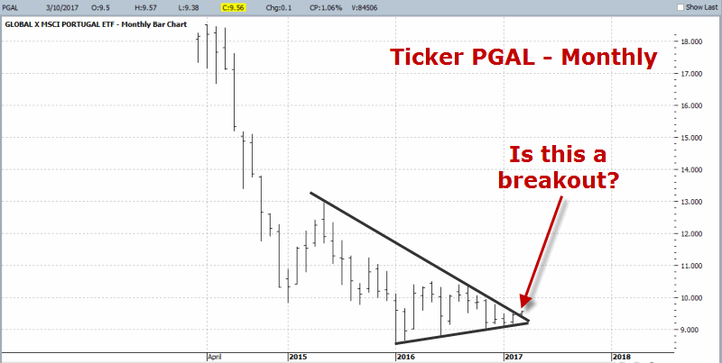 Figure 1 – PGAL Monthly (breakout or fake out?) (Courtesy ProfitSource by HUBB)
Figure 2 displays the weekly chart for PGAL. As you can see I have labeled two price levels – one as support the other as resistance. The support level is objective and sits at the low for the multi-year decline. The resistance level is more subjective (as another trader might choose a different level). We also see a potential (and yes, subjectively derived) profit-target near $13 a share.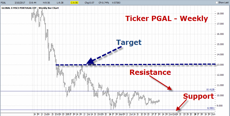 Figure 2 – PGAL Weekly (Courtesy ProfitSource by HUBB)
Figure 3 displays the daily chart for PGAL. Here you see the same support and resistance level as shown in Figure 2. You also see my subjectively drawn “narrowing range.”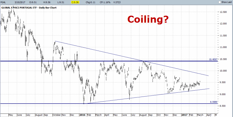 Figure 3 – PGAL Daily (coiling before a breakout?) (Courtesy ProfitSource by HUBB)
(See also Playing Whack a (VXX) Mole)
Summary
So what is the point of all this? Simple – it looks to me like PGAL is establishing a long-term consolidation pattern. From my own experience I know that this type of consolidation often (though certainly not always) sets the stage for a breakout to the upside and the next big advance.
For the record, I have no idea if it will play out that way here or not (and I am not actually “predicting” anything). But I do know the “Uncle” point (below the recent low of $8.59). So from here a trader has several choices:
- Forget PGAL and move on to something else
- Buy PGAL and place a stop below $8.59 a share (approximate risk from current level = -10.5%)
- Wait for an upside breakout of either the down sloping trend line in Figure 3 or the horizontal resistance line drawn in Figure 2 and 3 at $10.41 a share.
For the record – except in hindsight – there is no “right” or “wrong” answer, only the one that a trader is most comfortable with.
In reality -a better thing to do first, for those intrigued by this pattern – would be to look through historical bar charts or similar setups and get a feel for how this setup typically plays out.
Jay Kaeppel
Disclaimer: The data presented herein were obtained from various third-party sources. While I believe the data to be reliable, no representation is made as to, and no responsibility, warranty or liability is accepted for the accuracy or completeness of such information. The information, opinions and ideas expressed herein are for informational and educational purposes only and do not constitute and should not be construed as investment advice, an advertisement or offering of investment advisory services, or an offer to sell or a solicitation to buy any security.

