Monthly Archives: January 2016

The Two Key Prices for the S&P 500

I seem to be in “anecdotal mode” (as opposed to “quantitative mode”) of late, so why stop now?  So how about a bold claim just to make it sort of interesting?  OK, here goes:

*The only two prices that matter for the S&P 500 Index are 1972 and 2020

OK, “bold” might be a little strong.  Maybe “argumentative” would be a better choice.  In any event, take a look at Figure 1 below.2aFigure 1 – SPX and 1972 / 2020 price range (Courtesy: ProfitSource by HUBB)

As you can see in Figure 1 the 1972-2020 range has been the “battleground” range for some time now.  In a nutshell:

*Anything that happens between 1972 and 2020 is essentially meaningless (UNLESS you are a short-term trader, in which case all kinds of trading possibilities arise).

*When price is above 2020 the possibility (seems like more of a “hope” at the moment) exists that price will trend higher, breakout to the upside and start a new bullish leg; OR if price momentum wanes while SPX is above 2020 then traders may consider the short side of the market.

*When price is below 1972 the possibility exists that price will trend lower, breakout to the downside and start a new bearish leg; OR if price gets too oversold while SPX is below 1972 then traders may consider the long side of the market.

Two other thoughts for longer term investors:

*As long as SPX is above 2020 we ARE NOT in a long-term bear market

*If SPX drops below 1972 then the danger of a long-term bear market increases

Jay Kaeppel
Two Reasons for Short-Term Optimism (Maybe?)

The first is a nascent tidbit from the deep recesses of my market addled brain that still listens to my gut instincts (rather than relying on any sort of actual quantitative analysis).  The second is from an analyst whom I respect a great deal – and who did take the time to provide some actual quantifiable analysis (Thank goodness there’s still a few of those around).

Reason for Optimism #1

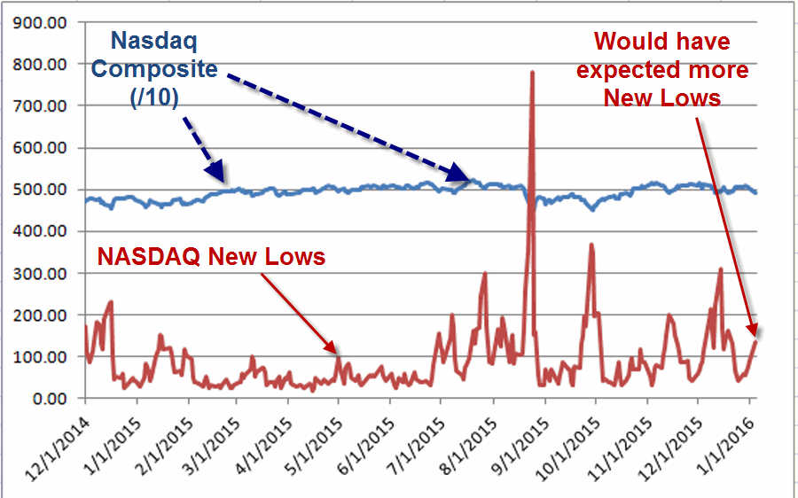
OK, I will admit this is just an anecdotal footnote based on a “gut” instinct.  But for what it is worth, it struck me as “surprising” that as the selloff on 1/4/16 progressed throughout the day “only” 135 NASDAQ stocks made new 52-week lows.  It just seemed to me that in the face of a serious selloff that served to push several trend-following indicators to the bearish side there should have been a lot more stocks breaking down to new lows.

Figure 1 displays the NASDAQ Composite Index and the number of NASDAQ New 52-week Lows for each day since 12/1/14.

1Figure 1 – NASDAQ Composite Index and Daily New 52-week lows (12/1/14-1/4/16)

As you can see there have been a number of days with a greater number of new 52-week lows.  Given the brutal nature of the 1/4/16 decline I would have expected a higher value.

Bottom Line: Maybe this means something, maybe it’s grasping for straws.  But for now at least it, it counts as a potential reason to be hopeful in the short run (at least in my mind).

Reason for Optimism #2

This was first reported by Rob Hanna, the Editor of QuantifiableEdges.com.  In a nutshell, since 12/31/1986 there have been 22 time when the S&P 500 Index:

a) Showed a loss on both of the last two trading days of the quarter AND

b) Showed a gain for the quarter

Following 21 of those 22 occurrences (or 95.45% of the time) the S&P 500 showed a subsequent gain 15 trading days later.

But don’t take my word for it, check out the link to Rob’s original work here.

Given:

a) This trend and

b) The fact that the market was down hard on day one of this new quarter

It is fair to speculate that we may be looking at least at a short-term buying opportunity, rather than edge of the precipice.

Here’s hoping.

Jay Kaeppel

The World is an Ugly Place Right Now (Part 2)

In The World is an Ugly Place Right Now I noted that in every region of the world local stock markets look awful. In essence, the only stock market that was holding up at all was the U.S. market.  This implies the potential for one of two scenarios to play out from here.  Before we get to that let’s take a closer look at the “US vs. The World”

SPX vs. the World (Index)

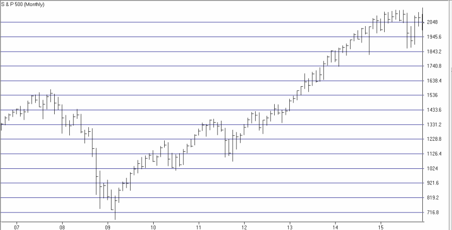
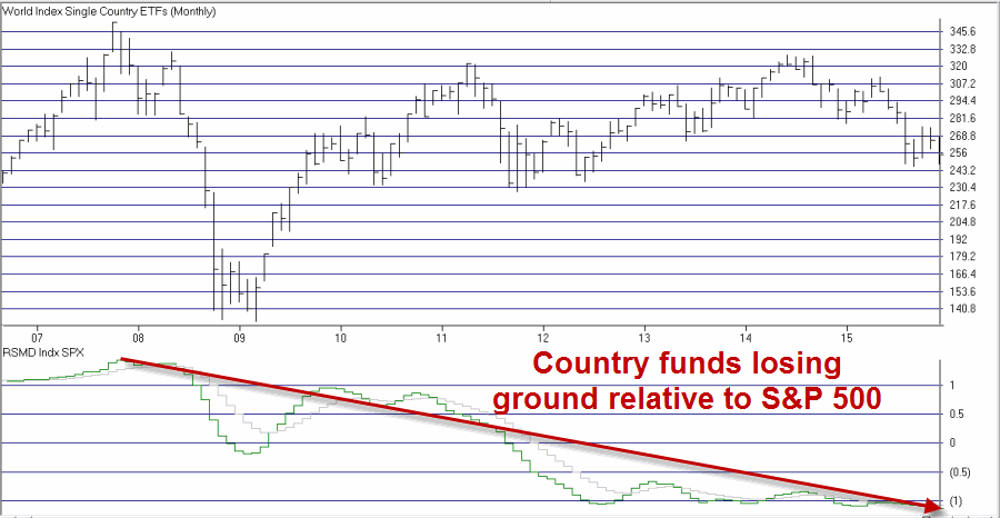
Figure 1 displays the S&P 500 Index.  Figure 2 displays a “World Index” of ETF’s that I created for my own use in AIQ TradingExpert (the 34 tickers that comprise the index are listed at the end of this article.

1Figure 1 – SPX

2Figure 2 – Jay’s World Index

The key thing to note here is at the bottom of Figure 2, which displays the relative strength for the World Index versus the S&P 500 Index.  As you can see from a close look, this line has been trending lower since the top in 2007.  This tells us that the S&P 500 Index has been outperforming the rest of the world consistently and for a long time.

Why you might ask?  A million and one reasons could be posited but for my money the key influencer was quantitative easing by the Fed (for evidence of the direct correlation between quantitative easing and SPX performance please see the two charts in this article).

Now that the Fed has signaled a willingness to be less accommodating what might happen?  Let’s get back to two possible scenarios I hinted at earlier

Two Potential Scenarios Going Forward

#1. The S&P 500 Index proves to be the “world leader”, rebounds and breaks out to a new high.  Stock markets around the globe – many already seriously oversold, also rebound and follow the lead of the S&P 500 Index and launch new bull markets.

#2. The S&P 500 Index – without the benefit of the Fed pumping billions of dollars into the financial system – falls in line with virtually every other country stock market index and heads lower.

Which scenario will it be?  At this point, I have to go with the old adage:

“Hope for the best, prepare for the worst”

Jay Kaeppel

Appendix: ETFs in Jay’s World Index

ECH – Chile; EWC – Canada; EWW – Mexico; EWZ – Brazil; IYY – USA

EPI – India; EWA – Australia; EWH – Hong Kong; EWJ – Japan; EWM – Malaysia; EWT – Taiwan; EWY – South Korea; FXI – China; IDX – Indonesia; RSX – Russia; THD – Thailand; VNM – Viet Nam

ECD – Sweden; EWG – Germany; EWI – Italy; EWK – Belgium; EWL – Switzerland; EWN – Netherlands; EWO – Austria; EWP – Spain; EWQ – France; EWU – United Kingdom; VGK – Vanguard European VIPER

EGPT – Egypt; ESI – Israel; EZA – South Africa; TUR – Turkey;


The World is an Ugly Place Right Now

Chances are you may have seen the title of this piece and shook your head side to side in knowing discouragement.  You may now be expecting me to launch into a rant about ISIS, terrorism, world economies or geopolitics in general.  Did you forget I am a financial writer?  As such I don’t do politics (in fact the only thing I hate more than politics are politicians, but I digress).

My only interest (in terms of writing) is the financial markets – stock markets primarily.  And like a said, the world is an ugly place right now.

I follow several “Regional” indexes that I created using ETFs within AIQ TradingExpert.

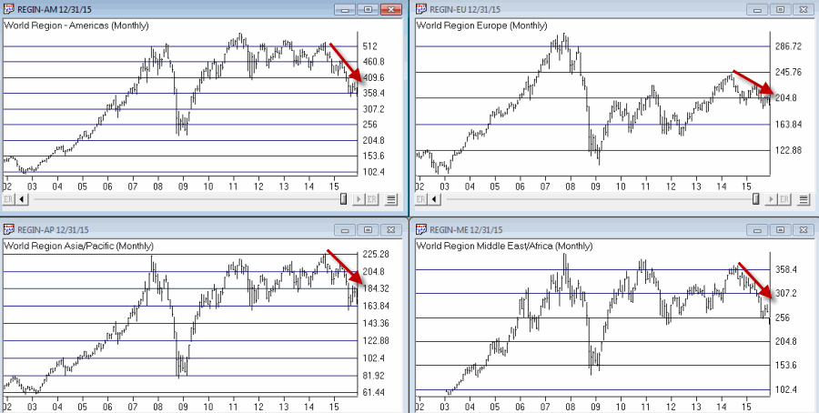
Consider Figures 1 through 4 below

Figure 1 displays my own ETF composite index for the “Americas” region.  The tickers included are: ECH – Chile; EWC – Canada; EWW – Mexico; EWZ – Brazil; IYY – USA

Figure 2 displays my own ETF composite index for the “Asia Pacific” region.  The tickers included are: EPI – India; EWA – Australia; EWH – Hong Kong; EWJ – Japan; EWM – Malaysia; EWT – Taiwan; EWY – South Korea; FXI – China; IDX – Indonesia; RSX – Russia; THD – Thailand; VNM – Viet Nam

Figure 3 displays my own ETF composite index for the “European” region.  The tickers included are: ECD – Sweden; EWG – Germany; EWI – Italy; EWK – Belgium; EWL – Switzerland; EWN – Netherlands; EWO – Austria; EWP – Spain; EWQ – France; EWU – United Kingdom; VGK – Vanguard European VIPER

Figure 4 displays my own ETF composite index for the “Middle East” region.  The tickers included are: EGPT – Egypt; ESI – Israel; EZA – South Africa; TUR – Turkey;

Now take a look at the ugliness contained in Figures 1 through 4.

(click to enlarge)1Figures 1 through 4 – Clockwise from Upper left (Americas, Europe, Middle East and Asia/Pacific (Courtesy: AIQ TradingExpert)

Notice anything these indexes ll have in common?

For the record, as of 12/31/2015:

World Region – Americas      -32.6% off of 2014 high

World Region – Asia Pacific   -23.3% off of 2014 high

World Region – Europe         -19.0% off of 2014 high

World Region – Middle East   -30.7% off of 2014 high

Like I said, the world is an ugly place right now.

(See also JayOnTheMarkets.com: The World is an Ugly Place Right Now (Part 2))

Jay Kaeppel