Let’s step back from the world of quantitative analysis and plunge headlong into the entirely subjective realm of reading chart patterns. I make no claim to be a great “chart trader”, but I have looked at enough charts that I know a “classic top formation” when I see one. Like the one that just played out in the sugar market.
(See also A Two-Fund Portfolio for the Next Three Months)
Now granted only a very small segment of the trading population cares much about the sugar market. But its not the market displayed that matters, but rather the pattern. In other words, the point here is that what appears below can happen with any market, stock, ETF, currency, etc.
I am going to present this without further commentary as it is either self explanatory from the information in the charts, or its not (OK, that and the fact that I am lazy….)
Roll em…..
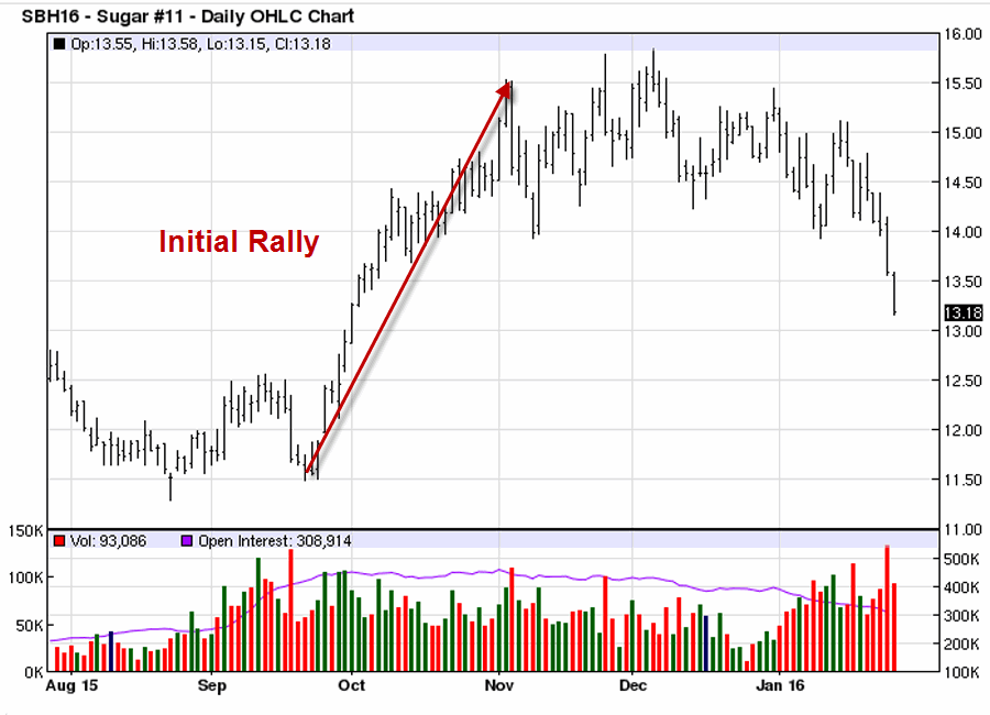 Figure 1 – Initial rally and top
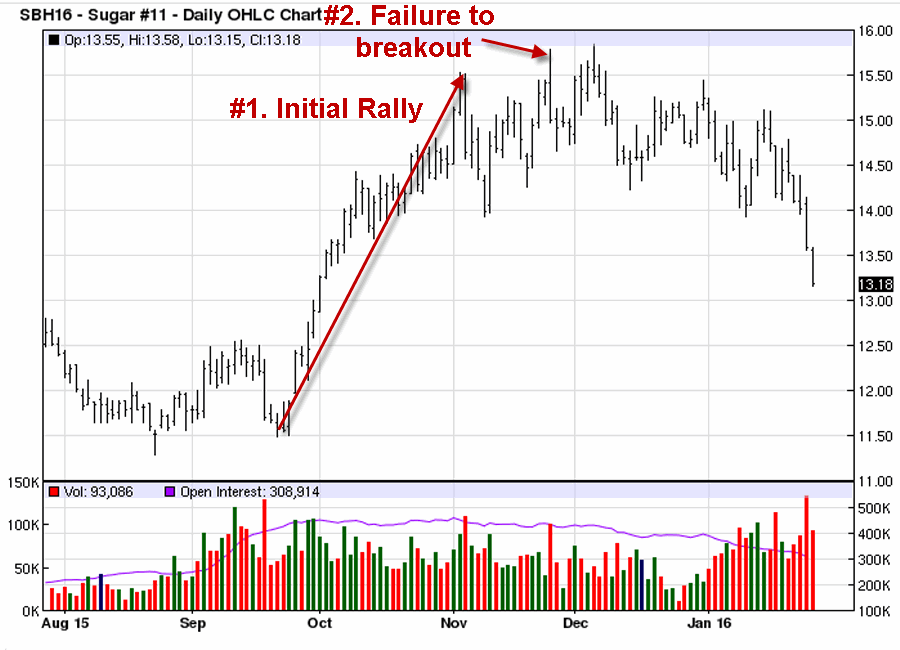 Figure 2 – Pullback, rally and a failed breakout
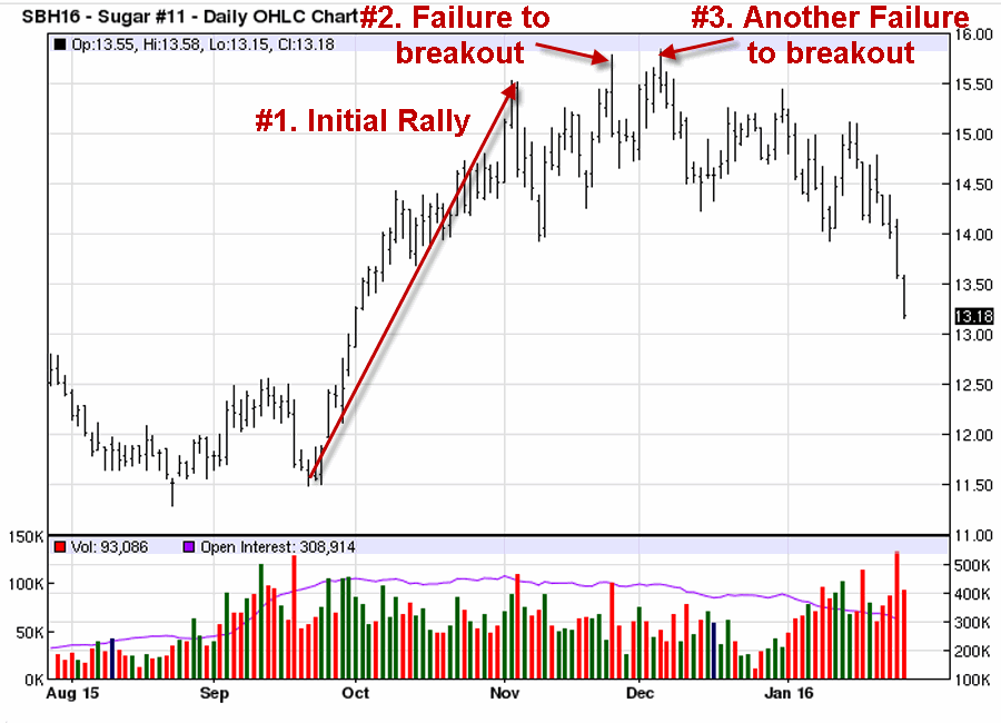 Figure 3 – Another pullback, then rally and another failed breakout
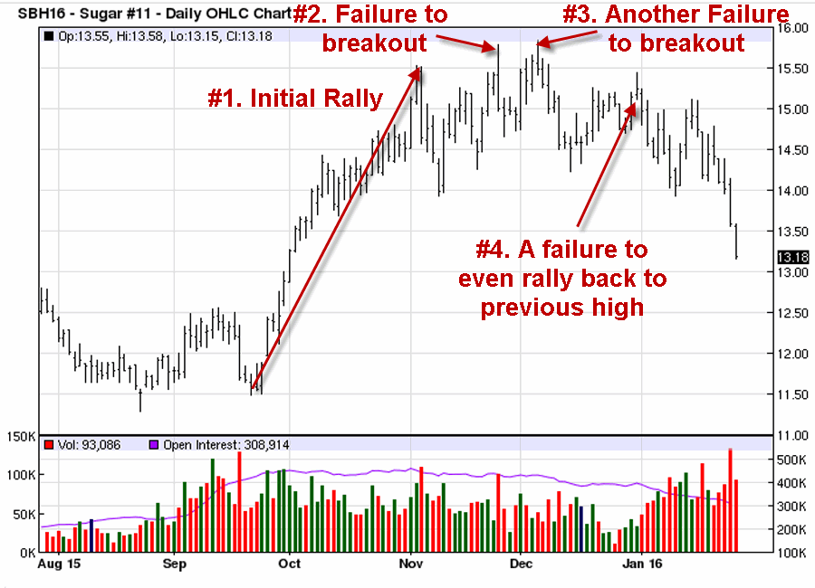 Figure 4 – A pullback followed by a very weak rally (that fails to retest the earlier high)
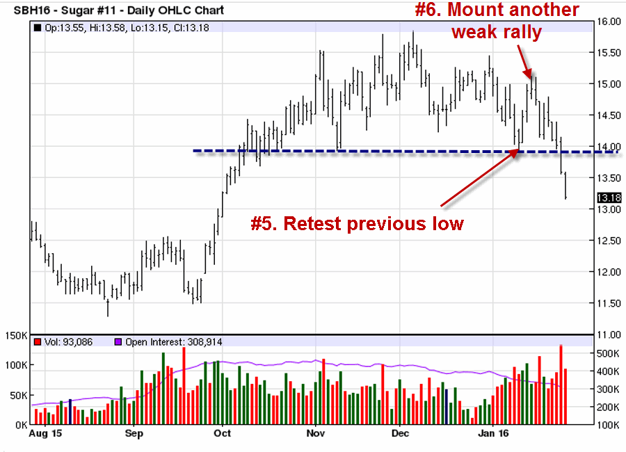 Figure 5 – A retest of an earlier low within the pattern(which creates a “Line in the Sand” support level) followed by another weak rally
Figure 6 – The “Line in the Sand” is broken….and the party is over
If you peruse enough different charts on a regular basis you will see this pattern play out on a surprisingly regular basis.
Jay Kaeppel

