Is there even such as thing as the “Ides
of October”? Probably not. But perhaps there should be. At least when it comes to gold stocks.
First a great big caveat: Seasonality
overall has not been as useful in 2020 as in previous years. So, there is no reason gold stocks cannot register
a meaningful gain in October of this year.
But investing and trading is as much a game of odds as anything
else. And the odds, generally speaking,
are unfavorable for gold stocks in the month of October.
Gold Stocks in October
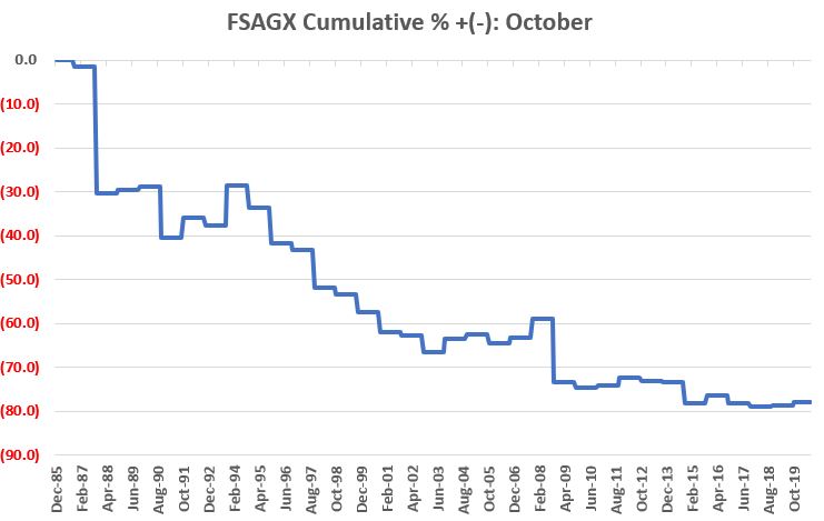
We will use Fidelity Select Gold (FSAGX) as our proxy as there is monthly data going back to 1986. Figure 1 displays the cumulative return an investor would have achieved by buying and holding FSAGX every year since 1986 ONLY during the month of October. For the record, the result to date is a loss of -78%.
Figure 1 – Cumulative %+(-) for FSAGX
only during month of October; 198-2019
Things to note:
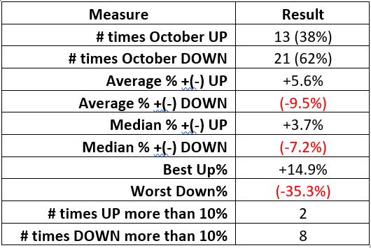
Figure 2 – Relevant Facts and Figures
Figure 3 displays year-by-year total
return results for FSAGX during the month of October.
Year
% +(-)
Oct-86
(1.4)
Oct-87
(29.2)
Oct-88
1.0
Oct-89
1.0
Oct-90
(16.4)
Oct-91
7.7
Oct-92
(3.0)
Oct-93
14.9
Oct-94
(7.2)
Oct-95
(12.1)
Oct-96
(2.7)
Oct-97
(15.3)
Oct-98
(3.0)
Oct-99
(8.4)
Oct-00
(11.0)
Oct-01
(1.9)
Oct-02
(10.5)
Oct-03
9.6
Oct-04
2.6
Oct-05
(5.7)
Oct-06
3.7
Oct-07
12.1
Oct-08
(35.3)
Oct-09
(4.4)
Oct-10
1.9
Oct-11
6.7
Oct-12
(3.1)
Oct-13
(0.7)
Oct-14
(17.9)
Oct-15
7.6
Oct-16
(7.3)
Oct-17
(3.4)
Oct-18
1.2
Oct-19
2.9
Figure 3 – FSAGX in October Year-by-Year; 1986-2019
Summary
In the current market environment, there
is no reason that gold stocks cannot rally substantially to the upside in the
month ahead.
Gold stocks (using FSAGX as a proxy)
have showed a gain in each of the last 2 Octobers and have done so 38% of the
time. So, the proper way to look at the
data above IS NOT to say “gold stocks are doomed to fall in the month ahead.”
The proper response is to ask
yourself the question, “is this where I want to allocate money right now?”
See also Jay Kaeppel Interview in July 2020 issue of Technical Analysis of Stocks and Commodities magazine
Disclaimer: The information, opinions and ideas expressed herein are for
informational and educational purposes only and are based on research conducted
and presented solely by the author. The
information presented represents the views of the author only and does not constitute
a complete description of any investment service. In addition, nothing presented herein should
be construed as investment advice, as an advertisement or offering of
investment advisory services, or as an offer to sell or a solicitation to buy
any security. The data presented herein
were obtained from various third-party sources.
While the data is believed to be reliable, no representation is made as
to, and no responsibility, warranty or liability is accepted for the accuracy
or completeness of such information.
International investments are subject to additional risks such as
currency fluctuations, political instability and the potential for illiquid
markets. Past performance is no
guarantee of future results. There is
risk of loss in all trading. Back tested
performance does not represent actual performance and should not be interpreted
as an indication of such performance.
Also, back tested performance results have certain inherent limitations
and differs from actual performance because it is achieved with the benefit of
hindsight.
Now back in the day I might have been
embarrassed to write an ostensibly bullish piece titled “What’s Up with
[Whatever]?” only to have [Whatever] completely fall apart immediately thereafter. But here are the important parts:
First:
*There is a critical distinction
between identifying a “potentially bullish” situation and actually risking money
Second:
The trading process – at least for me
– involves:
*Identifying a potential bullish or
bearish setup
*Identifying a catalyst or trigger
*Making a trade
The original article covered only
Step #1 of the trading process – identifying a setup. The closing sentences from the 9/14 piece stated,
“But if one was considering making a bullish play in silver, it may be getting
close to time to do so. My favorite play
would be something using options with a relatively low cost and low dollar
risk. Stay tuned…”. In other words, no action is warranted at the
moment, let’s see what transpires. Well
now we know:
*Spectacularly, ridiculously, (almost)
embarrassingly wrong in terms of direction and timing.
*But the setup was there, so as a trader
the proper response is to prepare to make a trade
*At the time (although I did not
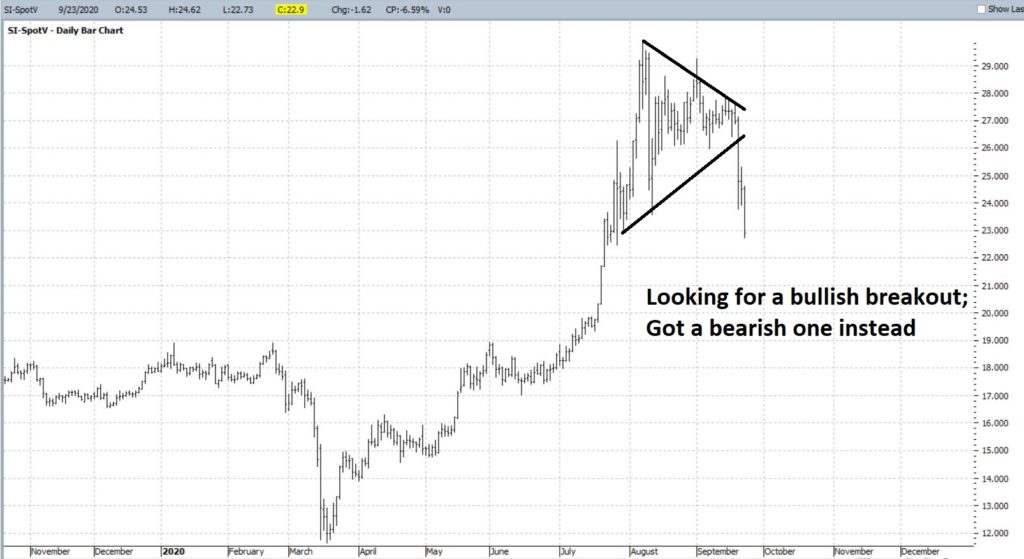
mention this specifically in the original article) I was looking for a breakout
of consolidation to the upside as a catalyst to make a bullish trade
And then BLAM – the bottom drops
out. As a trader I put this down as “No
Harm, No Foul”.
So, is that “The End”? Not for me.
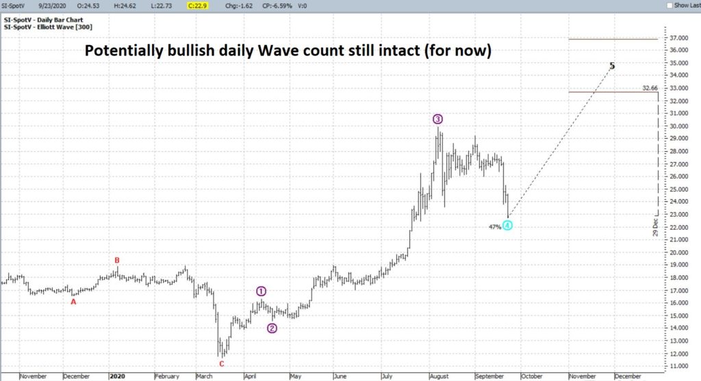
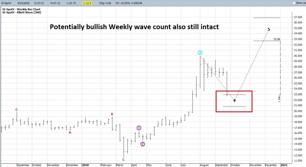
As you can see in Figures 2 and 3, the daily and weekly Elliott Wave
counts from ProfitSource by HUBB are both still potentially bullish, believe it
or not.
*The longer silver stays down the
more likely these wave counts will ultimately get “redrawn” (which is why I am
not a fully committed “Elliott Head” but use it only when the daily and weekly
counts agree)
*As you can see in Figure 3, silver
has now fallen to a level which could complete Wave 3 down and (possibly) set
the stage for a Wave 4 up
*In Figure 2 the bullish daily Wave 4
count remains intact (although as I just mentioned “for how long?” does remain
an issue)
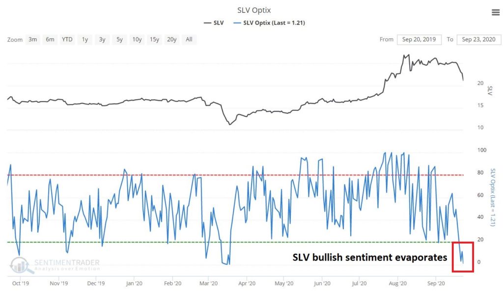
As you can see in Figure 4, the
recent plunge in silver has driven bullish sentiment for the silver ETF ticker
SLV to an extremely low level (only 1.2% of SLV traders surveyed are presently
bullish!).
Disclaimer: The information, opinions and ideas expressed herein are for
informational and educational purposes only and are based on research conducted
and presented solely by the author. The
information presented represents the views of the author only and does not
constitute a complete description of any investment service. In addition, nothing presented herein should
be construed as investment advice, as an advertisement or offering of investment
advisory services, or as an offer to sell or a solicitation to buy any
security. The data presented herein were
obtained from various third-party sources.
While the data is believed to be reliable, no representation is made as
to, and no responsibility, warranty or liability is accepted for the accuracy
or completeness of such information.
International investments are subject to additional risks such as
currency fluctuations, political instability and the potential for illiquid
markets. Past performance is no
guarantee of future results. There is
risk of loss in all trading. Back tested
performance does not represent actual performance and should not be interpreted
as an indication of such performance.
Also, back tested performance results have certain inherent limitations
and differs from actual performance because it is achieved with the benefit of
hindsight.
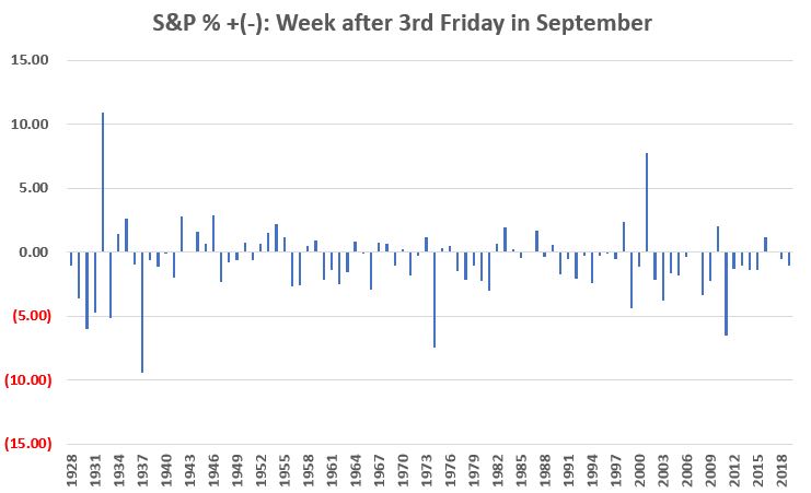
I have written in the past about the “dangers” of September (see here and here) and a lot of investors are aware that it has historically been the worst month of the year for the stock market overall. But the truth is things can vary a lot from year to year – except for this week. This week – defined as the week after the 3rd Friday in September – has been pretty awful pretty consistently for a pretty long time. As you may gather, no, it has not been pretty.
Two of my favorite analysts – Wayne Whaley of Witter & Lester and Rob Hanna of www.QuantifiableEdges.com both made light of this recently. The bottom line:
*The week after the 3rd Friday
in September has seen the S&P 500 decline in 24 of the last 30 years.
Being the numbers geek that I am I
went back to the start of my own database in 1928. I found that in the prior 31 years this week
was up 14 times and down 17 times.
While at first blush this “doesn’t
sound as bad”, the reality is that given the magnitude of the overall market
advance since 1928, that this particular week is so consistently NOT bullish is
downright dismal. Especially when we
consider the magnitude of the ups versus the downs and the overall long-term
trend.
The Numbers
Since 1928, the week after the 3rd
Friday in September has seen the S&P 500 Index:
*Advance 33 times
*Decline 54 times
*Unchanged once
*Average gain = +1.64%
*Average loss = (-2.04%)
Figure 1 displays the cumulative % +(-) achieved by the S&P 500 Index since 1928 during the week after the 3rd Friday in September.
Figure 1 – Cumulative % return for
S&P 500 Index ONLY during week after 3rd Friday in September
Figure 2 displays the year-by-year
results.
Figure 2 – Week after 3rd
Friday in September Year-by-Year % +(-)
September “Hell Week” for 2020 is off
to a pretty dismal start. Will things improver
anytime soon? It beats me. But I am of the mind that during September
and October “anything can happen” so investors should be prepared. I am also of the mind that starting in November
the bullish trend will re-assert itself.
Here’s hoping.
On a slightly separate note – even a down September is not totally without value thanks to the “September Barometer” (see here and here).
See also Jay Kaeppel Interview in July 2020 issue of Technical Analysis of Stocks and Commodities magazine
Disclaimer: The information, opinions and ideas expressed herein are for
informational and educational purposes only and are based on research conducted
and presented solely by the author. The
information presented represents the views of the author only and does not constitute
a complete description of any investment service. In addition, nothing presented herein should
be construed as investment advice, as an advertisement or offering of
investment advisory services, or as an offer to sell or a solicitation to buy
any security. The data presented herein
were obtained from various third-party sources.
While the data is believed to be reliable, no representation is made as
to, and no responsibility, warranty or liability is accepted for the accuracy
or completeness of such information.
International investments are subject to additional risks such as
currency fluctuations, political instability and the potential for illiquid
markets. Past performance is no
guarantee of future results. There is
risk of loss in all trading. Back tested
performance does not represent actual performance and should not be interpreted
as an indication of such performance.
Also, back tested performance results have certain inherent limitations
and differs from actual performance because it is achieved with the benefit of
hindsight.
As people age, very often investing
becomes more about “keeping what you have” and less about “making more.” Oh sure, more is still always better. But the bottom line is there comes a point
when Will Rogers old adage below becomes relevant.
“I’m less interested in the return on
my money as I am the return of my money” Will Rogers
To this end, in this piece we will
focus on one possible approach to “low risk investing” (which of course makes
the assumption that there is such a thing).
The Components
Ticker VTIP ( Vanguard Short-Term Inflation-Protected Securities Index Fund ETF)
VTIP holds short-term TIPs
bonds. TIPs are treasury bonds that are indexed
to inflation. A newly issued TIPs bond has
a principal value of $1,000 and pays a stated percentage of interest on that
principal. Moving forward, if the
Consumer Price Index rises, the principal amount of the bond is adjusted
upward, and interest is paid as a percentage of the higher principal
amount. If inflation were to soar, a
TIPs bond could end up paying a lot of interest, hence the reason they are considered
a hedge against inflation.
On the other side of the coin, if we
have deflation and the CPI declines, then the principal amount for a TIPs bond
gets adjusted lower and interest is paid on this lower amount. HOWEVER, keep in mind that each TIPs security
is repaid the full $1,000 original face value at maturity and the effective
maturity of VTIP is roughly 2.9 years.
So even if the principal amount gets adjusted lower temporarily
(resulting in lower interest payments for the time being), at maturity the full
$1,000 is repaid. This makes deflation
less of a concern for a short-term TIPs holder than for a long-term TIPs
holder.
Speaking of long-term versus
short-term bonds, long-term TIPs can get hurt by rising interest rates. Short-term bonds are less impacted by rising
rates as they mature much sooner.
Ticker SHY ( iShares 1-3 Year Treasury Bond ETF)
Ticker SHY holds treasury securities
that mature in 1 to 3 years. The reality
is that with interest rates presently so low the only way to make money on
short-term bonds is if rates go even lower, or possibly even into negative
territory. However, this portion of the portfolio is a play on safety and low
volatility. If interest rates were to rise, a) short-term bonds would be much
less sensitive in terms of any price decline than longer-term bonds, and, b) if
interest rates were to embark on a sustained increase, short-term bonds would
be able to roll over into higher yielding securities sooner and on a more
frequent basis than longer-term bonds.
I am always a bit leery of securities
that seem “gimmicky”. SWAN may be
thought of as such by some investors.
But in the context of our “lower risk approach” it can be a portfolio
enhancer. Ticker SWAN holds roughly 90%
of its portfolio in treasury securities (with a duration roughly equivalent to
a 10-year treasury). This portion of the
portfolio has no credit risk and moderate interest rate risk (i.e., the value
of the bond holdings may increase if rates decline or decrease if rates rise).
The other 10% holds exposure to the
S&P 500 Index in the form of LEAPs call options. This gives the portfolio the potential to
gain during an advance in stocks. While this portion of the portfolio will
decline during a stock market decline, the bond holdings can serve as a
“buffer”, as treasury securities often rally during stock market declines as
investors flee to investments perceived to be “safe”.
Putting the Portfolio Together
First a few caveats/footnotes:
*For the record, I am not actually
advocating that anyone run out and put money into this idea. At the moment, it is just that – an idea,
food for thought. This portfolio will
rarely make a lot of money, AND it is possible that a given scenario (possibly
an excessively large “spike” in interest rates, perhaps) could create a larger
loss than what was experienced in back testing.
*For testing purposes, I used ETF
total return data wherever possible.
Prior to that I used either index data or a comparable ETF in order to
generate a longer back test. So DO NOT
mistake the results below as “real time” results. The results depicted are strictly a
hypothetical representation of hat real world results might have
resembled. And as always, past performance
is no guarantee of future results.
*For VTIP, I used Adjusted Close data
from Yahoo (which is believed to account for price changes and dividend income)
for ticker TIP (which has a longer duration that ticker VTIP) from 12/6/2005
through 10/16/2012, when VTIP started trading. From that date forward VTIP
Adjusted Close data from Yahoo is used.
*For SHY, I used Adjusted Close data from
Yahoo (which is believed to account for price changes and dividend income) for
ticker SHY from 12/6/2005 to the present.
*For SWAN, I used total return daily
data for the Index that ticker SWAN is designed to track from 12/6/2005 through
11/6/2018, when SWAN started trading. From that date forward SWAN Adjusted
Close data from Yahoo is used.
Are we having fun yet?
The Portfolio
For our purposes we will keep it
simple – 1/3 in each ETF with a rebalance at the beginning of every year.
VTIP = 33%
SHY = 33%
SWAN = 33%
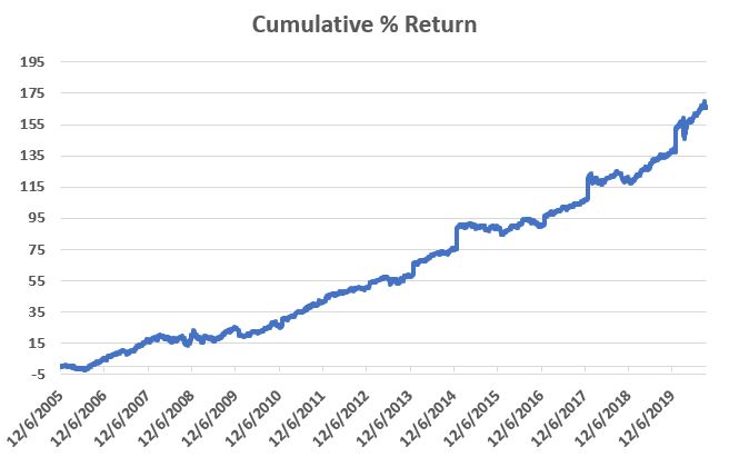
The Results
Figure 1 displays hypothetical
cumulative return for the portfolio from December 6, 2005 through 9/16/2020.
*The standard deviation of 12-month
returns is 4.17% (i.e., low)
*The maximum % drawdown was -6.54%
(i.e., low)
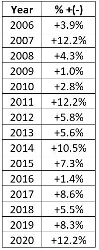
Figure 3 displays the annual % gain on a calendar year basis.
Figure 3 – Annual hypothetical
results
*The key thing to note is that – so
far – there have been no down years.
Summary
Once more for the record, I am not “recommending”
this portfolio. I am merely pointing out
that for a person who was seeking decent returns with relatively low risk and
low volatility, hypothetically speaking this one hasn’t been half bad.
Still, one has to consider potential
risks before committing real money to anything.
I can envision at least one scenario – the stock market tanks BECAUSE interest
rates are spiking BUT inflation remains relatively low – where this portfolio
could have some more serious trouble.
There may be others.
All in all, though, not the worst
idea as food for thought for investors looking for a low risk approach.
See also Jay Kaeppel Interviewin
July 2020 issue of Technical Analysis of Stocks and Commodities magazine
Disclaimer: The information, opinions and ideas expressed herein are for
informational and educational purposes only and are based on research conducted
and presented solely by the author. The
information presented represents the views of the author only and does not constitute
a complete description of any investment service. In addition, nothing presented herein should
be construed as investment advice, as an advertisement or offering of
investment advisory services, or as an offer to sell or a solicitation to buy
any security. The data presented herein
were obtained from various third-party sources.
While the data is believed to be reliable, no representation is made as
to, and no responsibility, warranty or liability is accepted for the accuracy
or completeness of such information.
International investments are subject to additional risks such as
currency fluctuations, political instability and the potential for illiquid
markets. Past performance is no
guarantee of future results. There is
risk of loss in all trading. Back tested
performance does not represent actual performance and should not be interpreted
as an indication of such performance.
Also, back tested performance results have certain inherent limitations
and differs from actual performance because it is achieved with the benefit of
hindsight.
Much has been written about the vast disparity in the performance of large-cap stocks versus small-cap stocks and of growth stocks versus value stocks. And an equal amount of speculation keeps raising the question of how long the current trends can last and when things will reverse.
What to make of all this?
Let’s try to make it easy.
The Comparison
For our purposes we will use monthly
total return data starting in January 1979 for:
*Large cap growth (using the Russell
1000 Growth Index)
*Small cap value (using the Russell
2000 Value Index)
Clearly these two indexes represent a
vastly different subset of stocks.
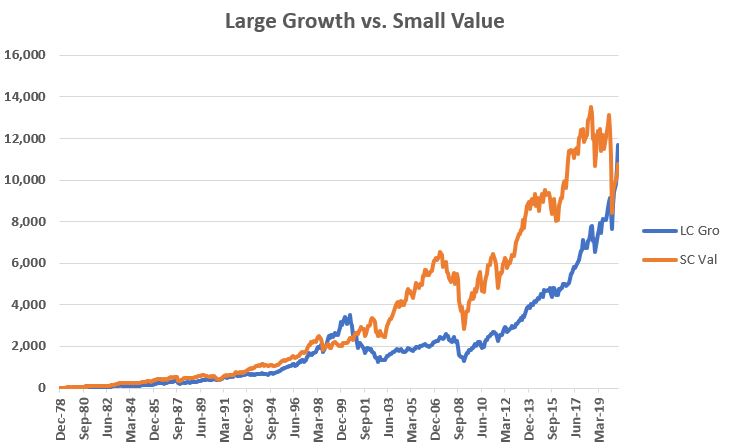
Figure 1 displays the cumulative
total return for both indexes starting in 1979.
Figure 1 – Large cap growth (blue)
vs. Small cap value (orange); cumulative total return starting in 1979
Many investors would be surprised to learn that small-cap value had been outperforming by a fairly sizable margin not that long ago. Only recently did large cap growth once again “take the lead.”
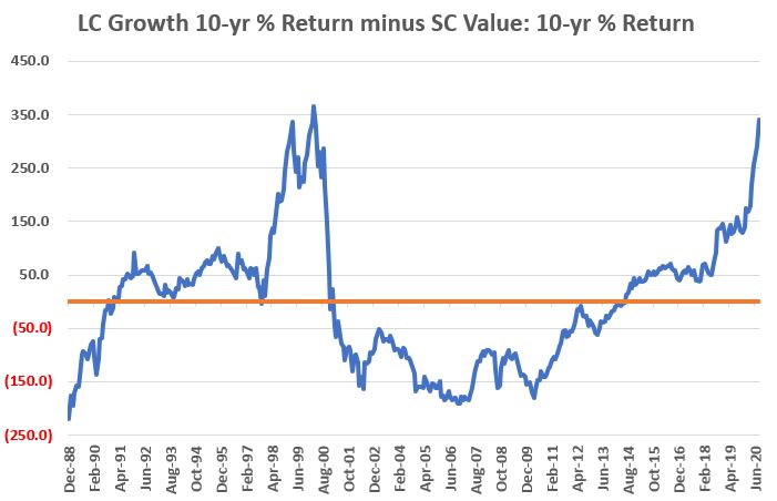
To get a better sense of the “back and forth” nature of this relationship, Figure 2 displays the 10-year cumulative return for large cap growth minus the 10-year cumulative return for small cap value starting in 1989.
Figure 2 – Cumulative 10-yr % return
for Large cap growth minus Cumulative 10-yr % return for Small cap value
To read Figure 2 – if the blue line
is above 0 it means large cap growth has outperformed small cap value over the
past 10 years, and vice versa. In a
perfect world this chart would eliminate all discussion of any “permanent edge”
for one index over the other. The lesson
SHOULD be obvious:
*Large cap growth leads for a number
of years, often by a wide margin
*Then small cap value leads for a
number of years – again, often by a wide margin
Clearly large cap growth has been
better of late and that trend still is in force. Figure 2 does remind us however, that this
trend WILL NOT last forever and that investors who pile into large cap growth
now need to pay close attention to the location of the nearest exit.
How to Use This Relationship
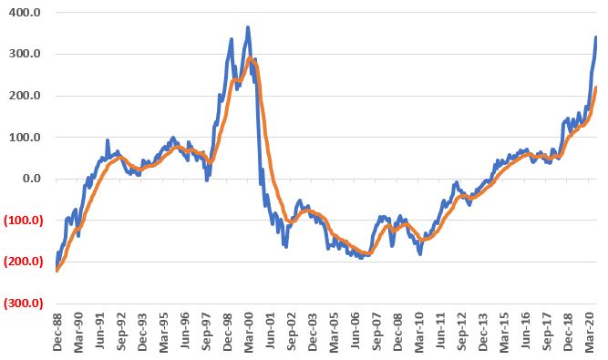
One approach is to use a 13-month
exponential moving average of the line in Figure 2 and note whether the line in
Figure 2 is above or below that 13-month average. These two lines appear in Figure 3.
Figure 3 – LC growth 10 yr. minus SC
value 10 year (blue) versus 13-month EMA (orange)
In Figure 3:
*If the blue line is above the orange line then the trend favors large cap growth.
*If the blue line is below the orange line then the trend favors small cap value.
So, let’s test the following
strategy:
NOTE: Total monthly return data is reported sometime early in the next month. So, because of this I use a 1-month lag in signals. Specifically, if I get total return data for January in early February and the results through the end of January signal a “switch” (i.e., if the 10-yr return for LC Growth minus the 10-yr return for SC Value crosses above or below the 13-month exponential moving average) then the actual switch will take place at the end of February
*If the blue line in Figure 3 moves
above the orange line in Figure 3 we will switch 100% into large cap growth
stocks (Russell 1000 Growth Index)
*If the blue line in Figure 3 moves below
the orange line in Figure 3 we will switch 100% into small cap value stocks
(Russell 2000 Value Index)
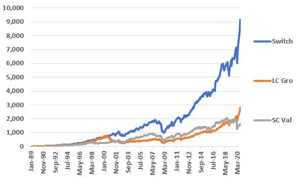
For comparison sake we will also compare
the results of this switching approach to simply buying and holding the Russell
1000 Growth Index and/or the Russell 2000 Value Index.
The % return for each appears in
Figure 4.
Figure 4 – Cumulative % return for “Switching”
versus simply buying and holding the indexes
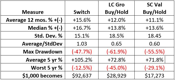
Figure 5 displays some of the comparative
results.
Figure 5 – Switching versus Buying and Holding (1989-2020)
Summary
Switching between large cap growth and small cap value is by no means a perfect strategy (note the -47.7% drawdown for the switching strategy). But the real point is that this test clearly demonstrates that “falling in love” with one index over the other (as many have done in favor of large cap growth in recent years) is long-term a mistake.
A useful business adage is “Adapt or
Die.” Turns out it is pretty handy for
stock investors too…
See also Jay Kaeppel Interviewin
July 2020 issue of Technical Analysis of Stocks and Commodities magazine
Disclaimer: The information, opinions and ideas expressed herein are for
informational and educational purposes only and are based on research conducted
and presented solely by the author. The
information presented represents the views of the author only and does not
constitute a complete description of any investment service. In addition, nothing presented herein should
be construed as investment advice, as an advertisement or offering of investment
advisory services, or as an offer to sell or a solicitation to buy any
security. The data presented herein were
obtained from various third-party sources.
While the data is believed to be reliable, no representation is made as
to, and no responsibility, warranty or liability is accepted for the accuracy
or completeness of such information.
International investments are subject to additional risks such as
currency fluctuations, political instability and the potential for illiquid
markets. Past performance is no
guarantee of future results. There is
risk of loss in all trading. Back tested
performance does not represent actual performance and should not be interpreted
as an indication of such performance.
Also, back tested performance results have certain inherent limitations
and differs from actual performance because it is achieved with the benefit of
hindsight.
It has been nearly impossible lately to view the financial news in the 2020 and to not see some headline or story about “the coming explosion in Silver!!!!” (I left off a number of exclamation points in order to save space). While I do hold some bullish positions in metals it is more of a “trend-following thing” than an act of buying into the whole “MASSIVE RALLY AHEAD”.
Still, a quick recent look at all
things silver suggests that if “something big” is going to happen, a good chunk
of it might occur between now and the end of 2020. That’s not so much a “prediction” as it a “possibility
to be aware of.”
To wit:
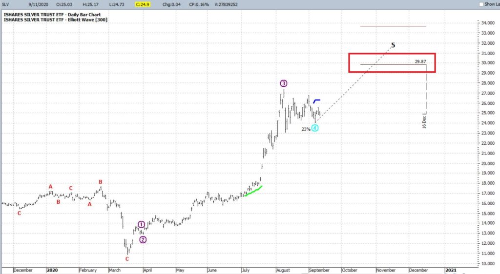
Figure 1 displays ticker SLV with a
daily Elliott Wave count calculated using the objective EW algorithm built into
ProfitSource by HUBB. As you can see,
the current projection is for rally to at least 29.87 by roughly the end of the
year.
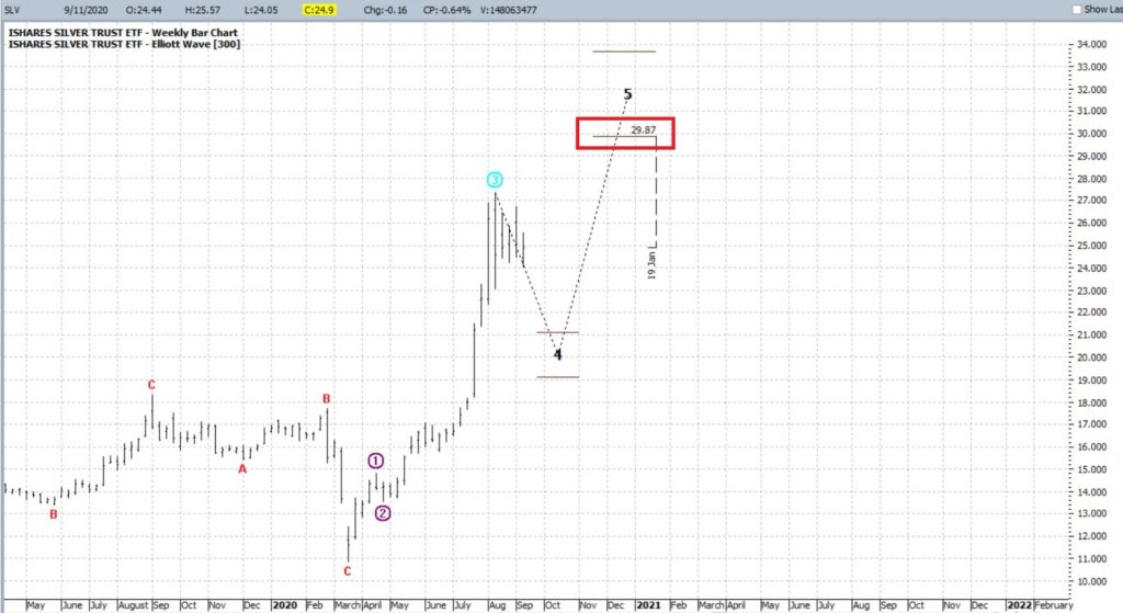
Figure 2 displays ticker SLV with a weekly Elliott Wave count calculated using the objective EW algorithm built into ProfitSource by HUBB. As you can see, it is making a similar projection to the daily one, i.e., projecting a possible move toward $30 a share – in this case in late 2020 or early 2021.
*I am not a true “Elliott Head”, but
I do tend to pay attention when both the daily and weekly counts (using
ProfitSource) line up as bullish or bearish
*Elliott Wave counts from ProfitSource are like a lot of other things in the market – sometimes they pan out, sometimes they don’t. There is no “magic” involved. But the fact that they are generated “objectively” (as opposed to say Me picking what I subjectively “think look like wave counts”) gives me a bit more confidence.
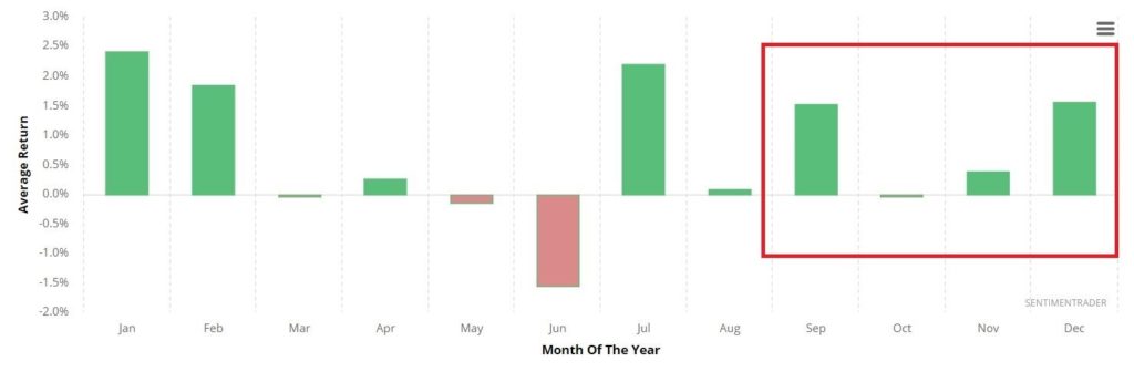
Figure 3 from www.Sentimentrader.com displays the monthly annual seasonal trend for silver futures. As you can see, the months ahead look fairly favorable. For the record, seasonality on the whole has seen a lot of things “out of whack” in 2020, so there is every chance this won’t pan out either. But for the moment I put it down as another factor in the “favorable” column.
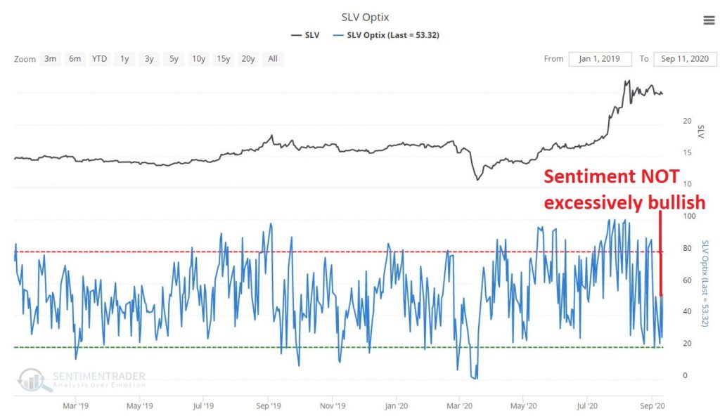
Figure 4 – also from www.Sentimentrader.com – displays the trader sentiment for ticker SLV. For the record, this one is presently technically (in my mind) “kinda neutral”. In other words, sentiment is neither excessively low nor excessively high.
Given that all “hubbub” surrounding
silver has been mostly bullish, I am actually counting it as a slight positive
that sentiment is presently not “off the charts” bullish. Looking at it this way may be seen as a bit
of a stretch to some, but it makes sense in my market-addled mind.
So, will SLV actually “explode higher”
as all the talking heads have been prognosticating since (well, technically
since the peak in 1979, but I digress) early this year? It beats me.
But if one was considering making a bullish play in silver, it may be
getting close to time to do so.
My favorite play would be something using
options with a relatively low cost and low dollar risk.
Stay tuned…
See also Jay Kaeppel Interview in July 2020 issue of Technical Analysis of Stocks and Commodities magazine
Disclaimer: The information, opinions and ideas expressed herein are for
informational and educational purposes only and are based on research conducted
and presented solely by the author. The
information presented represents the views of the author only and does not
constitute a complete description of any investment service. In addition, nothing presented herein should
be construed as investment advice, as an advertisement or offering of
investment advisory services, or as an offer to sell or a solicitation to buy
any security. The data presented herein
were obtained from various third-party sources.
While the data is believed to be reliable, no representation is made as
to, and no responsibility, warranty or liability is accepted for the accuracy
or completeness of such information.
International investments are subject to additional risks such as
currency fluctuations, political instability and the potential for illiquid
markets. Past performance is no
guarantee of future results. There is
risk of loss in all trading. Back tested
performance does not represent actual performance and should not be interpreted
as an indication of such performance.
Also, back tested performance results have certain inherent limitations
and differs from actual performance because it is achieved with the benefit of
hindsight.
The
recent “concentration” in the March-August 2020 rally is pretty well
acknowledged at this point. Apple,
Amazon, Facebook, Nvidia, Tesla, Microsoft, growth, momentum, tech, etc. go up
pretty much all the time – everything else, maybe yes, maybe no.
And his kind of ride is great. While it lasts. Now the market is selling off for three days and suddenly everyone wants to know if its time to panic. So, let’s talk “perspective”.
The Here and Now
Since
the Covid panic in February and March, the stock market has staged a historic
rally. The rally has been dominated by
large-cap/growth/tech/momentum stocks.
*September-October:
Anything can happen, so be prepared
*November-April
2021: Based on several seasonal factors plus a lot of bullish momentum signals
I look for a resumption/continuation of the bull market into spring 2021
*May-Oct
2021: Based primarily on seasonal factors, the market could easily struggle
between mid-2021 and mid-2022. But that’s
all a way off and mere prognostication.
For
now, let’s focus on a few obvious trends – trends which may be getting a bit “stretched.”
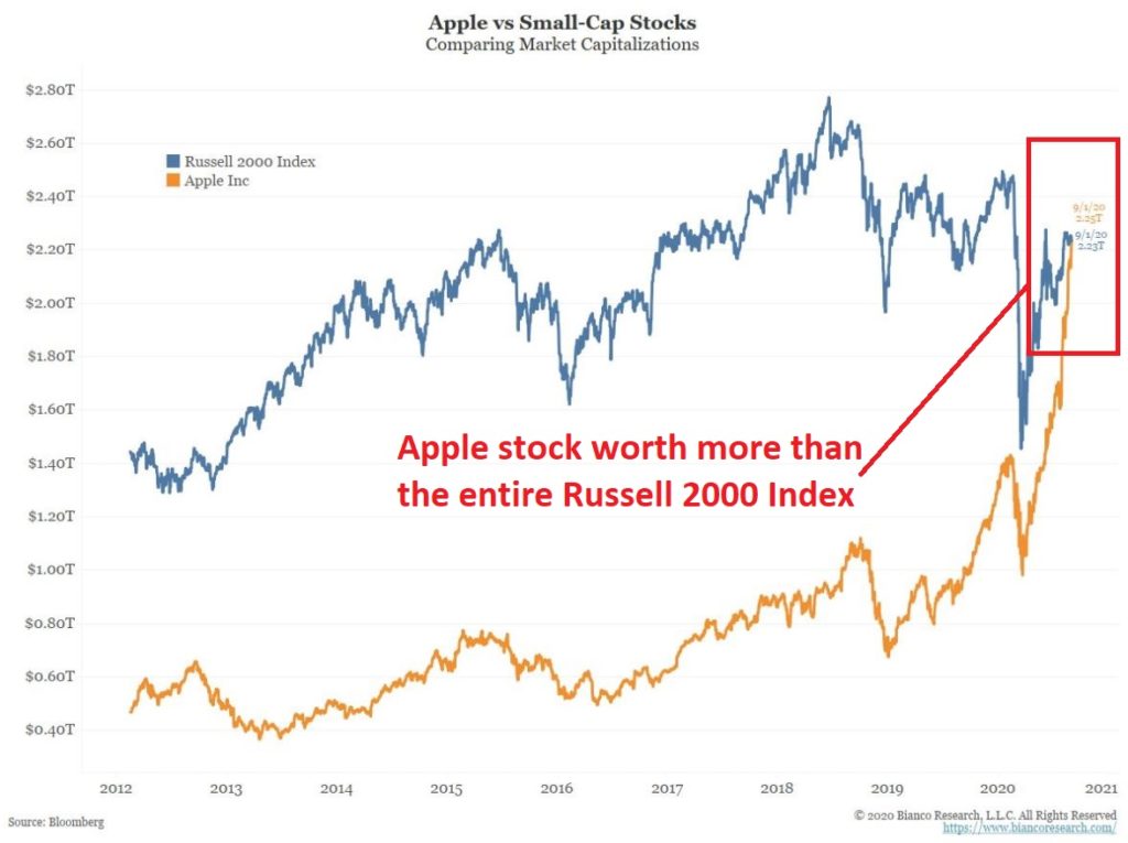
Apple vs. The Little Guy
Figure
1 displays the market capitalization of AAPL versus the ENTIRE Russell 2000
Index.
Figure
1 – Apple vs. Russell 2000 market capitalization (Courtesy: www.BiancoResearch.com)
I am going to give you my perspective as straight as possible. Apple is a great company, it will likely continue to be a great company for a long time, and I have no idea when the price of the stock will top out. All that being said – and even forgetting Apple the company for one second – this type of herd mentality concentration in one asset almost NEVER works out well in the end. The same can be said for Tesla stock market cap dwarfing the rest of the entire automobile industry.
So,
the bottom line:
*Will
AAPL and TSLA stock ultimately rise further?
It wouldn’t surprise me.
*Will
all of this ultimately end badly? Almost
certainly.
*Should
you dump these highfliers now? It beats
me.
*Should
you remain vigilant and be prepared to one day dump these highfliers? Absolutely.
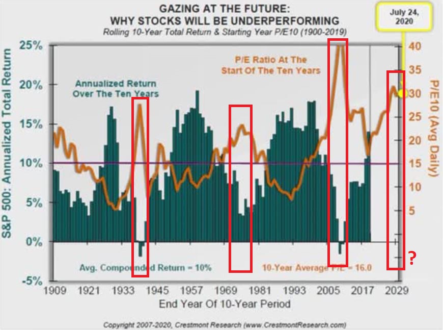
Stock Market Returns vs. Stock Market Valuations
For the record, please note that P/E ratios are lousy timing indicators. The market can remain “overvalued” or “undervalued” for years. BUT, ultimately it does matter. Figure 2 displays the following:
*The
orange line is the P/E ratio at the beginning of a given 10-year period (the
P/E ratio scale is on the right)
*The
bars along the way display the average annual return for the S&P 500 Index
in the subsequent 10 years.
*10-year
periods that start with a high P/E ratio (look for peaks in the orange line)
invariably experience below average 10-year returns
*And
vice versa
*The
current P/E ratio is at the high end of the historical spectrum
What
does it all mean? It likely means that
stock market returns over the next 10 years will NOT resemble the returns in
the past 10 year.
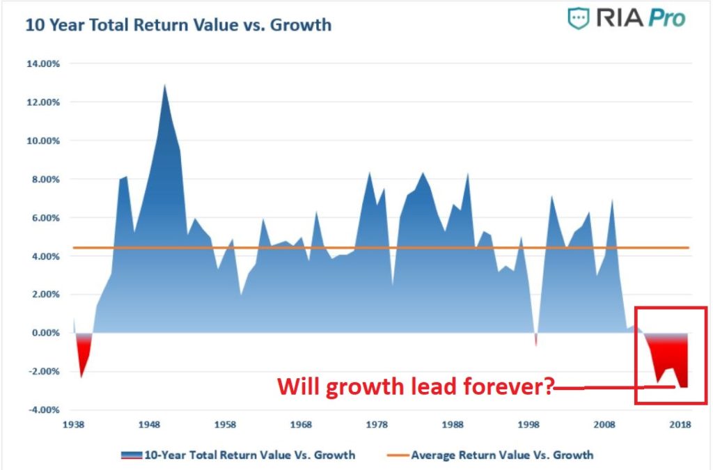
Growth vs. Value
In
recent years “Growth is God” and “Value is Dead”. The difference in performance has not even
been close. So, the longer this goes on
the more it becomes “a given” in the minds of many investors that this trend
will continue ad infinitum. But will
it? History is pretty clear on this
point. With certain relationships
(growth vs. value, large-cap vs. small-cap, U.S. vs. international and so on)
there is a definite ebb and flow over time. Which leads us to:
Jay’s Trading Maxim #45: The only thing more foolish that trying to
time the exact turning point in the ebb and flow of things is believing that a
particular ebb or flow will last forever.
Figure
3 displays 10-year total return for Value versus the 10-year total return for
Growth since the 1930’s. Note that the
current reading is the most extreme reading in favor of growth ever using this
data series.
Figure
3 – 10-year value return minus 10-year growth return (Source: RIA Pro)
While
at the moment the “Growth is God” banner is flying high, Figure 3 argues pretty
strongly that this trend will not last forever.
So, enjoy the growth ride while it lasts, but remember that it will end someday.
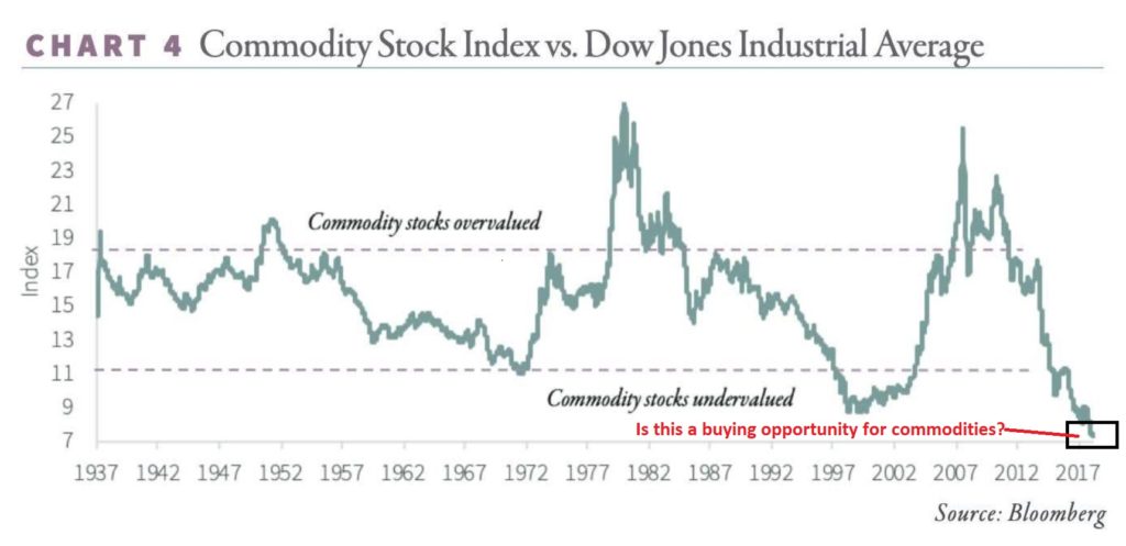
Commodities versus Stocks
Figure
4 displays the relative performance an index of commodity related stocks to the
performance of the S&P 500 Index, going back to the 1930’s. Note that commodity related performance has
never been worse relative to stocks.
Figure
4 – Commodity related stocks versus the S&P 500 Index.
Once
again, trying to pick the exact bottom in this relationship is a mistake. The bigger mistake is assuming this
relationship will never reverse.
Summary
Don’t get caught staring at the “shiny object” for too long. The “large-cap/growth/tech/momentum party will likely resume and roll on for who knows how long. But just remember, all good things gotta come to an end.
See also Jay Kaeppel Interview in July 2020 issue of Technical Analysis of Stocks and Commodities magazine
Disclaimer: The information, opinions and ideas expressed herein are for
informational and educational purposes only and are based on research conducted
and presented solely by the author. The
information presented represents the views of the author only and does not
constitute a complete description of any investment service. In addition, nothing presented herein should
be construed as investment advice, as an advertisement or offering of
investment advisory services, or as an offer to sell or a solicitation to buy
any security. The data presented herein
were obtained from various third-party sources.
While the data is believed to be reliable, no representation is made as
to, and no responsibility, warranty or liability is accepted for the accuracy
or completeness of such information.
International investments are subject to additional risks such as currency
fluctuations, political instability and the potential for illiquid
markets. Past performance is no
guarantee of future results. There is
risk of loss in all trading. Back tested
performance does not represent actual performance and should not be interpreted
as an indication of such performance.
Also, back tested performance results have certain inherent limitations
and differs from actual performance because it is achieved with the benefit of
hindsight.
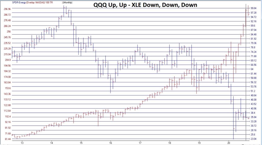
Everyone hates the energy sector (Foreshadowing alert: Well, almost everyone). And a quick perusal of Figure
1 clearly illustrates why the energy sector is unloved.
Since
ticker XLE (Energy Select Sector SPDR ETF) topped out in 2014:
*XLE
has lost -65%
*QQQ
has gained +210%
And
in another kick in the head to the energy sector, Exxon (ticker XOM) was just
kicked out of the Dow Jones Industrial Average.
Take that, losers!
So
yeah, who wouldn’t hate energy stocks and decide to shun them? Well, as it turns out, the answer to that
question of late is “the people who know the energy business the best.”
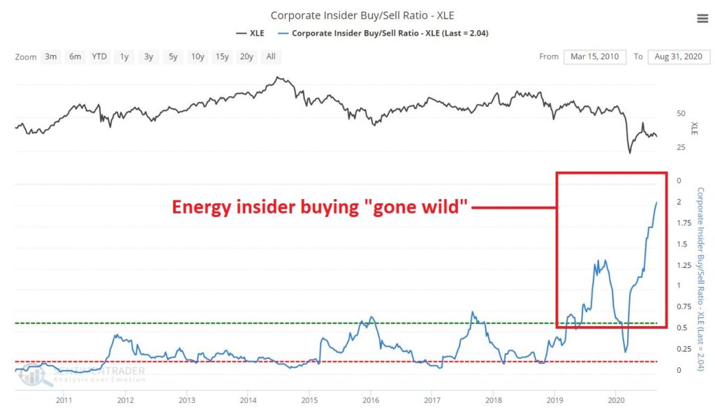
Figure 2 from www.Sentimentrader.com displays the Insider Buy/Sell ratio for executives and other muckety-mucks running energy related corporations. The picture speaks for itself.
As
you can see, energy corporate insiders have been on a massive buying binge of
late. Interestingly, they went on a
buying binge in 2019 – apparently expecting an improvement in the sector – then
the sector got waylaid by Covid-19.
Instead of bailing out the insiders really kicked their share buying into
overdrive as you can see at the far right of Figure 2.
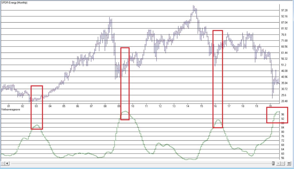
Figure
3 displays ticker XLE with an indicator that I developed by simply smoothing
Larry Williams VixFix indicator. The
gist of the idea, is that when this indicator reaches an extreme high level and
then turns down, it often highlights a “washed out” situation which may be
followed by a bullish move. Ticker XLE
is presently nearing that point.
Should
savvy investors follow the insider’s lead and start piling into the energy
sector? Unfortunately, hindsight is the
only way to know for sure. But for what
it is worth, my own answer is “probably, but maybe not just yet.”
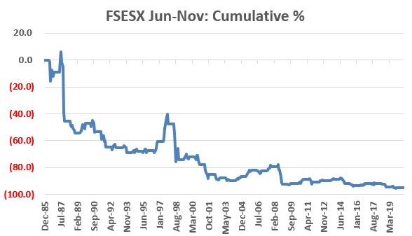
Energy Seasonality
The
primary reason for hesitation at this exact moment in time is seasonality. Let’s use ticker FSESX (Fidelity Select
Sector Energy Services) as a proxy for the broader energy index. This fund’s first full month of trading was
January 1986. Figure 4 displays the
cumulative total return for ticker FSESX ONLY during the months of June through
November every year since 1986.
Figure
4 – FSESX cumulative % return June through October (1986-2020)
The
cumulative total return during these months for holders of FSESX during June
through November is -94.7%(!!!) So, you
see my hesitation with “piling in”.
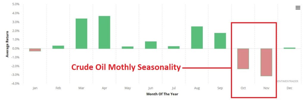
Additionally
– climate change concerns aside – much of the energy industry still revolves
around crude oil. Figure 4 displays the
annual seasonal trend by month for crude oil.
Seasonal trends can vary widely from
year-to-year, and there is NO guarantee that trouble lies ahead in Sep-Oct-Nov
for the energy sector.
But that is what history suggests.
Summary
The
bottom line is this:
*Energy
sector corporate insider buying should be seen as a bullish longer-term sign
for the sector
*The
energy sector is so beaten down, battered and unloved that it probably accurate
to refer to the situation as “Blood in the Streets”
Based
on these factors I look for energy to surprise investors in the years
ahead. That being said:
*Trying
to pick the exact bottom in anything is typically a fool’s errand
*Getting bullish on the energy sector in early September is at times fraught with peril.
Sometime around December 1st it will be time to take a close look at the energy sector. If an actual uptrend develops or has already developed, the time may be write for investors to join the insiders.
See also Jay Kaeppel Interviewin
July 2020 issue of Technical Analysis of Stocks and Commodities magazine
Disclaimer: The information, opinions and ideas expressed herein are for
informational and educational purposes only and are based on research conducted
and presented solely by the author. The
information presented represents the views of the author only and does not constitute
a complete description of any investment service. In addition, nothing presented herein should
be construed as investment advice, as an advertisement or offering of
investment advisory services, or as an offer to sell or a solicitation to buy
any security. The data presented herein
were obtained from various third-party sources.
While the data is believed to be reliable, no representation is made as
to, and no responsibility, warranty or liability is accepted for the accuracy
or completeness of such information.
International investments are subject to additional risks such as
currency fluctuations, political instability and the potential for illiquid
markets. Past performance is no
guarantee of future results. There is
risk of loss in all trading. Back tested
performance does not represent actual performance and should not be interpreted
as an indication of such performance.
Also, back tested performance results have certain inherent limitations
and differs from actual performance because it is achieved with the benefit of
hindsight.
One of the keys to trading success is to put as many factors in your favor as possible when identifying a trading opportunity. The other key is to understand that “this time around” those factors may not mean a hill of beans so you had better allocate your capital – and manage your risk – wisely.
A
relevant potential case in point is found in the soybean market.
The Factors: Seasonality
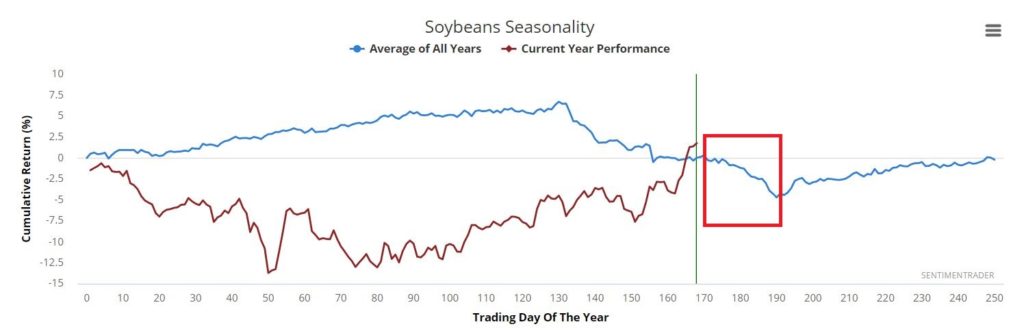
Figure
1 displays the annual seasonal trend for soybeans. Focus on the action of the blue line
contained in the red box.
The
period contained in the box roughly equates to September Trading Day #5 through
October Trading Day #2. We’ll focus on
this period more closely in a moment, but for now just note that seasonality is
suggesting an edge to the bears during this period.
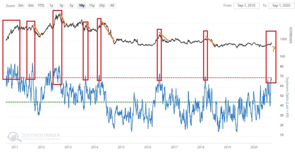
The Factors: Sentiment
Figure 2 displays the Soybeans Optix for the past 10 years. As you can see at the far right, the current Optix value is just touching what would be considered the upper end (i.e., overly bullish sentiment). By itself this should NOT be interpreted as a “Sell Now!!” signal. However, as part of the overall “weight of the evidence” it is fair to add it to the “potentially negative” side of the ledger.
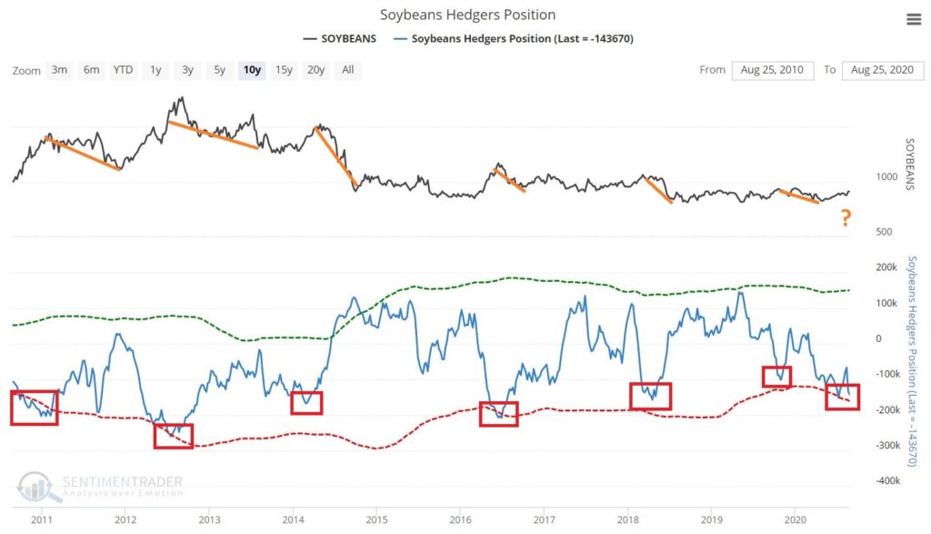
Like
sentiment, the current state of “hedgers positions” on a standalone basis is
not flashing any kind of a definitive signal.
However, it is toward the lower end of the range following a significant
decline in the indicator in the lower clip.
As you can see in Figure 3, previous significant declines in soybean
hedger positions toward roughly a 1-year low have often been followed by
weakness in soybean prices.
What
follows IS NOT a “recommended” trade. It
is simply an example of how a trader might approach this situation, taking this
opportunity into account in terms of:
*Probability
*Capital
allocation
*Risk
control
If
we look a little more closely, we find that the period that extends from the
close on September Trading Day #5 through October Trading Day #2 has been
unfavorable for beans over the year. How
unfavorable?
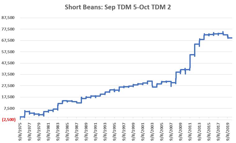
Figure 4 displays the cumulative dollar return from holding a short position in soybeans futures during only this period every year starting in 1975. A price of 950 for soybean futures equates to $9.50 for a bushel of soybeans. Each 1 “point” move is worth $50, so a trader who sells beans at 950 and buys back at 900 earns 50 points times $50 a point, or a gain of +$2.500.
Figure 4 – Soybeans cumulative hypothetical $ +/- holding a short futures position from September Trading Day #5 through October Trading Day #2
Figure 5 displays the yearly $ +(-) hypothetical $ +/- holding a short futures position from September Trading Day #5 through October Trading Day #2
Things to Note:
*32
years showed a gain (71%)
*13
years showed a loss (29%)
*Average
winning trade = +$2,663
*Average
losing trade = (-$1,184)
*Win/Loss
Ratio = 2.46 (71%/29%)
*Ave.
Win/Ave. Loss = 2.25 ($2,663/$1,184)
Clearly
this trend offers possibilities on a “probability” basis.
The
real questions for an actual trader are “how much $ to commit?” and “how much
risk is involved?”
Considering Drawdowns
Figure 6 displays the annual +/- from holding a short position in soybean futures for the full period along with the worst open loss experienced along the way.
Year
$ +(-)
Worst Open $ Loss
1975
$13
($2,425)
1976
$4,625
($475)
1977
($1,425)
($2,250)
1978
($775)
($1,575)
1979
($488)
($1,375)
1980
$2,850
($1,163)
1981
$850
($575)
1982
$1,325
($938)
1983
$4,913
($1,038)
1984
$2,338
($75)
1985
($238)
($1,050)
1986
($513)
($650)
1987
($1,038)
($1,200)
1988
$3,825
$0
1989
$913
$0
1990
$1,300
($450)
1991
($88)
($1,550)
1992
$1,725
$0
1993
$1,850
($338)
1994
$1,988
($225)
1995
($263)
($1,650)
1996
$2,588
($1,038)
1997
$475
($488)
1998
$325
($600)
1999
$1,250
($375)
2000
$800
($50)
2001
$850
($600)
2002
$1,675
($888)
2003
($5,350)
($5,350)
2004
$2,913
$0
2005
$1,900
$0
2006
$275
($500)
2007
($1,288)
($4,550)
2008
$9,400
($650)
2009
$2,300
($1,300)
2010
($138)
($3,875)
2011
$13,200
($450)
2012
$9,400
($1,450)
2013
$4,150
($1,950)
2014
$4,125
$0
2015
$100
($788)
2016
$700
($613)
2017
$275
($1,188)
2018
($1,025)
($1,025)
2019
($2,763)
($3,025)
Figure
6 – Annual hypothetical +/- and largest open loss during life of trade;
1975-2019
To
read Figure 6, in 1975 the short trade registered a net gain of $12.50 (rounded
to $13 in the Table). The worst open
loss during the life of the trade was -$2,425.
In other words, you had to sit through an open loss of -$2,425 in order
to garner the $12.50 profit. As you can
see, these numbers can vary widely from year to year.
Now
let’s get down to the nitty-gritty of capital allocation. First off, there are no hard and fast rules,
so we will simply highlight one common sense approach.
The worst recorded drawdown for any one trade was $5,350 in 2003. As I write, the margin requirement to sell short 1 soybean futures contract at the Chicago Board of Trade is $4,725.
*So, one simple approach would be to add these two values together ($5,350 + $4,725 = $10,075). Using this simple approach, a trader would allocate capital of $10,075 to sell short 1 soybean futures contract.
*IMPORTANT NOTE: A short position in a futures contract entails unlimited risk. So a trader should also consider a stop loss order. There is no “magic number” but for sake of example, let’s assume we want to put a stop-loss beyond the largest previous loss of -$5.350. If we will risk a maximum of $5,400 then we divide $5,400 by $50 and get 108 soybean “points”. So if we sell short a soybean futures contract trading at a quoted price of 965 (or $9.65 a bushel), we might place a stop-loss to buy back the contract at 1,073.
What Kind of Return?
For
sake of example, let’s assume that every year a Trader allocates $10,075 and
sells short 1 soybean futures contract at the close on the 5th
trading day of September and then buys it back to close the short position at
the close on the 2nd trading day of October.
Figure 7 displays the hypothetical annual results in terms of “% return on capital allocated” and “largest open loss as a % of allocated capital.”
Year
% Return
Largest % Open loss
1975
0.1%
(24.1%)
1976
45.9%
(4.7%)
1977
(14.1%)
(22.3%)
1978
(7.7%)
(15.6%)
1979
(4.8%)
(13.6%)
1980
28.3%
(11.5%)
1981
8.4%
(5.7%)
1982
13.2%
(9.3%)
1983
48.8%
(10.3%)
1984
23.2%
(0.7%)
1985
(2.4%)
(10.4%)
1986
(5.1%)
(6.5%)
1987
(10.3%)
(11.9%)
1988
38.0%
0.0
1989
9.1%
0.0
1990
12.9%
(4.5%)
1991
(0.9%)
(15.4%)
1992
17.1%
0.0
1993
18.4%
(3.3%)
1994
19.7%
(2.2%)
1995
(2.6%)
(16.4%)
1996
25.7%
(10.3%)
1997
4.7%
(4.8%)
1998
3.2%
(6.0%)
1999
12.4%
(3.7%)
2000
7.9%
(0.5%)
2001
8.4%
(6.0%)
2002
16.6%
(8.8%)
2003
(53.1%)
(53.1%)
2004
28.9%
0.0
2005
18.9%
0.0
2006
2.7%
(5.0%)
2007
(12.8%)
(45.2%)
2008
93.3%
(6.5%)
2009
22.8%
(12.9%)
2010
(1.4%)
(38.5%)
2011
131.0%
(4.5%)
2012
93.3%
(14.4%)
2013
41.2%
(19.4%)
2014
40.9%
0.0
2015
1.0%
(7.8%)
2016
6.9%
(6.1%)
2017
2.7%
(11.8%)
2018
(10.2%)
(10.2%)
2019
(27.4%)
(30.0%)
Average
+15.4%
(-11.0%)
Figure
7 – % returns and risks
Summary
Will soybeans decline between the close on 9/8/2020 and 10/2/2020? It beats me. This seasonal trade has been a loser each of the last two years and seasonality overall has not been great in 2020.
Still history clearly suggests a negative bias. When we add in sentiment and hedgers positioning, the odds seem to favor a the downside. In the end – and as always – the real questions are “how much money do you have to commit” and “is it worth the risk” in your opinion.
See also Jay Kaeppel Interview in July 2020 issue of Technical Analysis of Stocks and Commodities magazine
Disclaimer: The information, opinions and ideas expressed herein are for
informational and educational purposes only and are based on research conducted
and presented solely by the author. The
information presented represents the views of the author only and does not constitute
a complete description of any investment service. In addition, nothing presented herein should
be construed as investment advice, as an advertisement or offering of
investment advisory services, or as an offer to sell or a solicitation to buy
any security. The data presented herein
were obtained from various third-party sources.
While the data is believed to be reliable, no representation is made as
to, and no responsibility, warranty or liability is accepted for the accuracy
or completeness of such information.
International investments are subject to additional risks such as
currency fluctuations, political instability and the potential for illiquid
markets. Past performance is no
guarantee of future results. There is
risk of loss in all trading. Back tested
performance does not represent actual performance and should not be interpreted
as an indication of such performance.
Also, back tested performance results have certain inherent limitations
and differs from actual performance because it is achieved with the benefit of
hindsight.
Maybe
not even consciously in many cases (think of any cash you have anywhere – checking,
savings, money-market, brokerage account but not invested in anything at the
moment, etc.), but most investors are “earning interest” on some portion of
their assets. Not much interest. Not in the current “low interest rate environment”,
but interest nevertheless.
Yet
the interesting (har) thing is that the vast majority of investors never think
about how changes in interest rates affect things. For our example, we will go to the far end of
the bond spectrum – the 30-year treasury bond.
Long-term treasuries are essentially the “purest play” on interest rates
because treasury bonds are assumed to entail no “credit risk”, they trade
solely based on “interest rate risk”, i.e.:
*When
long-term interest rates go DOWN, long-term treasury price go UP
*When
long-term interest rates go UP, long-term treasury price go DOWN
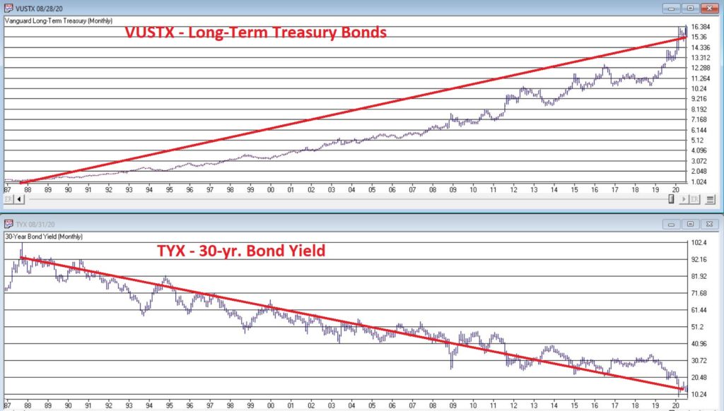
Figure
1 “says” it all. The top clip is price
action for ticker VUSTX (Vanguard Long-Term Treasury) and the bottom clip is
ticker $TYX (an index that tracks the yield on 30-year treasuries times 10 – so
if TYX is at 20, it means the yield on LT treasuries is 2%).
The
obvious thing to note is the inverse relationship.
The 2 Big Questions
The
“2 Big Questions” in this example are:
*Where
will long-term interest rates go from here?
*What
will happen to long-term treasury bonds as a result?
Interestingly,
the answers are:
“No
one really knows for sure”
“We
can calculate it almost exactly”
There
is lots of speculation regarding where interest rates will go from here. One camp says the Fed will keep forcing rates
lower – possibly even into negative territory (it has already happened in other
parts of the world, and “Yes”, it can happen here).
The
other camp argues that all the money printing will spark inflation and that
will lead to higher rates.
Again, no one knows for sure. Fortunately, the one thing we can do – with only the help of a handy bond calculator – is figure out how long-term treasury bond prices will react.
An Example
Let’s
assume a new 30-year treasury bond is issued today with a yield of 1.35%. These means:
*Buyer
pays $1,000 to buy the bond
*Every
year for the next 30 years the treasury pays bondholder $135 in interest
*In
30 years, the treasury pays the bondholder back the original $1,000
The
calculations below estimate the expected change in price and $ value of a
30-year treasury bond based on interest rate movement and the passage of time.
NOTE: The data in the tables “may not compute” in your head at
first. If not, I strongly encourage you
to step back and then take another shot.
Because this data spells out the potential risks and rewards pretty
explicitly.
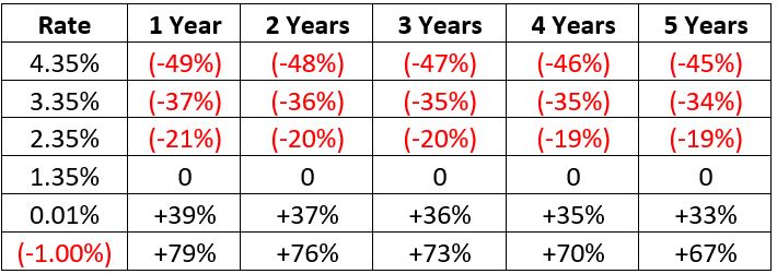
Figure
2 displays the expected dollar value of a current 30-year treasury 1 to 5 years
from now based on some future level of interest rates.
Figure 3 displays the expected percentage change in dollar value of a current 30-year treasury 1 to 5 years from now based on some future level of interest rates.
Figure 2 – Expected $ Value of 30-year 1.35% bond based on change in current interest rate and the passage of time
Figure 3 – Expected % change in price of 30-year 1.35% bond based on change in current interest rate and the passage of time
So,
let’s use the extremes as examples:
*If
rates fall to -1.00% one year from now, today’s 30-year treasury will rise in
value from $1,000 to $1,793 or +79%
*If
rates rise to 4.35% five years from now, today’s 30-year treasury will be
priced at $546, or -45% below today’s price level.
What It All Means
First
off note that investments in shorter-term securities will have less volatility
in terms of price movement, but will still be affected by changes in rates.
If interest rates rise:
*Bond
holders – especially holders of long-term bonds – will get hurt.
*As
you can see in Figures 2 and 3, if rates were to rise over the next several
years long-term bonds would be severely underwater and could take as long as
waiting until maturity to get back to $1,000 in value.
If interest rates fall:
*Bond
holders can still profit significantly.
*If
the bottom fell out of interest rates and they plunged to -1.00% a year from
now, our 30-year treasury bond would gain a massive +79%.
BUT
BEWARE: Remember – even if rates did fall to -1.00% a year from now, and if our
30-year bond soared in value to $1,793 a year from now – ultimately our 30-year
bond is going to mature at a value of $1,000.
So, any gains above that value would eventually evaporate.
To
spell it out: If interest rates do decline towards 0% or even below, hitting
the “Sell” button would likely make sense at some point.
See also Jay Kaeppel Interviewin
July 2020 issue of Technical Analysis of Stocks and Commodities magazine
Disclaimer: The information, opinions and ideas expressed herein are for
informational and educational purposes only and are based on research conducted
and presented solely by the author. The
information presented represents the views of the author only and does not
constitute a complete description of any investment service. In addition, nothing presented herein should
be construed as investment advice, as an advertisement or offering of
investment advisory services, or as an offer to sell or a solicitation to buy
any security. The data presented herein
were obtained from various third-party sources.
While the data is believed to be reliable, no representation is made as
to, and no responsibility, warranty or liability is accepted for the accuracy
or completeness of such information.
International investments are subject to additional risks such as
currency fluctuations, political instability and the potential for illiquid
markets. Past performance is no
guarantee of future results. There is
risk of loss in all trading. Back tested
performance does not represent actual performance and should not be interpreted
as an indication of such performance.
Also, back tested performance results have certain inherent limitations
and differs from actual performance because it is achieved with the benefit of
hindsight.