Monthly Archives: September 2018

The (Potential) Bullish Case for Bonds

OK, first the bad news.  In terms of the long-term, we are probably in the midst of a rising interest rate environment.  Consider the information contained in Figure 1 from McClellan Financial Publications.

(click to enlarge)0a
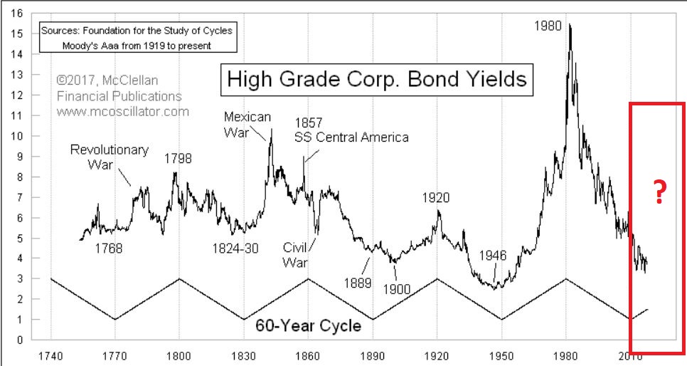
Figure 1 – The 60-year cycle in interest rates (Courtesy: www.mscoscillator.com)

Though no cycle is ever perfect, it is only logical to look at Figure 1 and come away thinking that rates will rise in the years (and possibly decades) ahead.  And one should plan accordingly, i.e.:

*Eschew large holdings of long-term bonds. Remember that a bond with a “duration” -Google that term as it relates to bonds please – of 15 implies that if interest rates rise 1 full percentage point then that bond will lose roughly 15% of principal.  Ouch.

*Stick to short to intermediate term bonds (which will reinvest at higher rates more quickly than long-term bonds as rates rise) and possibly some exposure to floating rate bonds.

That is “The Big Picture”.

In the meantime, there is a potential bullish case to be for bonds in the shorter-term.  The “quick and dirty” guide to “where are bonds headed next” appears in the monthly and weekly charts of ticker TLT (iShares 20+ years treasury bond ETF).  Note the key support and resistance levels drawn on these charts.

(click to enlarge)1
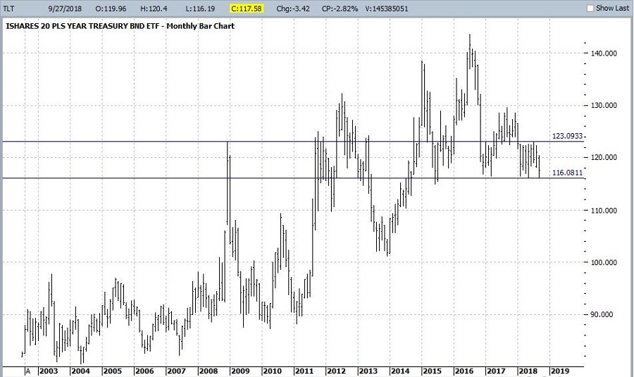
Figure 2 – Monthly TLT with support and resistance (Courtesy ProfitSource by HUBB)

(click to enlarge)2
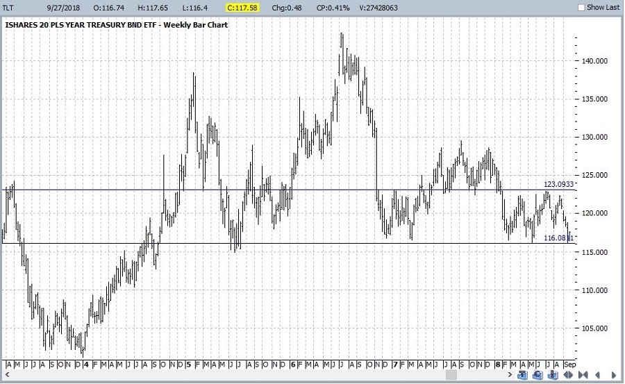
Figure 3 – Weekly TLT with support and resistance (Courtesy ProfitSource by HUBB)

There is nothing magic about these lines, but a break above resistance suggests a bull move, a break below support suggests a bear move, and anything in between suggests a trading range affair.

Now let’s look at some potentially positive influences.  Figure 4 displays a screen from the excellent site www.sentimentrader.com that shows that sentiment regarding the long treasury bond is rock bottom low.  As a contrarian sign this is typically considered to be bullish.

(click to enlarge)3
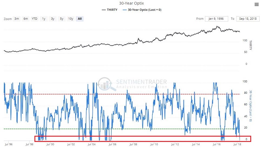
Figure 4 – 30-year treasury investor sentiment is extremely low (Courtesy Sentimentrader.com)

Figure 5 – also from www.sentimentrader.com – suggests that bonds may be entering a “bullish” seasonal period between now and at least late-November (and possibly as long as late January 2019).

(click to enlarge)4
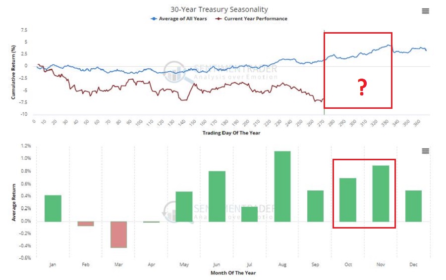
Figure 5 – 30-year treasury seasonality (Courtesy Sentimentrader.com)

Figure 6 displays the 30-year treasury bond yield (multiplied by 10 for some reason).  While rates have risen 27% from the low (from 2.51% to 3.18%), they still remain below the long-term 120-month exponential moving average.

(click to enlarge)5
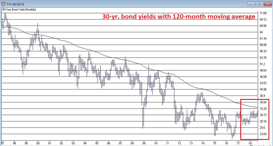
Figure 6 – Long-term treasury bond yields versus 120-month moving average (Courtesy AIQ TradingExpert)

Finally, two systems that I developed that deems the bond trend bullish or bearish based on the movements of 1) metals, and 2) Japanese stocks turned bullish recently.  The bond market has fallen since these bullish signal were flashed – possibly as a result of the anticipated rate hike from the Fed.  Now that that hike is out of the way we should keep a close eye on bonds for a potential advance in the months ahead.

(click to enlarge)6a
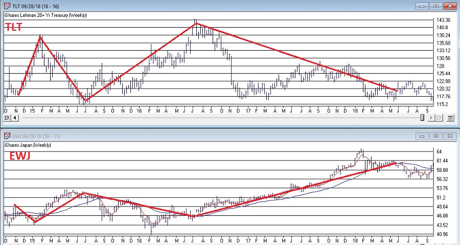
Figure 7 – Bonds tend to move inversely to Japanese stocks; Ticker EWJ 5-week average is below 30-week average, i.e., potentially bullish for bonds (Courtesy AIQ TradingExpert)

Summary

It’s a little confusing here.

a)  The “long-term” outlook for bonds is very “iffy”, so bond “investors” should continue to be cautious – as detailed above.

b) On the other hand, there appears to be a chance that bonds are setting up for a rally in the near-term.

c) But, in one final twist, remember that if TLT takes out its recent support level, all bullish bets are off.

Are we having fun yet?

Jay Kaeppel

Disclaimer:  The data presented herein were obtained from various third-party sources.  While I believe the data to be reliable, no representation is made as to, and no responsibility, warranty or liability is accepted for the accuracy or completeness of such information.  The information, opinions and ideas expressed herein are for informational and educational purposes only and do not constitute and should not be construed as investment advice, an advertisement or offering of investment advisory services, or an offer to sell or a solicitation to buy any security.


When the U.S. Stock Market Leads, It Really Leads

The U.S. stock market has been leading the rest of the world’s stock markets.  Turns out that’s a good thing.  As least for U.S. stocks.  To illustrate this let’s look at the results achieved from holding the S&P 500 Index only when U.S. stocks are “leading”.

The Test

The indexes used are:

*S&P 500 Index – measures U.S. stock performance

*MSCI World ex US Index – measures the rest of the world

The Calculations

Using monthly total return data from the PEP Database from Callan Associates from 12/31/1971 through 8/31/2018:

A1 and A2;

A1 = The cumulative total return for the S&P 500 over the latest 10 years;

A2 = The cumulative total return for the MSCI over the latest 10 years

B = The difference between A1 and A2 (i.e., SPX total 10-year return minus MSCI total 10-year return)

C = a 36-month exponential moving average of B*

D = Subtracts C from B (i.e., if B above the 36-month EMA or below it)

*If the S&P 500 Index performed better over the previous 10 years then D is positive

*If the MSCI World ex US Index performed better of the previous 10 years then D is negative.

Figure 1 displays Variable B and C above.

1

Figure 1 – B (blue line) = difference between SPX 10-year total return and MSCI 10-year total return; C (red line) = 36-month EMA; 12/31/1981-8/31/2018

Figure 2 displays the month-end difference between Variables B and C (i.e. Variable D).  When the value is positive SPX is “leading”; when the value is negative MSCI is “leading”.

2

Figure 2 – the month-end difference between Variables B and C (i.e. Variable D); 12/31/1981- 8/31/2018

The Test

For the purposes of this test our only concern is the performance of the S&P 500 Index when Variable D is positive.

Figure 3 displays the growth of $1,000 invested in the S&P 500 Index ONLY when Variable D is positive at the end of the previous month.

3

Figure 3 – Growth of $1,000 invested in SPX ONLY when Variable D is positive; 12/31/1981-8/31/2018

As you can see in Figure 3, holding the S&P 500 Index when it is “leading” the MSCI World ex US Index has generated some consistently positive results.

At the moment, Variable D remains firmly in positive territory.  Does this mean that the U.S. stock market is impervious to decline?  Not at all.  Still, the long-term results displayed in Figure 3 represent a fairly compelling piece of evidence for the bullish case.

Lastly, so how did SPX perform when MSCI was leading?  Interestingly, it made money.  For reference:

*When SPX leads MSCI (when Variable D is positive): SPX gained +1,799%

*When SPX leads MSCI (when Variable D is negative): SPX gained +222%

In sum:

*The SPX did make money (+222%) during those times when MSCI was leading

*However, SPX made 8.1 times as much when SPX was leading than when MSCI was leading

*Also, while MSCI was leading, SPX endured, a) the Crash of 1987, b) the 2000-2002 bear market, and, c) the 2007-2009 bear market (see Figure 4), i.e., all good things to avoid.

4

Figure 4 – Growth of $1,000 invested in SPX ONLY when Variable D is negative; 12/31/1981-8/31/2018

To put it as succinctly as possible: U-S-A,  U-S-A!!

Jay Kaeppel

 Disclaimer:  The data presented herein were obtained from various third-party sources.  While I believe the data to be reliable, no representation is made as to, and no responsibility, warranty or liability is accepted for the accuracy or completeness of such information.  The information, opinions and ideas expressed herein are for informational and educational purposes only and do not constitute and should not be construed as investment advice, an advertisement or offering of investment advisory services, or an offer to sell or a solicitation to buy any security.

New Highs, Check…Now What?

Let’s open with Jay’s Trading Maxim #7.

Jay’s Trading Maxim #7: Being able to identify the trend today is worth more than 1,000 predictions of what the trend will be in the future.

Yes trend-following is boring.  And no, trend-following never does get you in near the bottom nor out at the top.  But the reality is that if you remain long when the trend appears to be up (for our purposes here let’s define this roughly as the majority of major market averages holding above their long-term moving averages) and play defense (i.e., raise cash, hedge, etc.) when the trend appears to be down (i.e., the majority of major market averages are below their long-term moving averages), chances are you will do pretty well for yourself.  And you may find yourself sleeping pretty well at night as well along the way.

To put it more succinctly:

*THE FOREST = Long-term trend

*THE TREES = All the crap that everyone tells you “may” affect the long-term trend at some point in the future

Human nature is a tricky thing.  While we should clearly be focused on THE FOREST the reality is that most investors focus that majority of their attention on all those pesky trees.  Part of the reason for this is that some trees can offer clues.  It’s a question of identifying a few “key trees” and then ignoring the rest of the noise.

A New High

With the Dow Industrials rallying to a new high virtually all the major averages have now reached a new high at least within the last month.  And as you can see in Figure 1 all are well above their respective 200-day moving average.  Long story short the trend is “UP”.

(click to enlarge)1Figure 1 – U.S. Major Market Indexes in Uptrends (Courtesy AIQ TradingExpert)

Now What? The Good News

As strong as the market has been of late it should be noted that we are about to enter the most favorable seasonal portion of the 48-month election cycle.  This period begins at the close of September 2018 and extends through the end of December 2019.

Figure 2 displays the growth of $1,000 invested in the Dow Industrials only during this 15-month period every 4 years.  Figure 3 displays the actual % +(-) for each of these periods.  Note that since 1934-35, the Dow has showed a gain 20 out of 21 times during this period.

2a

Figure 2 – Growth of $1,000 invested in Dow Industrials ONLY during 15 bullish months (mid-term through pre-election year) within 48-month election cycle.

Start Date End Date Dow % +(-)
9/30/1934 12/31/1935 +55.6%
9/30/1938 12/31/1939 +6.2%
9/30/1942 12/31/1943 +24.5%
9/30/1946 12/31/1947 +5.1%
9/30/1950 12/31/1951 +18.9%
9/30/1954 12/31/1955 +35.5%
9/30/1958 12/31/1959 +27.7%
9/30/1962 12/31/1963 +31.8%
9/30/1966 12/31/1967 +16.9%
9/30/1970 12/31/1971 +17.0%
9/30/1974 12/31/1975 +40.2%
9/30/1978 12/31/1979 (-3.1%)
9/30/1982 12/31/1983 +40.4%
9/30/1986 12/31/1987 +9.7%
9/30/1990 12/31/1991 +29.2%
9/30/1994 12/31/1995 +33.1%
9/30/1998 12/31/1999 +46.6%
9/30/2002 12/31/2003 +37.7%
9/30/2006 12/31/2007 +13.6%
9/30/2010 12/31/2011 +13.0%
9/30/2014 12/31/2015 +2.2%

Figure 3 – 15 bullish months (mid-term through pre-election year) within 48-month election cycle

Now What? The Worrisome Trees

While the major averages are setting records a lot of other “things” are not.  My own cluster of “market bellwethers” appear in Figure 4.  Among them the Dow Transportation Index is the only one remotely close to a new high, having broken out to the upside last week.  In the meantime, the semiconductors (ticker SMH), the inverse VIX index ETF (ticker ZIV) and Sotheby’s (ticker BID) continue to meander/flounder. This is by no means a “run for the hills” signal.  But the point is that at some point I would like to see some confirmation from these tickers that often (though obviously not always) presage trouble in the stock market when they fail to confirm bullish action in the major averages.

(click to enlarge)4Figure 4 – Jay’s 4 Bellwethers (SMH/TRAN/ZIV/BID) (Courtesy AIQ TradingExpert)

Another source of potential concern is the action of, well, the rest of the darn World.  Figure 5 displays my own regional indexes – Americas, Europe, Asia/Pacific and Middle East.  They all look awful.

(click to enlarge)3Figure 5 – 4 World Regional Indexes (Courtesy AIQ TradingExpert)

Now the big question is “will the rest of the world’s stock markets start acting better, or will the U.S. market start acting worse?”  Sadly, I can’t answer that question.  The key point I do want to make though is that this dichotomy of performance – i.e., U.S market soaring, rest of the world sinking – is unlikely to be sustainable for very long.

Summary

It is hard to envision the market relentlessly higher with no serious corrections over the next 15 months.  And “yes”, those bellwether and world region indexes trees are “troublesome”.

Still the trend at the moment is inarguably “Up” and we about to enter one of the most seasonally favorable periods for the stock market.

So, my advice is simple:

1) Decide now what defensive actions you will take if the market does start to breakdown

2) Resolve to actually take those actions if the need arises

3) Enjoy the ride as long as it lasts.

Jay Kaeppel

Disclaimer:  The data presented herein were obtained from various third-party sources.  While I believe the data to be reliable, no representation is made as to, and no responsibility, warranty or liability is accepted for the accuracy or completeness of such information.  The information, opinions and ideas expressed herein are for informational and educational purposes only and do not constitute and should not be construed as investment advice, an advertisement or offering of investment advisory services, or an offer to sell or a solicitation to buy any security.


To Lock in a Winner…or Let it Ride?

In this article in early August I highlighted the possibility for a bullish move in crude oil as well as an example trade using options on ticker USO – an ETF intended to track the price of crude oil.

At the time the daily and weekly Elliott Wave counts  (generated using the EW algorithm in  ProfitSource by HUBB software) for crude oil futures – and the daily Elliott Wave count for ticker USO – were all pointing to a potential Wave 5 advance.  Since that time USO has advanced roughly 7%, from $14.01 a share to $14.94 a share.  As you can see in Figure 1, the example USO option trade is now showing an open profit of of 38% ($960 on an original cost of $2,496).

(click to enlarge)1Figure 1 – Original example USO trade as of 9/19 (Courtesy www.OptionsAnalysis.com)

Looking forward there is – what else? – Good News and Bad News.  As you can see in Figures 2 and 3, the Elliott Wave count for both daily and weekly crude oil futures and daily USO continue to suggest that more upside potential may lie ahead.

(click to enlarge)2Figure 2 – Crude oil futures – daily and weekly both with bullish Elliott Wave projections (Courtesy ProfitSource by HUBB)

(click to enlarge)3Figure 3 – Ticker USO daily with bullish Elliott Wave projection (Courtesy ProfitSource by HUBB)

That’s the Good News.  The Bad News is that we are 10 calendar days from the beginning of the least fabvorable seasonal period for crude oil – from late September into early December – as you can see in the chart from www.sentimentrader.com in Figure 4.

(click to enlarge)4Figure 4 – Annual Seasonbal Trend for crude oil is nearing the unfavorable time of year (Courtesy Sentimentrader.com)

So, Elliott Waves counts say “bullish” and seasonal trends say “bearish”.  Which one will be right in the months ahead.  Sorry folks, gotta go with my standard response of “It beats me.”  Predictions aren’t something I am too good at.

But for a person holding our hypothetical (and bullish) option position, some determination needs to be made.  So, let’s consider two possibilities.

Course of Action #1: Damn the Torpedoes, Full Speed Ahead!

If a trader is expecting crude to break out above resistance and rally ahead strongly just like the Elliott Wave counts suggests, there is no real need to take any action  Just hold the position, wait for the big advance and cash in a big winner.  Or – just to cover all the bases – give it all back and lose all or part of your initial $2,496 investment.   Maximum reward, maximum risk, Hoo Ha!

Course of Action #2: Lock in a Profit and Let the Rest Ride

Another course of action might be to hedge one’s bet by adjusting the trade to lock in a profit while still allowing for more upside profit potential if the bullish scenario does in fact play out.  Often this type of action comes at the cost of reduced upside potential.

In the example below a trader gives up a substantial amount of upside profit potential as a trade off for locking in a profit while still allowing for further upside potential.

The example adjustment:

*Sell 18 USO Jan2019 14 calls (reducing long position from 24 to 6 contracts)

*Sell 4 USO Jan2019 16 calls (a new position)

The net result of this adjustment appears in Figure 5.

(click to enlarge)

5Figure 5 – Adjusted USO trade (Courtesy www.OptionsAnalysis.com)

This adjusted position:

*Locks in a minimum profit of $284 if crude oil reverses and heads lower

*Also retains unlimited profit potential

*The bad news is that this new position has a delta of 288 versus the original position which has a delta of 1,726.  This means that for each full $1 USO might advance in price the original trade will gain roughly $1,726 in new profits while the new adjusted position will gain only $288 in new profits.

The stark difference between these two positions is obvious in Figure 6

(click to enlarge)6Figure 6 – Original USO trade (higher reward, higher risk) versus adjusted USO trade (lower reward, lower risk) (Courtesy www.OptionsAnalysis.com)

Clearly the original position is an all-or-nothing bet on higher prices, while the adjusted position is designed to keep the position from turning into a loss while still allowing for additional profit potential if USO rallies – but far less upside potential than the original trade.

Which one is better?  Please see my “standard response” above…

Jay Kaeppel

Disclaimer:  The data presented herein were obtained from various third-party sources.  While I believe the data to be reliable, no representation is made as to, and no responsibility, warranty or liability is accepted for the accuracy or completeness of such information.  The information, opinions and ideas expressed herein are for informational and educational purposes only and do not constitute and should not be construed as investment advice, an advertisement or offering of investment advisory services, or an offer to sell or a solicitation to buy any security.


Repairing a Losing Trade

In this article in early August I highlighted the potential for the VIX Index to “bounce” and highlighted a hypothetical bullish trade using options on ticker VXX – an ETF intended to track the VIX Index.  The original trade looked like what you see in Figures 1 and 2.

1Figure 1 – Original VXX position (Courtesy www.OptionsAnalysis.com)

2Figure 2 – Original VXX risk curves (Courtesy www.OptionsAnalysis.com)

Interestingly, 3 trading days later this position showed an open gain of 46% as displayed in Figure 3, as VXX rallied from $28.14 a share to $31.80.

(click to enlarge)3Figure 3 – Original position 3 days later; as of 8/13 (Courtesy www.OptionsAnalysis.com)

The 1st (unwritten) rule of trading bullish positions in VXX is “Take your profits while you have them”.  To understand this viewpoint simply glance at the long-term chart of ticker VXX in Figure 4.4Figure 4 – VXX daily bar chart (Courtesy AIQ TradingExpert)

While there can and will be sharp rallies along the way, the long-term trajectory is inexorably long (this is due to “contango” in the futures market – which I AM NOT going to explain here.  If you want to know more just do an internet search).

But let’s assume for a moment that our hypothetical trader did not take a profit in our hypothetical VXX position, hoping for a bigger up move. Bottom line, it hasn’t worked out well at all.  The stock market has rallied and VXX has once again slumped.  The current status appears in Figure 5.

(click to enlarge)5Figure 5 – Original VXX position as of 9/19 (Courtesy www.OptionsAnalysis.com)

As you can see in Figure 5 this trade is in “some trouble”.  With VXX trading at $28.07 the breakeven price is $32.28, and the maximum risk is -$642.

HERE COMES THE POINT…..

A trader who bought shares of VXX would have two choices:

a) Hold the shares

b) Sell the shares

A trader who put on our hypothetical trade has three choices:

a) Hold the position

b) Close the position

c) Adjust the position

It is this third option that makes option trading appealing, i.e., the potential opportunity to improve the odds of an existing trade “on the fly”.  How, you might ask.  Let’s walk through one example.

First, the goals of adjusting an existing position are typically one or more of the following:

*Improve profit potential

*Reduce dollar risk

*Improve probability of profit

Typically (though not always) attempting to improve the profit potential of an existing trade that is showing a loss involves assume more risk.  In this instance we are going to de-emphasize profit potential and focus on reducing our risk and improving our odds of making any profit.

Here are the hypothetical adjustments to our hypothetical trade:

*Sell 5 Oct 19 VXX 31 calls (exit existing long calls)

*Buy 2 Oct 19 VXX 29 calls (buy fewer closer to the money calls)

*Buy 2 Oct 19 VXX 36 calls (reduce existing short call position)

What does all of this accomplish?  Consider Figure 6.

(click to enlarge)6Figure 6 – Adjusted VXX position (Courtesy www.OptionsAnalysis.com)

First the Bad News:

*VXX still MUST rally sometime between now and 10/19 in order for this trade to show a profit.

*This adjustment caps our maximum profit potential at $900.

The Good News:

*We have reduced our dollar risk from -$642 to -$500.  So, if the worst-case scenario plays out at least we save about a hundred and forty bucks.

*We have reduced the breakeven price (at expiration) from $32.28 to $31.50.

Summary

As always please remember this is all hypothetical and I am not suggesting that everyone rush out and put on bullish trade in ticker VXX.  The real point of this piece is to highlight the potential to, a) make trade with limited dollar risk using options, and, b) the potential to adjust an existing option position “on the fly” to make it a more attractive position.

It’s a pretty good arrow to have in one’s quiver.

Jay Kaeppel

Disclaimer:  The data presented herein were obtained from various third-party sources.  While I believe the data to be reliable, no representation is made as to, and no responsibility, warranty or liability is accepted for the accuracy or completeness of such information.  The information, opinions and ideas expressed herein are for informational and educational purposes only and do not constitute and should not be construed as investment advice, an advertisement or offering of investment advisory services, or an offer to sell or a solicitation to buy any security.

The ‘Soybean 3-Step’

Some markets are prone to following seasonal trends and some markets are really prone to following seasonal trends.  The soybean market falls into the latter category.

Why It Works

Soybeans are grown in other places around the world, however, the primary growing spot is the U.S. Midwest.  Seeds are planted in the spring and harvested in the early fall.  There is no real way around this schedule since farmers in the U.S. Midwest cannot go ahead and plant soybeans, a) early, since the ground is frozen until early spring, nor, b) late, since the seeds would die in the ground in the winter and even if they didn’t they wouldn’t grow nor could the farmer really get out and “harvest” anything due to the snow on the ground.

So, the planting, growing and harvesting schedule is pretty much set in stone in the Heartland.

This has certain implications.  For one thing it means that between late fall and early spring there literally are NO soybeans growing.  Likewise, bad weather (or exceptionally good weather) can impact how early the seeds can be planted and the likelihood of a good or bad crop year.

To put it another way – more related to supply and demand, which drives prices – between the time this year’s beans are harvested (fall) and the time that anyone can truly figure out how the next year’s crop will look (typically late spring to early summer), there is a lot of “doubt” about soybeans.  This doubt tends to push prices higher as there are questions about potential future supply.

On the other hand, once it becomes pretty clear that this year’s crop is going to be, a) fantastic, b) awful, or c) somewhere in between, the doubts are eased and the “pressure” comes off of soybean prices.

That in a nutshell is everything you probably ever didn’t really want to know about soybeans.  Certainly not as “exciting” as some new technology company or other revolutionary product.  Still, as we will see, “predictability of supply and demand” can be a pretty exciting thing itself.

The Soybean 3-Step

As always let me first point out that what follows is for “Educational” purposes only and I am NOT encouraging anyone to start trading soybeans (either in the futures market by trading soybean futures or in the stock market by trading ETF ticker SOYB).  I am just passing on some information that I found interesting and am hoping that you may as well (for the record, if you are still reading at this point after all the mundane gibberish about “the planting cycle” I think we’re doing pretty well).

Step 1 is BULLISH:

Long beans from close on the last trading day of January through the close on 2nd trading day of May (when there is doubt about this year’s planting, crop, etc.)

Step 2 is BEARISH:

Short beans from close on the 14th trading day of June through the close on 2nd trading day of October (after the state of this year’s crop becomes apparent)

Step 3 is BULLISH:

Long beans from the close on 2nd trading day of October through the close on 5th trading day of November (when there are new doubts about next year’s crop)

The Results

Figure 1 displays the hypothetical results (assumes no commission and no slippage) of holding a long position of 1 soybean futures contract during the 3 periods listed above (for soybean futures, each full $1 in price movement in the price of 5,000 bushels of soybeans is worth $5,000).

1

Figure 1 – $ gain or loss from holding long 1 soybean futures contract during Step 1 (blue); Step 3 (gray) and Step 2 (orange); 12/31/1975-9/7/2018

For the record:

*Step 1 (blue line) gained +$111,288

*Step 2 (orange) lost -$165,338

*Step 3 (grey) gained +$64,575

So, a strategy of:

*Holding a long position in soybeans during Step 1 and Step 3

*Holding a short position during Step 2

*Resulted in a (again, hypothetical) gain of $341,200 (See Figure 2)

*versus buying and holding a long position in soybean futures

2

Figure 2 – Long beans Step 1 and Step 2, short beans Step 3 (blue) versus buying and holding long one soybeans contract (orange); 12/31/1975-9/7/2018)

Note in Figure 3 that the maximum drawdown exceeded -$18,000 on four separate occasions.  So, DO NOT mistake this for some sort of “you can’t lose trading soybeans” contrivance. Trust me when I say that “the accumulation over time of slippage, commissions and $18,000 drawdowns will at some point test your will to go on.”

3

Figure 3 – Drawdowns using the Soybean 3 Step Method; 12/31/1975-9/7/2018

Still, the point is that all in all the results are fairly consistent.

Ticker SOYB

For those not inclined to wade into the exciting world of commodity futures there is a potential alternative – albeit one with less upside potential (i.e., lacking the leverage of commodity futures).  Ticker SOYB is an ETF that tracks the price of soybean futures but trades like shares of stock in a stock account.  SOYB started trading in September 2011.  Figure 4 displays the growth of $1,000 invested in SOYB ONLY DURING step 1 and Step 3 each year since inception of trading versus buying and holding SOYB (it is possible to sell short shares of SOYB during Step 2 but that is not included in this test since – let’s be honest – very few traders are ever going to actually sell short shares of SOYB).

4

Figure 4 – Growth of $1,000 invested in SOYB during Step 1 and Step 3 (blue line) versus $1,000 invested in SOYB using buy-and-hold (orange); 9/19/2011-9/7/2018

For the record:

*$1,000 invested in SOYB only during Step 1 and Step 3 grew to $1,439 (+43.0%)

*$1,000 invested in SOYB using a buy-and-hold approach declined to $643 (-35.7%)

*The maximum drawdown so far holding SOYB during Step 1 and Step 3 has been -12.5%

Summary

Are soybeans for everyone?  Certainly not.

But if you are going to consider trading them it might be wise to consult your calendar first.

Jay Kaeppel

Disclaimer:  The data presented herein were obtained from various third-party sources.  While I believe the data to be reliable, no representation is made as to, and no responsibility, warranty or liability is accepted for the accuracy or completeness of such information.  The information, opinions and ideas expressed herein are for informational and educational purposes only and do not constitute and should not be construed as investment advice, an advertisement or offering of investment advisory services, or an offer to sell or a solicitation to buy any security.


Attention Wild-Eyed Speculators

Most people are familiar with ADHD, manic-depressive disorder, depression and schizophrenia.  But one common affliction within our trading community that gets almost no attention is WESS.  That stands for “Wild-Eyed Speculation Syndrome”.  And it’s more common than you think (“Hi, my name is Jay”).

The exact symptoms vary, but generally speaking they go something like this:

*A person gets up in the morning with a hankering to make a trade

*Said person then finds “some reason” to make some trade in something

*If the person happens to make money on that trade then the affliction is reinforced by virtue of IGTS (“I’ve Got the Touch Syndrome”, which is one of the occasional side effects of WESS)

*If the person loses money on the trade the side effects can vary but may include: angry outbursts, kicking oneself in the head (typically figuratively), vows to either stop the behavior or at least do it better, and so on.

*The most common side effect of WESS is a declining trading account balance (which not coincidentally is how this disorder is most commonly diagnosed).

For those suffering from WESS – with the caveat/disclosure that I am not a medical professional (although I have found that ibuprofen really clears up a lot of stuff, but I digress) – I am here to help.

If you find yourself suffering from Symptom #1 above:

The most effective step is to go back to bed until the urge passes.  If this doesn’t work or is not possible (for instance, if you have one of those pesky “jobs” – you know, that 8-hour a day activity that gets in the way of your trading), repeat these two mantras as many times as necessary:

Mantra 1: “I must employ some reasonably objective, repeatable criteria to find a trade with some actual potential”

Mantra 2: “I will risk no more than 2% of my trading capital” on any WESS induced trade (and just as importantly, you must fend off the voice on the other shoulder shouting “But this is the BIG ONE!!”)

Repeat these mantras as many times as necessary to avoid betting the ranch on some random idea that you “read about on the internet, so it must be true.”

Regarding Mantra 1

There are a million and one ways to find a trade.  There is no one best way.  But just to give you the idea I will mention one way and highlight a current setup. IMPORTANT: That being said, and as always, I DO NOT make recommendations on this blog.  The particular setup I will highlight may work out beautifully, or it may be a complete bust.  So DO NOT rush out and make a trade based on this just because you read it – you know – on the internet.

The Divergence

Lots of trades get made based on “divergence”.  In this case we are talking about the divergence between price and a given indicator – or even better, series of indicators.  There is nothing magic about divergence, and like a lot of things, sometimes it works and sometimes it doesn’t.  But the reason it is a viable consideration is that when an indicator flashes a bullish divergence versus price it alerts us to a potential – nothing more, nothing less – shift in momentum.

Let’s look at ticker GDX – an ETF that tracks an index of gold mining stocks.  In Figure1 1 through 4 below we see:

*GDX price making a lower low

*A given indicator NOT confirming that new low (i.e., a positive divergence)

1Figure 1 – GDX and MACD (Courtesy AIQ TradingExpert)

2Figure 2 – GDX and 3-day RSI (Courtesy AIQ TradingExpert)

3Figure 3 – GDX and TRIX (Courtesy AIQ TradingExpert)

4Figure 4 – GDX and William’s Ultimate Oscillator (Courtesy AIQ TradingExpert)

So, do the divergences that appear in Figures 1 through 4 justify a trade?  Well, here is where the aforementioned affliction comes into play.

Average Trader: “Maybe, maybe not.  In either case I am not entirely sure that trying to pick a bottom in gold stocks based solely on indicator divergences is a good idea”

WESS Sufferer: “Absofreakinglutely!!  Let’s do this!!”

You see the problem.

So, let’s assume that a WESS Sufferer likes what he or she sees in Figures 1 through 4.  The good news is that we have met the minimum criteria for Mantra #1 above – we have employed some reasonably objective, repeatable criteria (i.e., a bullish divergence between price and a number of variable indicators) to spot a potential opportunity.

Now we must follow Mantra #2 of risking no more than 2% of my trading capital.  Let’s assume our WESS Sufferer has a $25,000 trading account.  So he or she can risk a maximum of $500 ($25,000 x 2%).

In Figure 5 we see a potential support area for GDX at around $16.40 a share.

5Figure 5 – Ticker GDX with support at $16.40 (Courtesy AIQ TradingExpert)

So, one possibility would be to buy 300 shares of GDX at $17.84 and place a stop loss order below the “line in the sand” at say $16.34 a share.  So if the stop is hit, the trade would lose -$450, or -1.8% of our trading capital (17.84 – 16.34 = -1.50 x 300 shares = -$450).

Summary

Does any of the above fit in the category of “A Good Idea”.  That’s the thing about trading – and most things in life for that matter – it’s all in the eye of the beholder.  Remember, the above is NOT a “recommendation”, only an “example.”

The real key thing to note is that we went from being just a random WESS Sufferer to a WESS Sufferer with a Plan – one that has something other than just an “urge” to find a trade, AND (most importantly) a mechanism for limiting any damage that might be done if things don’t pan out.

And if that doesn’t work, well, there’s always ibuprofen.

Jay Kaeppel

Disclaimer:  The data presented herein were obtained from various third-party sources.  While I believe the data to be reliable, no representation is made as to, and no responsibility, warranty or liability is accepted for the accuracy or completeness of such information.  The information, opinions and ideas expressed herein are for informational and educational purposes only and do not constitute and should not be construed as investment advice, an advertisement or offering of investment advisory services, or an offer to sell or a solicitation to buy any security.


Do “Good Days” in Bonds Still Matter?

Some days are better than others.  Boy, are there any truer words than those?  And this phrase holds true for many, many things.  You know, like treasury bonds for example.

Good Days in Bonds

I define “Good Days” in bonds as:

*Trading Days of the Month #10, 11 and 12

*The last 5 trading days of each month

It may not be fair to designate all other days of the month as “Bad” – but as you will see, they certainly aren’t “Good”.  So, for testing purposes we will go ahead and refer to them as “Bad Days”

For testing purposes:

*We will look at the daily dollar value change in the U.S. treasury bond futures contract (each full point is worth $1,000 – so if t-bond futures rise one day from 120 to 121, the value of the contract increases by $1,000) to track results during “Good Days” only, “Bad Days” only and “All Days”, i.e., Buy-and-Hold.

*We will total up the cumulative $ gain/loss for all the Good Days

*We will total up the cumulative $ gain/loss for all the Bad Days

*Our test extends from 12/31/194 through 8/31/2018

In Figure 1, the blue line represents the cumulative $ gain of the “Good Days” and the red line represents the cumulative $ loss of the “Bad Days” and the green line represents and holding a long position in a t-bond futures contract continuously.

1

Figure 1 – Good Days (blue) versus Bad Days (red) versus Buy-and-Hold (green) based on daily $+(-) for treasury bond futures; 12/31/194-8/31/2018

For the record:

bonds

Figure 2 – Good Days versus Bad Days and Buy and Hold (1231/1983-8/31/2018)

Of course, we operate in a “What Have You Done for Me Lately?” business.  So, it is fair to ask, how have Good Days/Bad Days” fared since the bond market hit rough water a while back. So let’s take a look.

The long-term treasury bond topped out on 7/8/2016.  Figure 3 displays the cumulative gain/loss from holding a long position in t-bond futures on Good Days versus Bad Days since that date.

3

Figure 3 – Good Days (blue) versus Bad Days (red) since t-bonds topped out on 7/8/2016

As you can see, on an absolute basis, Good Days haven’t been all that great.  Still, they have eked out a gain (+$3,627) and on a relative basis have vastly outperformed Bad Days (which have lost -$35,877).

Have a Good Day.

Jay Kaeppel

Disclaimer:  The data presented herein were obtained from various third-party sources.  While I believe the data to be reliable, no representation is made as to, and no responsibility, warranty or liability is accepted for the accuracy or completeness of such information.  The information, opinions and ideas expressed herein are for informational and educational purposes only and do not constitute and should not be construed as investment advice, an advertisement or offering of investment advisory services, or an offer to sell or a solicitation to buy any security.