Monthly Archives: July 2018

Spoilin’ to Play the Coilin’

There are certain patterns/situations in the financial markets that arise on a fairly regular basis.  Take for example, the “Coil.”

The “Coil” simply involves a security trading into an ever-narrower range.  The theory is that when price finally breaks out of the coil it will make a significant price move.  Like most things, sometimes things work out that way and sometimes they don’t.  But often enough they do which makes the “Coil” so intriguing to a lot of traders.

The “Catch” to the “Coil” and the Potential Solution

The “catch” to the “Coil” is that if you are buying or selling short shares or futures contracts, you still must get the direction right.  In other words, if you buy shares in expectation that price will break out of a coil to the upside, and price instead breaks hard to the downside, you’re out of luck (not to mention a certain percentage of your trading capital).

The potential solution is a strategy known as the “strangle”.  Let’s illustrate with an example.

The Example

As always, please note that I am NOT “recommending” the trade below.  It serves solely as an example of using a “strangle” to play the “coil”.

Figure 1 displays a daily bar chart of ticker FXE – an ETF that tracks the price of the euro currency.  You will note that it tends to “coil” and then breakout and run.  At present, it appears to be “coiling” again.

1
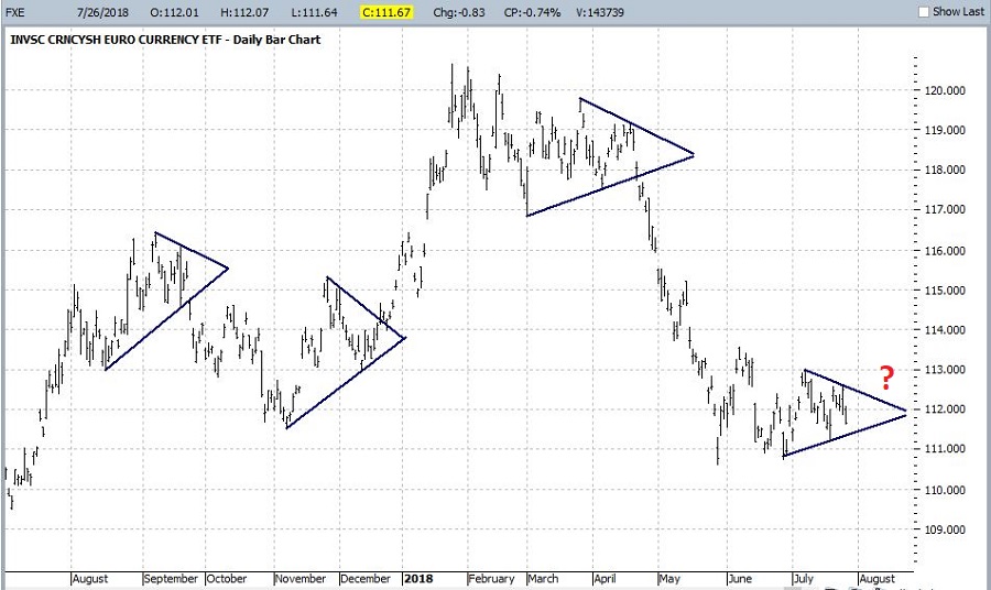
Figure 1 – Ticker FXE: Coils followed by breakouts and price runs (Courtesy ProfitSource by HUBB)

So, will FXE breakout of its current coil and run?  And if so, in which direction.  As always, I have to go with my standard answers of, “It beats me” and “It beats me.”

But what if I still felt like a breakout of some sort was quite possible.  In that case I could consider the example trade of:

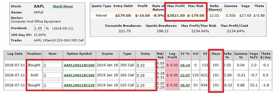
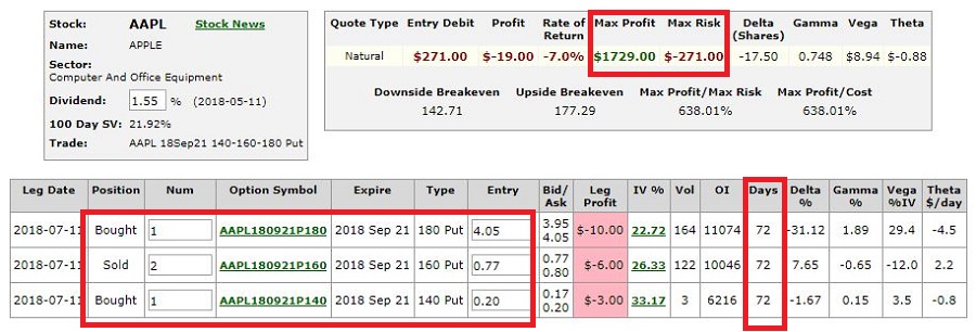
*Buy 1 Dec2018 FXE 112 call @ 2.40

*Buy 1 Dec2018 FXE111 put @ 1.39

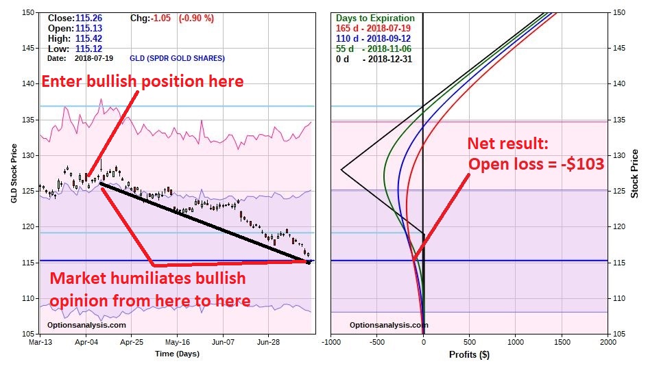
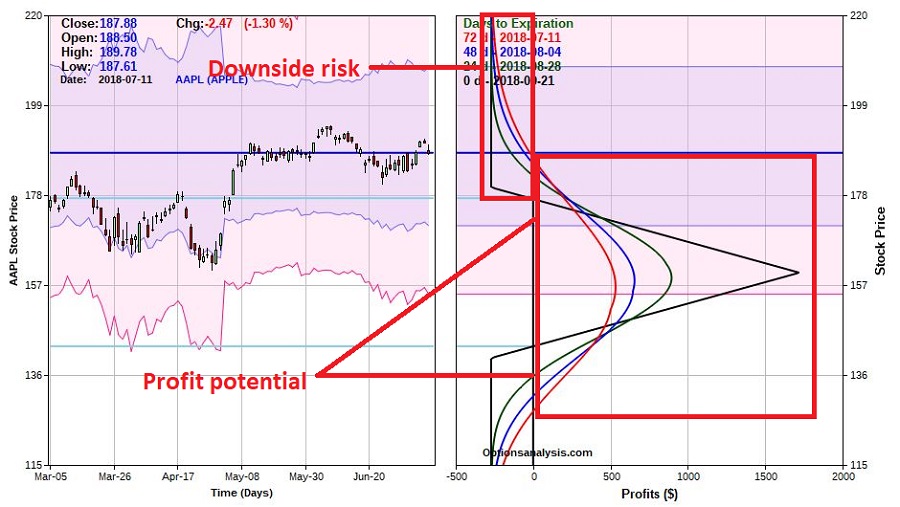
The particulars of this trade appear in Figure 2 and the risk curves in Figure 3.

2
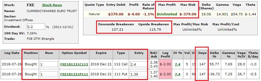
Figure 2 – FXE strangle (Courtesy www.OptionsAnalysis.com)

3
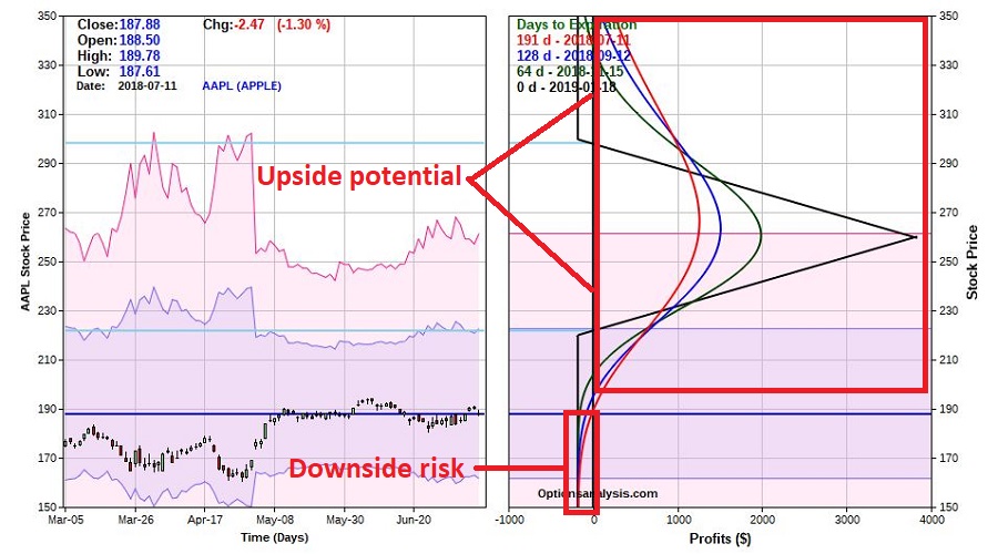
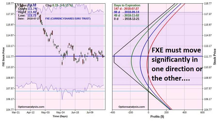
Figure 3 – FXE strangle risk curves (Courtesy www.OptionsAnalysis.com)

A few things to note:

*FXE absolutely, positively must make a move of at least 4.00 points (or more) in order for this trade to generate any kind of a profit (i.e., this trade is pure speculation and should involve a small percentage of your investment capital).

*The bulk of any losses would accumulate in the last 30-50 days prior to expiration.  Looking at the green risk curve line in Figure 3, at its nadir the open loss is about -$188.   As you can see, this loss would grow to -$379 by December expiration if FXE remained unchanged (i.e., if FXE hasn’t shown any sign of movement by about the middle of November, a trader might consider throwing in the towel in order to avoid the negative effects of time decay as expiration nears).

Summary

So, is this a great trade?  We’ll only know in hindsight (and remember, I am in no way suggesting that it is ).  Is it a good example of one potential way to play a “Coiling” market. I leave that to the reader to decide.

Jay Kaeppel

Disclaimer:  The data presented herein were obtained from various third-party sources.  While I believe the data to be reliable, no representation is made as to, and no responsibility, warranty or liability is accepted for the accuracy or completeness of such information.  The information, opinions and ideas expressed herein are for informational and educational purposes only and do not constitute and should not be construed as investment advice, an advertisement or offering of investment advisory services, or an offer to sell or a solicitation to buy any security.


Transports Low Mileage in August

The month of August is sometimes referred to as the “Dog Days of Summer”.  Speaking of dogs, let’s look at transportation stocks during the month of August.

The Test

For our purposes we will look at the monthly total return for Fidelity Select Transports (ticker FSRFX) ONLY during the month of August every year since FSRFX started trading (in October of 1986).

The Results

Figure 1 displays the cumulative growth (decline?) of $1,000 invested in FSRFX only during the month of August for the years 1987 through 2017.

1

Figure 1 – Growth of $1,000 invested in Fidelity Select Transports (FSRFX) only during the month of August; 1987-2017

A couple of things to note:

*On one hand the cumulative result is a decline of -44%

*On the other hand, it is not like transports decline every year during August

Some numbers:

*FSRFX was UP in August 14 times (45% of the time)

*FSRFX was DOWN in August 17 times (55% of the time)

*The Average UP August showed a gain of +2.5%

*The Average DOWN August showed a loss of (-5.1%)

*FSRFX gained more than 5% during August two times:

2009 +7.3%

1989 +6.5%

*FSRFX lost more than 5% during August six times:

1999 (-6.2%)

2015 (-6.3%)

2011 (-6.7%)

2010 (-7.3%)

1990 (-14.7%)

1998 (-17.6%)

In a nutshell, when transports are “good” in August they are “OK”.  When transports are “bad” in August they are “very bad”.  To get a sense of this, see Figure 2.

2

Figure 2 – August Total % Return for FSRFX during the month of August; 1987-2017

Summary

Does any of this mean that transports are certain to head lower in the month ahead?  Not at all.  Remember in 2009 transports soared over 7% in the month of August.  No reason that can’t happen again.

Still, if you are thinking that now is exactly the right moment to pile heavily into transportation stocks then, well, history suggests otherwise.

Jay Kaeppel

Disclaimer:  The data presented herein were obtained from various third-party sources.  While I believe the data to be reliable, no representation is made as to, and no responsibility, warranty or liability is accepted for the accuracy or completeness of such information.  The information, opinions and ideas expressed herein are for informational and educational purposes only and do not constitute and should not be construed as investment advice, an advertisement or offering of investment advisory services, or an offer to sell or a solicitation to buy any security.


An Important Correction to ‘A Simple Asset Allocation Model’

Well I hate to say it but I have to alert you to a major update/correction to my last piece titled A Simple Asset Allocation Model (The 60/40 NOT Method).

In testing various iterations I used leverage of 1.25-to-1 for the stock portion during one test.  However, when I put the numbers in the article I forgot to switch back to the non-leveraged results.

So the results in the original article assume the use of leverage even though no mention was made of this fact in that article.  My bad.

So again, the results that appeared in the original article actually assumed using leverage of 1.25-to-1 for the stock portion of the portfolio.

In other words, the numbers are correct, BUT no mention was made in the original article that the results reflected the use of leverage of 1.25 to 1 in the stock portion of the monthly allocations.

Regarding the results in the original article:

*If for example, the month was December then the allocation model said to be 100% in stocks (in this case, the S&P 500 Index).

*Let’s say the S&P 500 Index showed a gain in December of +2.00%.

*The results displayed in the article were based on leverage of 1.25-to-1, i.e., the calculations assumed a December gain of +2.50% (+2.00% actual SPX gain times 1.25).

So here are the results – leveraged and unleveraged:

LEVERAGED:

Stock allocations assume SPX monthly total return x 1.25 plus Aggregate Bond Index total return x 1

1a

Figure 1 – Leveraged Results for Jay’s 60/40 NOT Method versus 60/40

NON-LEVERAGED:

No leverage is used. Stock allocations assume SPX monthly total return x 1 plus Aggregate Bond Index total return x 1

2a

Figure 2 – Non-Leveraged Results for Jay’s 60/40 NOT Method versus 60/40

Figure 3 displays the results for the 1.25 leveraged version as well as the unleveraged version (and also the standard 60/40 annual rebalance method).3Figure 3 – Comparative results (Leveraged method, non-leveraged method, standard 60/40 method)

Clearly using leverage raises the stakes – higher returns, but also higher risks.  The average annual return for the non-leveraged version is still a respectable 13.1%.

And, sorry again for the confusion….

Jay Kaeppel

Disclaimer:  The data presented herein were obtained from various third-party sources.  While I believe the data to be reliable, no representation is made as to, and no responsibility, warranty or liability is accepted for the accuracy or completeness of such information.  The information, opinions and ideas expressed herein are for informational and educational purposes only and do not constitute and should not be construed as investment advice, an advertisement or offering of investment advisory services, or an offer to sell or a solicitation to buy any security.

A Simple Asset Allocation Model (The 60/40 NOT Method)

“The beauty of simplicity is that it I so uncomplicated.”  Anonymous

I couldn’t have said it better myself in 1,000 words.

When it comes to investing, I am fond of the phrase “It doesn’t have to be rocket science.”  Let’s consider one, um, simple example.

The 60/40 NOT Method

Over the years one strategy that many investors have been drawn to involves (essentially, but with a number of potential variations) investing 60% in the stock market – often via an index fund – and 40% in the bond market.  The underlying premise is that both assets will make money over the long-term and that – at least in theory – when one “zigs” the other will “zag” and in that in the process losses and volatility will be muted.

There are far more potential flaws in this theory than can be covered here, yet still the theory is fairly elegant and can “work” for people who want simplicity and no market timing.

The 60/40 NOT Method utilizes seasonal trends to adjust the stock/bond allocation on a monthly basis.  The allocation table appears in Figure 1.

1

Figure 1 – 60/40 NOT Method Monthly Allocation %

As you can see in Figure 1, the allocation changes rather than using a fixed percentage.  Again, this is based on the fact that stocks tend to perform better during certain times of the year.

The Test

*Method 1 involves reallocating between the two indexes as shown in Figure 1.

*Method 2 involves reallocating 60% to stocks and 40% to bonds on January 1st of each year, and then holding the rest of the year with no changes.

*For generating hypothetical results I used total monthly return data for the S&P 500 Index (for stocks) and the Bloomberg Barclays Capital U.S. Aggregate Bond Index (for bonds) starting in January 1976 through June 2018.  No fees or commissions are deducted.

*Tickers SPY and AGG are ETFs that track these two indexes NOTE: the results below are generated using the indexes themselves and not the ETFs).

Figure 2 display the growth of $1,000 invested using Method 1 (blue line) versus Method 2 – the generic 60/40 method (orange line)

2

Figure 2 – Growth of $1,000 invested using Jay’s 60/40 NOT Method (blue) versus Traditional 60/40 (orange)

Figure 3 displays some comparative numbers.

3

Figure 3 – Jay’s 60/40 NOT Method versus Traditional 60/40 (using index data)

The numbers seem to strongly favor the 60/40 NOT Method.  However, as with all things a dose of reality is important.  One key note involves taxes.  The Traditional 60/40 Method would likely qualify for long-term capital gains as there is only trade (rebalancing to 60% stocks, 40% bonds) every 12 months.  The 60/40 NOT Method would be all short-term gains as the long a given allocation is held is 3 months.

Therefore, for a taxable account, income taxes could easily eat up a lot of potential advantage.

Summary

Is the 60/40 NOT Method a viable alternative to the Traditional 60/40 Method?  That’s for you the reader to decide.

Jay Kaeppel

Disclaimer:  The data presented herein were obtained from various third-party sources.  While I believe the data to be reliable, no representation is made as to, and no responsibility, warranty or liability is accepted for the accuracy or completeness of such information.  The information, opinions and ideas expressed herein are for informational and educational purposes only and do not constitute and should not be construed as investment advice, an advertisement or offering of investment advisory services, or an offer to sell or a solicitation to buy any security.

U.S. Dollar – The Party All Night, Sleep All Day Method

For the record, I am not sure if what I am about to discuss is really a “thing”, but it certainly caught my eye.

First the “Topical” Topic

Figure 1 displays a monthly bar chart of ticker UUP – an ETF that tracks the U.S. Dollar.  As you can see I have drawn a key “line in the sand” level at $25.21 a share.1Figure 1 – Ticker UUP (Courtesy ProfitSource by HUBB)

Simple interpretation would go something like this:

*Above $25.21 = (potentially) bullish

*Below $25.21 = bearish

For the record, UUP hit this key level and fell back just yesterday.  But none of this is really the point of this article.

The Party All Night/Sleep All Day Anomaly

Figure 2 displays the total gain/loss in terms of $/per share for UUP since inception in February 2007.2Figure 2 – Total cumulative points gained/lost by buying and holding ticker UUP since inception 2/20/07

As you can see, the total net “gain” for UUP over 11+ years is +$0.08.  A lot of up, a lot of down, a few trends here and there and in the end, a whole lot of nothing.

Now here comes the “weird” part.  Let’s look at two different periods.

A = Today’s open – yesterday’s close (i.e., the Party All Night Period, or PANP for short)

B = Today’s close – today’s open (i.e., the Sleep All Day Period, or SADP for short)

C = The running total of A

D = The running total of B

*A is essentially the “overnight” period

*B is essentially the “intraday” period

*The orange in Figure 3 displays Variable C, i.e., the running total of points gained/(lost) overnight

*The blue line in Figure 3 is the same blue line that appears in Figure 2 showing the cumulative gain/loss achieved by buying and holding UUP

*The grey line in Figure 3 displays Variable D, i.e., the running total of points gained/lost during the actual trading day3Figure 3 – Cumulative points +/- Overnight (Orange) versus Buy-and-Hold (Blue) and Intraday (Grey); 2/20/07-7/19/2018

Interestingly:

*The “Party All Night Period” (PANP) gained +17.38 points

*The Buy-and-Hold approach gained +0.08

*The “Sleep All Day Period” (SADP) lost -17.30 points

In other words, all the gain occurred overnight, and all the loss occurred during the trading day.

Other figures based on looking at 12-month rolling returns:

*The PANP showed a gain during 80% of all 12-month periods

*The SADP showed a gain during 12% of all 12-month periods

*The PANP outperformed the SADP 88% of all 12-month periods

Summary

Is there a way to actually use this information in trading?  I leave that up to the individual trader to determine.

Jay Kaeppel

Disclaimer:  The data presented herein were obtained from various third-party sources.  While I believe the data to be reliable, no representation is made as to, and no responsibility, warranty or liability is accepted for the accuracy or completeness of such information.  The information, opinions and ideas expressed herein are for informational and educational purposes only and do not constitute and should not be construed as investment advice, an advertisement or offering of investment advisory services, or an offer to sell or a solicitation to buy any security.

Winning While Losing

For the record, I come from a futures trading background. So – to paraphrase – I’ve seen a lot of “stuff”.  I’ve seen people literally go from rags to riches.  And I’ve seen people go from riches to rags.  And yes, a few people who did both.  This experience is the reason why Rule #1 goes like this:

Jay’s Trading Maxim #1: Your #1 job as a trader is to be able to come back and be a trader again tomorrow.

Sounds pretty obvious, no?  But the reality is that once you take a huge hit financially, it becomes exponentially harder to come back.

I knew a commodity broker many years ago, a guy in New Orleans named Mike.  And despite the fact that he was a commodity broker he was a great guy (go figure).  And whenever he opened a new account he would offer the new client his “Trade Guarantee”.  It went like this – “I guarantee you that there will be losing trades.”

This was probably not what a lot of people wanted to hear but the truth is that he did them a gigantic favor by properly setting expectations.  This also dovetails nicely with:

Jay’s Trading Maxim #5: It’s not how much you make when everything goes right that matters, it’s how much you keep when everything goes wrong.

re Losing Trades

Let’s be blunt, losing trades suck.  Financially of course, but even more so sometimes mentally.  When you put a lot of time, effort and energy – not to mention your “best thinking” into finding just the “right” trading opportunity, and then you get into a trade and the market goes “Pffft” and laughs in your face and almost immediately runs in the wrong direction – it hurts.  Well, at least if you let it.  Which leads to:

Jay’s Trading Maxim #16: What happens to your account equity during a losing trade can impact your ability to trade effectively in the near-term.  What happens between your ears during (and following) a losing trade can affect your ability to trade effectively in the long-term.

Which leads to:

Jay’s Trading Maxim #33: Successful traders, a) control risk ruthlessly, and, b) have short memories when it comes to losing trades.

Re Gold

Sometime late last year and into 2018 I looked at the “coiling” nature of the gold (and silver) market and got it in my head that they were destined to break out huge to the upside (fortunately, I never actually did anything about it, but forget that for now).  Eventually I realized that things could go sideways for a very long period of time and also that the breakout could be to the downside – although I was still setting my sights on the stars (i.e., an upside breakout).

Early in April I posted an article titled “Yes, Gold is at a Critical Juncture”, that included a hypothetical trade designed to make money if and when the “big upside explosion” took place in gold.  Oops.  Nice call, huh?

Ticker GLD – an ETF that tracks the price of gold bullion – closed at $125.80 on that day. Four trading days later it closed at $128.11 – and it’s been all downhill ever since. As I write GLD is trading at $115.26 – down almost 9% from the date of entry.  Impressed with my market timing abilities?  Not likely.  But here’s the thing.  The “example trade” I wrote about was a “ratio backspread.  The current status of that trade appears in Figure 1 below.

1Figure 1 – GLD Dec 119-128 backspread (Courtesy www.OptionsAnalysis.com)

2Figure 2 – GLD Dec 119-128 backspread risk curves (Courtesy www.OptionsAnalysis.com)

So here’s the thing.  The Bad News is that the timing of this “bullish” trade was embarrassingly wrong.  Gold has been in a steady decline almost from the day the trade was highlighted.  But wait, there is “Good News” (at least from a real-world trading perspective).  The “Good News” is that despite being essentially 100% wrong about timing and direction, this example trade is presently showing an open loss of -$103.

So, here’s the tricky part.  Is it a ‘good thing” to be horrifically wrong it terms of timing a trade?  Obviously not.  Is it a “good thing” to lose $103?  No, of course not.  But (foreshadowing alert – here comes “the point”) is it a good thing to “only lose $103 when you are essentially 100% wrong in your thinking?

You can decide your own answer for yourself.  For my answer please refer again to Trading Maxim’s #1 and #5 above.

Jay Kaeppel

Disclaimer:  The data presented herein were obtained from various third-party sources.  While I believe the data to be reliable, no representation is made as to, and no responsibility, warranty or liability is accepted for the accuracy or completeness of such information.  The information, opinions and ideas expressed herein are for informational and educational purposes only and do not constitute and should not be construed as investment advice, an advertisement or offering of investment advisory services, or an offer to sell or a solicitation to buy any security.


Good Bond Days vs. Bad Bond Days

There is one school of thought that claims “Timing is Everything” (and in life in general, you can make a pretty good case that that is true).  When it comes to the financial markets however, there is another school of thought that says, “Timing is Impossible” (and you can make a pretty good case that that is also true – IMPORTANT DISCLAIMER: Despite the fact that you can make a pretty good case that that is also true, interestingly that fact does little to dissuade millions of investors – myself included – from trying).

Now this desire to time the markets is only a natural part of human nature as we can pretty easily recognize that if we are the markets on “the good days” and out of the markets on “the bad days” we are going to do pretty well for ourselves.  Unfortunately, human nature is sort of a pesky thing when it comes to investing (fear, greed, all that stuff).  Which leads us directly to:

Jay’s Trading Maxim #17: Human nature is a detriment to trading and investment success and should be voided as much as, well, humanly possible.

Still, he persisted.

Bonds: Good Days

Figure 1 displays the growth of $1,000 invested in ticker TLT – an ETF that tracks the long-term treasury bond ONLY during the last 5 trading days of every month since TLT started trading in 2002.1Figure 1 – Growth of $1,000 invested in TLT last 5 trading days of month (2002-present)

Figure 2 displays the growth of $1,000 invested in ticker TLT ONLY on Trading Days of the Month #10, 11 and 12 (these are trading days, not calendar days).

2Figure 2 – Growth of $1,000 invested in TLT trading days of month #10, 11 and 12 (2002-present)

Figure 3 displays the growth of $1,000 invested in TLT ONLY during the 8 trading days of the month listed above versus buying-and-holding TLT since it started trading in 2002 (using price data only, not total return).

3Figure 3 – Growth of $1,000 invested in TLT last 5 trading days of month and trading days of month #10, 11 and 12 (blue) versus buy-and-hold (red); (2002-present)

Bonds: Bad Days

To put things in perspective, Figure 4 displays the growth of $1,000 invested in ticker TLT ONLY during ALL OTHER TRADING DAYS (i.e., you skip trading days of the month #10, 11 and 12 and the last 5 trading days of the month and hold TLT during all remaining days.)

4Figure 4 – Growth of $1,000 invested in TLT during all other trading days of the months (2002-present)

Figure 5 displays Good Days versus Bad Days.

5Figure 5 – Growth of $1,000 invested in TLT during “Good Days” (blue) versus “Bad Days” (red); (2002-present)

Summary

For the record:

*The Good Days gained +266%

*The Bad Days lost -59%

Notice a difference?  Does any of this mean that people should start trading in and out TLT a couple of times every month?  Not necessarily. Results from month to month can vary greatly.  Likewise, the middle of the month trading period has “flattened out” a bit in recent years as yields have started to rise.  What happens in a true bond bear market?  That’s an excellent question that should be pondered.

Still, as they say, “Opportunity is where you find it.”  And “finding an edge” here and there can sometimes make a difference.  Food for thought if nothing else.

Have a “Good Day”.

Jay Kaeppel

Disclaimer:  The data presented herein were obtained from various third-party sources.  While I believe the data to be reliable, no representation is made as to, and no responsibility, warranty or liability is accepted for the accuracy or completeness of such information.  The information, opinions and ideas expressed herein are for informational and educational purposes only and do not constitute and should not be construed as investment advice, an advertisement or offering of investment advisory services, or an offer to sell or a solicitation to buy any security.


How to ‘Fly a FAANG’

One school of thought these days suggests that the FAANG stocks are the “only place to invest” since they seemingly dominate the investment landscape (and/or their various industries, more or less).  Another school of thought is more of the “trees don’t grow to the sky” and/or “what goes up, must come down” variety.  The second school of thought has been taking it on the chin from FAANG stocks for some time now.

A Strategy to Play (Either Way)

I make no claim to know where the high flyers are headed next.  Regardless, there is a strategy that traders can use to express an opinion – be it bullish or bearish – without risking the thousands, or even tens of thousands of dollars required to buy or sell short even 100 shares of some of these stocks.  This strategy is referred to as the “Out-of-the-money butterfly spread”, or “OTM Fly” for short.

Let’s take a look at how this strategy can be used.  Please note, that the following two examples are just that – examples.  They are not intended to be viewed as “recommendations” and traders should note that there are myriad other variations of this strategy that can be explored.

AAPL: Bullish

So, let’s say you are thinking that AAPL might break out to a new high and that if it does it is going to go on another extended run to the upside.  One choice is to buy 100 shares of AAPL – which will cost $18,788.  Another choice is this:

*Buy 1 Jan2019 AAPL 220 call @ 2.25

*Sell 2 Jan2019 AAPL 260 calls @ $0.28

*Buy 1 Jan2019 AAPL 300 call @ $0.10

The cost to enter this trade is $179.  The particulars appear in Figure 1 and the risk curves in Figure 2.1Figure 1 – AAPL OTM Call Butterfly (Courtesy www.OptionsAnalysis.com)

2Figure 2 – AAPL OTM Call Butterfly (Courtesy www.OptionsAnalysis.com)

*If AAPL rallies one standard deviation (to roughly $223 a share) between now and January 2019 expiration this trade will generate a profit of somewhere between $162 and $717, depending on how soon that price is hit.

*If AAPL rallies two standard deviation (to roughly $261 a share) between now and January 2019 expiration this trade will generate a profit of somewhere between $1,257 and roughly $3,700, depending on how soon that price is hit.

*If AAPL fails to rally the maximum risk is -$179.

AAPL: Bearish

Let’s look at an alternative outlook.  Let’s say you think AAPL may sell off between now and late September.  You could sell short 100 shares of AAPL in a margin account.  Another choice is this:

*Buy 1 Oct2018 AAPL 180 put @ $4.90

*Sell 2 Oct2018 AAPL 160 put @ $1.15

*Buy 1 Oct 2018 AAPL 140 put @ $0.32

The cost to enter this trade is $292.  The particulars appear in Figure 3 and the risk curves in Figure 4.3Figure 3 – AAPL OTM Put Butterfly (Courtesy www.OptionsAnalysis.com)

4Figure 4 – AAPL OTM Put Butterfly (Courtesy www.OptionsAnalysis.com)

*If AAPL declines one standard deviation (to roughly $170 a share) between now and October 2018 expiration this trade will generate a profit of somewhere between $340 and $850, depending on how soon that price is hit.

*If AAPL declines to the mid strike price of $160 between now and October 2018 expiration his trade will generate a profit of somewhere between $430 and roughly $1,667 depending on how soon that price is hit.

*If AAPL fails to rally the maximum risk is -$292.

Summary

I can’t tell you where AAPL is headed next.  I certainly cannot guarantee that either of the examples detailed above will generate a profit.  I can tell you that if you are looking for a way to play a bullish or bearish opinion – without risking lots of $$$ – the OTM Fly is worthy of some consideration.

Jay Kaeppel

Disclaimer:  The data presented herein were obtained from various third-party sources.  While I believe the data to be reliable, no representation is made as to, and no responsibility, warranty or liability is accepted for the accuracy or completeness of such information.  The information, opinions and ideas expressed herein are for informational and educational purposes only and do not constitute and should not be construed as investment advice, an advertisement or offering of investment advisory services, or an offer to sell or a solicitation to buy any security.


Dollar and Gold ‘To the Barricades’

Last week I wrote about the long treasuries bumping resistance. This week it is the U.S. dollar and Gold taking their turns testing critical inflection points.

U.S. Dollar

As you can see in Figure 1, on a seasonal basis the dollar is moving into a traditionally weaker time of year.1Figure 1 – U.S. Dollar seasonality (Courtesy Sentimentrader.com)

In Figure 2 you can see that traders have been and remain pretty optimistic.  This is traditionally a bearish contrarian sign.2Figure 2 – U.S. Dollar trade sentiment (Courtesy Sentimentrader.com)

In Figure 3 we see the “line in the sand” for ticker UUP – an ETF that tracks the U.S. Dollar.  Unless and until UUP punches through to the upside there is significant potential downside risk.3Figure 3 – U.S. Dollar w/resistance (Courtesy AIQ TradingExpert)

Gold

As you can see in Figure 4, on a seasonal basis the dollar is moving into a traditionally stronger time of year.4Figure 4 – Gold seasonality (Courtesy Sentimentrader.com)

In Figure 5 you can see that traders have been and remain pretty pessimistic.  This is traditionally a bullish contrarian sign.5Figure 5 – Gold trader sentiment (Courtesy Sentimentrader.com)

In Figure 6 we see the “line(s) in the sand” for ticker GLD – an ETF that tracks gold bullion.

6Figure 6 – Gold w/support (Courtesy AIQ TradingExpert)

I would be hesitant about trying to “pick a bottom” as gold still looks pretty week.  But if:

a) GLD does hold above the support area in Figure 6 and begins to perk up,

AND

b) Ticker UUP fails to break out to the upside

Things could look a lot better for gold very quickly.

Summary

As usual I am not actually making any “predictions” here or calling for any particular action.  I mainly just want to encourage gold and/or dollar traders to be paying close attention in the days and weeks ahead, as the potential for a major reversal in both markets appears possible.

Likewise, if no reversal does take place – and if the dollar breaks out to the upside and gold breaks down, both markets may be “off to the races.”

So dollar and gold traders – take a deep breath; focus your attention; and prepare for action…one way or the other.

Jay Kaeppel

Disclaimer:  The data presented herein were obtained from various third-party sources.  While I believe the data to be reliable, no representation is made as to, and no responsibility, warranty or liability is accepted for the accuracy or completeness of such information.  The information, opinions and ideas expressed herein are for informational and educational purposes only and do not constitute and should not be construed as investment advice, an advertisement or offering of investment advisory services, or an offer to sell or a solicitation to buy any security.

Keep a Close Eye on the Long Bond

Just a quick one this time.  Price has a way of being drawn to significant support and resistance areas.  What happens once it gets there often provides useful and important information about what comes next.  So keep a close on the long-term treasury.

Overall it seems like most investors have adopted the “interest rates are now rising so I better get used to it” mode of thinking.  And there is good reason to believe it.  But in the financial markets, nothing (I actually mean – zip, zilch, nada, ninka, squat, nothing!!) is ever guaranteed.

As you can see in Figure 1, the long bond (using ETF ticker TLT as a proxy) is nearing an important “line in the sand” as I type.

1Figure 1 – Ticker TLT with a long-term “line in the sand” (Courtesy AIQ TradingExpert)

Now here is where a skilled market analyst would discuss in depth why the bonds are, a) set to break out to the upside, or b) sure to bump up against resistance and be repelled.  Alas, I don’t know the answer.

Here is what I do know: We are quite likely about to learn a lot about where bonds are headed next very soon.

So keep a close eye on TLT.

Jay Kaeppel

Disclaimer:  The data presented herein were obtained from various third-party sources.  While I believe the data to be reliable, no representation is made as to, and no responsibility, warranty or liability is accepted for the accuracy or completeness of such information.  The information, opinions and ideas expressed herein are for informational and educational purposes only and do not constitute and should not be construed as investment advice, an advertisement or offering of investment advisory services, or an offer to sell or a solicitation to buy any security.