Monthly Archives: April 2018

More Lines in the Sand; The Bonds, REIT and MLP Edition

Last week I wrote an article purporting to highlight significant levels of support and resistance across a variety of financial markets.  Well, it turns out there are more.

More Notes on “Lines”

I certainly look at the markets more from the “technical” side than the “fundamental” side (not even a conscious choice really – I just never really had much success buying things based on fundamentals. That doesn’t mean I think fundamentals are useless or that they don’t “work” – they just didn’t work for me).

Once I settled on the technical side of things, I started reading books about technical analysis.  All the classics.  I learned about chart patterns and trend lines.  By definition, a trend line is a line drawn on a price chart that connects two or more successive lows or highs.

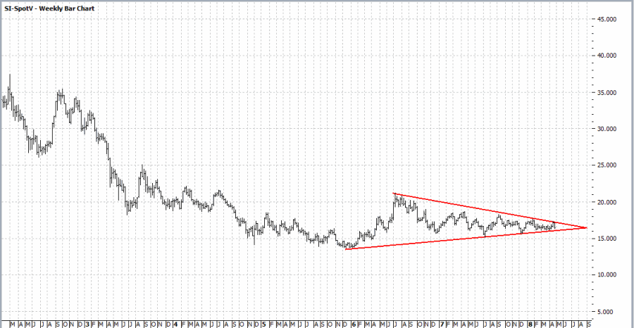
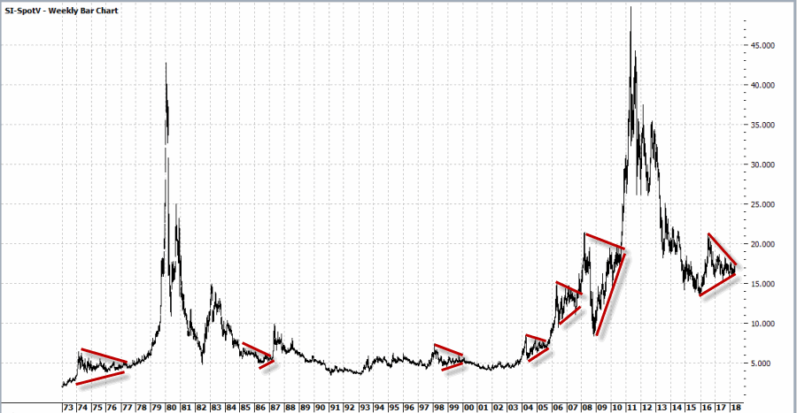
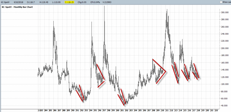
And then I got to work looking through charts and applying everything that I thought I had learned. And like a lot of “newbie” technicians – and a surprising number of seasoned ones – I typically ended up drawing “lines on charts” that would resemble something like what you see in Figure 1.1
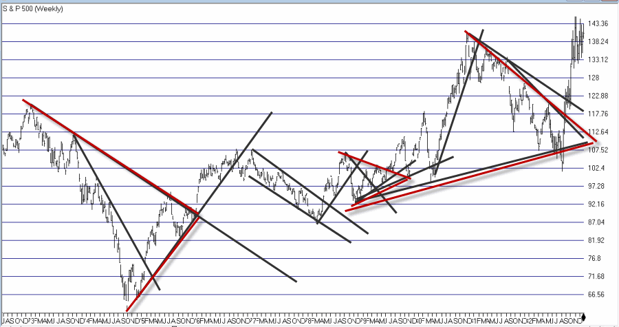
Figure 1 – “Important” trend lines (or not?) (Courtesy AIQ TradingExpert)

For a technical analyst this is sort of the equivalent of “throwing up” on a chart (and the real pisser was that back  in the day a fresh updated booklet of charts would show up in the mail each week – so you had to “throw up’ all over all the charts again and redraw every #$^& “important” line!!).

At some point I realized that perhaps every “important” line that I was drawing on a multitude of charts was perhaps maybe not so “important” after all. This revelation led me to establish the following maxim (as much to force me to “fight the urge” as anything:

Jay’s Trading Maxim #18: If you draw enough lines on a bar chart, price will eventually hit one or more of them.

(See also JayOnTheMarkets.com: The Line(s) in the Sand for Everything)     

True Confession Time

There are certain dirty little secrets that no respectable technician should ever utter. But just to “get a little crazy” (OK, at last by my standards – which are quite low, apparently) I’m going to put it down in print:

I hate trend lines

There, I said it.  Now for the record, up sloping and down sloping trend lines are a perfectly viable trading tool if used properly.  I personally know plenty of people trading successfully using trend lines drawn on a price chart.  Sadly, I’m just not one of them.

So remember the lesson I learned the hard way – “There is no defense for user error.”

The full truth is that I have nothing against trend lines, and yes I understand that there are “objective” methods out there detailing the “correct” method for choosing which two points to connect to draw a proper trend line (DeMark, Magee, I think Pring to name a few).  But I somehow seem to have failed that lesson.

One Line I Do Like

I still draw slanting trend lines from time to time. But the only lines I really like are lines that are drawn horizontally across a bar chart – i.e., “support” and “resistance” lines.  A multiple top or a multiple bottom marks a level where the bulls or the bears made a run and could not break through. Now that’s an “important” price level.  If that price level ultimately holds it means the charge failed and that a significant reversal is imminent.  If it ultimately fails to hold it means a breakout and a possible new charge to ever further new highs or lows as the case may be (for the record, it could also mean that a false breakout followed by a whipsaw is about to occur.  But, hey, that’s the price of admission).

I also like horizontal lines because even if very single horizontal line does not prove to be useful as a trading tool, it can still serve a purpose as a “perspective tool”.  Rather than explaining that theory let’s just “go to the charts.”

More “Lines in the Sand”

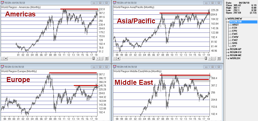
Figure 2 displays an index of bond and income related ETFs that I created.  Roughly half of the ETFs have a higher correlation to treasury bonds and the other half to the S&P 500 Index (i.e., CWB – convertible bonds, JNK – high yield corporate, PFF – preferred stock and XLU – utilities all react to interest rates but are more correlated to the stock market than to treasury bonds).aiq bonds1
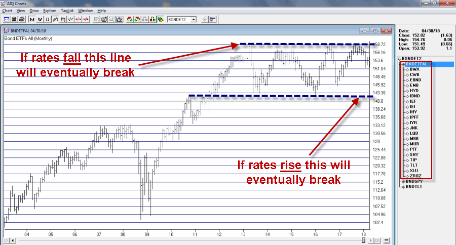
Figure 2 – Bond and Income Related ETF Index (Courtesy AIQ TradingExpert)

This monthly chart clearly illustrates the struggle going on in the interest rate related sector.  Interest rates mostly bottomed out in 2013 and have been grinding sideways to higher since.  As you can see, interest rate related securities have been trapped in a sort of large trading range for years.  Eventually, if the long-term trend in rates turns higher this chart should be expected to break through the lower (support) line Figure 2.

Still focusing on interest rate related sectors, Figure 3 displays a monthly index comprised of 3 REITs.  Talk about a market sector trapped in a range.

aiq reit
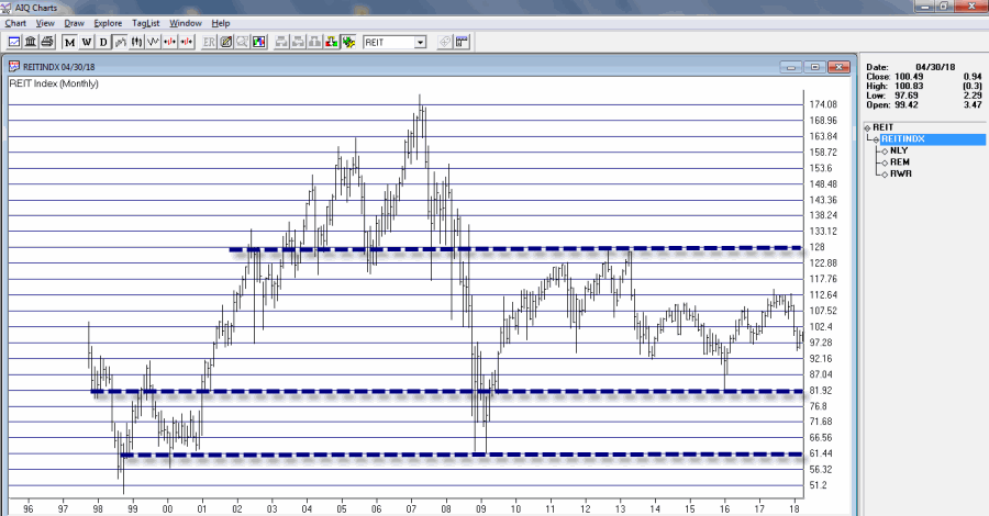
Figure 3 – REIT Index; Monthly (Courtesy AIQ TradingExpert)

For what it is worth, Figure 4 displays a weekly chart of the same index with an indicator I call Vixfixaverage (code for this indicator appears at the end of the article).  Typically, when this indicator exceeds 60 and then tops out, a decent rally often ensues (one word of warning, there is also often some further downside before that rally ensues to caution is in order).

reit 2Figure 4 – REIT Index; Weekly (Courtesy AIQ TradingExpert)

Speaking of oversold “things”, Figure 5 displays an index of Master Limited Partnerships (MLP’s).  As you can see in Figure 5, a) divergences between price and the 4-month RSI are often followed by significant rallies, and b) a new such divergence has just been established.  Does this mean that MLP’s are destined to rally higher?  Not necessarily, but given the information in Figure 5 and the fact that everybody hates MLP’s right now, it’s something to think about.aiq mlp
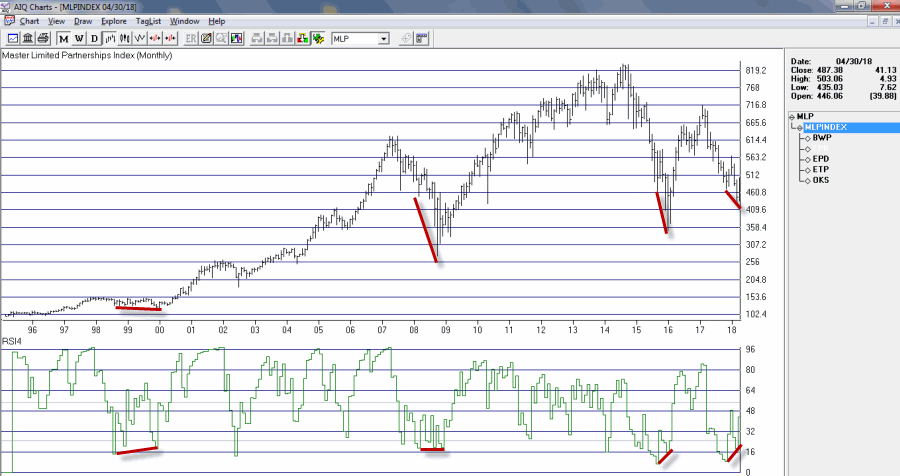
Figure 5 – MLP Index (Courtesy AIQ TradingExpert)

AIQ TradingExpert Code for Vixfixaverage

hivalclose is hival([close],22).

vixfix is (((hivalclose-[low])/hivalclose)*100)+50.

vixfixaverage is Expavg(vixfix,3).

Jay Kaeppel

Disclaimer:  The data presented herein were obtained from various third-party sources.  While I believe the data to be reliable, no representation is made as to, and no responsibility, warranty or liability is accepted for the accuracy or completeness of such information.  The information, opinions and ideas expressed herein are for informational and educational purposes only and do not constitute and should not be construed as investment advice, an advertisement or offering of investment advisory services, or an offer to sell or a solicitation to buy any security.

A Crazy Play in SLV (in case anything ever happens)

The silver market has been driving traders, well, crazy lately, as it refuses to go anywhere.  As you can see in Figure 1, silver prices have been narrowing into an ever and ever tighter range for quite some time now.  Despite all of the (incorrect) prognostications (including my own) that silver is “due” to break out into a major trend, nothing, zilch, nada.  The price range just coils tighter and tighter.1Figure 1 – Silver “coiling” (Courtesy ProfitSource by HUBB)

As you can see in Figure 2, silver has a “history” of this kind of thing happening, followed by “something crazy” (usually, though not always.)

2Figure 2 – Silver’s history of “coiling”, and what comes after (Courtesy ProfitSource by HUBB)

Despite the fact that silver has so far refused to cooperate, there are a few things we can say at this point.  Among them:

1) Silver is much closer to forging the next major trend than it was several months (or years ago).

2) The type of “coiling” action we have seen for at least the better part of a year and a half is often followed by an explosive move in one direction or another (a word of warning: often preceded by a fake out in the other direction).

3) As you can see in Figure 3, the implied volatility for options on ticker SLV (an ETF that tracks the price of silver) has collapsed to a very low level.  This tells us that there is relatively little time premium built into the price of the options, i.e., that SLV options are “cheap.”3Figure 3 – SLV options are “cheap” as implied option volatility is extremely low on a historical basis (Courtesy www.OptionsAnalysis.com)

A Crazy Play in Case Things Get Crazy

What follows is NOT a trading recommendation.  In fact, it’s not even a strategy that most traders would ever employ.  However, it:

1) Is an excellent illustration of the flexibility that option traders have in crafting a position

2) Affords profit potential if SLV breaks out significantly in either direction

3) Can accumulate even more value if and when implied volatility ever perks up again (the more the better)

4) And my personal favorite, it only costs $147 to enter

In technical options parlance this trade might be referred to as “an out-of-the-money call butterfly spread paired with a long put” (Do NOT attempt to say that three times fast).  The position involves:

*Buying 2 SLV Jan2019 17 calls @ $0.67

*Selling 3 SLV Jan2019 23 calls @ $0.09

*Buying 2 SLV Jan2019 29 calls @ $0.02

*Buying 3 SLV Jan2019 13 puts @ $0.12

The particulars are shown in Figure 4 and the risk curves in Figure 5.4Figure 4 – SLV example trade particulars(Courtesy www.OptionsAnalysis.com)

5Figure 5 – SLV example risk curves (Courtesy www.OptionsAnalysis.com)

Here is what you need to kow:

*This trade is nothing more than a wildly aggressive speculation that SLV will break out of the current “coil” (at the far right of Figure 2) in a meaningful way sometime between now and mid January 2019.

*Clearly if SLV does NOT make some kind of a significant price move between now and mid January 2019, this trade will lose money.  Hence the reason we are taking a small dollar risk and not “betting the farm.”

*If SLV soars or collapses this trade has significant profit potential.

*Finally, if implied volatility perks up from its current slumber and spikes to higher levels, that can inflate the profit potential (at least prior to expiration) of this trade. Remember, that a rise in IV would inflate the amount of time premium built into the options.

Summary

Is SLV going to make a significant move (finally!!) between now and mid January?  It beats me.  Remember, this trade is NOT a recommendation, only an illustration of a possibility available to option traders who answer in the affirmative to the following three questions:

1) Do you think there is a chance that SLV will make a significant price move between now and mid-January 2019?

2) Do you think there is a chance that the implied volatility for options on SLV will rise from their current low levels between now and mid-January 2019?

3) Do you have $147 bucks?

Jay Kaeppel

Disclaimer:  The data presented herein were obtained from various third-party sources.  While I believe the data to be reliable, no representation is made as to, and no responsibility, warranty or liability is accepted for the accuracy or completeness of such information.  The information, opinions and ideas expressed herein are for informational and educational purposes only and do not constitute and should not be construed as investment advice, an advertisement or offering of investment advisory services, or an offer to sell or a solicitation to buy any security.

The Line(s) in the Sand for Everything

I would like to tell you what will happen next in the financial markets.  No, seriously I really would.  Unfortunately, my crystal ball is presently not functioning. In the interest of full disclosure I should mention that it never actually did work, unfortunately I stared into it for a long time before I figured that out.  That was not a happy day.  That revelation led me to establish:

Jay’s Trading Maxim #62: Predicting stuff is hard.  Better to identify the current trend.  If you can’t identify the current trend, better to take the day off.

As I have written about a lot lately (here, here, here, here, here and here) there are a lot of markets “at the crossroads.”  So rather than wasting a lot of verbiage I’m going to save the 7,000 words and show 7 charts instead.  As I alluded to above, I can’t tell you where all of the various financial markets are headed, but I can show you a pretty good way to find out.

Keep a close eye on the markets relative to their respective “line(s) in the sand”.  Interpretation is fairly simple:

Price above red line = GOOD

Price below red line = BAD

All charts are Courtesy of ProfitSource by HUBB)

dxFigure 1 – U.S. Dollar

clFigure 2 – Crude Oil

spxFigure 3 – S&P 500

tltFigure 4 – T-Bonds (TLT)

gcFigure 5 – Gold

kcxFigure 6 – Coffee

beansFigure 7 – Soybeans

Summary

As far as what happens from here, you’re guess is as good as mine.  But the point is that NOW is exactly the time to be paying close attention.

Jay Kaeppel

Disclaimer:  The data presented herein were obtained from various third-party sources.  While I believe the data to be reliable, no representation is made as to, and no responsibility, warranty or liability is accepted for the accuracy or completeness of such information.  The information, opinions and ideas expressed herein are for informational and educational purposes only and do not constitute and should not be construed as investment advice, an advertisement or offering of investment advisory services, or an offer to sell or a solicitation to buy any security.

One Article Every “Investor” Should Read, and One Article Every “Trader” Should Read

Typically, I prefer to come up with my own ideas and do my own writing.  But sometimes I come across things that are so well thought out and so well written I figure “why recreate the wheel?”

For Investors

So the first article is about the yield curve.  While the phrase “yield curve” may not trigger excitement, the fact remains that the yield curve is one of the simplest and most useful ways to gauge future prospects for the economy and the stock market.  Just not always in the way most people think.  The 10-yr-2yr spread has been tightening of late, which has triggered a lot of consternation among the pundit class.

So the first article by Liz Ann Sonders of Charles Schwab addresses the reality (and the history) of the yield curve, and is extremely enlightening.  If you follow the economy or the stock market at all, please invest a few minutes and educate yourself about this important – and very misunderstood and misinterpreted – topic by reading the article linked below.

Don’t Fear the Yield Curve Reaper by Liz Ann Sonders at Charles Schwab

For Traders

Technically this second article does apply to “investors” as well as “traders”, but I like it more for people who trade in the financial markets on an active basis.  For many the material may seem like a “refresher”, and maybe it is. But even if so, a refresher is useful in order to help remind oneself about “how trading really works”, and how long-term success is actually achieved (Hint: It has less to do with “signal generation” and much more to do with “money management and risk management”).

So if you trade your own money on any kind of an active basis – again – please invest a few minutes and educate (or re-educate) yourself on this important topic

Losing To Win: 3 Reasons I Focus On Average Loss from Schwab Trading Services

Enjoy.  And learn.

Jay Kaeppel

Disclaimer:  The data presented herein were obtained from various third-party sources.  While I believe the data to be reliable, no representation is made as to, and no responsibility, warranty or liability is accepted for the accuracy or completeness of such information.  The information, opinions and ideas expressed herein are for informational and educational purposes only and do not constitute and should not be construed as investment advice, an advertisement or offering of investment advisory services, or an offer to sell or a solicitation to buy any security.

What to Watch in Energies

With crude oil hitting its highest level since November of 2014, the energy sector is suddenly drawing a lot of interest.  But there are few caveats that investors might want to keep in mind before getting too far ahead of themselves.

(BTW: If you enjoy reading JayOnTheMarkets.com – heck, even if you hate reading JayOnTheMarkets.com – please tell others and encourage them to stop by, “Like” an article, link an article, etc..  Thanks, The Management)

Energy Seasonality

Figure 1 (from www.Sentimentrader.com, which is quickly becoming one of my favorite sites) displays the annual seasonal calendar for ticker XLE – the SPDR Energy ETF. While it should be pointed out that it certainly is not like every year plays out like this chart, the primary point is that the “meat” part of year of from the end of January through the end of April is nearing the end of the line.0Figure 1 – XLE Seasonality (Courtesy: www.Sentimentrader.com)

XLE Overhead Resistance

XLE has had a terrific month of April, rallying over 14% since the low on 4/2.  And while it has been an impressive show of momentum, a look at the “bigger picture” points to some key levels of potential resistance just ahead.

Figure 2 is a monthly bar chart of XLE with two significant resistance levels drawn (at roughly $78.25 and $80.50). XLE has failed twice previously at roughly $78.40 – in December 2016 and again in January of 2018.1Figure 2 – XLE Monthly with overhead resistance (Courtesy ProfitSource by HUBB)

On the plus side, XLE is clearly trending higher at the moment and there is still another 6.4% and 9.4% of upside potential between the current price and the resistance levels drawn in Figure 2.  So short-term upside potential remains.

The only real “warning” I am raising is to pay attention to “what happens (if and) when we get there” (“there” being the $78.25-$80.50 range).

Jay’s Energy ETF Index

I created and follow an index of all manner of energy related ETFs (it combines traditional fossil fuel related ETFs with alternative energy source ETFs). A monthly chart with a significant resistance level drawn appears in Figure 3.2Figure 3 – Jay’s Energy ETF Index (Courtesy AIQ TradingExpert)

Figure 4 “zooms in” on Figure 3 using a daily bar chart of my Energy ETF Index.  As you can see, as nice as the latest rally has been, there is a “day of reckoning” looming out there somewhere if the energy sectors keeps going and retests this significant level.

2aFigure 4 – Jay’s Energy ETF Index; Daily (Courtesy AIQ TradingExpert)

For the record this index is comprised of:

GEX – Alternative Energy

KOL – Coal

LIT – Lithium

NLR – Nuclear

OIH – Oil Service

TAN – Solar

UGA – Gasoline

UHN – Heating Oil

UNG – Natural Gas

URA – Uranium

USO – Crude Oil

XLE – Energy Sector

Summary

Some might interpret this piece as a bearish to neutral word of warning related to the energy sector.  In reality I am pretty agnostic when it comes to energy and (sadly) can’t offer you a “prediction” that would do you any good.

But I will be watching closely to see what happens to XLE and my own index if and when the key resistance levels are tested – especially if that test occurs after the end of the most favorable February through April period.

Commodity related assets – such as energy, especially fossil fuels – appear “due” for a favorable move relative to stocks.  If and when these key resistance levels are pierced we could see an “off to the races” situation unfold.

Until then, be careful about  “bumping your head.”

Jay Kaeppel

Disclaimer:  The data presented herein were obtained from various third-party sources.  While I believe the data to be reliable, no representation is made as to, and no responsibility, warranty or liability is accepted for the accuracy or completeness of such information.  The information, opinions and ideas expressed herein are for informational and educational purposes only and do not constitute and should not be construed as investment advice, an advertisement or offering of investment advisory services, or an offer to sell or a solicitation to buy any security.

Commodities at the Crossroads

Here’s a fun thing to do.  If you want to get somebody to give you a weird look tell them that there is a good chance that commodities will outperform stocks in the next 3 to 8 years.  In the immortal words of Ralph Parker, they will look at you “like you have lobsters crawling out of your ears.”

But a glance at Figure 1 explains why this seemingly crazy notion may not be so farfetched.  Figure 1 displays the Goldman Sachs Commodity Index (GSCI) divided by the S&P 500 Index (SPX).  As you can see, this ratio “goes to extremes” and the move from one extreme to another typically takes a number of years to play out.

1Figure 1 – Goldman Sachs Commodity Index divided by S&P 500 Index

Historically, commodities vastly outperform stocks for a period of several years, then everything reverses and stocks vastly outperform commodities.  This ratio recently hit an all-time low as commodity prices fell while the stock market experienced a huge bull market.  This suggests (though certainly does not guarantee) that the next big move will involve commodities outperforming stocks.

Figure 2 displays a monthly bar chart for ticker RJI (the ELEMENTS Rogers International Commodity Index – Total Return) which is an ETF that holds a basket of commodities.  What we see is that a long-term down trending trend line, as well as a key “once support/then resistance” level ($5.27 a share) have both been pierced to the upside.

Which causes me to raise the obvious question “is this a breakout?”2Figure 2 – RJI Monthly Bar chart with potential signs of a breakout (Courtesy ProfitSource by HUBB)

Before getting too carried away and making wild-eyed proclamations about how the turn in the GSCI/SPX Ratio has begun, let’s consider a few other “things.”

Figure 3 displays the daily chart for RJI.  The red lines inFigure 2 are the same red lines drawn onthe monthly chart in Figure 2.  As you can see, on a short-term basis there is an obvious “line in the sand/resistance” level at $5.66 a share. Unless and until RJI clears that level it is probably premature to talk about being “off to the races.”

3Figure 3 – RJI Daily w/short-term resistance (Courtesy ProfitSource by HUBB)

It should be noted that there are other commodity ETFs available and that they presently paint a slightly different picture.  This is due to the fact that each tracks a different basket of commodities, with varying weights assigned to varying commodities.

Figure 4 displays a monthly chart of ticker DBC (PowerShares DB Commodity Index Tracking Fun) and ticker 5 displays ticker GSG (iShares S&P GSCI Commodity-Indexed Trust (which is designed to track the S&P GSCI Total Return Index).

4Figure 4 – DBC Monthly (Courtesy ProfitSource by HUBB)

5Figure 5 – GSG Monthly (Courtesy ProfitSource by HUBB)

As you can see in Figures 4 and 5, tickers DBC and GSG appear to paint a slightly different – seemingly less bullish – case for commodities.  Why the difference?  Figures 6, 7 and 8 display the portfolio holdings for RJI, DBC and GSG respectively.  The key thing to note is that RJI is the most diversified of the three.  Also RJI holds roughly 40% of its portfolio in energies whereas DBC and GSG hold roughly 56% and 63% of their respective portfolio in energy related commodities (crude oil, natural gas, etc.).  It should be noted that these holdings and the percentages can change over time.

RSI Holdings

Figure 6 – RJI holdings

DBC Holdings

Figure 7 – DBC holdings

GSG Holdings

Figure 8 – GSG holdings

Summary

*Based on Figure 1 I do believe that commodities may in fact outperform stocks (possibly by a significant margin) in the years ahead.

*Based on Figure 2 I think it is possible that commodities may start gaining significant ground sooner than later.

*However, based on Figures 3, 4 and 5 I am tempering my enthusiasm for the time being.

*If history (referring to the long-term swings in the GSCI/SPX ration displayed in Figure 1) is an accurate guide (and of course in the financial markets it is always important to remember that “yes, this time could be different”) there is no need to try to “pick the turn” in the GSCI/SPX ratio. We can wait for a new trend to develop first before “taking the plunge.”

*But now appears to be a good time to be keeping a close watch on commodities versus stocks.

Jay Kaeppel

Disclaimer:  The data presented herein were obtained from various third-party sources.  While I believe the data to be reliable, no representation is made as to, and no responsibility, warranty or liability is accepted for the accuracy or completeness of such information.  The information, opinions and ideas expressed herein are for informational and educational purposes only and do not constitute and should not be construed as investment advice, an advertisement or offering of investment advisory services, or an offer to sell or a solicitation to buy any security.

A Pinch of Junk, A Dash of Dividends, a Smattering of Bonds… and, Voila

It’s not exactly a secret – and it’s a widely misunderstood concept – but in the world of investing sometimes it’s not what you invest in but when that matter most.

Case in point.  What do you get when you combine junk bonds, dividend stocks and intermediate-term treasury notes?

It depends on how you do it.

We will look at two approaches – one approach buys and holds all three with an annual rebalance, the other switches between the three using a set calendar.

Spoiler Alert: The difference is “stark”.

(See Also JayOnTheMarkets.com: The World is at a Critical Juncture)

The Vehicles

For our purposes we will conduct two tests from 12/31/1989 through 3/31/2018 using the following set of monthly total return data:

Junk Bonds: From 12/31/1989 through 12/31/1993 we use Vanguard High Yield Bond fund (VWEHX).  From 12/31/1993 forward we use the Barclays Capital High Yield Very Liquid Index (which is the index that is tracked by the SPDR Barclays High Yield ETF – ticker JNK)

Dividend Stocks: We use the S&P 500 Dividend Aristocrats Index (which is the index used by the ProShares S&P 500 Aristocrats ETF – NOBL)

Intermediate-Term Treasuries: We use the Barclays Capital U.S. 3-7 Year Treasury Bond Index (which is the index tracked by the iShares 3-7 Treasury Bond ETF – ticker IEI)

Test 1 – The “Equal Split” Approach

For this test we simply split our money evenly between junk bonds, dividend stocks and intermediate-term treasuries and rebalance at the end of each year.  Figure 1 displays a graph of the cumulative growth of $1,000 since 12/31/1989.1Figure 1 – Growth of $1,000 split between Junk bonds, dividend stocks and intermediate-term treasuries with an annual rebalance; 12/31/1989-3/31/2018

The results look pretty good in terms of consistency.  The total return is +691% (about 7.8% for the 12-month average) with a maximum drawdown of -9.2%

Can these results be improved upon?  (Another Spoiler Alert: Yes, by a factor of about 8-to-1.)

Test 2 – The “Calendar Approach”

With this approach we will invest in only one category per month each year as displayed in

2

Figure 2 – Calendar Approach Investment Calendar

The results for Test 2 appear in Figure 3 as the blue line.  For comparisons sake, the original line that appeared in Figure 1 appears in Figure 3 as the red line.  Notice a difference?

3Figure 3 – Growth of $1,000 invested using Calendar Approach (blue  line) versis Split Approach (red line); 12/31/1989-3/31/2018

The particulars of relative performance appear in Figure 4.

4
Figure 4 – Performance Comparison; Calendar Approach vs. Split Approach; 12/31/1989-3/31/2018

Summary

For the record I am not “recommending” this as an investment approach.  Like any other approach there a relative pros and cons that would need to be carefully considered before adopting such an approach using one’s actual hard earned money.  For example, these returns involve the use of  index data and do not represent actual trading results and there are no deductions for any fees, etc.

The material presented above is intended simply to highlight:

Jay’s Trading Maxim #44: Sometimes it’s not what you invest in but when that matters most.

Case in point.

Jay Kaeppel

Disclaimer:  The data presented herein were obtained from various third-party sources.  While I believe the data to be reliable, no representation is made as to, and no responsibility, warranty or liability is accepted for the accuracy or completeness of such information.  The information, opinions and ideas expressed herein are for informational and educational purposes only and do not constitute and should not be construed as investment advice, an advertisement or offering of investment advisory services, or an offer to sell or a solicitation to buy any security.

The World is at a Critical Juncture

OK, sorry, I guess that was a little dramatic.  Anyway, the major indexes of many foreign countries staged outstanding advances, in some cases since the end of 2015. And while it was undoubtedly a great ride, the nagging question all along the way was, “what happens when these markets start to hit resistance?” The answer appears to be forming as I type.  So it is an important time to pay attention to how things play now, as that may have important implications going forward.

Figure 1 displays four separate indexes that I created and follow – The Americas, Asia/Pacific, Europe and the Middle East.

(click to enlarge)1xFigure 1 – The Four Major World Market Arenas (Courtesy AIQ TradingExpert)

The Americas (upper left) didn’t quite make it to its old all-time before running out of steam. Asia/Pacific (upper right) broke out to the upside for exactly one week before dipping back below resistance. It presently stands right on the edge (see Figure 2 below).

2xFigure 2 – Asia/Pacific fails its first test (Courtesy AIQ TradingExpert)

Europe (lower left) also broke out above its 2014 high for exactly one week before falling back (See Figure 3 below).

3xFigure 3 – Europe also fails its first test (Courtesy AIQ TradingExpert)

My Middle East index bumped its head at a somewhat arbitrarily drawn inflection point.4xFigure 4 – A key resistance point hanging over Middle East index (Courtesy AIQ TradingExpert)

Summary

So in sum, the “world” stock markets are sort of in a “Hey nice work, what have you done for me lately?” situation.  While I would love to tell you how this will all play out unfortunately I do not possess the ability to do so.

One thing I do know, however, is that the implications are large. If the “world markets” by and large break out to the upside and stage another up leg then the “bull is alive”.  On the other hand, if resistance holds and the majority of markets start to break down, things could get very ugly.

As the world turns…

Jay Kaeppel

Disclaimer:  The data presented herein were obtained from various third-party sources.  While I believe the data to be reliable, no representation is made as to, and no responsibility, warranty or liability is accepted for the accuracy or completeness of such information.  The information, opinions and ideas expressed herein are for informational and educational purposes only and do not constitute and should not be construed as investment advice, an advertisement or offering of investment advisory services, or an offer to sell or a solicitation to buy any security.

The World’s Most Important Commodity (if we’re being honest)

After rereading much of what I have written of late, it occurs to me that maybe I should just write about those markets that are not at a critical juncture, you know, just to save time.

Speaking of which, a long time ago I read an obscure article somewhere that made a compelling argument that the 3 most important commodities in the world are the “Three C’s” – crude oil (runs everything), corn (feeds everyone) and copper (builds everything).  It made sense.  It still does. (Although for the record, times being what they are, I am still concerned that someday the three most important commodities may be canned food, shotgun shells and cabins in the woods, but I digress).

Yes, it makes sense all day, into the evening, overnight and into the early morning. And then you wake up and realize that the author missed the most important “C” of all – Coffee!!

Coffee, the Commodity

Like any physical commodity there are two things you need to know about coffee:

*The price fluctuates based on supply and demand

*After boom comes a bust and vice versa

To put it mildly, coffee has a “history”.  To be more specific, coffee has a history of extremes booms and busts (which is what can make it an outstanding trading vehicle).  Consider Figure 1 which displays a monthly bar chart for spot Coffee prices.

kc1Figure 1 – Monthly Spot Coffee; a History of Big Moves (Courtesy ProfitSource by HUBB)

The good news is that you do not have to be an expert on Brazilian weather patterns to recognize “the way it works” in coffee.  The way it works, generally speaking, is this:

a) Price either collapses into a narrowing, declining range or consolidates into an every narrower sideways’ range

b) All hell breaks loose (See Figure 2)

kc2Figure 2 – Monthly Spot Coffee; a History of Big Moves (Courtesy ProfitSource by HUBB)

Part a) can be very frustrating for anyone trying to “pick tops  and bottoms with uncanny accuracy” and can seem like it will never end as price grinds lower in a trend that seems like it will last forever.

Part b) can be extremely profitable.  And the beauty part is in most cases you do NOT have to get in near the bottom (or top) to ride a pretty darn good trend.

The bad news until more recently is that the only way to trade coffee was to trade coffee futures.  Talk about a wild ride.  As someone who has traded coffee futures in the past, both professionally and personally, let me sum up the experience this way – picture downing three triple espresso’s.  Then a Monster chaser.  Then boarding a roller coaster.  Hands Up!

Bottom line, despite the obvious potential for profit, it is clearly not for everyone.

Ticker JO, the ETF

With the advent of ETFs the marketing people “got busy” and created ETFs to fill every nook and cranny of the investment sphere.  Commodities were included in this onslaught, including ticker JO (get it?) which tracks an index of coffee futures contracts. Figure 3 displays a bar chart for ticker JO.joFigure 3 – Ticker JO (Courtesy ProfitSource by HUBB)

Notice anything?

Good News: If history is a guide, coffee is setting up for the next big up move.

Bad News: I can’t tell you when the trend will change.

Good News: We know for sure is that it won’t start at least until the current down trending range is broken to the upside.

Bad News: Just because price breaks above the upper red line I have arbitrarily drawn in Figure 3 doesn’t guarantee that a profitable up move will occur.

Good News: But it could. And as you have seen, when coffee “goes”, it really goes.

Other Good News: Investors can buy coffee just like buying shares of stock via JO.

So grab another cup of – what else – and keep a close eye.

Jay Kaeppel

Disclaimer:  The data presented herein were obtained from various third-party sources.  While I believe the data to be reliable, no representation is made as to, and no responsibility, warranty or liability is accepted for the accuracy or completeness of such information.  The information, opinions and ideas expressed herein are for informational and educational purposes only and do not constitute and should not be construed as investment advice, an advertisement or offering of investment advisory services, or an offer to sell or a solicitation to buy any security.

The Most Important Economics Lesson You Will Learn Today (and 2 other Charts that have my attention)

Figure 1 below (Courtesy of NotesFromTheRabbitHole) presents the most important economics lesson you will learn today (or any other day for that matter).  Please take whatever time is necessary to memorize this important concept.

1Figure 1 – Economics 101 (Courtesy of NotesFromTheRabbitHole)

Figure 2 presents highlights 8 different major stock market indexes that (at least for now) have held at support, but which remain very much “in play”.

2Figure 2 – Major Market Index hold at support (Courtesy of KimbleChartingSolutions)

The implication is pretty simple: If these support levels start getting pierced to the downside, it is time to play defense.  Until then…..

Figure 3 displays the difference between the 10-year treasury yield and the 2-year treasury yield.

3Figure 3 – 10yr minus 2yr treasury yields (Courtesy RealInvestmentAdvice.com)

While the current trend (i.e., getting closer to 0) appears ominous it is important to remember that the “trouble” typically does not occur until this measure goes negative.  But attention should be paid.

Jay Kaeppel

Disclaimer:  The data presented herein were obtained from various third-party sources.  While I believe the data to be reliable, no representation is made as to, and no responsibility, warranty or liability is accepted for the accuracy or completeness of such information.  The information, opinions and ideas expressed herein are for informational and educational purposes only and do not constitute and should not be construed as investment advice, an advertisement or offering of investment advisory services, or an offer to sell or a solicitation to buy any security.