Monthly Archives: October 2017

A Turbo-Charged System (at Exactly the Wrong Time?)

The “system” I will write about here involves only a slight modification to one written about here by Dane Van Domelen on 10/23/2017. Any”credit” for anything that is good about this system should be given to Mr. Van Domelen.  The interesting thing – besides the surprisingly profitable, albeit volatile, long-term results – is the fact that I hated the idea when I first read Mr. Van Domelen’s article.

The Original Idea

In the linked article, Mr. Van Domelen’s proposed buying and holding tickers UPRO and TLT.  UPRO is an ETF that tracks the daily change for the S&P 500 Index times 3.  Ticker TLT tracks the long-term treasury bond.  I am not a huge fan of buying 3x funds and holding them for any length of time as my own personal feeling is that – “at some point they get killed.”  Also, while long-term treasuries have made investors a lot of money over the past 30+ years, some day interest rates will embark on a new uptrend – and long-term treasuries will likely get hit hard, or so it seems to me.

Mr. Van Domelen also tested his theory “starting in 2009.”  I must admit that I rolled my eyes when I read that.  “Of course it’s done well since 2009” I thought, “long-term bonds are up since that time and the S&P 500 has more than tripled in price”.  Still, as a “student of the market” I decided to test the idea out “a little further back.”

The results were very interesting.

The Original Test

For testing purposes I used monthly index total return data from the PEP Database from Callan Associates.  Using index data I was able to test back to a starting date of 12/31/1972.  For testing purposes I used:

*Monthly Total Return data for the S&P 500 Index (multiplied x 3)

*Monthly Total Return data for the Barclay’s Bloomberg Treasury Long-Term Index

*The portfolio rebalances at the start of each year to start the year holding:

1/3rd in SPX times 3

2/3rds in Long-Term Treasuries

*I also deducted 1% per year in “fees” (deducted pro rata on a quarterly basis)

Using this approach generated the results in Figure 1:

Measure System SPX
$1,000 on 12/31/1972 grow to==> $930,724 $81,330
Average Annual % +(-) +19.9% +13.0%
Median Annual % +(-) +19.7% +14.6%
Standard Deviation of Annual Returns 21.4% 16.9%
Ave/StdDev 0.93 0.77
Worst 12 months % +(-) (-32.2%) (-43.3%)
Maximum % Drawdown (-42.2%) (-50.9%)

Figure 1 – Original “SPX x 3 plus Long-Term Treasury” system results; 12/31/1973-9/30/2017

Classic “high risk, high return” results.  Almost 20% annually but a large standard deviation and very large drawdowns.

Other Tests

In testing other data I determined that a portfolio of:

*1/3rd SPX times 3

*2/3rds 7-10-Year Treasury times 2

Performed even better.  At least in the eye of this beholder. In addition, I personally prefer intermediate-term treasuries generally speaking as they tend to be less volatile than long-term treasuries.

There is an ETF (ticker UST) that tracks the 7-10 Year treasury times 2.

So in a nutshell, in this test:

*Each year on December 31st the portfolio resets to:

1/3 SPX (x3)

2/3 7-10 year treasuries (x2)

*Each month the SPX portion of the portfolio gains or loses the monthly total return for SPX times 3.

*Each month the 7-10 treasury portion of the portfolio gains or loses the monthly total return for the Bloomberg Barclays Treasuries – Intermediate Index times 2.

*1% in fees is deducted annually (with fees deducted quarterly)

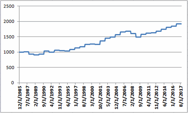
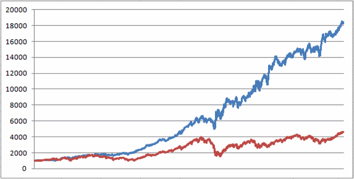
Using this hypothetical approach, $1,000 invested in 1972 would be worth $3,134,089 through September 2017 versus $81,330 invested in the S&P 500 Index.  Figure 2 displays a chart showing the growth of equity and Figure 3 displays the particulars.2
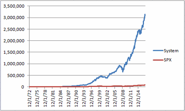
Figure 2 – Growth of $1,000 using “System using 7-10 yr. Treasuries (x2)” (blue line) versus SPX (red line); 12/31/1972-9/30/2017

Measure System SPX
$1,000 on 12/31/1972 grow to==> $3,134,089 $81,330
Average Annual % +(-) +23.1% +13.0%
Median Annual % +(-) +21.3% +14.6%
Standard Deviation of Annual Returns 21.4% 16.9%
Ave/StdDev 1.08 0.77
Worst 12 months % +(-) (-27.8%) (-43.3%)
Maximum % Drawdown (-39.9%) (-50.9%)

Figure 3 – “Updated System” versus SPX;12/31/1972 to 9/30/2017

Before anyone gets too excited based on the outsized hypothetical returns, there are a number of “reality checks” to consider:

*These results are “hypothetical” based on index returns and NOT real-time results from actual trading

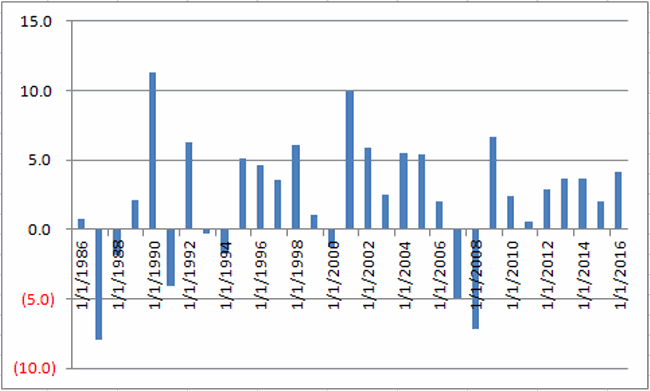
*These results involve “extremely volatility”.  The annual standard deviation of returns is 21.4% and the maximum drawdown is -39.9%.  On 3 separate occasions – 1973-74, 1987 and 2008 – drawdown exceeded -28%.  Not everyone is built to endure these types of declines and stay with it.

*The market has had an exceptional run up of late and some day interest rates will rise in earnest – so now may be the exact wrong moment to even be looking at something this aggressive.

A Trading Portfolio

I am in no way, shape or form recommending that anyone trade this portfolio.  As always it is – in the immortal words of Rod Serling – “submitted for your approval.”

It is my usual method though to try to shape ideas into actual trading methods – even if just for further analysis. So for trading purposes:

*1/3 in ticker UPRO (SPX x 3)

*2/3 in ticker UST (intermediate-term treasury x 2)

*Rebalanced annually

*1% fee deducted per year (0.25% deducted quarterly)

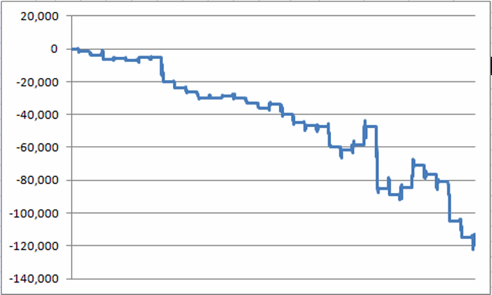
The first full month that both of these ETFs generated real-time returns was February of 2010. The results generated since that time – versus the S&P 500 Index – appear in Figure 4.

4
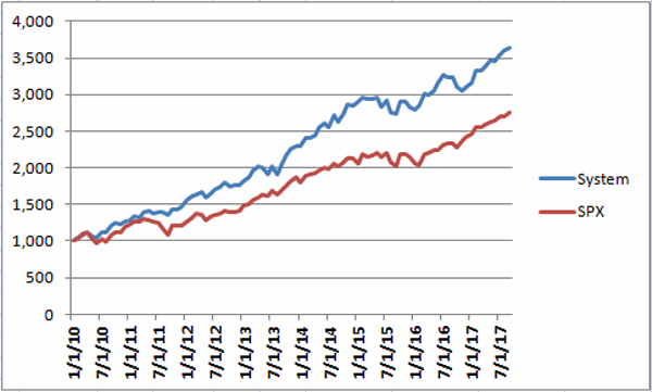
Figure 4 – Growth of $1,000 using total return data for UPRO and UST (blue line) versus SPX (red line); 1/31/2010-9/30/2017

Summary

Bottom line: The hypothetical results are excellent – and very compelling.  At the same time, the real world risks are huge.

This is absolutely “high risk/high reward” territory.  The danger is that an investor inured to all market risk by the recent non-stop advances by the major stock averages will see something like this as a way to “shoot for the stars.”  But the downside risk here is huge!  Consider that in 1987 this “system” lost -39.9% in just three months time (also 1973-74 witnessed a -29% decline and 2008 a -30% decline).  The reality is that most investors will not “stay the course” in the face of this type of volatility.

The fly in the ointment, the monkey in the wrench, the pain in the, uh, well you get the idea.  Just remember that if “past is prologue” this system could lose -39.9% in the next 3 months (ala the 1987 decline).

Who’s ready to ride?

Jay Kaeppel

Disclaimer:  The data presented herein were obtained from various third-party sources.  While I believe the data to be reliable, no representation is made as to, and no responsibility, warranty or liability is accepted for the accuracy or completeness of such information.  The information, opinions and ideas expressed herein are for informational and educational purposes only and do not constitute and should not be construed as investment advice, an advertisement or offering of investment advisory services, or an offer to sell or a solicitation to buy any security.

November Sector Focus

Orwell famously wrote that some animals are more equal than others.  As it turns out, during certain months some stock market sectors are more equal than others.  Let’s take a closer look at the month of November

November Sectors

I have my own methods for analyzing sector performance.  Based on these factors, the top sectors (using Fidelity Select Sector funds) for November are (or more accurately, “have been”):

FCYIX – Industrials

FBSOX – IT Services

FSRPX – Retailing

FSHOX – Construction & Housing

FSPHX – Health Care

Figure 1 displays the growth of $1,000 invested in these sector funds only during the month of November since 1986 (note that FCYIX started trading in 2003 and FBSOX in 2004).1Figure 1 – Growth of $1,000 invested in top November sectors

*This portfolio has showed a gain in November 23 times (74%) and a loss 8 times (26%).  Since 1994 the record is up 19 times and down 3.

*The average UP November was +4.3%

*The average DOWN November was -3.7%

*The 3 largest gains were +11.3% (1990), +9.9% (2001) and +6.7% (2009)

*The 3 largest losses were -8.0% (1987), -7.2% (2008) and -5.0% (2007)

Figure 2 displays the annual November gain/loss in chart form.

Figure 3 displays the annual November gain/loss in numerical form.

2Figure 2 – 5-Sector November +/-%

Year November % +/-)
11/30/1986 0.8
11/30/1987 (8.0)
11/30/1988 (1.8)
11/30/1989 2.1
11/30/1990 11.3
11/30/1991 (4.1)
11/30/1992 6.3
11/30/1993 (0.3)
11/30/1994 (1.8)
11/30/1995 5.1
11/30/1996 4.6
11/30/1997 3.5
11/30/1998 6.1
11/30/1999 1.1
11/30/2000 (1.3)
11/30/2001 9.9
11/30/2002 5.9
11/30/2003 2.5
11/30/2004 5.5
11/30/2005 5.4
11/30/2006 2.0
11/30/2007 (5.0)
11/30/2008 (7.2)
11/30/2009 6.7
11/30/2010 2.4
11/30/2011 0.6
11/30/2012 2.9
11/30/2013 3.6
11/30/2014 3.7
11/30/2015 2.0
11/30/2016 4.1

Figure 3 – 5-Sector November +/-%

Summary

Will this 5 fund portfolio show a gain or a loss in November 2017?  There is no way to predict.  Still, for investors looking for an “edge”, these sectors might be an interesting place to look.

Jay Kaeppel

Disclaimer:  The data presented herein were obtained from various third-party sources.  While I believe the data to be reliable, no representation is made as to, and no responsibility, warranty or liability is accepted for the accuracy or completeness of such information.  The information, opinions and ideas expressed herein are for informational and educational purposes only and do not constitute and should not be construed as investment advice, an advertisement or offering of investment advisory services, or an offer to sell or a solicitation to buy any security.

An Unusual 4 ETF Portfolio…That Seems to Work

I know I repeat it a lot but the purpose of this blog is not to offer recommendations but rather to share ideas.  So here is one that I am not quite sure about but am keeping an eye on.

The FourNonCorr Portfolio

Somewhere awhile back I started looking at trying to pair non correlated – or even inversely correlated – securities in a portfolio that had the potential to outperform the overall market. What follows is what I refer to as the FourNonCorr Portfolio.  For the record I do not trade this portfolio with real money.  I am still trying to figure out if there is something to it or not.  But given that it has outperformed the S&P 500 by a factor of 3-to-1 (granted, using hypothetical results) since December of 2007, I figure it might be worth monitoring for awhile.

The portfolio consists of four ETFs:

Ticker FXE – Guggenheim CurrencyShares Euro Trust

Ticker UUP – PowerShares DB US Dollar Index Bullish

Ticker TLT – iShares Barclays 20+ Yr Treas. Bond

Ticker XIV – VelocityShares Daily Inverse VIX ST ETN

The monthly charts for each appear in Figure 1.1Figure 1 –The Four ETFs in The Four NonCorr Portfolio (Courtesy AIQ TradingExpert)

As you can see there is a lot of “zigging” by one accompanied by “zagging” for another.  No surprise that when the Euro rises the dollar falls and vice versa. Also, TLT often seems to move opposite XIV. That is essentially the purpose of these pairings.

Figure 2 displays the correlations between the four ETFs in the portfolio (using AIQ TradingExpert Matchmaker function from 8/31/2012 through 8/31/2017 using weekly data).  A reading of 1000 indicates a perfect correlation, a reading of -1000 indicates a perfectly inverse correlation.

FXE UUP TLT XIV
FXE (913) 77 (13)
UUP (913) (117) 43
TLT 77 (117) (234)
XIV (13) 43 (234)

Figure 2 – Correlations for the FourNonCorr Portfolio ETFs (Source: AIQ TradingExpert)

Clearly there is a whole lot of “not correlating much” going on.

Results

For testing purposes I used monthly total return data for each ETF from the PEP Database from Callan Associates.  The one exception is ticker XIV which did not start actual trading until December 2010.  For January 2008 through November 2010 I used index data for the index that ticker XIV tracks inversely (S&P 500 VIX SHORT-TERM FUTURES INDEX). Actual XIV ETF data is used starting in December 2010.

As a benchmark, I also tracked the cumulative total return for ticker SPY (that tracks the S&P 500 Index).

Figure 3 displays the cumulative percent gain or loss for both the FourNonCorr Portfolio and ticker SPY.3Figure 3 – Cumulative % gain/loss for The FourNonCorr Portfolio (blue) versus SPY (red); 12/31/2007-9/30/2017

Year-by-year results appear in Figure 4

  4 NonCorr SPY Diff
2008 (6.0) (37.0) 31.0
2009 26.1 26.4 (0.3)
2010 45.2 14.9 30.3
2011 (1.3) 2.1 (3.4)
2012 34.3 15.8 18.5
2013 19.3 32.2 (12.9)
2014 5.3 13.5 (8.2)
2015 0.6 1.3 (0.8)
2016 21.0 11.8 9.2
2017* 24.4 14.1 10.2

Figure 4 – Year-by-Year Results

The results by the numbers appear in Figure 5.

4NonCorr SPY
Average 12mo % +/- 17.8 11.2
Median 12mo % +/- 14.9 15.0
Std. Deviation 17.1 16.8
Ave/Std. Dev. 1.04 0.67
Worst 12mo % (11.9) (43.2)
Max. Drawdown % (17.8) (48.4)

Figure 5 – By the numbers

All told The FourNonCorr Portfolio:

*Gained +334% versus +110% for SPY since 12/31/2007

*Experienced a maximum drawdown of -17.8% versus-48.4% for SPY

Thoughts

On paper, The FourNonCorr Portfolio looks pretty decent, particularly compared to the S&P 500 Index.  But you will recall that I stated earlier that I don’t actually trade this portfolio with real money.  Why not?  A few concerns:

*Interest rates tend to move in long-term waves up and down.  How beneficial will it be to have TLT in the portfolio if and when interest rates embark on a long-term wave up?

*I don’t entirely trust ticker XIV.  Because of the way it is built it seems to have the benefit of upward bias due to contango in the VIX futures market (the opposite of ticker VXX – please Google “VXX” and/or “contango” for an actual explanation) it also holds the potential to sell off in shocking fashion.  Using the index data as I did in order to replicate hypothetical performance from Jan 2008 through Nov 2010, XIV declined a stunning -72% between the end of May 2008 and the end of November 2008. It also experienced a -60% decline in 2015-2016. Need to give some thought to adding a security that is even capable of that to a permanent portfolio.

*On the flip side, XIV has been the driving force for gains in recent years and shows a cumulative gain of +416% since 12/31/2007.  If (and when?) we ever do see a bear market and/or a significant pickup in volatility will XIV have a large negative influence on performance?  That seems to be the $64,000 question.

Summary

As a thought experiment, The FourNonCorr Portfolio shows a pretty decent track record and seems to hold some interesting promise.  As a real money, real world experience – questions remain.

Stay tuned, tinker and experiment if you wish,and don’t be too quick to “dive in.”

Jay Kaeppel

Disclaimer:  The data presented herein were obtained from various third-party sources.  Whilne I believe the data to be reliable, no representation is made as to, and no responsibility, warranty or liability is accepted for the accuracy or completeness of such information.  The information, opinions and ideas expressed herein are for informational and educational purposes only and do not constitute and should not be construed as investment advice, an advertisement or offering of investment advisory services, or an offer to sell or a solicitation to buy any security.


This is One Crude Approach

In this previous article I wrote about some conflicting outlooks for crude oil in the near-term.  On one hand, the software that I use is pointing to higher prices based on a bullish Elliott Wave count.  On the other hand, there appears to be a lot of upside resistance and we are in a typically unfavorable seasonal period for crude oil.

For this piece we will assume that a trader:

1) Has settled on the “bearish case” and wants to enter a position that will profit if crude oil does decline in price in the days and weeks ahead.

2) Does not want to “bet the ranch”

3) Has no opinion as to how far crude oil may fall (i.e., would like to profit even if crude declines only a small amount).

The “purest” play for this trader would be to sell short crude oil futures. If crude declines the trader makes money and vice versa.  The problem for a lot of traders is that each $1 movement in the price of crude oil equates to a $1,000 gain or loss in their account.  Too rich for the “average” trader’s blood.  So let’s consider a “cheap” alternative.

In-the-Money Put Option on Ticker USO

Ticker USO is an ETF that is designed to track the price of crude oil futures (one warning: because of the vagaries of futures pricing there can over time be significant variances between the overall movement of crude oil futures and that of ticker USO).  As I write, ticker USO is trading at $10.48 a share.  This means that the 13 strike price put is $2.52 “in-the-money”.  The Dec 15 put is trading at $2.53 per option (or $253 since each option is for 100 shares).

For the record, a trader could easily buy a less expensive at-the-money put option.  However, the reason we are opting for the ITM put in this example is because we want point-for-point movement with the underlying shares. Consider:

Strike Price – option price = breakeven price

13 – 2.53 = $10.47

USO shares are trading at $10.48; buying this put at $2.53 gives us a breakeven price of $10.47.  In other words we are paying just $0.01 (x100) in time premium.  Below $10.47 a share we will enjoy point for point movement just as if we had sold short shares of USO.

Figure 1 displays the particulars; Figure 2 displays the risk curves.

1Figure 1 – USO Dec 13 put (Courtesy www.OptionsAnalysis.com)

2Figure 2 – USO Dec 13 put risk curves (Courtesy www.OptionsAnalysis.com)

Position Management

Important: As always, any trade examples appearing on JayOnTheMarkets.com are for educational purposes only and should not be considered “recommendations.”   With that in mind, let’s complete this example by discussing how a trader might manage this position once entered into.

As you can see in Figure 3, there are several prices levels that could be considered as “resistance” levels.  A trader holding the Dec 13 put might consider using these as “stop-loss” levels – i.e., exiting the trade, presumably with a loss, if USO rises above the chosen resistance level. 3Figure 3 – USO with resistance levels (Courtesy ProfitSource by HUBB)

*If the trader exits the trade if USO rises above the first resistance level of $10.71 a share, he or she would lose roughly -$30 (out of the initial $253 investment).

*If the trader exits the trade if USO rises above the second resistance level, he or she would lose roughly -$82 (out of the initial $253 investment).

There really is no “best” choice.  The key determinant is the traders own decision whether to give the trade “more room to move” or to “keep it on a tight leash.”

4Figure 4 – USO Dec 13 put position management plan (Courtesy www.OptionsAnalysis.com)

Summary

The purpose of this piece is NOT to convince you to play the short side of crude oil.  The purpose of this piece is to highlight a way to get point-for-point movement via the use of options instead of trading the underlying security.  Instead of selling short shares of USO – with the attendant margin requirements and unlimited risk – a trader can buy an in-the-money put for a fraction of the cost and still profit even on a small decline in the price of  USO.

That’s a lot to accomplish for $253.

Jay Kaeppel

Disclaimer:  The data presented herein were obtained from various third-party sources.  While I believe the data to be reliable, no representation is made as to, and no responsibility, warranty or liability is accepted for the accuracy or completeness of such information.  The information, opinions and ideas expressed herein are for informational and educational purposes only and do not constitute and should not be construed as investment advice, an advertisement or offering of investment advisory services, or an offer to sell or a solicitation to buy any security.

A Critical Juncture (and Rough Time of Year) for Crude Oil

I’ve been reading a lot of “bullish talk” regarding crude oil of late.  And I think that there might be something to it.  However, I for one will probably hold off on jumping on the bullish bandwagon for just a little while longer.

One the One Hand

Figure 1 displays the spot price for crude oil with key support and resistance levels highlighted.  Until price breaks out of this range all predictions are just that – predictions.

1Figure 1 – Monthly Crude Oil (Courtesy ProfitSource by HUBB)

Figures 2 and 3 show weekly and daily crude oil charts with the Elliott Wave counts from ProfitSource by HUBB. Note that the weekly put in a Wave 5 bottom a while back and the daily is now suggesting an impending 5th wave up.2Figure 2 – Weekly Crude Oil (Courtesy ProfitSource by HUBB)

3Figure 3 – Weekly Crude Oil (Courtesy ProfitSource by HUBB)

The caveat here is that EW wave counts can and do change and the counts presented in Figures 2 and 3 in no way “guarantee” that a rally is in the offing.  But Figures 1 through 3 do illustrate why there is a lot of “bullish talk” regarding crude oil.

On the Other Hand

The historical performance of crude oil suggests that this may not be the ideal time to pile onto the bullish side.  Figure 4 displays the Annual Seasonal chart for crude oil futures since they started trading in 1983.

4aFigure 4 – Crude Oil Annual Seasonal Trend

It is important to note that Figure 4 is NOT a “roadmap” and that prices do not simply follow this pattern year in and year out.  Historically through, crude has been a very “seasonal” market and it often is useful to know whether the current predominant seasonal trend is up or down. The seasonal trend has been up since mid-June – which as you can see in Figure 3 coincided with the most recent low in price.

The next significant seasonal period is bearish and extends from the close on October Trading Day #9 (which is Thursday 10/12) through the close on December Trading Day #8 (which is Tuesday 12/12).  As with any seasonal trend there is no guarantee that crude will decline in price between these dates. Still, consider the historical performance of crude oil during this period as displayed in Figures 5 and 6

5Figure 5 – $ gained (lost) holding a long 1-lot position in crude oil futures from Oct TDM 9 through Dec TDM 8 (1983-present)

Figure 6 displays a summary of crude oil performance during this particular seasonal period.

6

Figure 6 – Crude oil performance; Oct TDM 9 through Dec TDM 8 (1983-present)

Summary

Please remember that I am not urging anyone to play the short side of crude.  I am merely pointing out why I am hesitating to play the bullish side. Crude oil has historically been one of the more reliable seasonal markets. But remember that nothing can be counted on 100%.  Even the highlighted awful, terrible, no good, very bad October into December period has seen crude show a gain almost 30% of the time.

The bottom line: If the bullish case plays out I will miss out on an opportunity (It wouldn’t be the first time).  Nevertheless – and despite what anyone may say – investing and trading really is about playing the odds.  For the next several months the odds appear not to favor the bulls in crude.

Jay Kaeppel

Disclaimer:  The data presented herein were obtained from various third-party sources.  While I believe the data to be reliable, no representation is made as to, and no responsibility, warranty or liability is accepted for the accuracy or completeness of such information.  The information, opinions and ideas expressed herein are for informational and educational purposes only and do not constitute and should not be construed as investment advice, an advertisement or offering of investment advisory services, or an offer to sell or a solicitation to buy any security.

Buy Low, Sell High?

The act of “buying low and selling high” has long been regarded as the “ultimate goal” of the “average investor”.   But is it actually achievable on any kind of a consistent basis?  Depends who you ask, I think.  Another reasonable question is “is it even necessary?”  As a trader and investor who has spent a lot of time focusing on trends and relative strength, I would aver that it is –in the immortal words of Radar O’Reilly – “not necessarily necessary.”  Still, opportunities are where you find them.

One website I like a lot (in the interest of full disclosure, part of the reason I like it a lot is because they often link to my articles) is The McVerry Report.  If you are a market junkie (“Hi, my name is Jay”) or have even just a passing interest in a wide variety of market thoughts, McVerry is an excellent place to visit.

Way Up and Way Down

So today I will highlight two diametrically opposed ideas.  For the record, I am not endorsing these websites per se, nor am I endorsing the ideas set forth.  All I am saying is that I found them to be interesting and I believe that you might as well.

The first comes from www.StockCharts.com and highlights ticker LIT – an ETF that tracks the price of lithium.  As you can see in Figure 1, LIT is exhibiting a few “classic” signs of a blow off top – a parabolic move up plus a potential double-top.1Figure 1 – Ticker LIT; A parabolic blowoff and a double top?  Only time will tell

Has the rally in LIT run its course and is it doomed to collapse from here?  Not necessarily.  But I for one will be keeping an eye on this one.

The second idea comes from www.Stockerblog.blogspot.com

I recently wrote an article about the “potential joys and likely sorrows” associated with picking a bottom.  The two stocks highlighted don’t exactly fit that bill.  They are more in the “stocks forming a potential long-term base by moving sideways in a range for an extended period of time” category.

Very often – but definitely nowhere close to always – stocks that build a long narrow base eventually breakout to the upside and can register significant gains.  Under the category of CYA, for the record I am not suggesting that that will happen with the stocks displayed in Figures 2 and 3, nor am I recommending that you buy these stocks.  The truth is I don’t even really know what either of these companies do, what their fundamentals are, etc.

I just like a long, tight consolidating base.  Whether either of these examples pan out remains to be seen.  But you get the “picture.”

2Figure 2 – Ticker BEBE

3Figure 3 – Ticker SPRT

Summary

The average reader might come away from this piece thinking “so this Kaeppel fella wants me to buy BEBE and SPRT and to sell short LIT.”  Um, no.  All I am saying is this:

Securities that “spike” higher and then form a (potential) double top often have trouble making further headway.  Likewise – and more importantly – if a security exhibits this pattern and then starts to break, the subsequent decline can be swift and severe.  Will that prove to be the case with LIT? We’ll have to wait and see.

As I learned from my AAPTA colleague Charles Kirkpatrick, buying stocks that have formed a long sideways base is an extremely viable approach when it comes to achieving long-term investment success.  Does that mean that BEBE and SPRT are destined to soar? Not at all.  But they might be a good place to start looking.

Jay Kaeppel

Disclaimer:  The data presented herein were obtained from various third-party sources.  While I believe the data to be reliable, no representation is made as to, and no responsibility, warranty or liability is accepted for the accuracy or completeness of such information.  The information, opinions and ideas expressed herein are for informational and educational purposes only and do not constitute and should not be construed as investment advice, an advertisement or offering of investment advisory services, or an offer to sell or a solicitation to buy any security.


Gold Stocks in October

Figure 1 displays the action in gold stocks (using ETF ticker GDX as a proxy) since late 2007.  Here is one possible interpretation- gold stocks:

1. Plunged -81% from 2011 into the January 2016 low

2. Rallied 156% into August 2016

3. Retraced 68.1% of that rally into December 2016

4. Since then have been “coiling” into an ever tighter range

1Figure 1 – Ticker GDX

This may lead some traders to conclude that gold stocks are due for a breakout in the not too distant future.  Could this happen?  Of course.  Could it happen in the month of October?  Abolutely.

But is that the way to bet?

Gold Stocks and the Month of October

For testing purposes we will use monthly total return data for ticker FSAAGX (Fidelity Select Gold) sector fund since it started trading in 1986.  Figure 2 displays the monthly total return for ticker FSAGX during each month of October since 1986.

Year FSAGX %
1986 (1.4)
1987 (29.2)
1988 1.0
1989 1.0
1990 (16.4)
1991 7.7
1992 (3.0)
1993 14.9
1994 (7.2)
1995 (12.1)
1996 (2.7)
1997 (15.3)
1998 (3.0)
1999 (8.4)
2000 (11.0)
2001 (1.9)
2002 (10.5)
2003 9.6
2004 2.6
2005 (5.7)
2006 3.7
2007 12.1
2008 (35.3)
2009 (4.4)
2010 1.9
2011 6.7
2012 (3.1)
2013 (0.7)
2014 (17.9)
2015 7.6
2016 (7.3)

Figure 2 – FSAGX total return during the month of October

Figure 3 displays the growth (er, decline) of $1,000 invested in ticker FSAGX ONLY during the month of October.  In sum an initial $1,000 declined by -78% to just $218.3Figure 3 – Growth of $1,000 invested in FSAGX ONLY during October (1986-2016)

But no one should take this to mean that gold stock cannot advance during October.  To wit:

*FSAGX has risen 11 times (35% of the time)

*FSAGX has declined 20 times (65% of the time)

*The average UP month was +6.3%

*The average DOWN month was -9.8%

*The maximum October gain was +14.9% in 1993

*The maximum October loss was -35.3% in 2008

*October has registered a gain of +10% or more twice

*October has registered a loss of -10% or more eight times

Summary

So how will gold stocks perform during October 2017?  Well, so far so good.  After a sharp decline between the first week of September and the end of the month gold stocks have “bounced” higher during early October.

A fair number of usually reliable seasonal trends in a variety of areas have not panned out according to their usual tendencies in 2017 so there is certainly no guarantee that the overall bearish trend during October will play out in gold stocks.  In fact, as we saw in 1993, 2003 and 2007,there is no reason gold stocks cannot rally quite sharply just because the calendar reads “October.”  Given the setup described in Figure 1 above gold stocks could breakout strongly to the upside at anytime.

But history suggests that that is not the way to bet.

Jay Kaeppel

Disclaimer:  The data presented herein were obtained from various third-party sources.  While I believe the data to be reliable, no representation is made as to, and no responsibility, warranty or liability is accepted for the accuracy or completeness of such information.  The information, opinions and ideas expressed herein are for informational and educational purposes only and do not constitute and should not be construed as investment advice, an advertisement or offering of investment advisory services, or an offer to sell or a solicitation to buy any security.

Bottom Pickers Heaven

For openers I should point out that there are alternative names for “Bottom Pickers Heaven.”  The most common one is “Suckers Hell”.  In any event, I am pretty sure that “Bottom Pickers Heaven” is located on “Do You Feel Lucky Punk Avenue”.  But let’s not worry about all of that right now.

For now, welcome to the New Normal, which can be pretty well summed up as follows: Stocks go up, everything else goes down.

To wit, the microcap ETF ticker EWC has been up 26 of the last 28 trading days.  I am going to be brutally candid here: I have no idea what this means going forward.  Now onto our original topic.

Attempting to “pick bottoms” in the financial markets is often referred to as attempting to “catch a falling safe” or “catch a falling knife”, take your pick.  And there is good reason for this.  The desire to be a “hero” and to “maximize profit” and to buy as closely as possible to an actual bottom in price – well, in the immortal words of the late, great Glenn Frey – “it’s got a very strong appeal.”

Unfortunately, like trying to catch a falling safe, it’s a great trick when it works, but comes with certain inherent risks.  Does this mean you should never, ever attempt to pick a bottom? Not necessarily.  What it does mean is that “bottom picking” should fit firmly in the “Speculation with a very small percentage of your capital with an understanding that a great many of these attempts will fail spectacularly so you’d better have some kind of risk controls in place” portion of your overall portfolio.

Lastly, known of the securities highlighted below are “recommended” only “highlighted”.

Ticker UNG

Natural gas has been in a serious downtrend June 2008 when the fracking boom got going. Is that decline about to end? Probably not.  But as highlighted here we are in a (potentially) seasonally favorable period for natural gas and with UNG trading at $6.31 the “low to beat” is $5.78.1Figure 1 – Ticker UNG (Courtesy AIQ TradingExpert)

Ticker SGG

Like UNG, physical commodities of all stripes have been pretty much a disaster since 2008.  Sugar – as tracked by ETF ticker SGG – has declined roughly -72% since August 2011.  Does this mean it is about to rally?  Not necessarily.  But SGG appears to be attempting to form some sort of a short-term multiple bottom in the $26.50 area, with a “low to beat” of $24.97 established back in August of 2015.2Figure 2 – Ticker SGG (Courtesy AIQ TradingExpert)

Ticker SWN

The energy market in general has taken it on the chin since about June of 2014 with an attempt to rally in 2016 followed by more weakness in 2017.  Ticker SWN stands as a classic “bombed out” stock.  After a roughly 90% decline since its peak in 2010, SWN has formed (at least for now, he said ominously) a double bottom at $5 a share.  Will that low hold?  It beats me.  But if you’re wearing your “bottom pickers heaven” sunglasses, that means you think the sun is shining (For what its worth, SWN reported a 17% rise in revenues in the last quarter.  Does that mean anything?  I guess we will find out).3Figure 3 – Ticker SWN (Courtesy AIQ TradingExpert)

Summary

Please DO NOT go out and buy any of these securities based solely on what I have written here.

Let’s face facts:

Fact #1. Bottom picking has an allure

Fact #2. Bottom picking fails way more often than it succeeds

Fact #3. I have no strong feelings regarding the securities highlighted above one way or the other.

With all these “facts” in mind, the bottom line is that these securities are at the very least “attempting” to form a bottom.  Should you choose to examine these more closely or simply to run or the hills is entirely up to you.

If you do choose to look more closely remember to put on your “high risk speculation” hard hat.  It could come in handy.

Jay Kaeppel

Disclaimer:  The data presented herein were obtained from various third-party sources.  While I believe the data to be reliable, no representation is made as to, and no responsibility, warranty or liability is accepted for the accuracy or completeness of such information.  The information, opinions and ideas expressed herein are for informational and educational purposes only and do not constitute and should not be construed as investment advice, an advertisement or offering of investment advisory services, or an offer to sell or a solicitation to buy any security.


Seasonality All Over the World

It has been pretty well documented that certain days of the month have been better than others for the U.S. stock market. As it turns out, this may not just be an “American Thing.”

Country ETFs

In March 1996 17 iShares single country stock index ETFs began trading.  The tickers are listed below.

EWA – Australia

EWO – Austria

EWK – Belgium

EWC – Canada

EWQ  – France

EWG  – Germany

EWH – Hong Kong

EWI – Italy

EWJ – Japan

EWM – Malaysia

EWW – Mexico

EWN  – Netherlands

EWS  – Singapore

EWP – Spain

EWD – Sweden

EWL – Switzerland

EWU – United Kingdom

The Test

Buy and hold in equal dollar amounts all of the ETFs listed above only during the following days each month starting in 1996:

*The 1st 2 trading days of the month

*Trading days #9 through 13

*The last 4 trading days of the month

*While out of the market we will assume interest is earned at a rate of 1% annually.

We will compare this test to the results achieved by buying and holding all of the ETFs listed above with an annual rebalancing at the end of each year.

The Results

Figure 1 displays the growth of $1,000 invested in our “Seasonal System” (blue) versus $1,000 invested on a buy-and-hold basis with an annual rebalance (red).1Figure 1 – Growth of $1,000 invested using “Seasonal Single Country System” (blue) versus “Buy-and-Hold” (red); 3/29/1996-9/29/2017

Things to note:

Measure System Buy/Hold
Average 15.3 9.2
Median 13.4 11.2
Std. Deviation 12.4 21.3
Ave/SD 1.2 0.4
Worst 12 Mos.% (21.3) (56.6)
Max. Drawdown % (24.9) (62.2)

Figure 2 – “Seasonal System” versus “Buy/Hold”

Note in Figure 2 that the “System” generates a higher rate of return (+15.3% versus +9.2%) with a significantly lower annual standard deviation (12.5% versus 21.3%) and much lower (though not small) maximum drawdown of -24.9% versus -62.2% for “Buy/Hold”.

Other things to note:

*Overall the “System” gained  +1,746% while Buy/Hold gained +363%.

*The “System” showed a 12-month gain 92% of the time and a 12-month loss 8% of the time

*”Buy/Hold” showed a gain 66% of the time and a 12-month loss 34% of the time.

*The “System” outperformed “Buy/Hold” 61% of the time (looking at trailing 12 month performance) and “Buy/Hold” outperformed the “System” 39% of the time.

Summary

The results presented here – utilizing 17 non-US single country ETFs – suggest that the idea that certain days of the month are better than others for stocks is not limited to U.S. stocks.

Still, while the “system” presented herein outperformed buy-and-hold by 4.8-to-1 since 1996, it only outperforms buy-and-hold 61% of the time.  And in fact, in the past 12 months the “System” has gained +8.4% versus a gain of +25.6% for the “Buy/Hold” approach.  So it should be noted that in a rip-roaring bull market the “Seasonal” approach can under perform simple “Buy/Hold” by a significant amount.

Still, the long-term hypothetical results depicted here do suggest a significant long-term edge for the seasonal trading day-of-the-month approach.

Jay Kaeppel

Disclaimer:  The data presented herein were obtained from various third-party sources.  While I believe the data to be reliable, no representation is made as to, and no responsibility, warranty or liability is accepted for the accuracy or completeness of such information.  The information, opinions and ideas expressed herein are for informational and educational purposes only and do not constitute and should not be construed as investment advice, an advertisement or offering of investment advisory services, or an offer to sell or a solicitation to buy any security.