Monthly Archives: September 2017

Do You Think Gold Will Rally?

Please notice that the title of this piece is in the form of a question.  I am not offering any suggestions regarding the future direction for the price of gold. The sole purpose of this article is to highlight a particular strategy that many traders never consider – but which can be a terrific way to express a market opinion without risking a lot of money.

The State of GLD

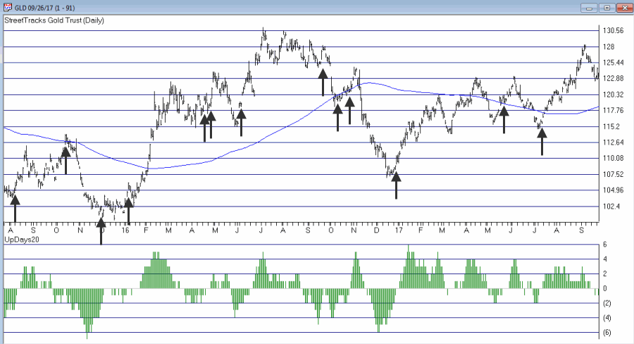
Figures 1 and 2 display two potentially alternate views for ticker GLD – an ETF that tracks the price of gold bullion.  Some people will look at Figure 1 and see a bullish setup, some will look at Figure 2 and see a chart with LOTS of overhead resistance and some people will simply shrug their shoulders and say, “it beats me.”1
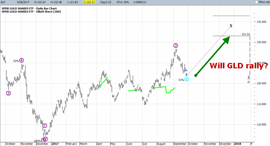
Figure 1 – Ticker GLD with bullish Elliott Wave count (Courtesy ProfitSource by HUBB)

2
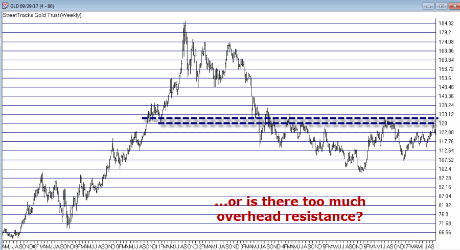
Figure 2 – Ticker GLD with a lot of overhead resistance levels (Courtesy AIQ TradingExpert)

For the purposes of this article let’s assume or a moment that you fall somewhere in the “I wouldn’t mind being bullish but I don’t really feel like risking much betting on it” category.  Given this hypothetical assumption, let’s consider the following hypothetical trade:

Buy 1 Jan2018 GLD 130 call

Sell 2 Jan2018 GLD 140 calls

Buy 1 Jan2018 GLD 150 calls

This strategy is referred to as an “Out-of-the-Money Butterfly Spread” or OTM Butterfly for short.  It might also be unofficially called a “really cheap bet just in case things go right.”

In essence the relevant questions are:

1) Do you think there is chance gold will rally between now and mid-January 2019?

2) Do you have $53 bucks?

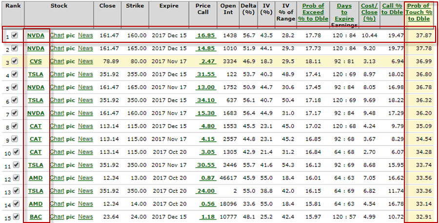
Figure 3 displays the particulars and Figure 4 displays the risk curves.

3
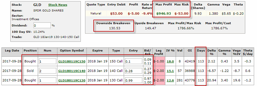
Figure 3 – GLD OTM Butterfly Spread (Courtesy www.OptionsAnalysis.com)

4
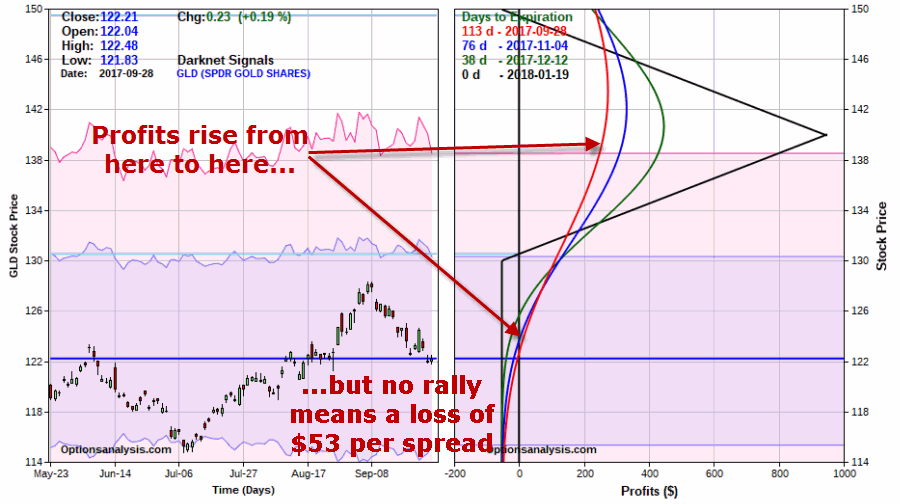
Figure 4 – GLD OTM Butterfly Spread Risk Curves (Courtesy www.OptionsAnalysis.com)

Things to note:

*A 1x2x1 spread costs $53.  This is the maximum risk on the trade

*If GLD does rally the potential profit will peak out and roll over if GLD rises above the middle strike of 140

*If GLD fails to rally this trade will absolutely, positively lose money

*The breakeven price for GLD at January expiration is $130.53

Bottom line: GLD MUST rally at some point or this trade will lose money.  But remember, the maximum risk only $53.  In the meantime – and for example’s sake – if GLD rises to roughly $130 a share by say, December 12, the open profit at that time would be roughly $125 – i.e., +136% ROI.

Either these types of numbers float your boat or they don’t.

Summary

Am I suggesting in any way shape or form that gold is going to advance in price between now and mid-January 2019?  Nope.

Am I recommending that you load up on the trade detailed above?  Nope.

The trade detailed above is intended to serve merely as an example of “one way to play” if:

*You think something “might” move

*You are willing to actually enter a trade to bet on that “something” actually moving

*But you don’t want to risk much capital

Jay Kaeppel

Disclaimer:  The data presented herein were obtained from various third-party sources.  While I believe the data to be reliable, no representation is made as to, and no responsibility, warranty or liability is accepted for the accuracy or completeness of such information.  The information, opinions and ideas expressed herein are for informational and educational purposes only and do not constitute and should not be construed as investment advice, an advertisement or offering of investment advisory services, or an offer to sell or a solicitation to buy any security.

A Simple Indicator for Traders

First the Bad News: There are no “magic bullets” when it comes to trading.  There are people in this industry who have literally tested somewhere in the range of six bazillion “indicators” – give or take (“Hi. My name is Jay”).  Every trend following indicator looks like a gold mine when it latches onto a huge trend and rides it (but not so much when it starts getting whipsawed).  And every overbought/oversold indicator looks like a gift from heaven from time to time when it somehow manages to peak (or valley) and then reverses right at a high (or low).  And then the next time the thing gets oversold the security in question just keeps plunging and the previously “amazingly accurate” indicator just gets more and more oversold.

Bottom line: what I am about to discuss is likely no better or worse than a lot of other indicators.  And it is no holy grail.  Still, I kinda like it – or whatever that is worth.

UpDays20

I call this indicator UpDays20 and I stole, er, learned it originally from Tom McClellan of McLellan Financial Publications.  My calculation may be slightly different because I wanted an indicator that can go both positive and negative.  For a given security look at its trading gains and losses over the latest 20 trading days.

UPDays20 = (Total # of Up days over the last 20 trading days) – 10

So if 10 of the last 20 trading days showed a gain then UpDays20 would read exactly 0.

If only 6 of the last 20 trading days showed a gain then UpDays20 would read -4

You get the idea (and proving once again that it “doesn’t have to be rocket science”).  As a “trading method” it is always advised that this indicator – like most all other indicators – NOT be used as a standalone approach to trading.  That being said, the way I follow this indicator is as follows.

Step 1) UpDays20 drops to at least -2

Step 2) UpDays20 rises 2 points from a low

Step 3) The security in question then rises above its high for the previous 2 trading days

It is preferable to follow this setup hen the security in question is above its 200-day moving average, but that is up to the trader to decide (the danger to using this with a security below its 200-day moving average is that it might just be in the middle of a freefall.  The upside is that counter trend rallies can be fast and furious – even if sometimes short-lived).

Again, there is nothing magic about these particular steps.  They are simply designed to do the following:

1) Identify an oversold condition

2) Wait for some of the selling pressure to abate

3) Wait for the security to show some sign of reversing to the upside

Like just about every other indicator/method, sometimes it is uncannily accurate and sometimes it is embarrassingly wrong (hence the reason experienced traders understand that capital allocation and risk management are far more important than the actually method you use to enter trades).

In this previous article (in Figures 3 and 4) I wrote about using this indicator with ticker TLT.  Figure 1 and 2 display the “buy” signals generated using the rules above for tickers IYT and GLD.1Figure 1 – UpDays20 “Buy” Alerts for ticker IYT (Courtesy AIQ TradingExpert)

2Figure 2 – UpDays20 “Buy” Alerts for ticker GLD (Courtesy AIQ TradingExpert)

Are these signals good or bad?  That is in the eye of the beholder and not for me to say.  One big unanswered question is “when do you exit”?  That is beyond the scope of this “idea” article – however, “sell some at the first good profit and then use a trailing stop” looks like a decent approach to consider) but would have a profound effect on any actual trading results.

Some of the signals displayed in Figures 1 and 2 are obviously great, others are maybe not so hot.  Interestingly, some of the signals in Figure 1 and 2 that don’t look to timely at first blush actually offered a profitable opportunity to a trader who was inclined to take a quick profit. Again, how you allocate capital and when you exit with a profit and when you exit with a loss would likely have as much impact on results as the raw “buy” signals themselves.

Summary

No one should go out and start trying to trade tomorrow based on UpDays20.  No claim is being made that the steps detailed herein will result in profits nor even that this is a good way to trade.

But, hey, it’s one way.

Jay Kaeppel

Disclaimer:  The data presented herein were obtained from various third-party sources.  While I believe the data to be reliable, no representation is made as to, and no responsibility, warranty or liability is accepted for the accuracy or completeness of such information.  The information, opinions and ideas expressed herein are for informational and educational purposes only and do not constitute and should not be construed as investment advice, an advertisement or offering of investment advisory services, or an offer to sell or a solicitation to buy any security.

The Election Cycle and…Gold Stocks?

It is not a little known fact that certain portions of the 4-year U.S. election cycle tend to witness above average stock market performance. Is it possible the same might be true for gold stocks?

Let’s examine the possibility.

The Gold Stock Election Cycle Calendar

Figure 1 displays my unofficial “Gold Stock Election Cycle Calendar.”1

Figure 1  – Jay’s Unofficial Gold Stock Election Cycle Calendar

Figure 2 displays the growth of $1,000 invested in ticker FSAGX (Fidelity Select Gold Sector Fund) only during the months labeled “Miners” in Figure 1.2Figure 2 – Growth of $1,000 invested in FSAGX during months labeled “Miners”; 1985-2017

Figure 3 displays the growth of $1,000 invested in ticker FSAGX only during months NOT labeled “Miners”.3Figure 3 – Growth of $1,000 invested in FSAGX during months NOT labeled “Miners”; 1985-2017

For the record:

*$1,000 invested during the months labeled “Miners” grew +3,766% to $38,662.

*$1,000 invested during the months NOT labeled “Miners” declined -87.5% to $125.

Probably the main thing to note is that anyway you cut it gold stocks are extremely volatile.  Figures 4 and 5 display the 12-month % profit/loss for both the favorable and unfavorable periods displayed in Figures 2 and 3.4Figure 4 – Rolling 12-month % rate-of-change from holding FSAGX during months labeled “Miners”; 1985-20175Figure 5 – Rolling 12-month % rate-of-change from holding FSAGX during months NOT labeled “Miners”; 1985-2017

*The “Miners” months had a maximum 12-month gain of +74.3% and a maximum 12-month loss of -16.6%.

*The “Non Miners” months had a maximum gain of +71.7% and a maximum 12-month loss of -63.1%

Summary

As a student of seasonal market trends I find all of this very interesting.  Nevertheless, given that the “good months” depicted herein can still witness some significant “downs” and that the “non good months” can still witness some very significant “ups”, it seems best to avoid the temptation to think that any sort of gold stock ”magic bullet” exists.

Never hurts to look for an “edge” though.

Jay Kaeppel

Disclaimer:  The data presented herein were obtained from various third-party sources.  While I believe the data to be reliable, no representation is made as to, and no responsibility, warranty or liability is accepted for the accuracy or completeness of such information.  The information, opinions and ideas expressed herein are for informational and educational purposes only and do not constitute and should not be construed as investment advice, an advertisement or offering of investment advisory services, or an offer to sell or a solicitation to buy any security.

The International Low Volatility Tortoise

In this article I compared results for the S&P 500 Index versus the S&P 500 Low Volatility Index.  In this piece we will broaden our horizons to include the whole darn world.

The Test

For test purposes I am using the actual index monthly total return data for both the MSCI ACWI All World Index (ACWIX) and the MSCI ACWI Index Minimum Volatility Index (ACWIXLV) starting in June 1993 when the Low Volatility Index was first calculated.

Figure 1 displays the growth of $1,000 invested in both indexes on a buy-and-hold basis since 1991.1Figure 1 – Growth of $1,000 invested in MSCI ACWI Minimum Volatility Index (blue) versus MSCI ACWI Index (red)

Some observations, from 5/31/1993 through 8/31/2017;

*$1,000 invested in the ACWIXLV grew +586%

*$1,000 invested in ACWIX grew +481%

*586% versus $1,239 represents 22% more return for ACWIXLV

So does this mean that ACWIXLV is a better investment?  Not necessarily.  ACWIX vastly outperformed during the late 1990’s bull market.  Also, the low volatility version experienced a maximum drawdown of -39%.  While this is much better than the -55% drawdown experienced by the regular ACWIX index, it hardly qualifies as what most people would consider “low volatility.”

So let’s add another wrinkle – Sell in May and Go Away.

The Seasonally Adjusted Test

In order to develop a truly “lower volatility” method for this test we will compare:

*Buying and holding ACWIX

Versus

*Holding ACWIXLV only during the months of November through May.  For June through October we will use the monthly total return for the Bloomberg Barclays Treasury 1-3 Year index.

Figure 2 displays the results.2Figure 2 – Growth of $1,000 invested in MSCI ACWI Minimum Volatility Index November through May (blue) versus MSCI ACWI Index buy-and-hold(red)

Figure 3 displays some performance numbers based on all 12-month returns

Measure ACWIX ACWIXLV Sell in May
Compounded 12mo% 7.3% 8.1%
Standard Deviation 17.2% 6.4%
Worst 12 mo % (-47.8%) (-9.7%)
Maximum Drawdown % (-54.6%) (-17.9%)

Figure 3 – ACWIX vs. Seasonally traded ACWIXLV (12-month returns); 1993-2017

The key thing to note is that over the 24 year test period the seasonally traded version ACWIXLV has generated a slightly higher return than ACWIX – with significantly less volatility and downside action.

Key things to note:

*The worst 12-months and maximum drawdown respectively for ACWIX was -47.8% and -54.6%

*The worst 12-months and maximum drawdown respectively for seasonally traded ACWIXLV was -9.7% and -17.9%

*The annual standard deviation for the low volatility version was roughly 1/3rd of that for buying and holding ACWIX (6.4% versus 17.2%)

The MSCI ACWI Index can be traded via ticker ACWI which is the iShares MSCI ACWI ETF

The MSCI ACWI Minimum Volatility Index can be traded via ticker ACWV which is the iShares Edge MSCI Min Vol Global ETF

Summary

Is trading the MSCI ACWI Minimum Volatility Index a good idea?  Even with a seasonal adjusted that reduces volatility even more?  Not necessarily.  But for investors looking for less volatility in their returns it’s something to think about.

Jay Kaeppel

Disclaimer:  The data presented herein were obtained from various third-party sources.  While I believe the data to be reliable, no representation is made as to, and no responsibility, warranty or liability is accepted for the accuracy or completeness of such information.  The information, opinions and ideas expressed herein are for informational and educational purposes only and do not constitute and should not be construed as investment advice, an advertisement or offering of investment advisory services, or an offer to sell or a solicitation to buy any security.


The Low Volatility Tortoise

The proliferation in the number and breadth of ETFs offered today is nothing less than breathtaking.  It’s almost as if “if you can think of an investment theme there is an ETF that covers it.”  I keep thinking that we’ll know the boom has run its course when some erstwhile ETF vendor launches a new series of ETFs starting with the “A” Fund.  The “A” Fund will only hold stocks whose ticker symbol starts with the letter “A”.  Once assets start to swell then the “B”,”C” and so on funds will be rolled out.

You think I’m kidding.

Anyway, one interesting area that has gotten a lot of attention is the “Low Volatility” arena.  For example, ticker SPLV tracks the S&P 500 Low Volatility Index, which holds the 100 stocks from the S&P 500 Index with the lowest realized volatility over the past 12 months.

Is there any merit to investing in this index, particularly in comparison to the widely followed S&P 500 Index?  Rather than offering “opinion” how about we just look at the numbers.

The Test

For test purposes I am using the actual index monthly total return data for both the S&P 500 Index (SPX) and the S&P 500 Low Volatility Index (SPXLV) starting in January 1991 when the Low Volatility Index was first calculated.

Figure 1 displays the growth of $1,000 invested in both indexes on a buy-and-hold basis since 1991.1Figure 1 – Growth of $1,000 invested in S&P 500 Low Volatility Index (blue) versus S&P 500 Index (red)

Some observations, from 12/31/1990 through 8/31/2017;

*$1,000 invested in the SPXLV grew +1,576% to $16,757.

*$1,000 invested in SPX grew +1,239% to $13,390.

*1,576%versus $1,239 represents 27% more return for SPXLV.

So does this mean than SPXLV is a better investment?  Not necessarily.  Note that from 12/31/1990 through 3/31/2000 SPX grew +478% versus only +194% for SPXLV (since then SPXLV has outperformed +471% versus +132%).

So it is quite possible that there will be another performance swing in the future which will propel SPX back into the lead.

Still, there are a few interesting potential benefits to considering the Low Volatility Index

The Tortoise versus the Hare

Figure 2 displays some performance numbers based on all 12-month returns

Measure SPX SPXLV
Average 12mo% 11.0% 11.5%
Median 12mo% 13.0% 13.4%
Standard Deviation 16.7% 12.2%
Ave/Std Dev 0.66 0.94
Worst 12 mo % (-43.3%) (-26.1%)
Maximum Drawdown% (-50.8%) (-35.4%)

Figure 2 – SPX vs. SPXLV (12-month returns); 1990-2017

The key thing to note is that over the 27 test period SPXLV has outperformed SPX in each of the categories listed – i.e., higher returns, lower volatility and lower drawdowns.

To further illustrate the potential advantage to SPXLV let’s now look at rolling 5-year returns (i.e., at the end of each month we look back over the previous 5 years and compare results).

Measure SPX SPXLV
Average 5-year% +68.9% +70.2%
Median 5-year% +61.8% +72.2%
Standard Deviation 69.8% 36.4%
Ave/Std Dev 0.99 1.93
Worst 60 months % (-29.1%) (-5.1%)
# times UP 213 (81%) 260 (99%)
# times DOWN 49 (19%) 2 (1%)

Figure 3 – SPX vs. SPXLV (5-year rolling returns); 1990-2017

Key things to note:

*SPXLV shows a higher 5-year average % return and median % return than SPX

*The average 5-year standard deviation (a measure of volatility of returns and therefore risk) for SPXLV is only about 52% of that for SPX

*The worst 60-month performance for SPXLV was just -5.1% (versus -20.1% for SPX)

*SPX showed a 5-year gain 99% of the time versus only 81% of the time for SPX

Summary

Does any of the above mean that the S&P 500 Low Volatility Index is a better investment than the S&P 500 Index itself?  That’s for each reader to decide for themselves.  As we saw during the 1990’s SPX has the potential to vastly outperform its low volatility brethren. Still, if one is looking to buy and hold an index fund for the long term, the Low Volatility has to date produced higher returns, notably lower risk and a much greater consistency of returns.

Jay Kaeppel

Disclaimer:  The data presented herein were obtained from various third-party sources.  While I believe the data to be reliable, no representation is made as to, and no responsibility, warranty or liability is accepted for the accuracy or completeness of such information.  The information, opinions and ideas expressed herein are for informational and educational purposes only and do not constitute and should not be construed as investment advice, an advertisement or offering of investment advisory services, or an offer to sell or a solicitation to buy any security.


Speculation 101

This article is for people who “trade” (i.e., we are not talking long-term buy-and-hold here) or who are interested in trading.

Please note that what follows is essentially an “example of one potential approach” and NOT a “You can’t lose in trading by following these exact steps specifically laid out here”.  Are we clear?  OK, then let’s proceed.

One Potential Route

Options offer a great way for speculators to, well, speculate – what else, while committing less capital than they might have to in order to buy shares of stock or hold futures contracts. They also are useful in helping traders to limit their risks to a specific amount.

What follows is a set of steps that may be useful if the stock market continues its “every little dip is a buying opportunity to be followed shortly by higher stock prices overall very soon” ways.  This trend will not last forever.  You have been warned.

The Gist

The gist of the idea is this:

*When the overall market pulls back

*Look for stocks/ETFs with good option volume and tight option bid/ask spreads

*Among those stocks, identify those that are in an uptrend and have also experienced a recent pullback

*From those stocks, find the best mathematical opportunities for profiting using options if in fact the price of the stock rises in the near future (in this case “near future” is roughly defined as “the next several months” – which for the record, is not everyone’s definition of “short-term speculation”).

From here we will use www.OptionsAnalysis.com

Step 1: Wait for a pullback in the overall stock market

There are at least a bazillion and one ways that traders may use to designate a “pullback”.  This is just one example (in the interest of CYA, please note that no assumption should be made that this simple technique will generate future profits. Recently, every short pullback inthe stock market has reversed relatively quickly without much follow through to the downside.  This WILL NOT last forever).

Figure 1 shows the S&P 500 Index with a 200-day moving average and a 4-day RSI.  For our purposes we are looking for the S&P500 to be above the 200-day moving average and the 4-day RSI to be below 25. The most recent occurrence was 8/17/17.1igure 1 – SPX > 200-MA; 4-day RSI<25 (Courtesy AIQ TradingExpert)

Step 2: Identify Stocks/ETFs with active option trading

In OA we go to Website | Lists | Filter List. There I have setup a template that scans all optionable stocks and ETFs to find those that trade at least 1,000 option contracts a day AND whose options have bid/ask spreads of 1% or less.  The Output list appears in Figure 2.  These 89 tickers are saved to My Stock List.2Figure 2 – Filter List Output (Courtesy www.OptionsAnalysis.com)

Step 3: Identify Stocks/ETFs in an Uptrend

In OA we go to Stocks | Rankers | Moving Averages and run a ranking of the 89 tickers in My Stock List to find only those that are presently above their own 200-day moving average (i.e., in an uptrend).  In Figure 3 we see that 67 of the 89 tickers qualified.  So we overwrite My Stock List with just those 67 tickers.3Figure 3 – OA Moving Average Ranker (Courtesy www.OptionsAnalysis.com)

Step 4: Identify Stocks/ETFs that have experienced a pullback

In OA we go to Stocks | Rankers | RSI and run a ranking to find tickers in My Stock List whose 3-day RSI has been below 35 sometime during the last 5 trading days.  The input screen is in Figure 4 and the output is in Figure 5. 47 of the tickers have experienced pullback.4Figure 4 – RSI Ranker Inputs (Courtesy www.OptionsAnalysis.com)5Figure 5 – RSI Ranker Outputs (Courtesy www.OptionsAnalysis.com)

Step 5: Search Option trades with the best mathematical expectation

In OA we go to Search | Single Strategy | Percent to Double.  Here we search the remaining 47 tickers for call options that have the highest probability of touching their respective “Percent to Double” target (Percent to Double tells you approximately how far the stock must rise in order for the call option to double in price. “Probability of Touch” measures the probability of that actually happening).  The output screen appears in Figure 6.6aFigure 6 – Percent to Double Output (Courtesy www.OptionsAnalysis.com)

The December 160 NVDA call appears at the top of the list (time for more CYA: NO IMPLICATION is being suggested that the trade that appears at the top of this list is certain or even likely to generate a profit.  Again, this is just an example of one way to filter down for potential opportunities).

Buying 1 NVDA Dec 160 call would cost $1,675.  Figure 7 displays the particulars, Figure 8 displays the risk curves.7Figure 7 – (Courtesy www.OptionsAnalysis.com)8Figure 8 – (Courtesy www.OptionsAnalysis.com)

The equation is pretty straightforward – either NVDA advances in price over the next 120 calendar days and the option has a chance of making money or the option loses money.

The status of this hypothetical position as of the close on 9/18 appears in Figure 9.9Figure 9 – NVDA Dec 160 call (Courtesy www.OptionsAnalysis.com)

Summary

Things absolutely, positively DO NOT always work out as this example did.

The real lesson is recognize that a reasonably well thought out series of steps will generally offer a trader better potential for long-term success than just “winging it.”

Jay Kaeppel

Disclaimer:  The data presented herein were obtained from various third-party sources.  While I believe the data to be reliable, no representation is made as to, and no responsibility, warranty or liability is accepted for the accuracy or completeness of such information.  The information, opinions and ideas expressed herein are for informational and educational purposes only and do not constitute and should not be construed as investment advice, an advertisement or offering of investment advisory services, or an offer to sell or a solicitation to buy any security.

Bullish Trend, Bearish Attitude

In this article on 9/6 I laid out in pretty great length (at least by my standards) the bullish and bearish factors facing the market at the time.  Since then, not a lot has changed. Other than maybe the stock market bullish trend possibly strengthing a bit:

The gist of the 9/6 article was this:

1. The major trend of the stock market was (and still is) bullish

2. There is a larger than average number of reasons why a significant decline in the stock market in the very near future should come as a surprise to no one.

3. The proper course of action (in my mind): stay with the bullish trend but locate the nearest exit “just in case.”

Since Then:

Figure 1 displays four major market averages.  3 of the 4 have broken out to even higher new all-time highs (the only one of these that has not so far is the Russell 2000 small cap index).

All four of these indexes are above their 200-day moving average and 3 of the 4 recently hit new all-time highs.  This is essentially the very definition of a “bull market.”  In fact, one of the worst actions an investor can take is to look at new all-time highs, pronounce “this is the top” and sell everything.  It’s not that this approach can’t work out.  It just seldom ever does.  And it does take a certain degree of hubris as it is tantamount to “telling the market what it’s supposed to do.”1Figure 1 – Major Average pushing higher (Courtesy AIQ TradingExpert)

On the Cautionary Side

On the flipside, Figure 2 displays my 4 market “bellwethers”. Recently, all 4 were flashing a warning signal.  Late last week however, the electronics sector (represented here by ticker SMH) broke out to a new high so can not presently be categorized as “bearish.”2Figure 2 – Market Bellwethers (Courtesy AIQ TradingExpert)

A close eye should currently be kept on the Dow Transports and ticker XIV.  If these continue higher and pierce their recent highs the stock market may well be “off to the races” again.  If not, well, you get the idea.

I do suggest at least a quick re-perusal of the original article in order to note some of the potentially bearish developments that surround the market at the moment.

Summary

*I (sadly) do not possess the ability to predict what will happen next in the financial markets.

*I am (however) pretty good at identifying the trend “right now” (and right now – as suggested in Figure 1 above – the trend is still “bullish”).

*I am also pretty good at identifying times when risks are “above average” (and right now – as suggested in Figure 2 above and the previous article – those risks are “high”).

Bottom line:

1. Don’t fight the trend

2. Don’t fall in love with the trend

 Jay Kaeppel

 Disclaimer:  The data presented herein were obtained from various third-party sources.  While I believe the data to be reliable, no representation is made as to, and no responsibility, warranty or liability is accepted for the accuracy or completeness of such information.  The information, opinions and ideas expressed herein are for informational and educational purposes only and do not constitute and should not be construed as investment advice, an advertisement or offering of investment advisory services, or an offer to sell or a solicitation to buy any security.


The Gathering Storm

First the Good News:

*The market averages are still in an up trend

*The Fed has yet to “remove the punch bowl”1Figure 1 – Major Averages still in Up Trends (Courtesy AIQ TradingExpert)

Fed Balance SheetFigure 2 – Fed Quantitative Easing propels the stock market (Courtesy RealInvestmentAdvice.com)

Now the bad news

Market Bellwethers Flashing Warnings

In this article I wrote about four tickers I follow for signs of early warnings of trouble.  At the moment, all four are flashing warnings.bellwether 4Figure 3 – Bellwethers flashing potential warnings (Courtesy AIQ TradingExpert)

Stocks are Extremely Overvalued

Something important to note: valuation indicators are NOT good timing indicators.  The overall market can be over or undervalued for years. However, overvalued valuation readings are extremely reliable at telling us what will come next once the top is in (whenever that may be).  Figure 4 displays the Schiller CAPE model which measures adjusted P/E ratio.schiller cape w datesFigure 4 – Schiller Adjusted PE (Courtesy: Schiller Data Library)

1901: Dow -37% in 32 months

1929: Dow -89% in 3 years

1932: Dow -49% in 13 months

1965: Dow sideways to 40% lower for 17 years

2000: Nasdaq 100 -87%

2007: Dow -55% in 17 months

2017: ??

When will the exact top form?  Don’t know

What will likely follow?  Don’t Ask

The Decennial Pattern

As I wrote about here and as you can see in Figures 5 and 6, the Year 7 into Year 8 period has historically witnesses significant market weakness.  That does not mean that that is what will happen this time around.  But it is reason for caution.

decennial

Figure 5 – Stock Market Decennial Pattern (Courtesy: OptionStrategist.com)

Year 7 2

Figure 6 – Trouble in Late Year “7”  (Courtesy: OptionStrategist.com)

Figure 7 from Tom McLellan illustrates this phenomenon even more clearly.

Year 7 3Figure 7 – Trouble in Late Year “7”  (Courtesy: www.mclellanoscillator.com)

September

What a crummy time for September to roll around.  Figure 8 displays the fact that the Dow has lost -80% during the month of September since 1897.sep

Figure 8 – Dow has lost -80% during September since 1897

Figure 9 displays the fact that since 1955 most of the “September Nasty” has occurred in that last 10 trading days of the month (after the close on 9/15 this year)sep xFigure 9 – Dow in September; 1st 3 days (blue); Last 10 days (green); in between (red); 1955-2016

Investor Complacency

Despite the fact that:

*We have experienced one of the longest bull markets in history

*Stock prices are extremely overvalued on an objective historical basis

*A number of warning signs are flashing

The investment world seems relatively untroubled (in the interest of full disclosure I have done only limited selling so far myself – more on this in a moment).

Figure 10 displays the AAII investor cash allocation reading from earlier this year.   Low cash levels tend to signal complacency (and impending market trouble) while high cash levels tend to occur near market bottoms.AAII CashFigure 10 – AAII Investor Cash % is low (Courtesy: American Association of Individual Investors)

Figure 11 displays the amount of assets in the Rydex suite of “bearish” funds from earlier this year.  As you can see, investors were not too concerned about the prospects for a bear market – a potential contrarian signal.rydex bear assetsFigure 11 – Rydex Bearish Funds Assets low (Courtesy: The Lyons Share)

Figure 12 shows the level of margin debt versus stock prices.  Historically when margin debt peaks and begins to decline the stock market suffers significantly.  There is no way to predict  when margin debt will top out and roll over but it did recently reach a new all-time high.  Could it go higher? Absolutely.  But if it rolls over – then look out below.margin debt xFigure 12 – If Margin Debt peaks trouble may follow (Courtesy: dshort.com)

Figure 13 displays the stock market versus the number of “Hindenburg Omens” (a measure of “churning” in the stock market) that have occurred in the most recent 6-month period.  Another warning sign is flashing.

Hindenburg Omen 6

Figure 13 – Hindenburg Omen flashing a warning (Courtesy: SentimentTrader.com)

Summary

Does any of the above guarantee that a significant stock market decline is imminent?  The correct answer is “No.”  The major market indexes all remain above their long-term moving averages. This can be considered the very definition of a bull market.

I personally have seen lots of warning signs flash along the way over the years.  And I have found that it is important to pay attention to these and to “prepare for the worst” – i.e., to plan an exit/hedging strategy “just in case.”  But trying to pick the exact top is an excellent way to end up looking stupid.  Trust me on this one.

So here is my summary:

*I do not possess the ability to “call the top” nor to “predict what will happen next” in the stock market

*I do possess a reasonably good ability to identify the trend “right now”

*I also possess the ability to recognize gathering storms clouds (and, yes, they are forming) and the ability to formulate an “emergency plan” as well as the wherewithal to follow the plan “should this be an actual (market) emergency.”

The current level of market valuation – and the history of the stock market following previous similar such readings – suggests that the next bear market will surprise many investors by its severity.

The clouds are gathering.  Please plan accordingly.

Jay Kaeppel

Disclaimer:  The data presented herein were obtained from various third-party sources.  While I believe the data to be reliable, no representation is made as to, and no responsibility, warranty or liability is accepted for the accuracy or completeness of such information.  The information, opinions and ideas expressed herein are for informational and educational purposes only and do not constitute and should not be construed as investment advice, an advertisement or offering of investment advisory services, or an offer to sell or a solicitation to buy any security.


Can’t Pass Natural Gas

If there is one thing we seem to have in abundance these days it is natural gas (heretofore referred to as NG).  Thanks to technological advances in drilling the U.S. has become the world leader in producing, using and exporting NG.

If you understand anything about supply and demand you can probably guess the affect that this massive supply of NG has had on the price of NG.  If you have any doubts peruse Figure 1.1Figure 1 – Natural Gas spot futures (Courtesy ProfitSource by HUBB)

The futures market price for NG gas has plummeted from over $15 to a low under $2 in the past 10+ years.  As you can see in Figure 1, NG prices are languishing in the $3 range.

Truth #1 is that I am not really a “fundamentals” kind of guy, but I am guessing that the fundamental outlook for NG is still pretty negative.

Truth #2 is that regardless of Truth #1 I am sort of a sucker for a long, drawn out base, a consolidating and narrowing trading range and a potential multiple bottom.  I look at the chart in Figure 1 and “I think I see a bottom forming”.  Granted, not the most sophisticated approach to finding a potential opportunity but, hey, I am who I am.

I also look at Figure 2 and see an Elliott Wave count from Profit Source by HUBB that suggests that NG may have completed 5 waves down.  Implication: the next move should (could?) – at least in theory – be to the upside.2Figure 2 – Natural Gas spot futures with Elliott Wave count (Courtesy ProfitSource by HUBB)

The reality is that trading NG futures is not on the radar for most traders.  So let’s take a look at ticker UNG which is an ETF designed to track the price of NG but which traders can buy and sell like shares of stock.3Figure 3 – ETF Ticker UNG (Courtesy AIQ TradingExpert)

Note that UNG also appears (at least in my market-addled mind) to be forming a multiple bottom and consolidating into a very narrow range of late.

The Seasonal Effect

For many years the period extending from the end of September Trading Day #1 through the end of October Trading Day #21 was a quite bullish period for NG.  However, as you can see in Figure 4 – under the category of “what have you done for me lately” – the answer is “not much”. The bullish Sep-Oct effect has been essentially non-existent during the overall NG swoon of recent years.   Still, for the record, this period has seen NG rise 20 time and decline 7 times.4Figure 4 – Long 1 NG futures contract close of September Trading Day #2 through October Trading Day #21 (1990-2017)

Still, it is possible for a stubborn trader with a hankering to speculate on something he thinks he sees (“Hi, my name is Jay”) to convince himself that NG is bottoming and that – fundamentals be darned – this “seasonally favorable period” is as good a time as any to take a flyer on NG.

Clearly, this is not “bet the ranch” territory.  In fact, this might not even be a good idea at all.  In situations like this the best question to ask is NOT “will I make money” but rather, “how can I take a shot without risking much money?”  One potential answer is via the use of UNG options.

UNG Calendar Spread

As always, what follows is not a “recommended trade.”  It simply represents an example of “one way to play” a situation where you are engaging in rank speculation.  The trade detailed involved buying 10 Jan2019 8 strike price calls and selling 8 Jan2018 8 strike price calls.5Figure 5 – UNG Calendar Spread (Courtesy www.OptionsAnalysis.com)

6Figure 6 – UNG Calendar Spread Risk Curves (Courtesy www.OptionsAnalysis.com)

Things to note:

*The cost to enter and the maximum $ risk is $478.

*There are 141 days until January 2018 option expiration, which means that NG has four and a half months try to rally/pop/meander higher

*The trade does have unlimited upside potential because we are long more calls than we are short

*If NG can move to higher ground time decay will work in our favor as the January 2018 call that we are short will start giving up its time premium much more quickly than the January 2019 that we are long.  In other words, if NG does move higher and then gets stuck in a range, profits will steadily increase.

*The record low for UNG was $5.78 a share in March 2016.  If we arbitrarily set $5.50 as a stop-loss point and exit the trade then, the maximum likely risk is somewhere in the range of -$300.

Summary

Is speculating on the long side of NG even a good idea?  Maybe.  But maybe also quite possibly maybe not. So let me be clear.  We are not taking about “wise long-term investing” here.  We are talking about “rank speculation” based on:

* A market that clobbered and has been trading sideways in a narrow range for close to 2 years (i.e., just maybe building a base)

*A potential end to an Elliott Wave downward count

*A market consolidating of late into a very narrow range (i.e., possibly coiling for the next big move)

*A potentially favorable seasonal period

*The ability to enter a trade with good upside possibilities (unlimited upside, profitability improves with the passage of time, relatively low dollar risk)

Bottom Line:

“Speculation” is not a four-letter word.  Nevertheless, it has to be done right.  And even if it is done right there is still a high degree of risk of loss.

Hence the use of the word “speculation.”

Jay Kaeppel

Disclaimer:  The data presented herein were obtained from various third-party sources.  While I believe the data to be reliable, no representation is made as to, and no responsibility, warranty or liability is accepted for the accuracy or completeness of such information.  The information, opinions and ideas expressed herein are for informational and educational purposes only and do not constitute and should not be construed as investment advice, an advertisement or offering of investment advisory services, or an offer to sell or a solicitation to buy any security.