Monthly Archives: August 2017

September – Good, then Bad, then Ugly

A quick review of the sordid “personality” of the stock market historically during the month of September.  We will break it into three periods, referred to sequentially as the “good”, the “bad” and the “ugly”

*The “Good”: the first three trading days of the month of September

*The “Bad”: All trading days between the 3rd trading day of September and the 10th to last trading day of September

*The “Ugly”: The last 10 trading days of September

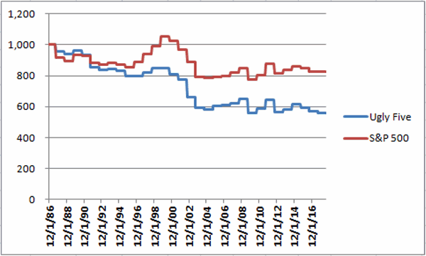
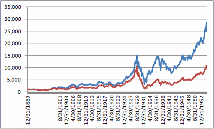
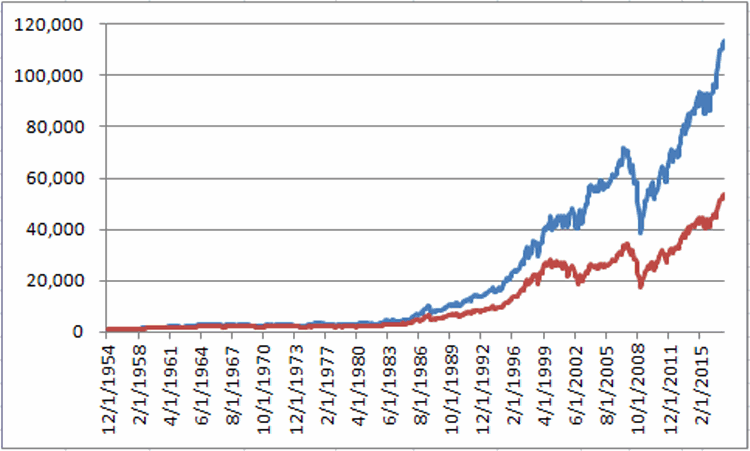
Figure 1 displays the growth of $1,000 invested in the Dow Jones Industrials Average during each of these three periods starting in1955.

1Figure 1 – Growth of $1,000 invested in the Dow Jones Industrials Average during the “Good” (Blue), “Bad” (Red) and “Ugly” (Green) periods (1955-present)

Figure 2 displays the particulars (TDM stands for Trading Days of the Month).
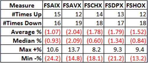
Measure 1st 3 TDM In Between TDM Last 10 TDM
# Times Up 36 31 18
# Times Down 26 31 44
% time UP 58.1% 50.0% 29.0%
Average % +(-) +0.26% +0.01% (-1.55%)

Figure 2 – “Good”, “Bad” and “Ugly” period performance

Key things to note:

*The “Good” showed a gain 58.1% of the time with an average gain of +0.26%

*The “Bad” showed a gain 50.0% of the time with an average gain of +0.26%

*The “Ugly” showed a gain only 29% of the time with an average loss of -1.55%

*The cumulative loss for the “Ugly” period is -56.1%

Summary

September is just around the corner people.  Enjoy it while you can.

Then maybe gird your loins.

Jay Kaeppel

Disclaimer:  The data presented herein were obtained from various third-party sources.  While I believe the data to be reliable, no representation is made as to, and no responsibility, warranty or liability is accepted for the accuracy or completeness of such information.  The information, opinions and ideas expressed herein are for informational and educational purposes only and do not constitute and should not be construed as investment advice, an advertisement or offering of investment advisory services, or an offer to sell or a solicitation to buy any security.


One More Year “7” Warning

Just a short one.  Under the category of “a picture is worth a thousand words” please refer to Figure 1 below.  This chart is courtesy of The Leuthold Group and pretty much speaks for itself.YEAR7Figure 1 – Years “7” (Courtesy: The Leuthold Group)

Let’s add one more “scary” picture to the mix courtesy of SentimentTrader.com.  It regards something known as the “Hindenburg Omen”, defined by Investopedia.com as follows:

“A technical indicator named after the famous crash of the German airship of the late 1930s. The Hindenburg omen was developed to predict the potential for a financial market crash. It is created by monitoring the number of securities that form new 52-week highs relative to the number of securities that form new 52-week lows – the number of securities must be abnormally large. This criteria is deemed to be met when both numbers are greater than 2.2% of the total number of issues that trade on the NYSE (for that specific day).  Traders use an abnormally high number of 52-week highs/lows because it suggests that market participants are starting to become unsure of the market’s future direction and therefore could be due for a major correction. Proponents of this indicator argue that it has been very accurate in predicting sharp sell-offs in the past and that there are few indicators that can predict a market crash as accurately.”Hindenburg Omen

Figure 2 – A large number of occurrences of the “Hindenburg Omen” flash a potential warning sign (Courtesy: SentimentTrader.com)

Now that the scary pictures are firmly pressed in the back of your head it is also important to remember that no matter how scary/dire/grim the implication of Figures 1 and 2 is, the truth is that it does not in any way shape or form ensure that a huge stock market decline is imminent.  It simply “alerts us to be alert”.

Remember the difference between a tornado watch and a tornado warning.  A tornado watch simply means that the “conditions are right” for a tornado to occur.  An actual tornado warning means that there is an actual tornado in progress.

So right now we are in “Stock Market Tornado Watch” mode.

To put it another way, now is the time to think about how you will “find shelter” for your investment portfolio if an actual stock market tornado appears.

One Hedge Example

The trade detailed below is not intended as a recommendation.  It is simply one example of one of many ways to hedge using options.  The trade involves options on ticker SH which is the Profunds Inverse S&P 500 ETF.  If the S&P 500 Index goes down 2% today then ticker SH should rise roughly 2%.

The trade involves:

*Buying 10 Nov32 calls

*Selling 8 Nov 37 calls

*Buying 10 Nov 33 puts

In technical terms it can be thought of as a “collar with an in-the-money call instead of ETF shares”.  In other words we buy the Nov 32 call instead of buying shares of SH itself.

2Figure 2 – Ticker SH option hedge (Courtesy www.OptionsAnalysis.com)

3Figure 3 – Ticker SH option hedge risk curves (Courtesy www.OptionsAnalysis.com)

For the record:

*This trade cost $1,780 to enter however the maximum risk of loss is -$780

*Maximum profit is unlimited if SH rises significantly in price (i.e. if the S&P 500 Index declines significantly in price

*Downside risk is limited and – at least in theory – if the stock market exploded to the upside and SH plunged significantly there is unlimited profit potential on the downside.

Again, not a “recommendation”, just an example.

Summary

Almost nothing about 2017 has been “typical”.  So it should not surprise anyone if the “inevitable Year 7 sell off” fails to materialize.  Still, being prepared in advance to weather a storm is a huge part of long-term investment success.

Jay Kaeppel

Disclaimer:  The data presented herein were obtained from various third-party sources.  While I believe the data to be reliable, no representation is made as to, and no responsibility, warranty or liability is accepted for the accuracy or completeness of such information.  The information, opinions and ideas expressed herein are for informational and educational purposes only and do not constitute and should not be construed as investment advice, an advertisement or offering of investment advisory services, or an offer to sell or a solicitation to buy any security.


Where NOT to Invest in September

It is pretty well established that the month of September can be – shall we say, “dicey” for stock market investors.  In addition, just generally speaking, when and where one chooses to allocate one’s investment capital is one of the two most critical decisions most investors face (the other being when to cut a loss).

Putting these two thoughts together let’s look at some good places NOT to allocate capital to in the month of September.

See also The Post-Election/Year ‘7’ Bermuda Triangle

The Ugly Five

The following Fidelity Select sector funds have historically performed poorly overall – individually and in combination – during the month of September.

FSAIX – Select Airline

FSAVX – Select Auto

FSCHX – Select Chemicals

FSDPX – Select Industrial Materials

FSHOX – Select Housing

It should not be assumed that these sectors are doomed to decline and/or underlperform the S&P 500 each and every year during the month of September.  The only point being made is that these have shown to be poor places to allocate capital during September.  Figure 1 displays the summary for each.1a

Figure 1 – The Ugly Five for September

Note that each fund has been down more often than up during September and that each has a negative average and median monthly return during September.

Figure 2 displays the growth of $1,000 invested in these 5 funds only during the month of September versus $1,000 invested in ticker VFINX (an S&P 500 index fund).  Notice that while the performance of the S&P 500 is subpar the performance of the Ugly Five is much worse.2aFigure 2 – Growth of $1,000 invested in Ugly Five (blue) versus S&P 500 Index fund (red) ONLY during September (1987-2016)

For the record, the Ugly Five during September have:

*Been UP 13 times (42% of the time)

*Been Down 18 times (58% of the time)

*Average UP = +3.4%

*Average DOWN = -5.3%

*Cumulative = -44% (versus -17% for the S&P 500)

Summary

Will the Ugly Five show a combined net gain or loss during September 2017?  It beats me.  It also doesn’t really concern me one way or another – because the only thing I know for sure is that I won’t be invested there.

The primary point is NOT: These five sectors are doomed to decline in the month ahead.

The primary point to ponder is: Why bother investing there?

Jay Kaeppel

Disclaimer:  The data presented herein were obtained from various third-party sources.  While I believe the data to be reliable, no representation is made as to, and no responsibility, warranty or liability is accepted for the accuracy or completeness of such information.  The information, opinions and ideas expressed herein are for informational and educational purposes only and do not constitute and should not be construed as investment advice, an advertisement or offering of investment advisory services, or an offer to sell or a solicitation to buy any security.


Beware the Bottom in Beans

One advantage of considering seasonal trends is that sometimes it is not about “what to do” but rather “what NOT to do”.

Many traders – myself included – will look at the chart of November soybeans in Figure 1 and instinctively see some sort of a bottom forming. 1aFigure 1 – A Potential Support Area in Soybeans (Courtesy ProfitSource by HUBB)

The two horizontal lines drawn in Figure 1 seem to suggest a strong area of support, which might compel a trader to consider a long position in the soybean market.  And in fact that may work out just fine.  But I for one am standing aside for awhile.

Why?  I thought you’d never ask.

Seasonally Unfavorable Fall Period for Soybeans

The period we will consider extends from the close of the 3rd trading day of September through the close of the 2nd trading day of October each year.  Figure 2 displays the “growth” of equity achieved by buying and holding one soybean futures contract during this period every year since 1978.2aFigure 2 – Cumulative results: Long 1 soybeans futures contract Sep TDM 3 through October TDM 2 (1978-2106)

As you can see, it is not a pretty picture.

Figure 3 displays the year-by-year profit/loss for this unfavorable period.3aFigure 3 – Year-by-Year Results Long 1 soybeans futures contract Sep TDM 3 through October TDM 2 (1978-2106)

For the record, soybeans:

*Showed a gain 12 times (31% of the time)

*Showed a gain 27 times (69% of the time)

*Average gain was +$1,105

*Average loss was -$3,366

Summary

The bottom line: When beans are good during early September to early October they are OK, and when they are bad they are very bad.

The results depicted in Figures 2 and 3 should NOT be taken to imply that soybeans are doomed to tank in the weeks ahead, nor that a decent rally cannot take place.  But given the results displayed in Figure 2 please note once again that they title of this piece is NOT “Sell Short as Many Soybean Contracts as You Can”, but rather “Beware the Bottom in Beans.”

Much of one’s success (or failure) in trading involves where one allocates his or her capital.  Based on Figure 1, one might consider allocating capital to a long position in soybeans.  Based on Figure 2 – I’ve decided to hold off.  It is possible that beans will rally and I will miss out.

Welcome to the exciting world of trading.

Jay Kaeppel

Disclaimer:  The data presented herein were obtained from various third-party sources.  While I believe the data to be reliable, no representation is made as to, and no responsibility, warranty or liability is accepted for the accuracy or completeness of such information.  The information, opinions and ideas expressed herein are for informational and educational purposes only and do not constitute and should not be construed as investment advice, an advertisement or offering of investment advisory services, or an offer to sell or a solicitation to buy any security.


‘The Pattern’ Strikes Again

Now seems like a good time for on an update on a simple trading technique I stumbled upon a good while back. Like every other trading “technique” it has its good points and its drawbacks.  But since my mission here is to share “ideas” – with no intimations that anything is ever guaranteed to work – here is the latest.

I first wrote about this pattern here with a clarification here and an update here.  It was primarily designed to use with stock index futures and I have done only limited testing with other markets.  In a nutshell:

The stock index should be trading above its 200-day moving average

Day 1: sees the index close below the previous day’s low

Day 2: has no meaning other than to record the high of the day

Day 3: buy if the index exceeds the Day 2 high on Day 3, otherwise the signal is deactivated.

Exit on the 1st profitable close after entry.

That’s it. There is also a matter of whether or not to use a stop and how far away that stop should be. But for today we will simply focus on the pattern itself.

Figure 1 is one example of this pattern playing out.2a

Figure 1 – “The Pattern” (Courtesy AIQ TradingExpert)

Day 1 – the close is below the previous day’s low

Day 2 – the day after Trading Day 1

Day 3 – price breaks above Day 2 high triggering a long trade

1st profitable close occurs on day after Day 3

Figure 2 below displays a bar chart of the eMini S&P 500 front month contract with the trades since December 2016.

(click to enlarge)1aFigure 2 – eMini S&P Front Month with “The Pattern” (Courtesy AIQ TradingExpert)

NOTES:

*”Up” arrows indicate a Day 3 entry

*”Down” arrows are “exit” signals and NOT sell short signals

The good news is that during this period “The Pattern” has generated 14 “wins” with 0 “losses”.  14 consecutive wins in anything is definitely an attention grabber.  However, this “test” employs:

*1-lot positions

*No stop-loss provision

*No deductions for slippage or commissions

Figure 3 below displays the hypothetical trade-by-trade results using 1-lot position – again assuming no slippage or commissions.3aFigure 3 – Hypothetical trade-by-trade since Dec 2016

Again, the good news is the consistency of the pattern in terms of identifying buying opportunities.  The real question though (as with all things trading) is “Do the rewards justify the potential risks?”  To illustrate this point note – for example the trade entered on 4/5/17 and exited on 4/24/17.  On paper the trade generated a profit of +$288 (before slippage and commissions).  However,we see in the next to last column that a trader would have had to sit through a drawdown of -$2,300 along the way in order to realize that profit.

Sometimes 14 and oh isn’t as clear cut as it seems.

Summary

If this pattern is at all intriguing to you:

1) Do some homework on your own before even considering actually using it to trade

AND

2) Make sure to seriously address the “risk” question above.

Jay Kaeppel


Disclaimer:  The data presented herein were obtained from various third-party sources.  While I believe the data to be reliable, no representation is made as to, and no responsibility, warranty or liability is accepted for the accuracy or completeness of such information.  The information, opinions and ideas expressed herein are for informational and educational purposes only and do not constitute and should not be construed as investment advice, an advertisement or offering of investment advisory services, or an offer to sell or a solicitation to buy any security.


The Easiest Market Beating ‘System’ of All Time

How’s that for an ambitious title?  And I actually believe the title to be accurate.  But I do feel compelled to point out specifically that the title reads “The Easiest Market Beating System of All Time” and NOT “The Greatest Market Beating System of All Time”.  Regarding the former, I am not entirely sure such a thing exists (but it you have it, please feel free to contact me).

For now, we will have to stick to “Easiest”.

The “System”

The “system” – such as it is – goes like this:

*Hold cash during September

*Hold the Dow Jones Industrials Average during all other months

Did I mention the word “easy”?

Lord knows I did not mention the words “rocket” or “science”.

Can it really be this simple?  As long as you have a long-term investment horizon, the answer appears to be “Yes”.  The reason for this appears in Figure 1 which displays the growth of $1,000 invested in the Dow Jones Industrial Average ONLY during the month of September every year starting 1890 (yes, during that Benjamin Harrison administration)

1Figure 1 – Growth of $1,000 invested in the Dow Jones Industrials Average ONLY during September (1980-2016)

For the record the Dow:

*Has lost -79.3% on a cumulative basis during September since 1890.

*was up 52 times (40.9%)

*was down (or unchanged one time) 75 times

*Average gain during Up Septembers = +3.7%

*Average loss during Down Septembers = -4.4%

To create a “system” – again, such as it is – I used month-end closing price for the Dow Jones Industrials Average going back to 12/31/1889 (no dividends are included) and ran the following test:

*Buying and Holding the Dow expect during September

Versus

*Buying and Holding the Dow during ALL months

For testing purposes I assumed that annualized rate of interest of 1% was earned while in cash.  The results:

*$1,000 invested in the Dow using a buy-and-hold approach grew to $604,910 through July 2017

*$1,000 invested using the “system” grew to $3,252,139 during the same time

Again, these results are based solely on price data and NOT total return data which would have added dividends.

To get a better sense of how this all plays out I have broken the test period into two periods: 12/31/1889 through 12/31/1954 and 12/31/1954 through 7/31/2017.2Figure 2 – “System” versus Buy-and-Hold (1890-1954)

The second period extends from 12/31/1954 through 7/31/20173Figure 3 – “System” versus Buy-and-Hold (1954-2017)

For the record the system:

*Outperformed buy-and-hold 59.8% of all calendar years

*Outperformed buy-and-hold 65% of all rolling 5-year periods

*Outperformed buy-and-hold 69% of all rolling 10-year periods

*Showed a 10-year gain 95% of the time versus 86% of the time for buy-and-hold

Summary

So does any of this really qualify as a “system”?  Will it continue to beat the market handily over long periods of time? Does it really make sense to get out of the stock market every year during September? Will September 2017 show a gain or a loss?

It beats me.  The only thing I can state for sure is: the system detailed above sure is “easy”.

Jay Kaeppel

Disclaimer:  The data presented herein were obtained from various third-party sources.  While I believe the data to be reliable, no representation is made as to, and no responsibility, warranty or liability is accepted for the accuracy or completeness of such information.  The information, opinions and ideas expressed herein are for informational and educational purposes only and do not constitute and should not be construed as investment advice, an advertisement or offering of investment advisory services, or an offer to sell or a solicitation to buy any security.

To Take What the VIX Gives You (or Not?)

Things have gotten a little “spooky” in the stock market of late (not everyone is surprised), and the VIX Index – as I wrote about here – has spiked as is typical in these situations. But now what?  I am not good at predictions, so I will not make one.  But how to react depends on what you expect.

The original trade (adjusted to a larger lot size than in the original article) using options on ticker VXX in the article above looked like Figure 1 at the close on 8/17.

1Figure 1 – VXX Nov 12/Oct 14 Directional Calendar Spread (Courtesy www.OptionsAnalysis.com)

Note that there is:

a) An open profit of $1,626 or 73.8%

b) Additional unlimited profit potential (if VXX soared to $21 a share the profit would be roughly $8,000)

c) Maximum risk of -$2,202

So do you feel lucky (punk)?

*If you are playing for a severe market decline (which would almost certainly be accompanied by a sharp rise in VXX) then it might make sense to “let it ride.”

*On the other hand, if you are willing to give up some upside potential to eliminate downside risk, then a simple adjustment might make sense.

For example, a person holding the original position could:

a) Buy back 24 Oct 14 calls

b) Sell 25 Nov 12 calls

The resulting position appears in Figure 2

2Figure 2 – Adjusted position to lock in a profit (Courtesy www.OptionsAnalysis.com)

Note that there is:

a) Additional unlimited profit potential (if VXX soared to $21 a share the profit would be roughly $4,800. Not bad but still significantly less than the original position).

b) The worst case scenario is a profit of $276 (if the position is held until November option expiration AND VXX is at or below $12 a share are that time).

So again, it comes down to a tradeoff depending on one’s expectations:

Summary

If you are playing for “The Big One” on the downside it might make sense to just hold on.  If you are more interested in “ringing the cash register” and letting the rest ride, then an adjustment might make sense.

Jay Kaeppel

Disclaimer:  The data presented herein were obtained from various third-party sources.  While I believe the data to be reliable, no representation is made as to, and no responsibility, warranty or liability is accepted for the accuracy or completeness of such information.  The information, opinions and ideas expressed herein are for informational and educational purposes only and do not constitute and should not be construed as investment advice, an advertisement or offering of investment advisory services, or an offer to sell or a solicitation to buy any security.

Keep an Eye on Gold Stocks

Something tells me that gold mining stocks are soon to make a big move.  It kind of makes me wish I had some feel for which direction that move will go.  Of course, the truth is that I have made this case before and was, ahem – at the least – way early.

Still, the situation is what it is.  To wit….

The Current State of GDX

Ticker GDX tracks the NYSE Arca Gold Miners Index.  Of late, it has been “compressing” and “coiling” in a fairly major way.  In Figure 1 we see the narrow range into which price action is contracting.  This is confirmed by the low “average true range” shown in the bottom clip.

1aFigure 1 – GDX “coiling” even tighter(Courtesy AIQ TradingExpert)

Figure 2 displays GDX price action since 2013 and the implied volatility for 90-day options on GDX.  For many securities, extremely low implied volatility often marks the “calm before the storm.”2Figure 2 – GDX implied option volatility at extremely low level (Courtesy www.OptionsAnalysis.com)

Figure 3 displays a weekly chart of GDX with the 14-week ADX indicator in the bottom clip.  Weekly ADX near an all-time low is one more sign of a “quiet” market.  A “quiet market” is typically followed by a “not so quiet market”.3Figure 3 – Weekly ADX indicator at historically low level (Courtesy AIQ TradingExpert)

Adding one more to the mix, Figure 4 shows ticker GDXJ – an ETF that tracks the MVIS Global Junior Gold Miners Index of small mining companies.  The bottom clip displays the daily 14-day ADX indicator.  For those days when the daily ADX indicator is below 12 the bar chart in the top clip is highlighted in green.  Note that these “quiet” periods are typically followed by sharp “bursts” in price action.4Figure 4 – Ticker GDXJ; Weekly ADX readings under 12 often mark inflection points (Courtesy AIQ TradingExpert)

Summary

“Something” – quite possibly something significant – is likely to happen soon with gold stocks.  Now is the time to prepare.

Oh, and if you figure out which direction that move will go – please let me know.

Jay Kaeppel

Disclaimer:  The data presented herein were obtained from various third-party sources.  While I believe the data to be reliable, no representation is made as to, and no responsibility, warranty or liability is accepted for the accuracy or completeness of such information.  The information, opinions and ideas expressed herein are for informational and educational purposes only and do not constitute and should not be construed as investment advice, an advertisement or offering of investment advisory services, or an offer to sell or a solicitation to buy any security.

One More Cry of ‘Wolf’

If I were the type to make bold proclamations I would probably consider “taking my shot” right here and shout “This is the Top” and/or “The Market May Crash.”  Unfortunately, on those occasions (well) in the past when I would make bold public predictions of what was about to happen in the financial markets I would almost invariably end up looking pretty stupid. So even if I did make a “bold proclamation” it wouldn’t necessarily mean that anyone should pay any attention.

Besides all that the last thing I want is for “the party to end”.  Even if you do think the market is about to tank it’s a pretty crummy thing to have to root for.  Even if you did manage to “call the top”, the ripple effect of the ramifications associated with a serious stock market decline can have pretty negative effect on just about everyone’s life.

So let’s put it this way: I am concerned – and prepared to act defensively if necessary – but still have money in the market and am still hoping for the best.

Reasons for Caution (Indexes)

Figure 1 displays four major indexes. The Dow keeps hitting new highs day after day while the others – at the moment – are failing to confirm.  That doesn’t mean that they won’t in the days ahead.  But the longer this trend persists the more negative the potential implications.1Figure 1 – Dow at new highs, small-caps, Nasdaq and S&P 500 not quite (Courtesy AIQ TradingExpert)

Reasons for Caution (Bellwethers)

Figure 2 displays 4 “bellwethers” that I follow which may give some early warning signs.2Figure 2 – Market Bellwethers possibly flashing some warning signs (Courtesy AIQ TradingExpert)

*SMH soared to a high in early June and has been floundering a bit since.

*Dow Transports tried to break out to the upside in July but failed miserably.

*XIV is comfortably in new high territory.

*BID tried to break out in July and then collapsed.  It is presently about 12% off of its high.

In a nutshell – 3 of the 4 are presently flashing warning signs.

Reasons for Caution (Market Churn)

In this article I wrote about an indicator that I follow that can be useful in identify market “churn” – which can often be a precursor to market declines.  Spikes above 100 by the blue line often signify impending market trouble

It should be noted that the indicators signals are often early and occasionally flat out wrong.  Still, a churning market with the Dow making new highs has often served as a “classic” warning sign.

3Figure 3 – JK HiLo Index (blue) versus Nasdaq Compsite / 20 (red); 12/31/2006-present

Summary

Again, and for the record, I do not possess the ability to “predict” the markets.  But I have seen a few “warning signs” flash bright red at times in the past.  As a general rule, it is best to at least pay attention – and maybe make a few “contingency plans” – you know,  just in case.

For more variations on the theme be sure to review:

Respect the Trend, But Beware

On Picking a Bottom in VXX

Here’s hoping my gut is wrong – again.

Jay Kaeppel

Disclaimer:  The data presented herein were obtained from various third-party sources.  While I believe the data to be reliable, no representation is made as to, and no responsibility, warranty or liability is accepted for the accuracy or completeness of such information.  The information, opinions and ideas expressed herein are for informational and educational purposes only and do not constitute and should not be construed as investment advice, an advertisement or offering of investment advisory services, or an offer to sell or a solicitation to buy any security.

Taking What The AAPL Gives You

This is a lesson in subjective analysis.  Not a lesson so much maybe as an example.  Because subjective analysis is just that – making decisions on the fly based on “gut”, “instinct”, and/or accumulated experience.

The AAPL Story

In this article I wrote about a hypothetical trade using options on AAPL anticipating a bounce back up towards a previous high.

In this article I raised the idea of potentially “doing something” to lock in a profit.

Now in this article I am going to say that on a subjective basis I would take a profit and close the trade here.

The current status of the example trade appears in Figure 1.1aFigure 1 – AAPL Calendar Spread as of 8/2/17 (Courtesy www.OptionsAnalysis.com)

Note the following:

*AAPL has bounced back up to its previous high – which was the impetus of the trade in the first place.

*The trade now has an open profit of 149%

*I have no idea where AAPL is headed next

*Also, while AAPL is sharply higher on the day, many of the other FAANG stocks are heading in the opposite direction at the same time.2a

Figure 2 – AMZN stock (Courtesy: Barchart.com)

3a

Figure 3 – NVDA stock (Courtesy: Barchart.com)

4a

Figure 4 – PCLN stock (Courtesy: Barchart.com)

With our trade objective (i.e., AAPL retouching the old high) reached, with a sizeable % profit and with the other stocks in the “club” acting in an exactly opposite manner, I for one would probably “ring the cash register” at this point.

Jay Kaeppel

Disclaimer:  The data presented herein were obtained from various third-party sources.  While I believe the data to be reliable, no representation is made as to, and no responsibility, warranty or liability is accepted for the accuracy or completeness of such information.  The information, opinions and ideas expressed herein are for informational and educational purposes only and do not constitute and should not be construed as investment advice, an advertisement or offering of investment advisory services, or an offer to sell or a solicitation to buy any security.