This probably qualifies more as a “market tidbit” than as a tradable idea, but I found it interesting so decided to pass it along.
(See also An Update on 26% a Year on 3 Trades a Year)
Figure 1 displays Historical Gold Prices for the past 100 years. It uses a log scale and the values are inflation adjusted.
Figure 2 displays Historical Dow Jones Industrials Prices for the past 100 years. It uses a log scale and the values are inflation adjusted.
I added red and green arrows to highlight the major trend. For what it is worth, I think I see a (far from perfect, but nevertheless viable) long-term inverse relationship here.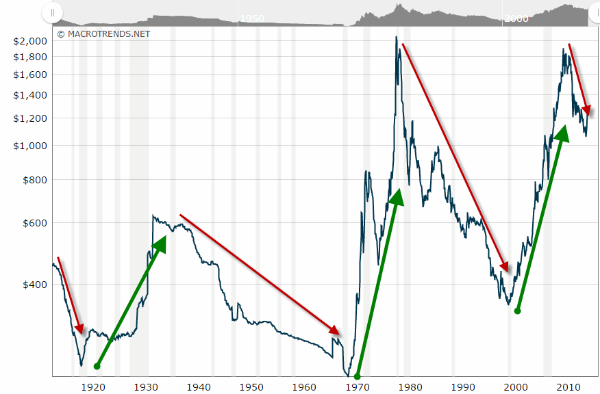
Figure 1 – Gold price; inflation adjusted (Source: MacroTrends.net)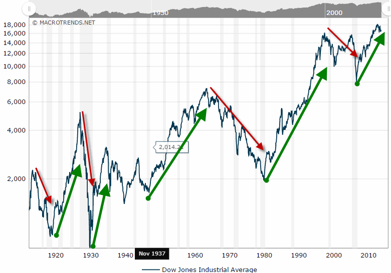
Figure 2 – Dow Industrials price; inflation adjusted (Source: MacroTrends.net)
Interestingly, If you do not adjust the values for inflation the trend is much less clear. Figures 3 and 4 show Gold and the Dow respectively without adjusting for inflation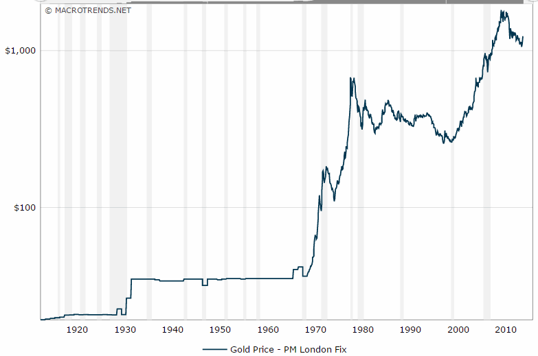 Figure 3 – Gold price; NOT inflation adjusted (Source: MacroTrends.net)
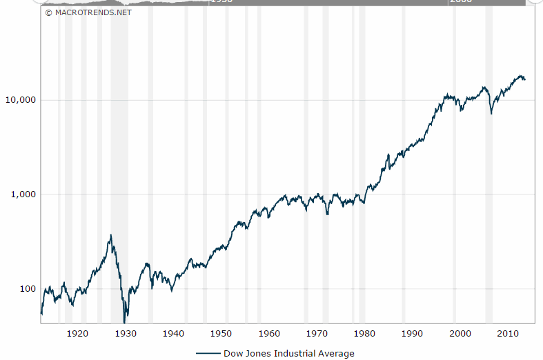 Figure 4 – Dow Industrials price; NOT inflation adjusted (Source: MacroTrends.net)
Jay Kaeppel

