OK, first off you have to admit that we are getting a little bit soft, don’t you think? I mean, after marching relentlessly higher to the tune of 34% since the November 2012 low, the Dow pulls back about 4.3%. And from all of the racket you would think that the end of the freaking world is apparently just around the corner. We used to be made of sterner stuff. Or so it seemed.
So there is a part of me that wants to shout “Buck up, people”. As a TFF (“Trend Followin’ Fool”) from way back, I would like to think that given the fact that the major stock market averages are above their respective long-term moving averages, we should stop all of the hand wringing and simply acknowledge that (at least for now) the major trend of the stock market is still bullish.
And when I say “I would like to”, I mean I really would “like to”. But the truth is there are a lot of good reasons to be keeping a close eye on the exits. To wit:
Indexes vs. Moving Averages
There is nothing magical about the relationship between the price of an asset/stock/index and its 200-day moving average. That being said, I sure do rely on it a lot – maybe because the interpretation is pretty darn simple:
Price > 200-day moving average = GOOD
Price < 200-day moving average = BAD
In Figure 1 we see four major stock market indexes (the Dow, the Nasdaq 100, the S&P 500 and the Russell 2000 clockwise from upper left).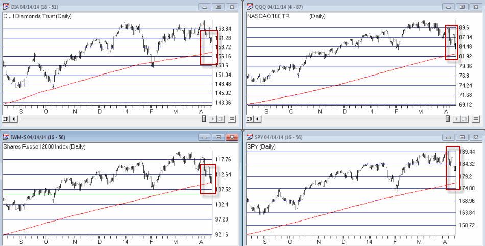 Figure 1 – Major stock indexes versus their 200-day moving averages (Courtesy: AIQ TradingExpert)
The thing to note is that with the exception of the Russell 2000 – which is only slightly above it’s MA – they are still well above their respective 200-day moving averages. Now granted this could change quickly if prices keep heading south. But the point is that for now, an objective trend-follower still has to designate the major trend as “up.”
Alright, I hope you enjoyed the “Good News”
Is Elliott Wave Waving “Goodbye” (to the Bull)?
Figure 2 displays the Elliott Wave count for the Dow and the Nasdaq 100 as calculated mechanically by ProfitSource by HUBB.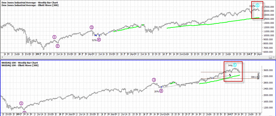 Figure 2 – Dow and Nasdaq completing Elliott Wave 5? (Source: ProfitSource by HUBB)
OK, a few things. For the uninitiated, the Elliott Wave Theory is based on work by – who else, a guy named Elliott – that suggests that price moves up in 5 waves – 3 waves up, 2 waves down – and then declines in 5 waves – 3 waves down and 2 waves up. Now the truth is that a lot of Elliott Wave counts don’t pan out. But I known a lot of people who’s market opinion I respect who follow “the Wave”.
As you can see in Figure 2 both the Dow and the Nasdaq 100 appear to have formed or are in the process of forming a completed 5-wave “up” pattern. The implication going forward is for lower prices ahead.
Sell In May – with MACD Filter (SMMF)
The “Sell in May” pattern was first reported by Yale Hirsch and since then The Hirsch Organization’s Stock Trader’s Almanac has kept track of an updated – and improved version – that uses the MACD indicator to determine the exact entry and exit dates.
By my calculations, this SMMF method issued an early “sell” signal on 4/7/14 as shown in Figure 3. This sell signal remains in effect until at least the end of September (which is significant, as we will see shortly).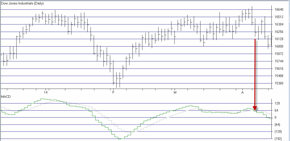 Figure 3 – Early “Sell in May” signal on 4/7/14 as MACD Oscillator turns negative (Courtesy: AIQ TradingExpert)
Why does this SMMF signal matter? In Figures 4 and 5 you can see the growth of $1,000 during bullish and bearish periods as signaled by the “Sell in May with MACD Filter” Method since 12/31/1949. 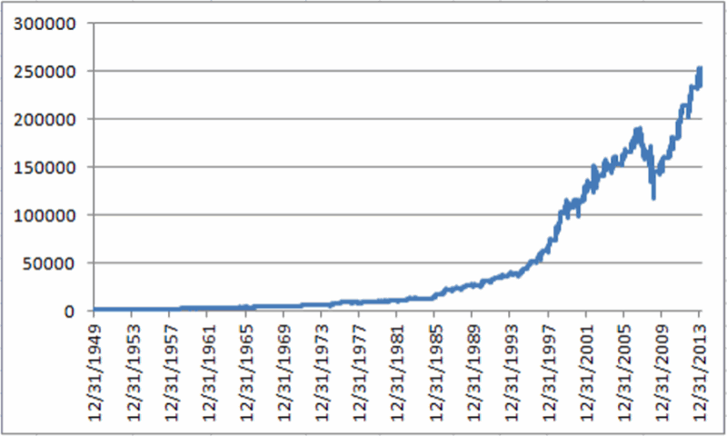 Figure 4 – Growth of $1,000 invested in Dow Industrial when SMMF Method is bullish
 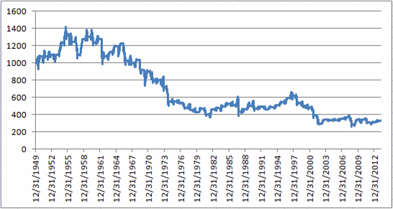 Figure 5 – Growth of $1,000 invested in Dow Industrial when SMMF Method is bearish
Notice any difference? For the record – and excluding any interest earned while of the market:
Bullish Phase gain = +24,753%
Bearish Phase loss = (-68%)
This method is now deemed”bearish.” ‘Nuff said.
Mid-Term Election Time of Year
Let me sum up the historical trend for mid-term election years as succinctly as possible by stating:
“Everything until September 30th is a crapshoot, but ignore any bad news after that.”
This summary is nicely illustrated in Figure 6.
*The blue line in Figure 6 displays the growth of $1,000 invested in the Dow between December 31st of the post-election year and September 30th of the mid-term election year.
* The red line in Figure 6 displays the growth of $1,000 invested in the Dow between September 30th of the mid-term year and December 31st of the mid-term year.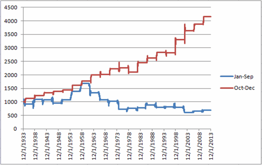 Figure 6 – Stock market shows bullish trend September 30 of mid-term election year through December 31st (Red line)
Again, the interpretation is fairly simple:
Jan 1 to Sep 30 – “Whatever”
Oct 1 to Dec 31 – “Bullish (usually)”
Summary
As a dutiful trend follower – and with the major indexes still holding above their long-term moving averages – I am still wearing the “brave face” and hoping that the stock market will continue to move higher. But if weakness persists or accelerates, it would appear that investors might be wise to take some defensive action (hedge, raise cash, go short) and to check back around September 30th of this year.
Sounds like a good time to invoke one of the most useful old adages:
“Hope for the best, prepare for the worst”
Jay Kaeppel


Speaking of Presidential cycles, Barry Ritholtz has a great chart on his blog (http://www.ritholtz.com/blog/2014/04/historical-presidential-cycle-pattern-1928-through-2012/) showing an 80+ year trend for the market to languish during the mid-term election year, only to look very promising from the 4Q into the next year. If we can all just hang tough in 2014, things should be better about October into 2015.